Download to read offline

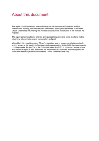
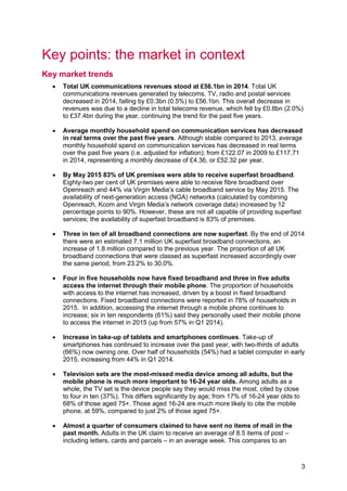
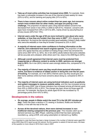
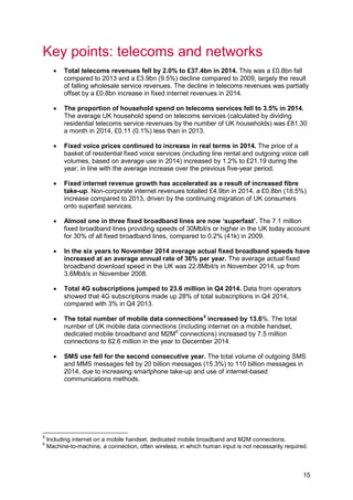


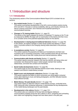


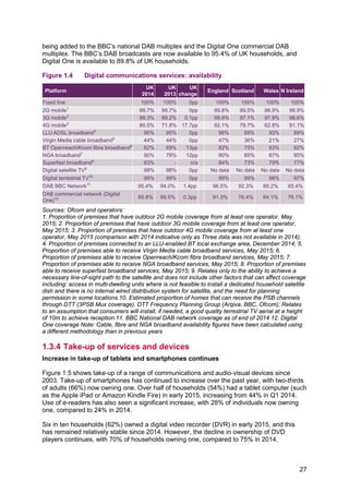
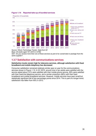
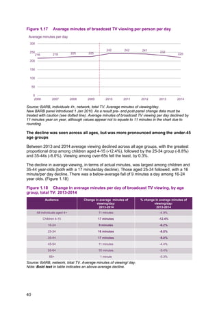
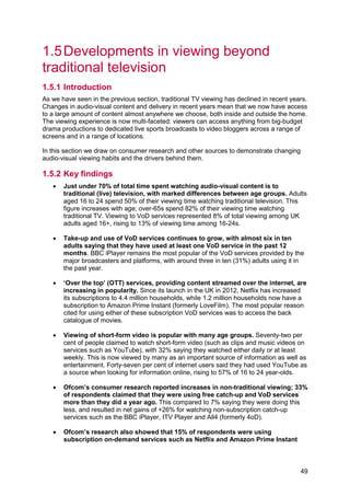
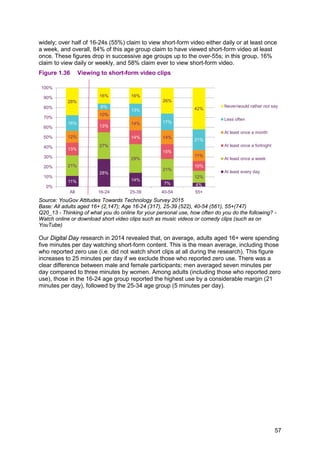
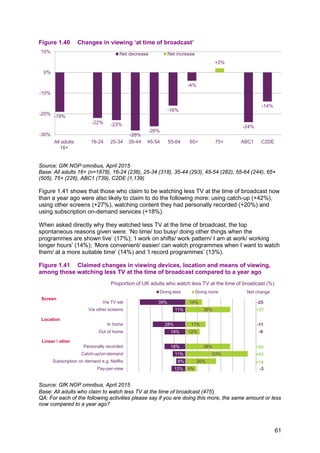
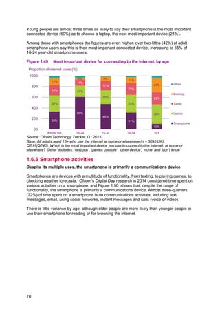
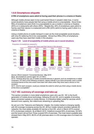
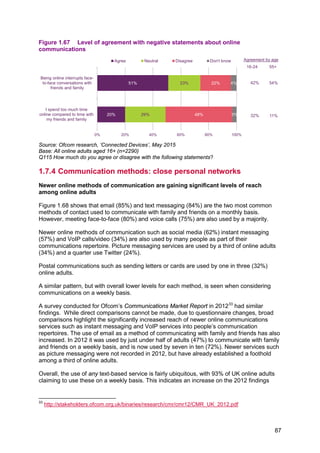
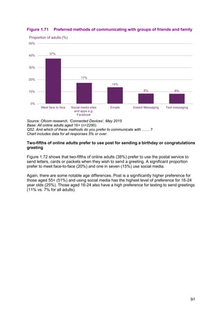
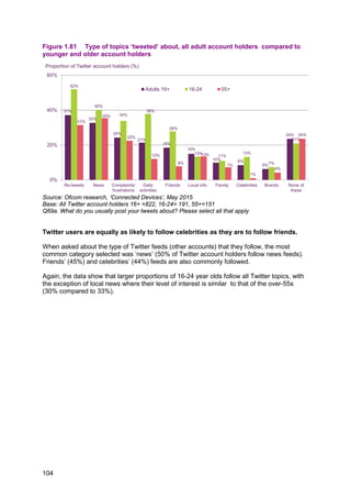
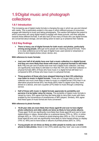
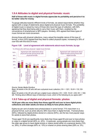
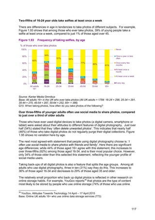
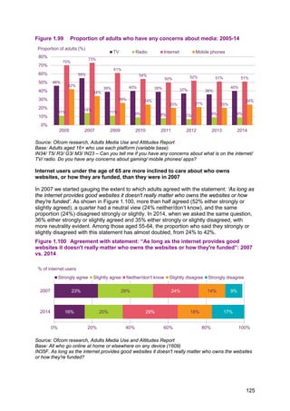
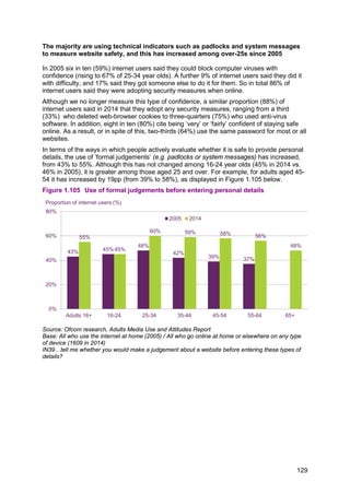
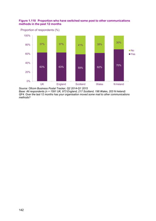
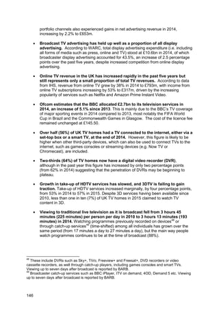
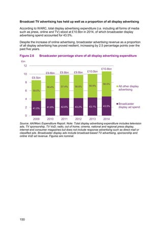
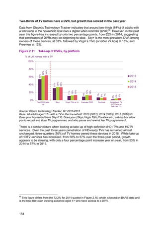
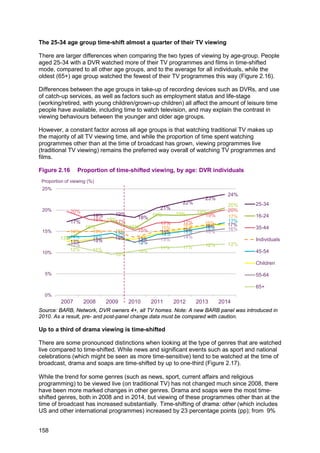
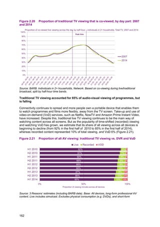
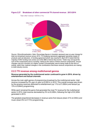
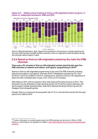
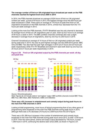
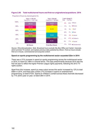
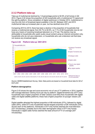
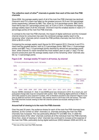
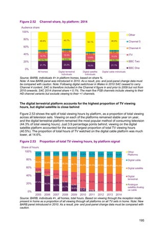
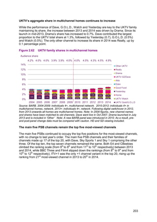
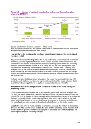
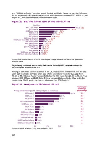
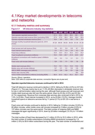
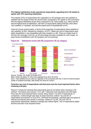
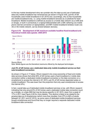
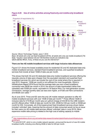
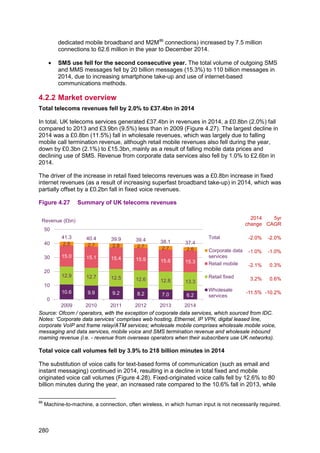
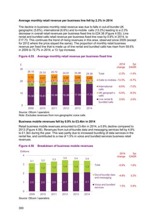
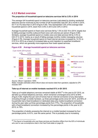
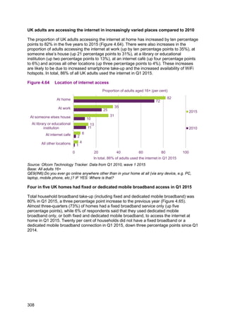
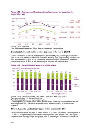
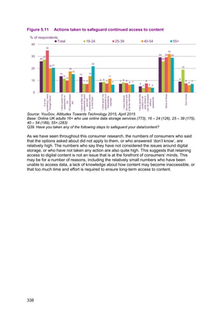
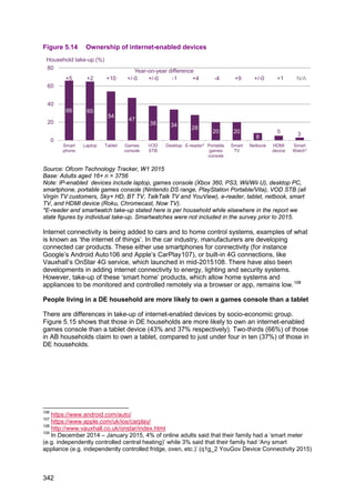
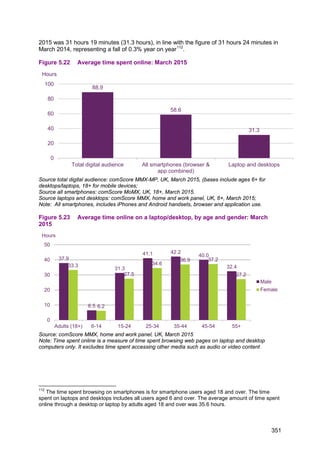
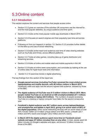
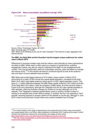
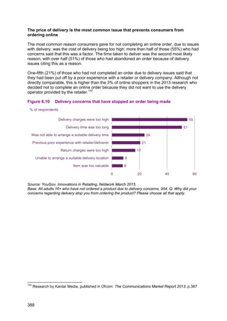
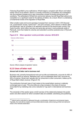
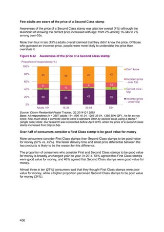
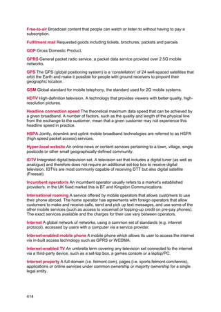
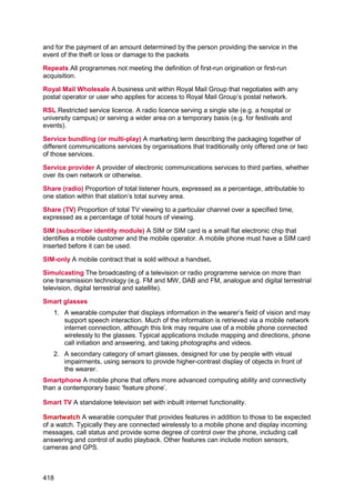
![Figure 1.15 Overall satisfaction with communications services
Source: Ofcom Technology Tracker. Data from Q1
Base: All adults aged 16+
Q: Thinking about your home phone/ mobile phone/ fixed broadband internet/ mobile broadband
internet service only, please say how satisfied you are with the overall service provided by [main
supplier]
Note: Shows the proportion of users with each service, includes only those who expressed an
opinion.
57%57% 56%56%59% 57% 61%61% 58%60% 60%58%
50% 46% 43% 48% 49%45%
39% 42%40%
33%
42%38%
34% 32% 34% 34% 30% 32%
33% 32% 37% 35% 33% 33%
40%
41% 44%
40% 39%
41%
44%
46%
44% 57%
46%
48%
91% 89% 89% 90% 89% 89%
94% 93% 95% 94% 93% 91% 90%
86% 87% 88% 88% 86%
83%
88%
83%
90% 88% 86%
0%
20%
40%
60%
80%
100%
2010
2011
2012
2013
2014
2015
2010
2011
2012
2013
2014
2015
2010
2011
2012
2013
2014
2015
2010
2011
2012
2013
2014
2015
Very satisfied Satisfied
Fixed
telephony
Mobile
telephony
Fixed
broadband
Mobile
Broadband
Proportion of users of service (%)
36](https://image.slidesharecdn.com/cmruk2015-150811140452-lva1-app6891/85/Ofcom-communications-report-2015-40-320.jpg)

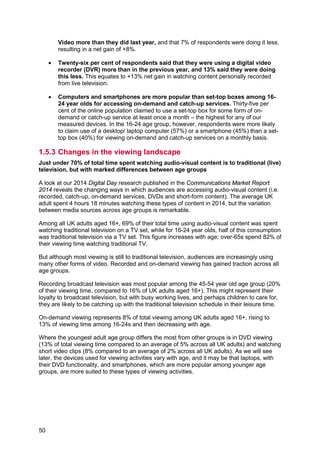
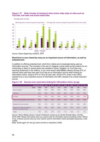

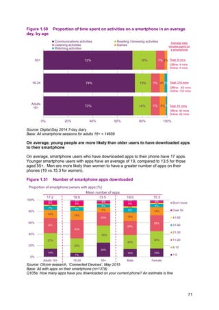

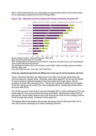
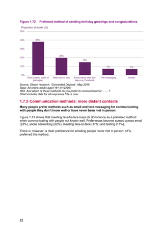

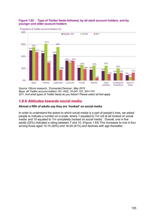

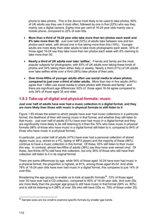
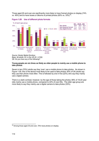
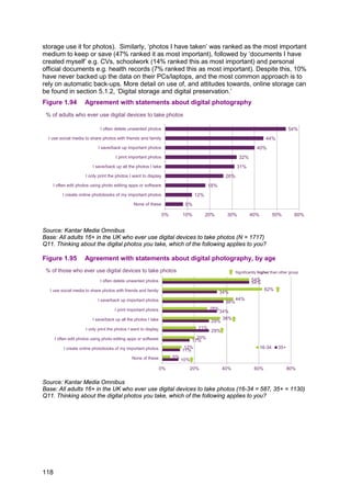

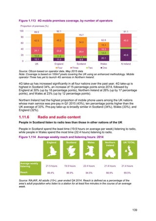
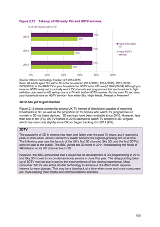
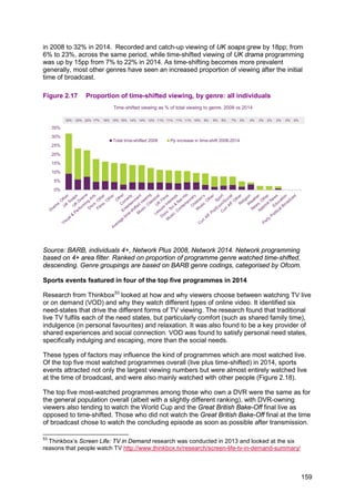
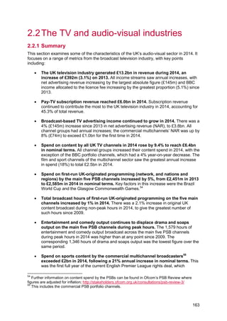
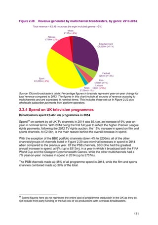
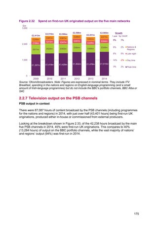
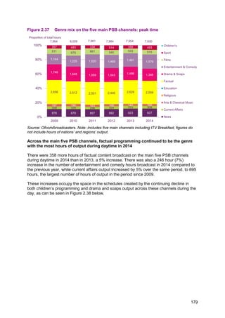

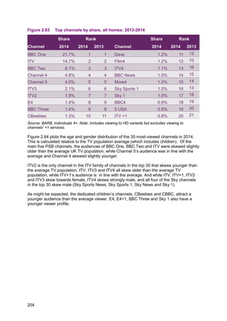

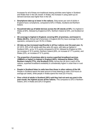
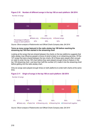
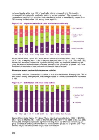
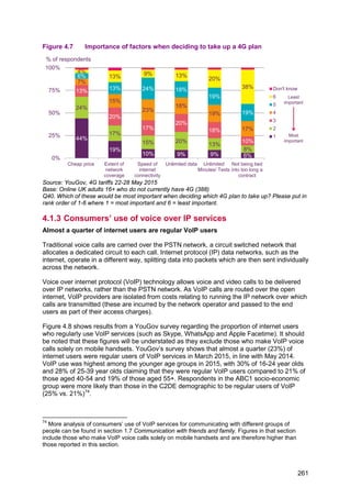
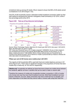
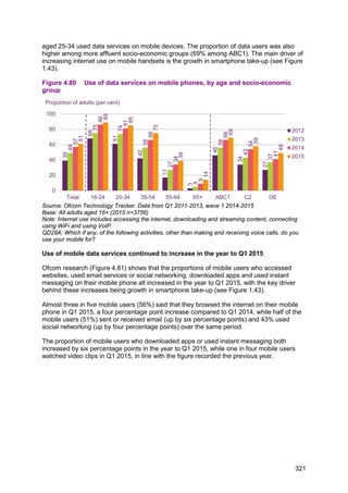
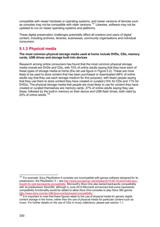
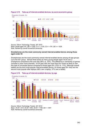
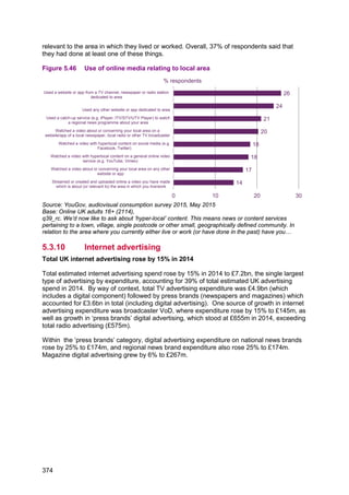
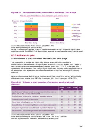
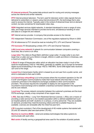
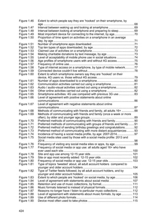
![Figure 3.6 Use of streamed audio services among internet users, by age: Q1 2015
Source: Ofcom research, Q1 2015
Base: All internet users (2298). Q: Which, if any, of these do you use the internet for?
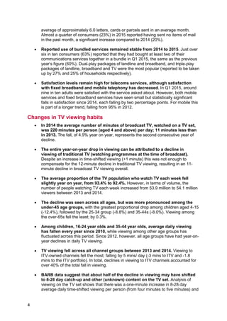
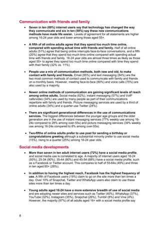
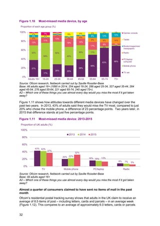
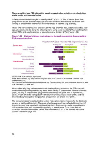
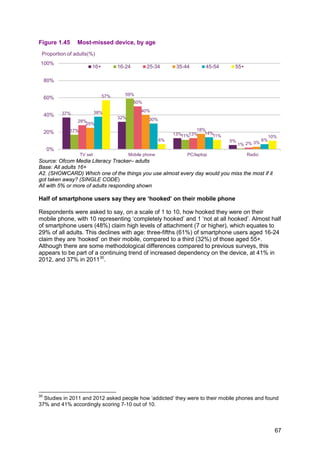
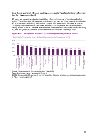
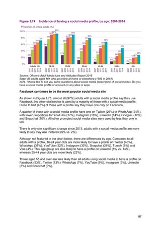
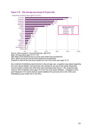
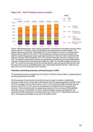
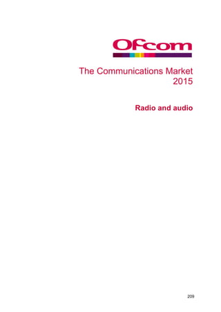
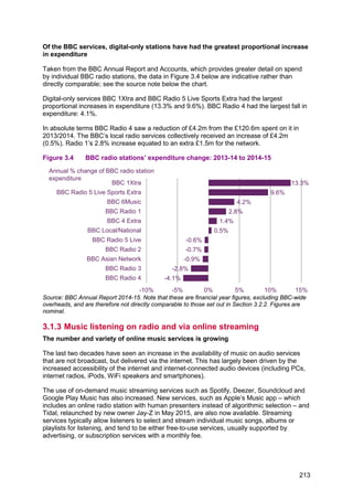
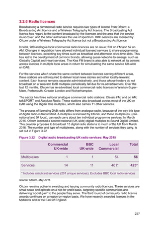
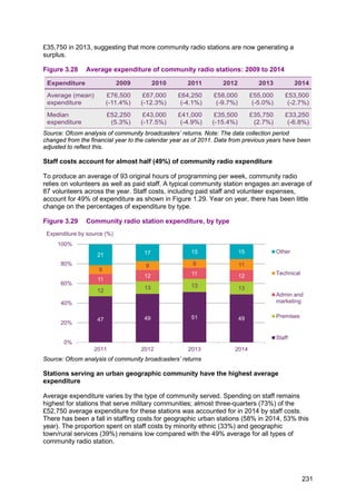
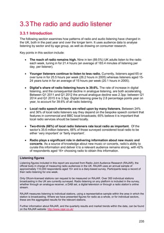
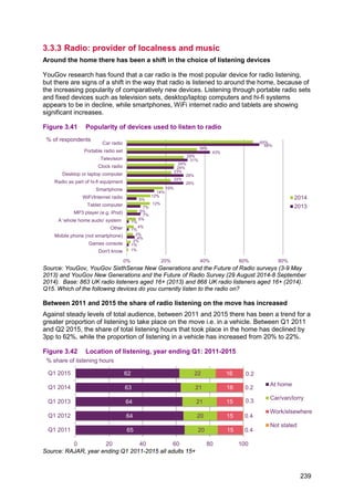
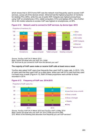
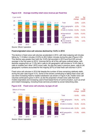
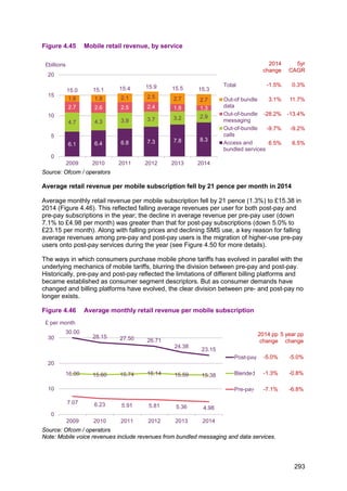
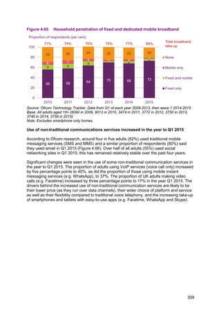
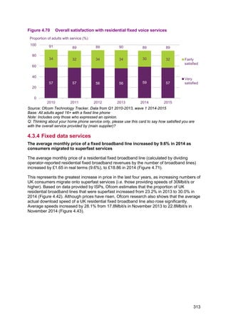
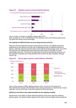
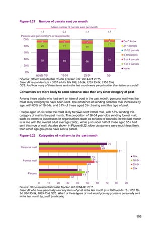
Among those who pay for music services, subscription is the most likely method
In addition to subscription streaming services, on-demand and pay-per-use music services
are available. Among those who pay for a streaming service, the subscription model is the
most likely way to do this; almost half (48%) of those who pay for a streaming service do so
through a subscription. Over a third (37%) pay for music on a per-use basis, and just under
one in ten (8%) have a paid-for streaming service bundled with an existing contract, such as
those offered by mobile phone providers.
Figure 3.7 Methods of paying for music services: 2014
Source: YouGov, Audiovisual Consumption 2015, fieldwork May 2014.
Base: those who pay for a music service (266) Q. How do you pay for your music, […] service?
Those aged 16-24 spend more time with streaming services than with radio
Ofcom’s Digital Day research, published in the 2014 edition of this report,69
used a diary
survey to determine the amount of time that listeners spent with different sources of audio.
69
Ofcom, The Communications Market Report 2014, August 2014, http://www.ofcom.org.uk/cmr
13
24
16 13 10 7 5
11
21
14
12
9
6
4
6
12
8
6
5
2
3
0
10
20
30
40
50
60
All adults 16-24 25-34 35-44 45-54 55-64 65+
Any service Free services Subscription services
Proportion of each age group (%)
48 8 37 11
0 25 50 75 100
Type of payment
Subscription Part of a contract Per use Other/don't know
Proportion of respondents (%)
215](https://image.slidesharecdn.com/cmruk2015-150811140452-lva1-app6891/85/Ofcom-communications-report-2015-219-320.jpg)
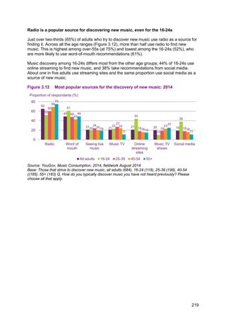

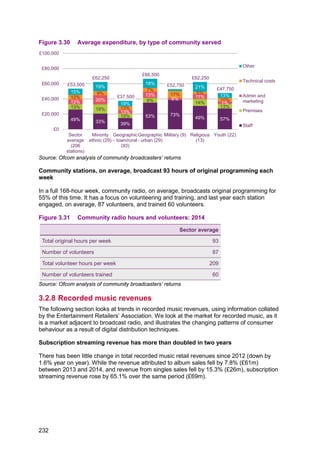
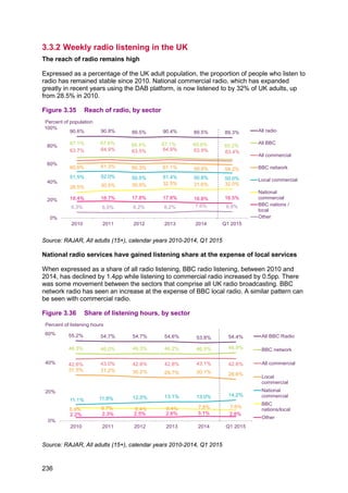
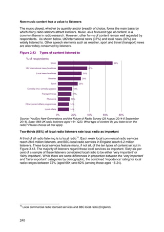
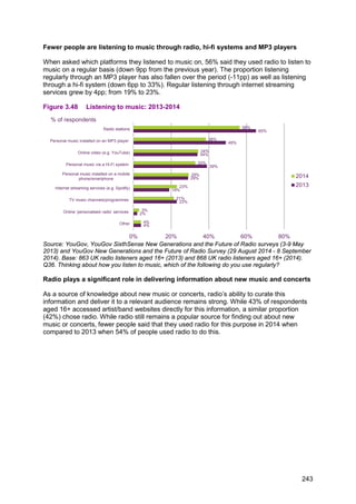
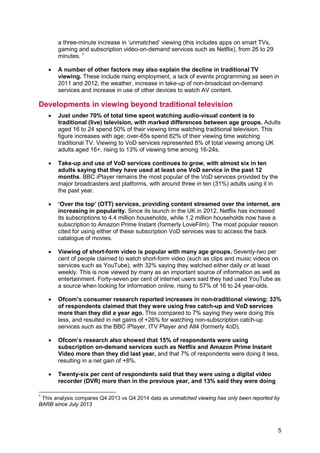
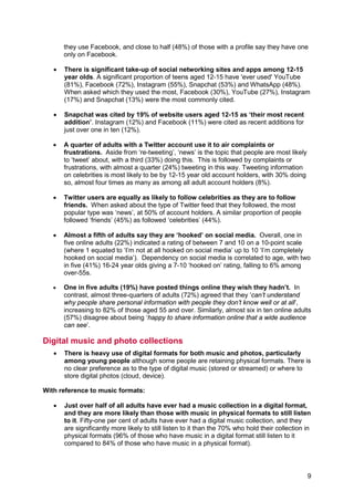
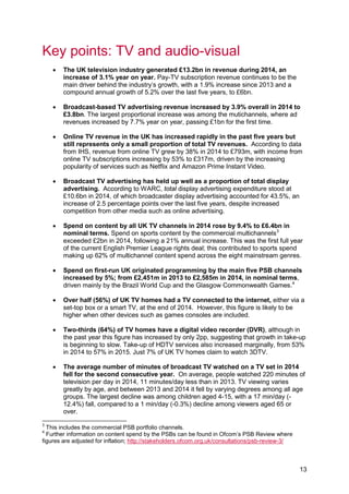
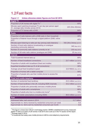
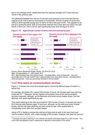
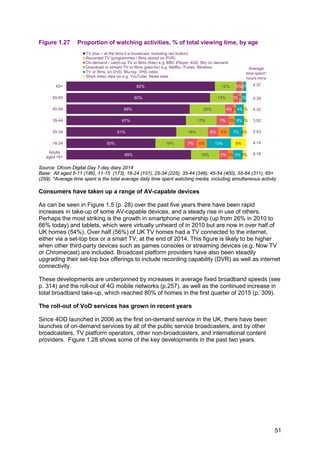
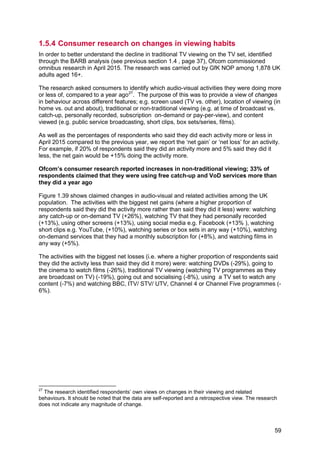
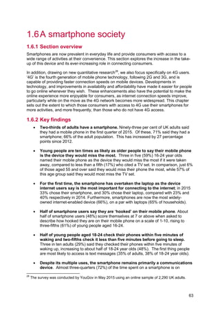
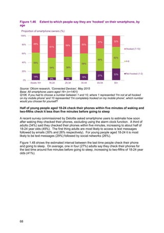
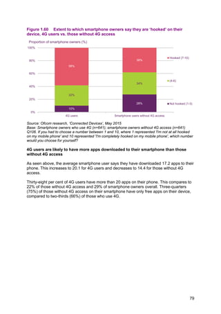
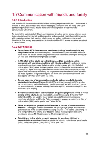
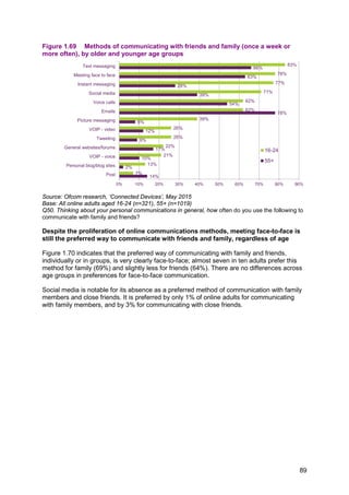
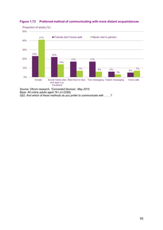
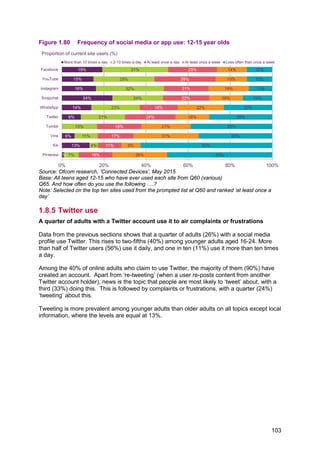
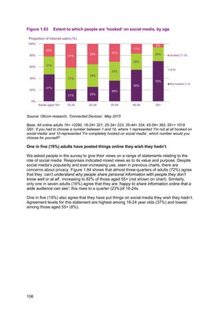
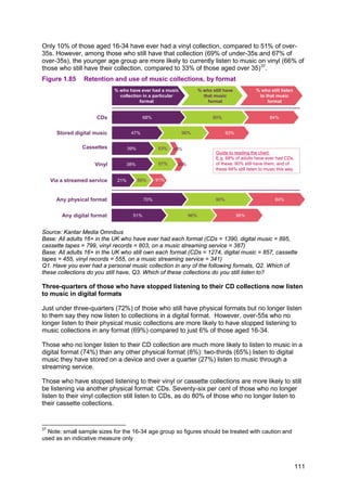
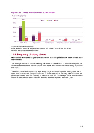
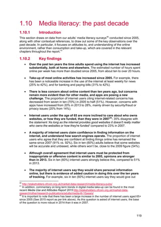
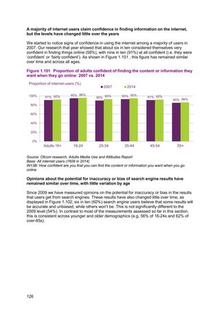
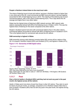
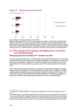
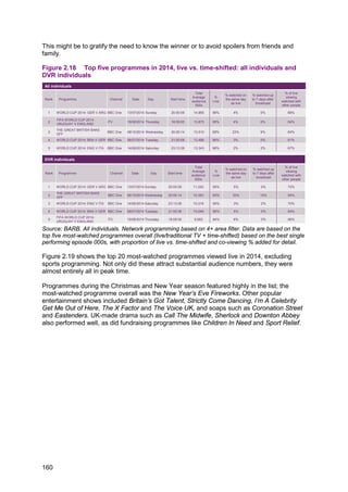
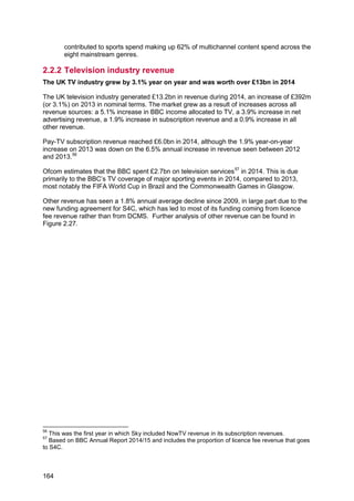
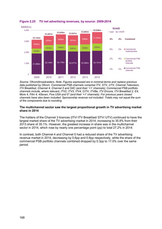
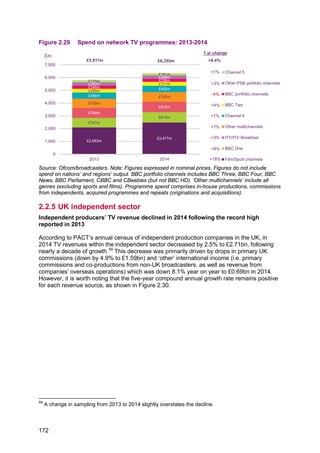
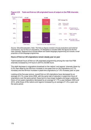
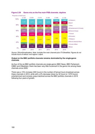
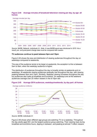
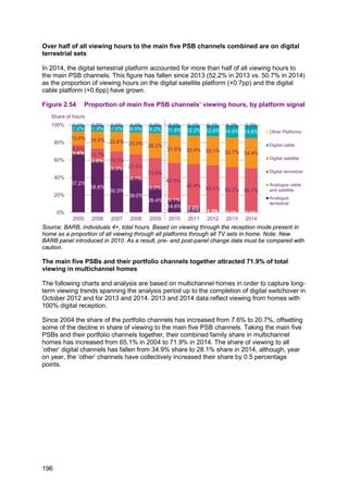
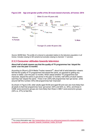
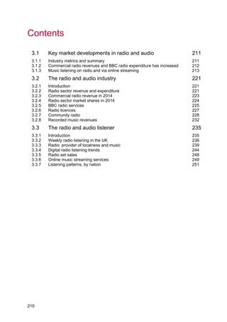
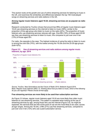
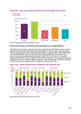
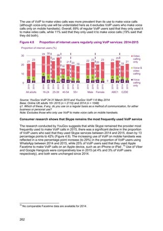
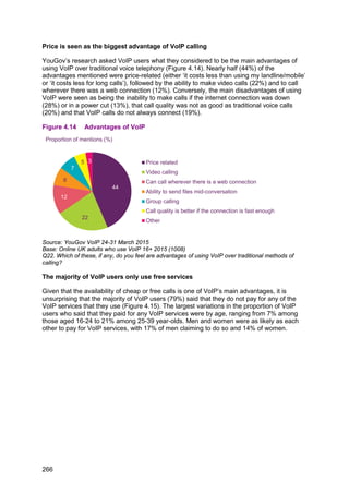
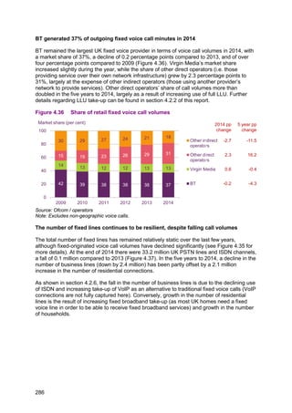
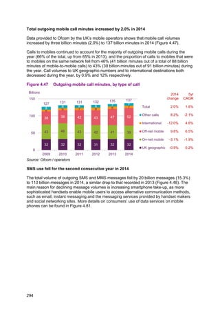
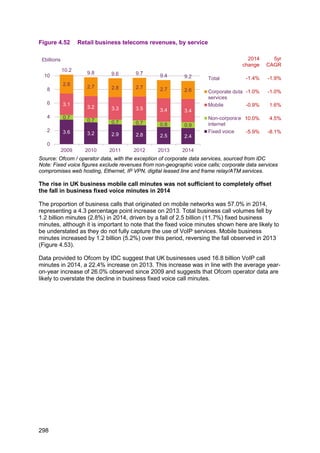
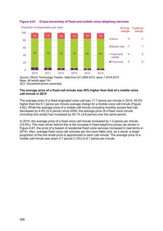
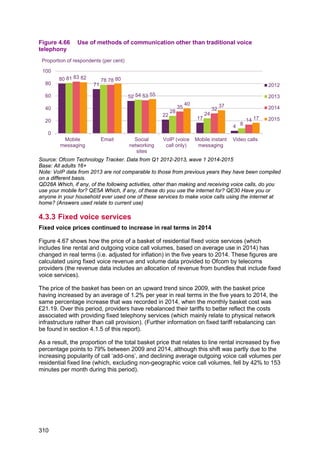
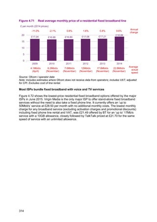
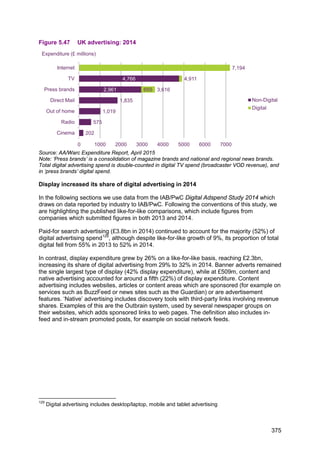
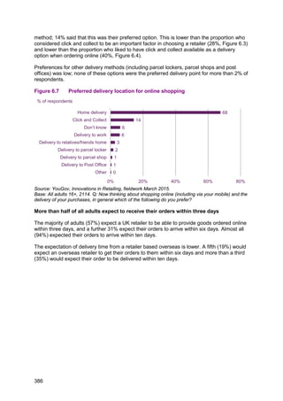
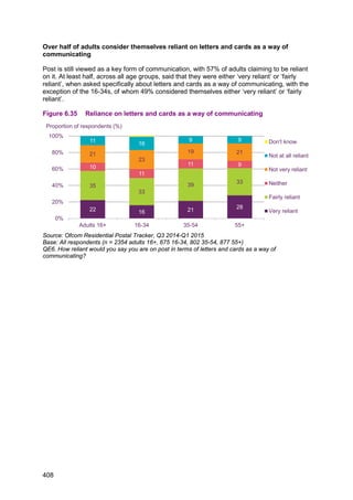
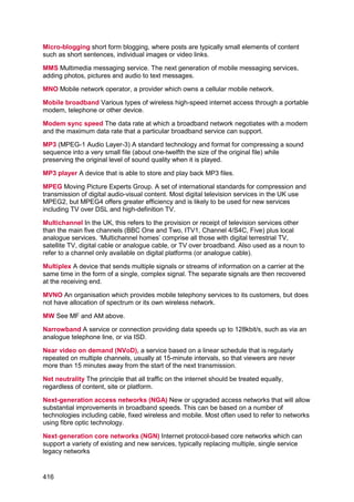
![4.8pp to 1.7pp. The growth in listening to radio via the internet and/or on a mobile phone
(see Figure 3.53), together with the numbers of those who were previously inclined to buy a
DAB receiver and have now done so, may account for this slow growth.
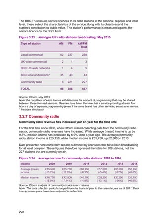
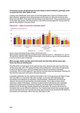
With 22% of all radio listening occurring in a motor vehicle, the take-up of DAB receivers in
cars has increased year on year. Today, 65% of new cars have a DAB radio fitted as
standard.71
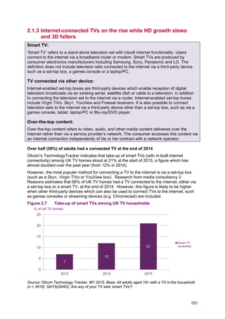
Figure 3.53 Ownership of DAB sets: Q1 2015
Source: RAJAR / Ipsos MORI / RSMB Q1 2008-2015
Tablet take-up continues to rise steeply while smartphone take-up growth continues
Take-up of tablets, smartphones and internet access are the three growth areas to consider
regarding access to radio programmes. Tablet take-up has risen from 44% to 54% over the
last 12 months; smartphone take-up is up by 5pp to 66% and internet access has increased
by 3pp to 85%. DAB radio take-up remains fairly flat; up 1pp to 49%. While few current-
generation smartphones are fitted with a DAB receiver component, listening is possible
through the use of the internet or apps, and some smartphones include an analogue tuner.
However, online streaming presents a possible downside for listeners on the move, because
consumption may use up their monthly mobile data allowance.
71
Digital Radio UK, ‘5 million cars have digital radio’, 11 June 2015,
http://www.getdigitalradio.com/dab-news/view/528 [accessed 8 July 2015]
27.3%
32.1% 34.5% 38.2% 42.6% 44.3% 47.9% 49.0%
0%
15%
30%
45%
60%
Q1 2008 Q1 2009 Q1 2010 Q1 2011 Q1 2012 Q1 2013 Q1 2014 Q1 2015
Percentage of adults who claim to own a DAB set / have a DAB set in the home
246](https://image.slidesharecdn.com/cmruk2015-150811140452-lva1-app6891/85/Ofcom-communications-report-2015-250-320.jpg)
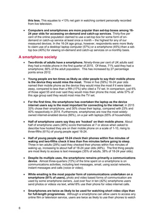
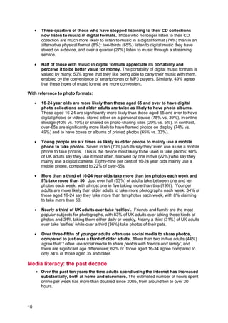
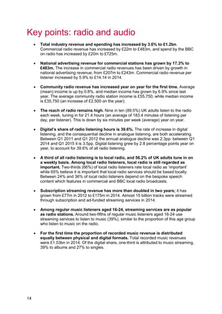
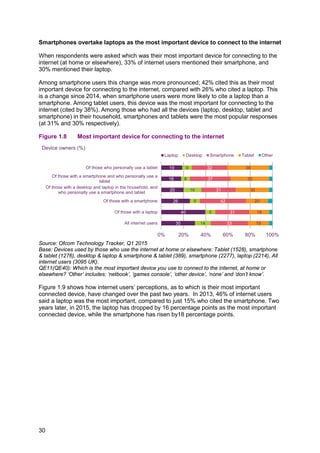
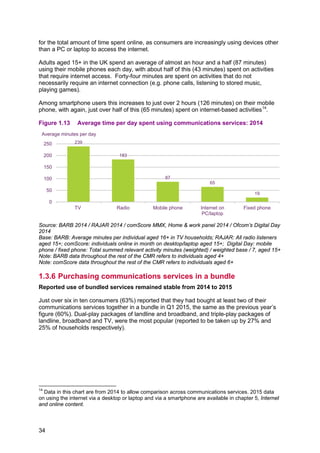
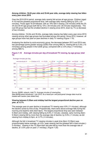
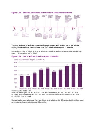
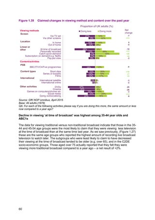
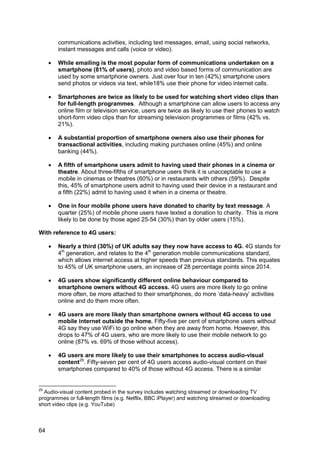
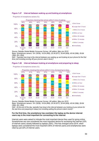
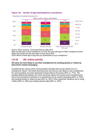
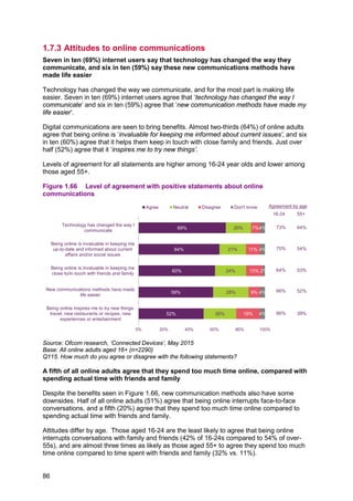
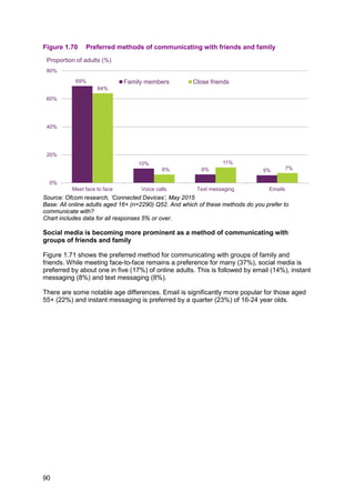
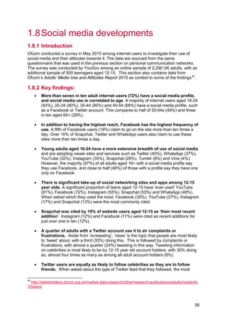
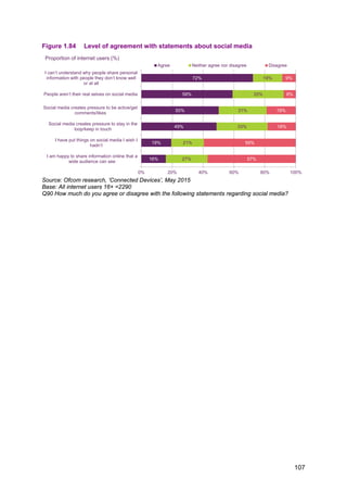
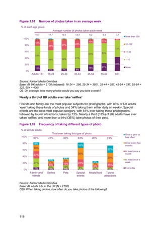
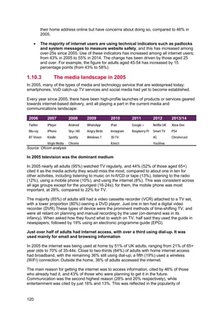
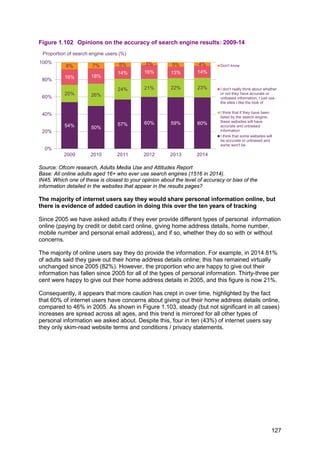
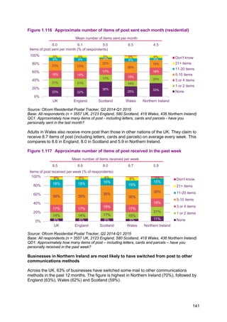
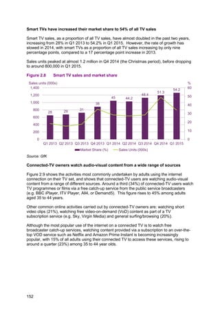
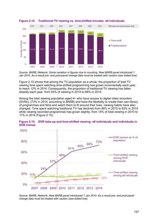
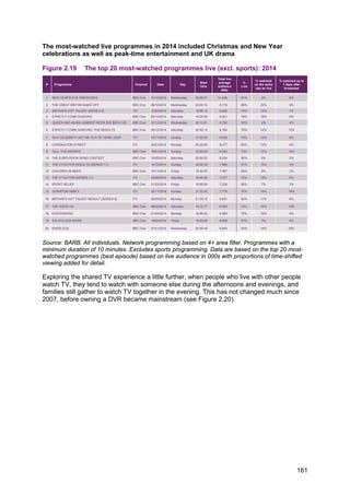
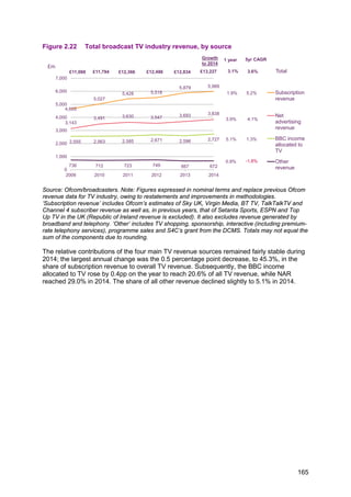
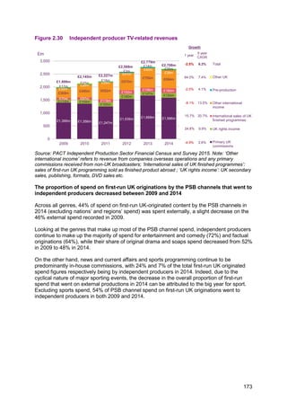
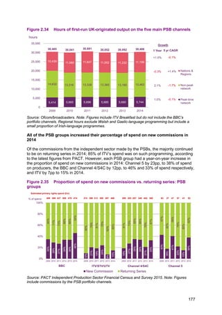
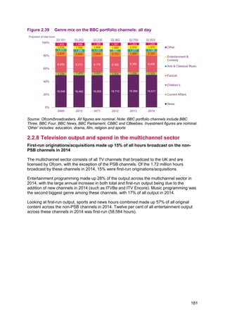
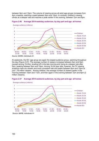
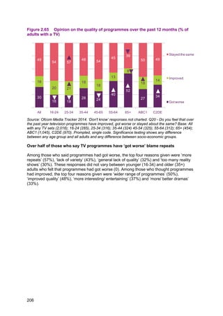
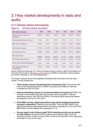
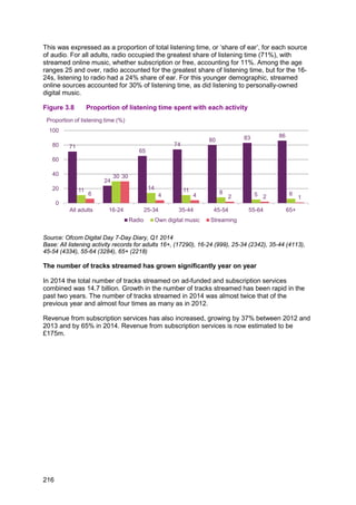
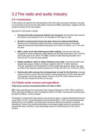
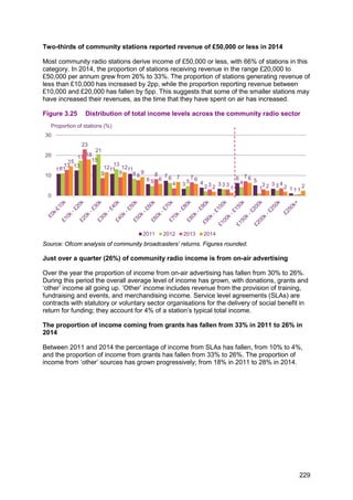
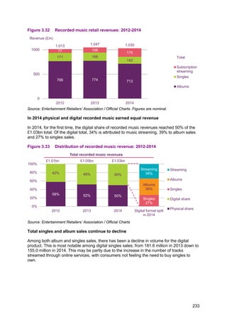
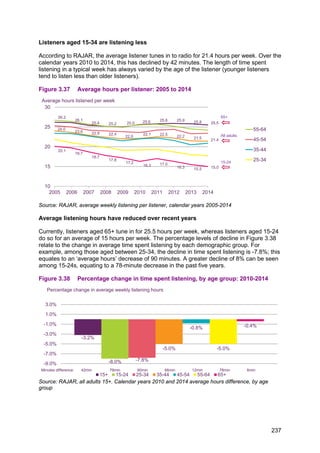
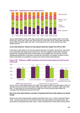
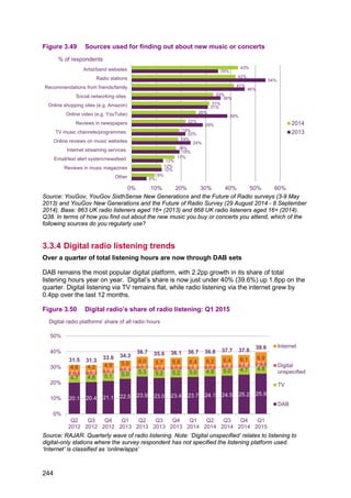
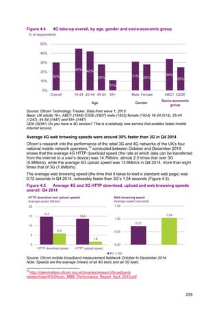
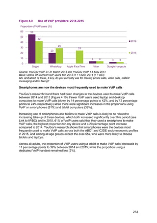
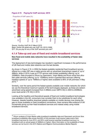
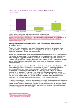
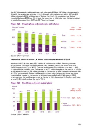
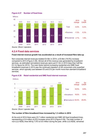
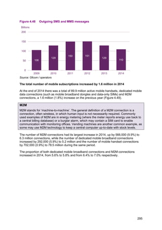
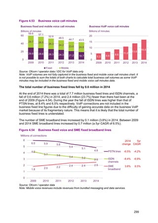
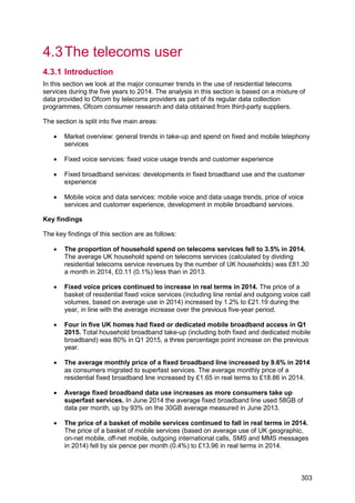
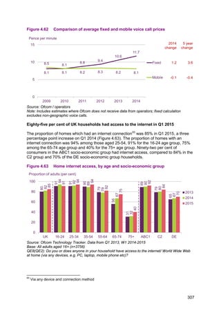
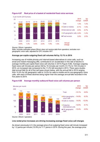
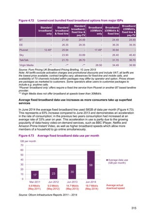
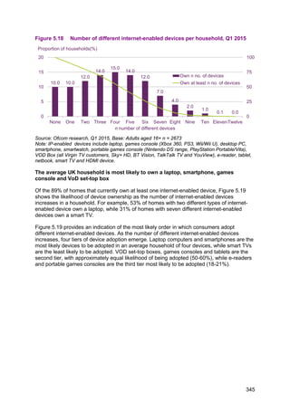
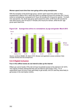
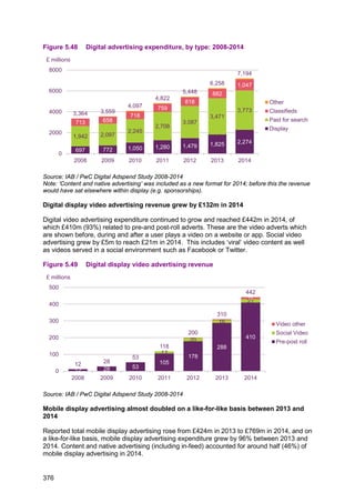
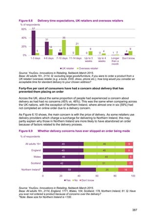
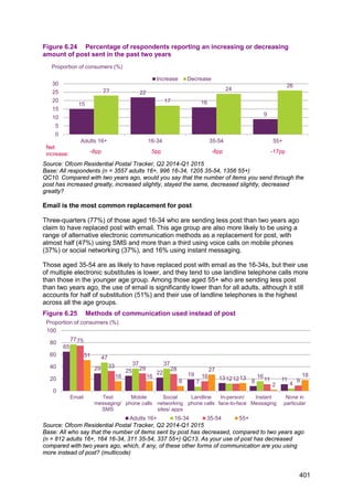
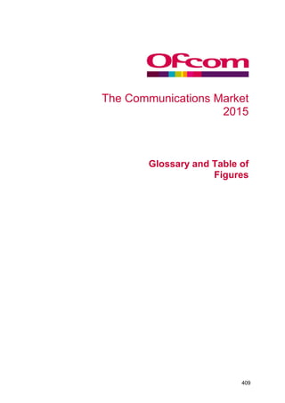
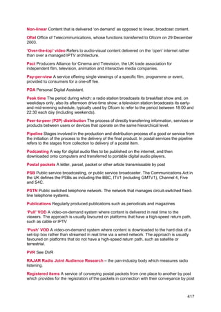
![areas, although there is an overlap in the more populated areas (42.5% of UK premises
were covered by all four operators, in terms of outdoor coverage).
Figure 4.3 4G outdoor premises coverage, by network
Source: Ofcom mobile broadband performance reports, November 2014
[http://stakeholders.ofcom.org.uk/binaries/research/broadband-research/mbb-nov14.pdf] & April 2015
[http://stakeholders.ofcom.org.uk/binaries/research/broadband-
research/april15/Ofcom_MBB_Performance_Report_April_2015.pdf]
Note: 4G coverage data were not available for Three in June 2014.
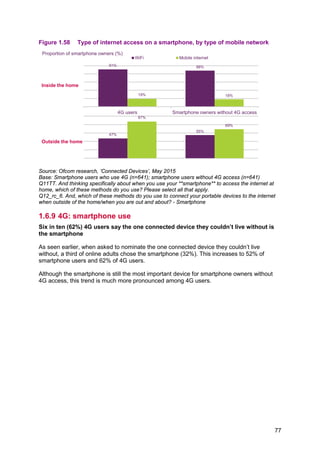
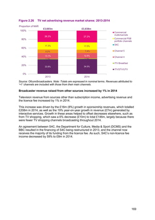
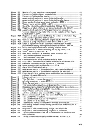
Adults in the ABC1 socio-economic group are more likely than those in the C2DE
group to use 4G services
Overall, 30% of adults had a 4G mobile phone package in Q1 2015. Take-up of 4G mobile
services varied by nine percentage points across socio-economic groups, with 34% of ABC1
and 25% of C2DE respondents using a 4G package. Male respondents had a 31% take-up
of 4G services, while female take-up was 28%.
As can be seen in Figure 4.4, 4G take-up varies by age group. Only 11% of respondents
aged 55+ claimed to have a 4G package, compared to 45% of respondents in the 16-24 age
group. Forty-two per cent of respondents in the 25-44 age group had a 4G package, 14
percentage points higher than the 28% recorded among those aged 45-54.
37
43
6865 66
81
53
0
25
50
75
100
Vodafone Telefonica (O2) EE Three
June 2014
March 2015
4G premises coverage (%)
No
data
258](https://image.slidesharecdn.com/cmruk2015-150811140452-lva1-app6891/85/Ofcom-communications-report-2015-262-320.jpg)
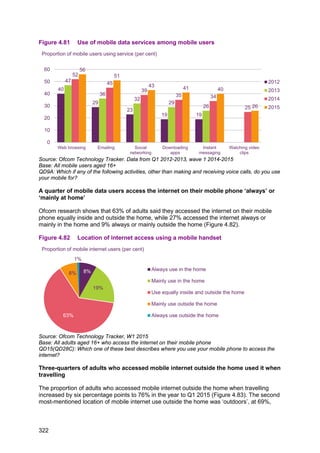

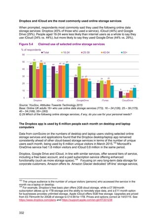
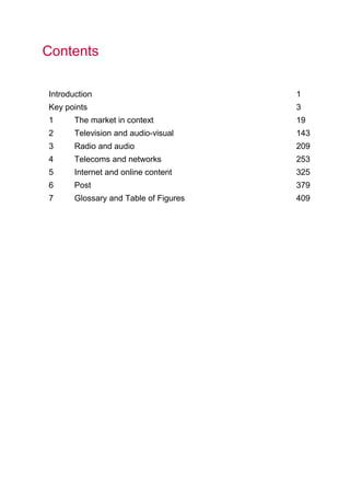
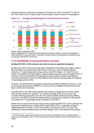
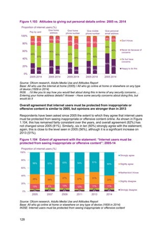
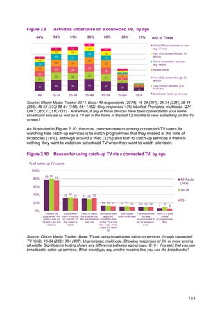
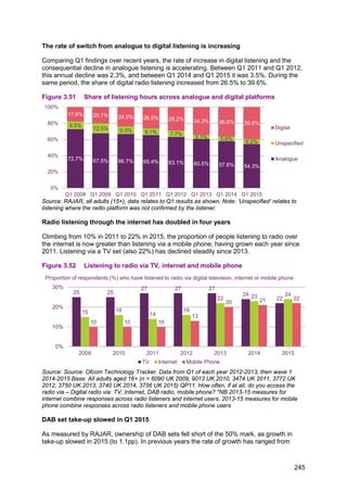
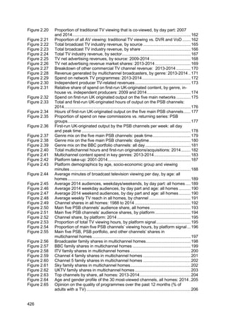
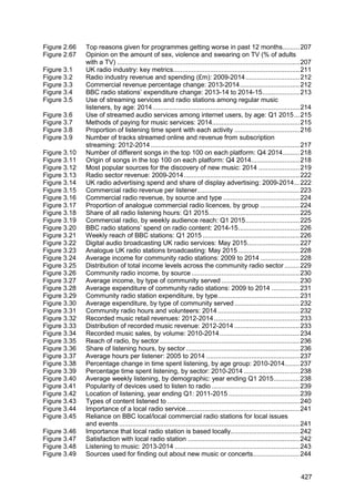
![for businesses which need to keep large volumes of records for long periods of time (for
example, to meet legal requirements) but which do not need instant access to the data.105
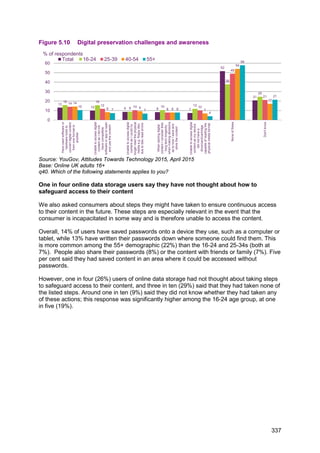
Figure 5.5 Use of selected online storage services on desktop and laptop
computers
Source: comScore MMX, UK, home and work panel, April 2013- March 2015. NB: Google Drive not
separately identified in comScore MMX. Entities reported in MMX: Dropbox (App) [M], OneDrive [C],
ICLOUD.COM [P], MEGA.CO.NZ [P], Box (App) [M], Copy (App) [M]. Note: Services may include
other websites and apps e.g. for mobile uploads, apart from those identified above.
Three-quarters of users of online storage services use them to store their photos
When asked about what kind of content they were storing on online storage services, three-
quarters (74%) of users said they stored photos they had taken. Just under half (44%) said
they used the services to store documents they had created themselves. Around a quarter
(24%) said they used the services to store music they had purchased, and 6% said they
stored films and TV programmes they had purchased. More details on consumers’ use of,
and attitudes towards, digital music and photos can be found in section 1.9 of this report.
Of the five most commonly-cited content types stored on online storage services, four relate
to content created by, or personal to the individual user, rather than purchased content, the
exception being purchased music.
105
See: http://aws.amazon.com/glacier/
0
2
4
6
8
Apr-2013
May-2013
Jun-2013
Jul-2013
Aug-2013
Sep-2013
Oct-2013
Nov-2013
Dec-2013
Jan-2014
Feb-2014
Mar-2014
Apr-2014
May-2014
Jun-2014
Jul-2014
Aug-2014
Sep-2014
Oct-2014
Nov-2014
Dec-2014
Jan-2015
Feb-2015
Mar-2015
Dropbox (App) OneDrive ICLOUD.COM MEGA.CO.NZ Box (App) Copy (App)
Unique audience (millions)
333](https://image.slidesharecdn.com/cmruk2015-150811140452-lva1-app6891/85/Ofcom-communications-report-2015-337-320.jpg)
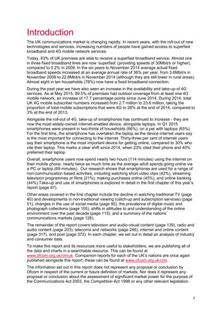
![and attribute this to audience demographics in a way that is not affected by cookie deletion,
blocking, and rejection.
Metrics
Throughout this report we make reference to a number of metrics as defined below:
Unique audience – the total number of unique persons who visited a website or used an
application at least once in a given month. Persons visiting the same website more than
once in the month are therefore counted only once in this measure.
Active audience – the total number of people who visited any website or used any
application at least once in a given month; i.e. the number of people online and using any
specific platform in a given month, no matter which website or app they used.
Digital audience – the active audience across all digital platforms (laptop/desktop
computers, Android and iOS smartphones, iPads and, for those sites who have tagged in
comScore’s census network, Android tablets).
Active reach – the proportion of the active audience made up by the unique audience of a
website.
Time spent per month – the average time spent browsing a website per unique visitor per
month (excludes time spent watching online video and listening to streamed music, and for
mobile audiences excludes any traffic over a home or public WiFi connection).
Dictionary
Each of the entities reported by comScore is attributed to a level in comScore’s Client
Focused Dictionary. Several entities (including apps) can exist within one service (e.g. BBC
Sport and BBC iPlayer) and comScore’s dictionary defines how these entities are structured
and related to each other. It is client-focused because comScore’s clients define how their
websites appear in reports according to this dictionary. All comScore reports use the same
six-tiered dictionary structure, as explained below:
Property [P] - The highest level of reporting within the dictionary. Properties represent all full
domains (i.e. felmont.com), pages (i.e. sports.felmont.com/tennis), applications or online
services under common ownership or majority ownership for a single legal entity. A property
may also contain any digital media content that is not majority-owned but has been legally
signed over for reporting purposes by the majority owner.
Media Title [M] - A Media Title is an editorially and brand-consistent collection of content in
the digital landscape that provides the marketplace with a view of online user behaviour.
This may represent a domain, a group of domains, online service or application.
Channel [C], SubChannel [S], Group [G] and SubGroup [SG] - Within a Media Title there
may be grouped URLs of editorially consistent content that make up a Channel. For some of
the largest Media Titles, Channels themselves may be broad, and Subchannels, Groups and
Subgroups within the larger Channels may prove useful for categorisation within the
comScore Dictionary.111
111
“Glossary – Key Terms for comScore Dictionary”, comScore.
348](https://image.slidesharecdn.com/cmruk2015-150811140452-lva1-app6891/85/Ofcom-communications-report-2015-352-320.jpg)
![Just below the ten most commonly cited reasons for using the internet, four in ten (39%)
SMEs said they also used the internet for marketing purposes; over half (52%) of larger
SMES (50-249 employees) said they did this. Among online marketing users, 85% said they
used Facebook, 45% Twitter and 42% LinkedIn.
Overall, 23% of SMEs using a fixed internet service said they were using cloud services,
although this was higher among larger SMEs (35% of businesses with 50-249 employees).
For more details of Ofcom’s work on the provision of broadband services to SMEs, including
more details of the research, please see http://stakeholders.ofcom.org.uk/market-data-
research/other/telecoms-research/smes-research-jun15/
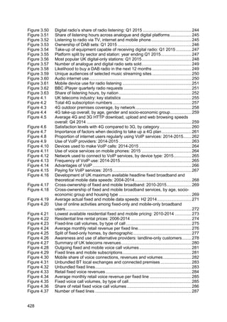
Google’s services remain the most-visited websites and apps across laptop and
desktop, mobile and tablet devices, with 46 million UK visitors in March 2015
To identify those organisations with the largest total online audiences across all of their
services we report against an organisation’s comScore property (the sites and apps owned
by the organisation).
In March 2015, Google’s services were visited by 46 million users in the UK, with Facebook,
and the BBC, in second and third places with 41 and 40 million unique visitors respectively.
Three of the ten most popular comScore internet properties in the UK were organisations
based in the UK, i.e. the BBC, Mail Online/Daily Mail and Sky sites.
The unique audience of the Google Sites comScore Property reflects the significant
audiences for the services that are captured within this, including Google Search and
YouTube, which we look at in more detail in the following sections.
Figure 5.29 Top ten most popular comScore Properties among the digital audience:
March 2015
Source: comScore MMX-MP, UK, March 2015
Notes: All sites listed are at the Property level [P]. Please note MMX Multi-Platform includes
laptop/desktop browsing, laptop/desktop video streams and mobile use. Mobile use includes Android
smartphones and iOS smartphones and tablets. Only those entities that have been tagged as part of
the census network report Android tablet usage data. Google Sites included YouTube.
46
41 40
37 37
33 31
28 28 27
0
10
20
30
40
50
Google Sites Facebook BBC Sites Microsoft
Sites
Amazon
Sites
Yahoo Sites eBay Mail Online /
Daily Mail
Sky Sites Apple Inc.
Unique audience (millions)
358](https://image.slidesharecdn.com/cmruk2015-150811140452-lva1-app6891/85/Ofcom-communications-report-2015-362-320.jpg)
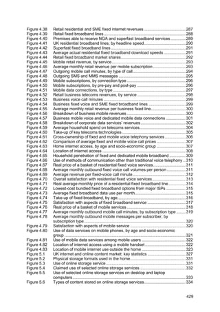
![People spend most time with websites and apps owned by Facebook
In March 2015, UK visitors to Facebook’s services spent 51 billion minutes on them across
desktop, laptop and mobile devices. In contrast, the multiplatform audience spent 34 billion
minutes on Google’s properties.
Although not in the top ten properties by reach in the digital audience, Netflix.com’s position
as eighth in total minutes reflects the fact that users spent on average 7.5 hours each (3.22
billion minutes in total) in March 2015 on the service.
Figure 5.30 Top ten comScore Properties among the digital audience, by time spent
Source: comScore MMX Multi-Platform, UK, March 2015
Note: All sites listed are at the Property level [P]. Time spent online is a measure of time spent on
laptop/desktop webpage browsing and on-network and WiFi mobile browsing and application data. It
excludes time spent accessing audio content.
5.3.3 Mobile apps
Facebook published the three most downloaded apps in March 2015
The most downloaded app across the iOS App Store and Google Play in March 2015 was
WhatsApp Messenger, followed by the Facebook app and the Facebook Messenger app, all
of which are published by Facebook. Of the top ten most downloaded apps downloaded in
March 2015, two were games (Crossy Road and Candy Crush Saga), another two were
video and/or music (YouTube and Spotify), with the remainder relating to messaging and
social networking.
2.85
3.02
3.22
4.90
5.52
7.98
8.01
9.52
34.16
51.04
0 10 20 30 40 50 60
Sky Sites
Amazon Sites
NETFLIX.COM
eBay
Yahoo Sites
Microsoft Sites
Apple Inc.
BBC Sites
Google Sites
Facebook
Total Minutes (billions)
359](https://image.slidesharecdn.com/cmruk2015-150811140452-lva1-app6891/85/Ofcom-communications-report-2015-363-320.jpg)
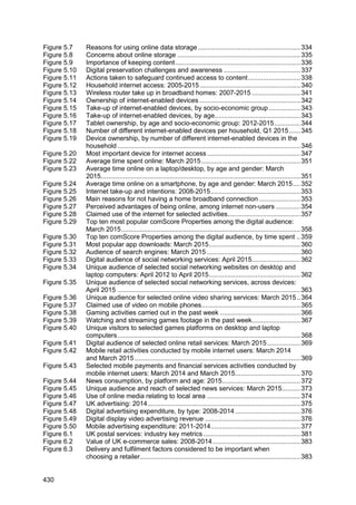
![Figure 5.31 Most popular app downloads: March 2015
Source: App Annie Index https://www.appannie.com/indexes/all-stores/rank/overall/?month=2015-03-
01&country=GB
5.3.4 Search
Google remains the most popular search engine
Google Search had a digital audience of 39.6 million across all platforms in March 2014
(83% active reach), followed by Microsoft’s Bing search engine (17.3 million; 36% active
reach) and Yahoo Search (14.0 million; 29% active reach). The same ranking is seen for
desktop and laptop audiences and access on mobile devices.
Figure 5.32 Audience of search engines: March 2015
Source: comScore MMX-MP, comScore MMX, comScore MoMX, UK, March 2015
MMX Multi-Platform includes laptop/desktop browsing, laptop/desktop video streams and mobile use.
‘Total mobile’ includes Android smartphones and iOS smartphones and tablets. Only those entities
that have been tagged as part of the census network report Android tablet usage data.
App Company
1 WhatsApp Messenger Facebook
2 Facebook Facebook
3 Facebook Messenger Facebook
4 YouTube Google
5 Crossy Road HIPSTER WHALE
6 Instagram Facebook
7 Skype Microsoft
8 Snapchat Snapchat
9 Spotify Spotify
10 Candy Crush Soda Saga King
App ranking by number of downloads in UK - iOS and Google Play Combined
39.6
17.3
14.0
32.0
13.4
11.7
21.7
6.3
3.7
0
10
20
30
40
50
Google Search [C] Bing [C] Yahoo Search [C]
Digital Audience Desktop/laptop Total Mobile
Unique audience (millions)
360](https://image.slidesharecdn.com/cmruk2015-150811140452-lva1-app6891/85/Ofcom-communications-report-2015-364-320.jpg)
![Figure 5.33 Digital audience of social networking services: April 2015
Source: comScore MMX-MP, UK, April 2015
Note: Entities cited from comScore MMX Multi-Platform: FACEBOOK.COM [M], TWITTER.COM [P],
LinkedIn [P], Google Plus [C], INSTAGRAM.COM [M], PINTEREST.COM [P], MySpace [P], Friends
Reunited Group [P]. MMX Multi-Platform includes laptop/desktop browsing, laptop/desktop video
streams and mobile use. Mobile use includes Android smartphones and iOS smartphones and
tablets. Only those entities that have been tagged as part of the census network report Android tablet
usage data.
Facebook’s audience on desktop and laptop computers was 1.1 million higher in April
2015 than in the previous year
Facebook remains the largest social network by audience on desktop and laptop computers
in the UK. In April 2015, its unique audience of 30.1 million (up by 1.1 million) reversed a
trend of declining audiences seen since April 2013. In contrast, Twitter’s unique audience on
desktop and laptop computers fell by 1.5 million, reversing audience increases seen each
April since 2012. LinkedIn’s desktop and laptop audience was stable at 8.9 million, gaining
0.2 million unique visitors in the year to April 2015. Desktop and laptop audiences for
MySpace and Friends Reunited continued to decline, to 0.3 million and 0.2 million
respectively.
Figure 5.34 Unique audience of selected social networking websites on desktop and
laptop computers: April 2012 to April 2015
Source: comScore MMX, UK, home and work panel, April 2012 to April 2015.
Note: Entities cited from comScore MMX: FACEBOOK.COM [M], TWITTER.COM [P], LinkedIn [P],
Google Plus (2012-2014), Google + [C] (2015), MySpace [P], Friends Reunited Group [P]
40.7
21.6 20.7 20.2
14.1
9.4
6.1
0.2
0
10
20
30
40
50
Facebook Twitter Linkedin Google+ Instagram Pinterest Myspace Friends
Reunited
Group
Unique audience (millions) and reach as % total digital audience
86% 46% 44% 43% 30% 20% 13% 1%
31.1
9.7
5.4
2.6
0.7
30.0
10.4 9.1
5.1
1.9 0.9
29.0
10.6
8.7 8.4
0.6 0.4
30.1
9.1 8.9 8.6
0.3 0.2
0
10
20
30
40
Facebook Twitter Linkedin Google+ Myspace Friends
Reunited Group
Apr-12 Apr-13 Apr-14 Apr-15
Unique audience (millions)
362](https://image.slidesharecdn.com/cmruk2015-150811140452-lva1-app6891/85/Ofcom-communications-report-2015-366-320.jpg)
![More people accessed Twitter, Instagram and Pinterest on mobile devices than on
desktop and laptops in March 2015
Among the social networking services below, in all cases, the majority of unique visitors
accessed the service via a mobile device (i.e. an Android or iOS smartphone or tablet) in
April 2015. In the case of Twitter, Instagram and Pinterest, the absolute numbers of unique
visitors on mobile devices was higher; 9.1 million desktop and laptop unique visitors on
Twitter, compared to 16.2 million unique visitors on a mobile device). For Instagram and
Pinterest the respective figures were 3.7 million vs. 11.1 million, and 4.7 million vs. 5.9
million.
Overall, the total number of people who accessed Facebook via a desktop or laptop
computer was similar to the numbers who accessed it via a mobile device (smartphone or
tablet). Looking specifically at smartphone use, 22 million people accessed Facebook via an
app on an Android or iOS smartphone, 2.3 million more than those who accessed it via the
browser on these platforms. App rather than browser access was greater for Twitter,
Google+ and Instagram. In contrast, 1.2 million people accessed LinkedIn via an app on a
smartphone, compared to 9.1 million who accessed it via a browser on a smartphone.
Looking at reach of services across devices, nine in ten (89%) active users of Android or iOS
smartphones accessed Facebook on their handsets in April 2015, compared to two-thirds
(67%) of desktop and laptop users. Among users of smartphones, slightly more accessed
Facebook via the app (76% smartphone users) than the browser (75% smartphone users).
Twitter’s active reach on mobile devices (44%) was more than twice that on laptops and
desktops (20%).
Figure 5.35 Unique audience of selected social networking services, across
devices: April 2015
Source: comScore MMX home and work panel, MMX-MP, MoMX UK, April 2015.
Note: Mobile devices include iOS and Android smartphones, iPads. Android tablets included for
tagged entities. Entities cited include FACEBOOK.COM [M], TWITTER.COM [P], Linkedin [P],
Google+ [C], INSTAGRAM.COM [M], PINTEREST.COM [P]. ‘Mobile’ includes Android smartphones
and iOS smartphones and tablets and Android tablets. Only those entities that have been tagged as
part of the census network report Android tablet usage data. ‘Smartphones’ includes iOS and Android
smartphones.
40.7
21.6 20.7 20.2
14.1
9.4
30.1
9.1 8.9 8.6
3.7 4.7
30.5
16.2 15.4
14.2
11.1
5.9
26.0
11.8
9.6 10.3
8.6
4.0
19.7
7.0
9.1
3.4 2.9 2.4
22.0
7.3
1.2
7.6 7.2
2.3
0
10
20
30
40
50
FACEBOOK.COM TWITTER.COM Linkedin Google+ INSTAGRAM.COM PINTEREST.COM
Total Digital Population Desktop & laptop
Mobile (Browser & App Combined) Smartphones (Browser & App Combined)
Smartphones (Browser) Smartphones (App)
Million
363](https://image.slidesharecdn.com/cmruk2015-150811140452-lva1-app6891/85/Ofcom-communications-report-2015-367-320.jpg)
![5.3.6 Online video-sharing services
YouTube’s audience and reach on smartphones and tablets is higher than that on
desktop and laptop computers
In this section we examine take-up and use of online ‘video sharing’ services. These
services, such as YouTube and Vimeo, generally offer a high proportion of user-generated
content, and videos which are generally shorter than traditional films and television
programmes, and include features to share and comment on the videos. We discuss VoD
services which primarily offer long-form TV programmes and films (both broadcaster catch-
up and library VoD including subscription services such as Netflix) in more detail in section
1.5 in the ‘Market in context’ chapter.
YouTube remains the UK’s most popular online video sharing service, with a total digital
audience of 41.5 million in March 2015, giving it an active reach of 87% across the total
digital population. YouTube’s total mobile audience (which includes tablets) of 27.1 million
exceeds the number of people accessing YouTube on desktop and laptop computers by 2.2
million; its active reach across mobile audiences (74%) is 19 percentage points higher than
its audience on desktops and laptops. One reason for this may be that the YouTube app is
generally included on Android handsets as part of the suite of pre-installed applications.
Other video services with large audiences on mobile devices in March 2015 included Vimeo,
whose digital audience (12.2 million compared to its reported desktop/laptop and mobile
audience figures of 2.5 million and 2.7 million respectively), reflects the fact that the digital
audience figure includes the consumption of embedded videos on desktop and laptop
computers. Twitch.TV is a service that allows users to stream and watch video game-play
footage from console and computer games. It had had a total digital audience of 2.1 million
in March 2015, giving it an active reach of 4% among the population as a whole, although
among the male digital audience aged 15-24 its active reach was 18%. We look at the link
between gaming and short-form content in more detail below.
Figure 5.36 Unique audience for selected online video sharing services: March 2015
Source: comScore MMX, UK, home and work panel, comScore MMX-MP, UK and comScore MoMX,
UK. All March 2015.
Note: MMX Multi-Platform includes laptop/desktop browsing, laptop/desktop video streams and
mobile use. Mobile audience includes Android smartphones and iOS smartphones and tablets. Only
those entities that have been tagged as part of the census network report Android tablet usage data.
41.5
12.2
6.3
4.4
2.4 2.1 2.0
24.9
2.5 2.9
0.6 1.0 1.3 1.5
27.1
2.7 3.3
1.6 0.2 1.1 0.3
0
10
20
30
40
50
YOUTUBE.COM [M] Vimeo [P] DAILYMOTION.COM
[P]
VINE.CO [M] MSN Video [S] TWITCH.TV [P] Yahoo Screen [C]
Digital Audience Laptop & desktop audience Mobile Audience
Unique audience (millions) and active reach %
87% 55% 74% 26% 6% 7% 13% 6% 9% 9% 1% 4% 5% 2% 0% 4% 3% 3% 4% 3% 1%
364](https://image.slidesharecdn.com/cmruk2015-150811140452-lva1-app6891/85/Ofcom-communications-report-2015-368-320.jpg)
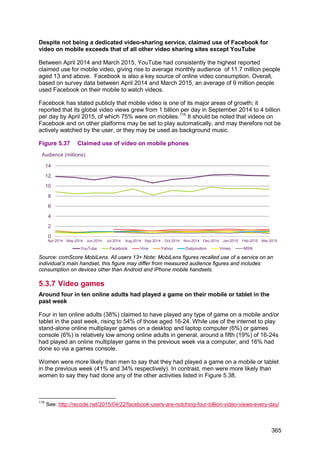
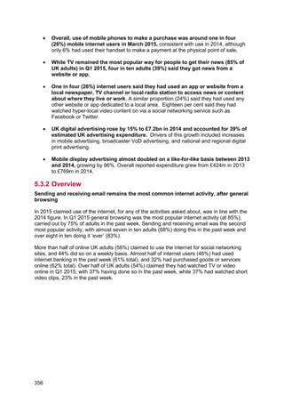
![Figure 5.39 Watching and streaming games footage in the past week
Source: YouGov, Attitudes Towards Technology 2015, April 2015
Base: Online UK adults 16+ (2147), 16 – 24 (279), 25 – 39 (384), 40 – 54 (554), 55+ (930), Male
(1018), Female (1129)
q4. Have you done any of the following in the past week?
Platforms such as Steam and Origin enable digital distribution of video game content,
online multiplayer management, and provide social networking facilities
The largest dedicated games platform by for PCs is Valve’s Steam, whose app for desktop
and laptop computers had 3.9 million unique visitors in March 2015, giving 9% active reach
(among males aged 15-24, Steam’s active reach was 28%)118
. Publishers use Steam to
distribute games; however, the platform also facilitates online multiplayer functions, social
networking and digital rights management for games. Another games platform used by UK
consumers is Electronic Arts’ Origin platform, whose audience had grown from 0.8 million
unique visitors in March 2013 to 2.0 million by March 2015. Smaller games distribution
platforms also exist, such as GOG, which focuses on back catalogue and classic/retro
games, and had 62 thousand unique visitors on laptop and desktop computers in March
2015.
While platforms such as Steam use the internet for facilitating digital rights management
(DRM), online multiplayer and software distribution, they rely on the game software being
stored and run on the user’s local device. As an alternative, cloud-based gaming services
allow gamers to play games via a range of connected devices. The internet is used to
stream the game’s graphics to the user, in a similar way that video content is streamed. This
approach has been adopted by Sony for its PlayStation Now service.119
Other providers of
cloud-based gaming services include NVidia, whose Grid service allows gamers to stream
games to its Shield tablets and PCs.
118
comScore MMX, UK home and work panel, Steam (App) [M]
119
This service, in beta in the UK at the time of writing allows users to stream PS3 games to PS4
consoles and other supported devices. https://www.playstation.com/en-gb/explore/playstation-now/
% of respondents
7
3
1 1
22
10
4
5
8
4
2 2
4
1 1
0
2
0 0 0
9
4
2 2
5
1 1 1
0
5
10
15
20
25
Watched other people play
videogames /computer games via
a non-gaming specialist video site
Watched online footage of other
people playing games via a
dedicated gaming service e.g.
Twitch.TV
Streamed or uploaded footage of
myself playing games on a
computer and or console
Taken part or attended (either in
person or online) a video/computer
game tournament (this is
sometimes called ‘e-sports’)
Total 16-24 25-39 40-54 55+ Male Female
367](https://image.slidesharecdn.com/cmruk2015-150811140452-lva1-app6891/85/Ofcom-communications-report-2015-371-320.jpg)
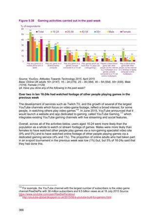
![Figure 5.40 Unique visitors to selected games platforms on desktop and laptop
computers
Source: comScore MMX, UK, home and work panel, April 2013 to March 2015
5.3.8 Online retail and mobile payments
Two-thirds of the UK’s digital audience visited Amazon in March 2015
In March 2015, 32.1 million people visited Amazon on a desktop / laptop or mobile device,
equivalent to two-thirds (68%) of the digital population. This was the largest digital audience
among our comparator online retail services. eBay was visited by six in ten of the digital
population (59% or 28.2 million), the second highest total digital audience, followed by Argos
with 14.1 million (an active reach of 30%) in March 2015. Tesco, the UK’s largest
supermarket,120
was visited by 12.7 million people i.e. 27% of the active digital audience.
The number of people accessing our comparator retailers via desktop and laptops was
generally higher than those accessing these on mobile devices, although in March 2015
more people accessed Argos, Tesco and Asda on mobile devices than on desktops and
laptops.
120
http://www.bbc.co.uk/news/business-32218170
0
1
2
3
4
5
Apr-2013
May-2013
Jun-2013
Jul-2013
Aug-2013
Sep-2013
Oct-2013
Nov-2013
Dec-2013
Jan-2014
Feb-2014
Mar-2014
Apr-2014
May-2014
Jun-2014
Jul-2014
Aug-2014
Sep-2014
Oct-2014
Nov-2014
Dec-2014
Jan-2015
Feb-2015
Mar-2015
Steam (App) [M] Origin (App) [M] GOG.COM [P]
Unique audience (millions)
368](https://image.slidesharecdn.com/cmruk2015-150811140452-lva1-app6891/85/Ofcom-communications-report-2015-372-320.jpg)
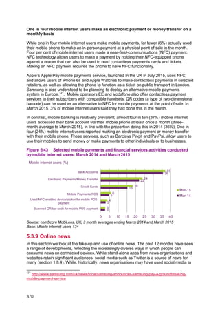
![Figure 5.41 Digital audience of selected online retail services: March 2015
Source: comScore MMX Multi-Platform, comScore MMX, comScore MoMX UK, March 2015.
Note: MMX Multi-Platform includes laptop/desktop browsing, laptop/desktop video streams and
mobile use. Mobile use includes Android smartphones and iOS smartphones and tablets. Only those
entities that have been tagged as part of the census network report Android tablet usage data.
comScore dictionary entities used were Amazon [M], eBay Sites [M], Argos [M], TESCO.COM* [M],
Asda [M], MARKSANDSPENCER.COM [M], NEXT.CO.UK [M], ASOS.COM [M], DEBENHAMS.COM
[M], John Lewis [M] * Indicates that the entity has assigned traffic to certain pages in the domain to
other entities
Around a quarter of mobile internet users make a purchase on their phone or use it to
find a store location
Overall, use of mobile phones for retail activities was relatively stable between 2014 and
2015; around one in four mobile internet users (26%) said they used their mobile phone to
purchase goods or services in the month, the same proportion who said that they had used
their mobile phone to find the location of a store.
Figure 5.42 Mobile retail activities conducted by mobile internet users: March 2014
and March 2015
Source: comScore MobiLens, UK, 3 month averages ending March 2014 and March 2015
Base: mobile internet users 13+
1.9
2.4
2.3
2.4
2.9
6.5
8.4
8.5
18.5
21.1
2.6
2.9
3.6
3.4
3.9
4.6
5.7
7.9
19.9
21.6
4.0
4.7
5.3
5.3
6.1
9.8
12.7
14.1
28.2
32.1
0 10 20 30 40
Debenhams
Asos
Next
John Lewis
Marks and Spencer
Asda
Tesco
Argos
eBay Sites
Amazon
Digital Audience Desktops & laptops Mobile Audience
Unique audience (millions)
5
17
19
21
22
25
25
6
18
20
22
23
26
26
0 5 10 15 20 25 30
Mobile payments POS
Found coupons or deals
Checked product availability
Researched product features
Compared product prices
Purchased goods or services
Found store location
Mar-15
Mar-14
Mobile internet users (%)
369](https://image.slidesharecdn.com/cmruk2015-150811140452-lva1-app6891/85/Ofcom-communications-report-2015-373-320.jpg)
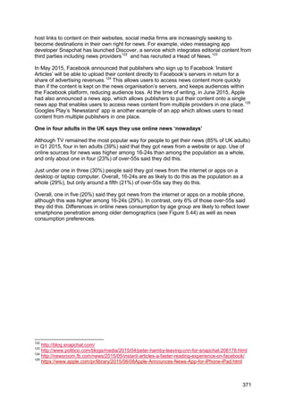
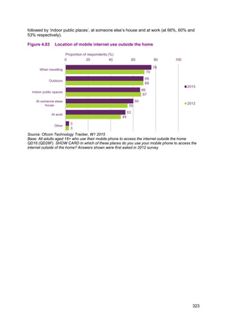
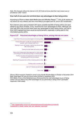
![Figure 5.45 Unique audience and reach of selected news services: March 2015
Source: comScore MMX-MP and MoMX, UK, March 2015.
MMX Multi-Platform includes laptop/desktop browsing, laptop/desktop video streams and mobile use.
Mobile includes Android smartphones and iOS smartphones and tablets. Only those entities that have
been tagged as part of the census network report Android tablet usage data. Entities Note: comScore
dictionary entities used were BBC News [C], DAILYMAIL.CO.UK [M], The Guardian [P],
TELEGRAPH.CO.UK [M], MIRROR.CO.UK [C], INDEPENDENT.CO.UK [P], BUZZFEED.COM [P],
METRO.CO.UK [M], ITV News [M] HUFFINGTONPOST.CO.UK* [C], VICE.COM [M],
THESUN.CO.UK [C].
* Indicates that the entity has assigned traffic to certain pages in the domain to other entities
One in four internet users say they have used a website or an app related to their local
area
In this section we look at apps, websites and videos, containing news or content services
related to a town, village, postcode or other small geographically-defined community.128
These services (sometimes called hyperlocal media) are run by a range of organisations
from established broadcasters, local and regional newspapers and radio stations or ‘digital-
native’ providers. Some of these services are run on a non-commercial basis. Around one in
four internet users said they had ever used either a website or app from a TV channel,
newspaper or radio station dedicated to the local area in which they live or work (26%) or
any other website or app dedicated to their local area (24%).
Around one in five internet users have consumed some form of online video related to or
about their local area. Around one in five said they had watched a regional news programme
on a catch-up service (21%). Eighteen per cent of respondents said they had watched a
video with hyperlocal content on social media, the same proportion who said they had done
this on an online video service such as YouTube or Vimeo. Fourteen per cent of internet
users said they had streamed or uploaded a video they had created which was about or
128
We note that news and information may also be available on national and globally-focused
platforms and services, including social media platforms, ‘vertical’ websites, and apps such as
weather services or listings.
1.4
3.5
4.2
6.4
7.8
10.0
10.3
14.7
12.7
14.1
18.5
19.6
2.1
5.1
5.3
7.7
9.8
12.8
14.4
18.4
19.0
21.0
24.5
27.8
0 5 10 15 20 25 30
THESUN.CO.UK
VICE.COM
HUFFINGTONPOST.CO.UK*
ITV News
METRO.CO.UK
BUZZFEED.COM
INDEPENDENT.CO.UK
MIRROR.CO.UK
TELEGRAPH.CO.UK
The Guardian
DAILYMAIL.CO.UK
BBC News
Total digital auidence
Mobile audience
Unique audience (million) / reach (%)
59%
54%
52%
51%
44%
39%
40%
35%
39%
40%
30%
28%
27%
27%
21%
21%
5%
4%
11%
10%
11%
12%
16%
18%
373](https://image.slidesharecdn.com/cmruk2015-150811140452-lva1-app6891/85/Ofcom-communications-report-2015-377-320.jpg)


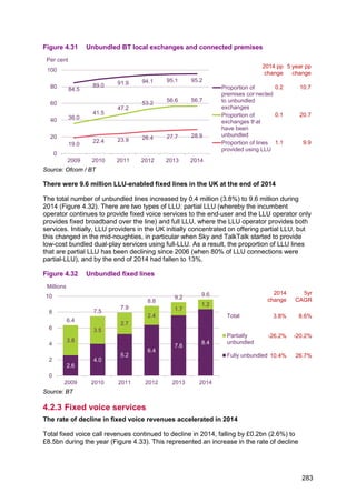
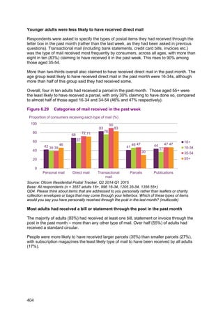
![6.1.3 Parcels and online shopping
Although there are a currently a number of different estimates of the size of the parcels
market in the UK, from different analysts, all agree that it is growing, both in volume and
revenue, and that the driver of this is online retail.
The parcels market is growing, and is more competitive than the letters sector
Figures published in Royal Mail’s latest annual report estimate total parcel volume growth at
approximately 4%. The business-to-consumer (B2C) and consumer-originated (C2X) parcel
segments are estimated to be growing at a slightly faster rate – between 4.5% and 5.5%.
The volume of parcels sent from businesses to other businesses, while also increasing, is
doing so more slowly.
As the market grows, operators are adding additional capacity. Over the past two years, UK
Mail, DPD, Parcelforce and Hermes have all invested in new hubs and depots with the
intention of increasing the volume of parcels that they can process and deliver. As well as
these established operators increasing their capacity, online retailer Amazon has created its
own delivery network in selected areas of the UK. Amazon Logistics uses a combination of
workers directly employed by Amazon, alongside partnership with local delivery firms, to
deliver parcels seven days a week in these areas. The variety of operators, the increase in
capacity, and the desire of consumers for free home delivery for fulfilment of their online
shopping, has had the effect of keeping prices relatively low. This competitive intensity was
demonstrated by the market exit of City Link in December 2014.
The greater competitiveness of the parcels market is clear in the market share estimates that
were recently published by Royal Mail.130
By volume, Royal Mail considers that it has a 52%
share. In terms of estimated revenue, Royal Mail considers that it accounts for the largest
share, with 38%. This compares to Royal Mail’s near-99% share of the letters sector by
volume, and 95% share by revenue.
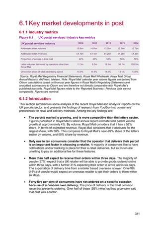
Online retail has continued to grow
In 2014, the Interactive Media in Retail Group (IMRG) put the value of the UK e-commerce
sales at £104bn. This is 14% greater than the value of sales the previous year, and more
than double the 2009 value. However, not all of the increase in sales tracked by IMRG may
result in increased parcel volumes, as items may be fulfilled electronically as well as
physically. Even when items are fulfilled physically, this may be through ‘click and collect’
services, enabling buyers to pick up their purchases from online retailers’ high street shops.
Online retail is accounting for an increasing proportion of total retail sales. Figures from the
Office for National Statistics show that 11.2% of total retail sales were made online in 2014,
compared to 10.4% in the previous year.131
Consumers in the UK are also shopping more on
mobile devices; 40% of online retail sales at the end of 2014 were through mobile devices.132
130
Royal Mail plc, Full year 2014-15 annual results, 21 May 2015
131
Office for National Statistics, Overview of Internet retail sales in 2014, 23 January 2015,
http://www.ons.gov.uk/ons/rel/rsi/retail-sales/december-2014/sty-overview-of-internet-retail-sales-in-
2014.html, [accessed 13 July 2015]
132
Interactive Media in Retail Group, Mobile accounts for 40% of all online retail sales,
http://www.imrg.org/index.php?catalog=1769, [accessed 13 July 2015]
382](https://image.slidesharecdn.com/cmruk2015-150811140452-lva1-app6891/85/Ofcom-communications-report-2015-386-320.jpg)
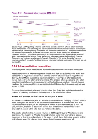
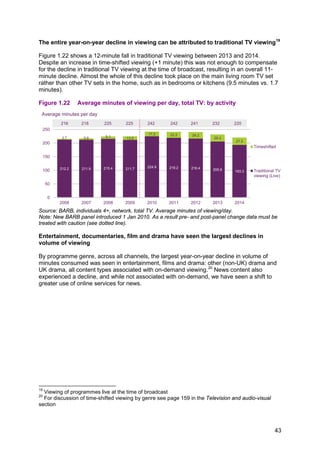
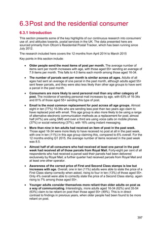
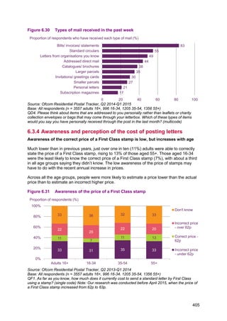
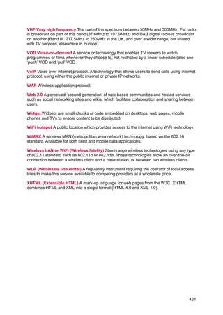
![Figure 6.13 Proportion of access in total mail: 2010-2014
Source: Royal Mail Regulatory Financial Statements, Operators’ returns, Ofcom estimates
Operators other than Royal Mail delivered 158.5 million items in 2014
The number of letters delivered entirely through the networks of operators other than Royal
Mail almost tripled in 2014, increasing by 183% to 158.5 million items. For the first time since
the UK letters market was opened to competition, the share of volume accounted for by
other operators was greater than 1%. Other operators’ share by volume in 2014 was 1.2%.
However, it is unlikely that this growth will continue. The majority of the increase in delivered
volumes, as in the previous year, was due to Whistl (formerly TNT Post UK) which began
delivering letters end to end in West London in April 2012. Whistl began to roll out services
more widely, extending its network to deliver to 2 million addresses in London, Manchester
and Liverpool. 134
It announced in June 2015 that it would close down its end-to-end
operations after its investment partner, LDC, announced that it would not fund Whistl’s
further roll-out, citing “ongoing changes in UK postal market dynamics and the complexity of
the regulatory landscape”.135
As well as carrying out end-to-end delivery, Whistl is also an access operator. It had been
converting its access customers to its delivery products, using its end-to-end network to
deliver in the areas where it had rolled this out and using access products to provide a UK-
wide service.
In January 2014, Royal Mail introduced changes to its access pricing and terms. It stated
that these changes were “an important part of Royal Mail’s commercial response to
changing market conditions, including the expansion of direct delivery [end-to-end]
competition”.136
Royal Mail’s price notifications included a 1.2% price difference between its
price plans that included forecasting future volumes and those that did not. An operator
delivering in some areas and using access products to retain UK-wide coverage would not
be able to use price plans that involved forecasting without revealing its expansion plans to
its competitor. The notifications also included changes to the prices for delivering to its
access zones, including substantial cuts in charges in competitive zones.
134
Equivalent to 7.4% of UK households. Post NL, Annual Report 2014, February 2015,
http://www.postnl.nl/en/Images/2014-postnl-annual-report_tcm9-22091.pdf.
135
Post NL, LDC concludes discussion with PostNL on investment in Whistl UK E2E operations, 30
April 2015, http://www.postnl.nl/en/about-postnl/press-news/press-releases/2015/april/ldc-concludes-
discussion-with-postnl-on-investment-in-whistl-uk-e2e-operations.html
136
Royal Mail Group, Ofcom investigation into Access contract changes, 9 April 2014,
http://www.royalmailgroup.com/ofcom-investigation-access-contract-changes
44% 49% 54% 56% 56%
0%
20%
40%
60%
2010 2011 2012 2013 2014
Proportion of access in total mail volume
Year on year growth rate of access volumes
13.1% 3.8% 0.9% -0.6% -1.2%
392](https://image.slidesharecdn.com/cmruk2015-150811140452-lva1-app6891/85/Ofcom-communications-report-2015-396-320.jpg)


The document provides a summary of key trends in the UK communications sector in 2014-2015 based on Ofcom's research: - Superfast broadband availability reached 83% of UK premises and 30% of broadband connections were superfast. - Four in five households had fixed broadband while three in five adults accessed the internet via mobile phones. - Traditional TV viewing declined 11 minutes on average per person per day between 2013-2014 across all age groups. - Non-traditional viewing, such as via video on demand services, increased and now accounts for 30% of audio-visual content viewing.