They2ze: Digitizing Access to Transgender-Spectrum Resources
•Download as PPTX, PDF•
1 like•160 views

Transgender-spectrum youth are wildly underserved when it comes to health services and resources. TransConnect is a mobile app that collates all trans-spectrum services in the area, and was built alongside the community to insure maximum inclusiveness and support. Come find out how youth-centered health design and our use of technology has made TransConnect a vital health resource for trans-spectrum youth.

Recommended
Recommended
More Related Content
Similar to They2ze: Digitizing Access to Transgender-Spectrum Resources
Similar to They2ze: Digitizing Access to Transgender-Spectrum Resources (20)
More from YTH
More from YTH (20)
Recently uploaded
Recently uploaded (20)
They2ze: Digitizing Access to Transgender-Spectrum Resources
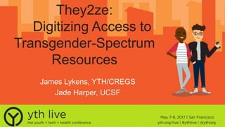
- 1. They2ze: Digitizing Access to Transgender-Spectrum Resources James Lykens, YTH/CREGS Jade Harper, UCSF
- 2. YTH
- 3. YTH DiscoverWhat works Innovate Health solutions for youth Lead Through training & digital strategy
- 4. Trans-spectrum • People who identify as trans men, trans women, genderqueer, agender, two spirit, and more!
- 5. Trans-spectrum Health 41% attempt suicide. 1. Williams Institute. Haas, A. P., Rodgers, P. L., & Herman, J. L. (2014). Suicide attempts among transgender and gender non-conforming adults. work, 50, 59 Documented Health Disparities
- 6. Trans-spectrum Health 41% attempt suicide. 1. Williams Institute. Haas, A. P., Rodgers, P. L., & Herman, J. L. (2014). Suicide attempts among transgender and gender non-conforming adults. work, 50, 59 Documented Health Disparities 61% physically assaulted.
- 7. Trans-spectrum Health 41% attempt suicide. 1. Williams Institute. Haas, A. P., Rodgers, P. L., & Herman, J. L. (2014). Suicide attempts among transgender and gender non-conforming adults. work, 50, 59 Documented Health Disparities 61% physically assaulted. 28% harassed by doctors.
- 9. Trans-spectrum Youth • Dependent upon parents/guardians
- 10. Trans-spectrum Youth • Dependent upon parents/guardians • Unwilling providers
- 11. Trans-spectrum Youth • Dependent upon parents/guardians • Unwilling providers • Lack of funds/on parental insurance
- 13. Staying Connected • 97% of 18-29 year olds have smartphones.2 2. Mobile Fact Sheet, PEW Internet Research. http://www.pewinternet.org/fact-sheet/mobile/
- 14. Staying Connected • 97% of 18-29 year olds have smartphones.2 • Coming out online & more likely to search for health information online (81% vs. 46%).3 2. Mobile Fact Sheet, PEW Internet Research. http://www.pewinternet.org/fact-sheet/mobile/ 3. Out Online: GLSEN 2013. https://www.glsen.org/press/study-finds-lgbt-youth-face-greater-harassment-online
- 16. Aims
- 25. Aims Increase service uptake Connect to supportive providers Train health providers Community feedback
- 26. Community Advisory Board Development and usability testing
- 27. Next steps
- 28. • Analytics and reports Next steps
- 29. • Analytics and reports • Scale to state and US Next steps
- 30. • Analytics and reports • Scale to state and US • Ongoing community feedback Next steps
- 31. • Analytics and reports • Scale to state and US • Ongoing community feedback • Community forum Next steps
- 32. Available in the App Store yth.org/projects/innovate-they2ze/
- 34. A NEW SEXUALITY EDUCATION PLATFORM: Karen Murtfeldt, MPH Planned Parenthood of the Pacific Southwest Reaching Youth on Snapchat
- 37. WHY SNAPCHAT? SNAPCHAT works closer to how we actually communicate face to face. In life, moments “disappear” SNAPCHAT went the opposite route of most internet platforms—where everything is saved/archived. SNAPCHAT has been shown to make people happier.
- 39. WHY SNAPCHAT? Snapchat’s Form & Function FIT Snapchat is: Private Informal Fun
- 40. WHY SNAPCHAT? Private Youth reported preferring messages that disappear— content someone looking through their phone won’t find. Snapchat allows us to provide education on sensitive topics on a private platform.
- 41. With busy schedules and tight budgets—our new platform had to be “low frills” and doable without significant investment. Snapchat allows us to create a varying array of messages— ranging from short, sweet & simple to scripted, produced & directed. WHY SNAPCHAT? Informal
- 42. Youth reported wanting messaging that was “friendly but serious.” Snapchat allows us to create messages on serious topics in a light-hearted and casual manner—as if we were talking directly to them. WHY SNAPCHAT? FUN!
- 43. Implementation 2015 Presentation of formative research on Tech & Sexuality Education Implementation Planning Phase I: Snapchat Team Phase II: Teen Success Phase III: Broad Internal Launch Phase IV: PPPSWsnaps goes live! Promotion at community events & presentations April May June July August September October
- 44. Implementation Planning Goals Topics Terms Guidelines A sex positive educational resource for youth The topics are endless—but keep it related to our specialty Use inclusive and relatable language Be intentional about representing diversity
- 45. A Week in the Life of PPPSWsnaps One Snapchat story each weekday Each member of the team is assigned a day to create a Snapchat story Time needed to create story can vary Upkeep & Development: Monthly meetings: Brainstorm new content Discuss new techniques/app updates Update guidelines
- 46. Youth on PPPSWsnaps Youth Interns: • Created Snapchat stories • Brainstormed story ideas • “Starred” in stories • Snapchat takeovers
- 47. THANK YOU! ADD US ON SNAPCHAT! Karen Murtfeldt, MPH kmurtfeldt@planned.org Snapchat: PPPSWsnaps
- 48. Trusted Source: Teens Co-create a New Girlshealth.gov Ann Abercrombie, M.L.S. HHS Office on Women’s Health
- 49. Teens = Savvy Web Users • Nearly 75% of teens have access to a smartphone • Of these, 94% go online at least daily
- 50. Background
- 52. Web Design Goal Find a balance between the designs of adult health sites and a health site geared toward teen girls… to launch a new girlshealth.gov that girls will look to as a trusted resource they want to engage with.
- 53. 5-stage Mobile-first Approach 1.Content audit and site map development 2.Copy development, mobile wireframes, and branding (style tiles) 3.Mobile design and desktop wireframes 4.Desktop design and refined deliverables 5.Development and launch, with continued evaluation and maintenance
- 54. Target Audience Research Panel • Panel of nine 14- to 15-year-old girls • Four activities over several months (Jan.–Sept. 2016): – One-on-one web-based card sorting exercise – Online focus group to test style tiles in mobile view – One-on-one mobile wireframes usability testing – Online focus group to test enhanced style tiles with health content in mobile view
- 55. Card Sort
- 56. Card Sort Findings • Expected: Topic cards could be grouped into clear categories • Unexpected: Girls tend to group topics together based on positive and negative behaviors • Existing topics covered on girlshealth.gov are the kinds of health information girls seek • Update existing site map:
- 57. Top Navigation Categories • Know Your Body • Emotions & Stress • Sex & Health • Fitness & Nutrition • Your Relationships • Safety & Independence • Drugs, Alcohol, & Smoking • Illness & Disability
- 59. Content Strategy Goals • Establish girlshealth.gov as a trusted, go-to source for health information. • Encourage visitors to recommend girlshealth.gov to friends and family. • Apply new knowledge to their lives. • Show versus tell. • Set and meet expectations for girls. • Redirect users to their specific health information when appropriate, as quickly as possible.
- 60. Strategic Content Recommendations • Incorporate empowerment and storytelling • Use small, digestible content chunks • Use short sentences and sections • Provide clear, descriptive share links • Improve readability • Avoid fluff language • Add resource pages • Include traffic drivers, such top 10 lists
- 61. Style Tiles and Branding • Online focus groups Style Tiles Design #1 Design #2 Design #3 Branding Logos & Marks
- 62. Mobile Wireframe Testing • Can the target audience find the information they’re looking for? • Does the structure of the website appeal to them?
- 63. Final Focus Group: Enhanced Style Tiles Design #1 Design #2
- 64. Discussion
- 65. Thank you! • Questions? Ann Abercrombie Program Manager Office on Women’s Health U.S. Department of Health and Human Services E-mail: Ann.Abercrombie@hhs.gov Websites: www.womenshealth.gov | www.girlshealth.gov twitter.com/girlshealth
Editor's Notes
- YTH is a non-profit organization that was founded in 2001. Our mission is to advance the health and wellness of young people through technology.
- YTH is a non-profit organization that was founded in 2001. Our mission is to advance the health and wellness of young people through technology.
- High suicide rates.
- 61% sexually assaulted.
- 28% harassed by doctors. These are horrible, and a completely missed chance to connect folks to the care they are seeking.
- Transgender-spectrum youth in particular face some additional challenges…
- Many trans youth are under the care of parents or guardians, depending upon the support of the guardians, trans youth may or may not be able to access some very critical resources for trans-related care. Some youth may want to access hormone blockers, some may want to access surgery, some may want to access a support group to process feelings about identifying and coming out as trans. Much of the time, individuals may be even unable to find any information or true health information.
- Many providers are unwilling to serve trans folks, whether that be from not being knowledgeable about trans issues, harboring transphobia, or being fearful of working with minors in regards to gender-related care. Even providers who are knowledgeable about some trans issues might not know much about genderqueer folks, and might not know that many people want to seek medical interventions only to look more androgynous, and not necessarily completely feminine or masculine.
- Youth are also usually under their guardian’s insurance, which is difficult to get health services when you’re afraid your parent will see where you went and what you did. Plus the age group has difficulty securing funds; many youth can’t work yet and don’t have their own insurance.
- Yet, all this health disparity is happening at the same time where LGBTQ youth have more access to smartphones than ever.
- According to PEW, 97% of 18-29 year olds have smartphones now.
- And for LGBTQ youth, even despite online harassment and bullying, many share experiences of finding themselves online and being able to openly talk about their identities to others. LGBTQ youth are also far more likely to search for health information online; 81% of LGBTQ youth in a survey by GLSEN reported they searched online for health information, where only 46% of non-LGBTQ youth stated they looked online for health info. There can be a lot of reasons for this; safety, parents not supportive and answering questions, schools not following comprehensive sex education laws and leaving LGBTQ people out.
- So in response to all this, YTH created they2ze; we received funding from NLM to create an app that could be highly utilized by trans-spectrum youth so that they can find health resources that will work for them. This image here was a splash image created for the project with feedback from CAB; in it we can see many representations of the community, which include folks who identify on the masculine spectrum, feminine spectrum, and folks who may identify as an amalgamation of the two, as genderqueer folks. The name they2ze uses pronouns that folks of the community use; often, “they” and “ze” are gender neutral pronouns used by folks who identify as genderqueer. We knew the ongoing issues that needed addressing in the trans community, particularly for trans youth. And with such high rates of phone use, coupled with the fact that trans youth are already likely to use the internet and their phones for health information, we thought this could be a resource people could use to connect to vital health services.
- With they2ze, we aimed for the following:
- Increase uptake of services among trans youth…
- Here we can see the database of resources that folks can connect to. You can sort by age, gender identity, and location. You can search for relevant health services.
- Connect trans-spectrum to truly inclusive health providers…
- Connect trans-spectrum to truly inclusive health providers… You can see that you can connect to community centers here and other community based services that have truly inclusive resources.
- enhance provider capability to serve trans-spectrum clients…
- Here you can see the provider module, which gives providers resources on many things to enhance their practice and make it more inclusive for trans specturm youth. This includes a medical intake form that’s truly exclusive with multiple gender options, as well as continuing education links so health providers can become more trans-inclusive.
- And finally community feedback. It was very important for us to include community feedback on all stages of the app to make sure it was truly inclusive and working for the community.
- Here you can see the main page that lets folks know you can rate every service, so the community knows the best places to go.
- So with these aims in mind, they2ze was created. Then, we built our community advisory board to lead the way.
- CAB photos here/usability process, Jade speaks about CAB.
- So where are we going? We have some next steps for they2ze.
- First, we are including surveys on the app for the community to provide feedback on the app and also running app analytics to see what services are used most, so future versions are even better.
- We plan to scale to the state, then the US, particularly in places that have not been historically supportive, like the US South.
- Then, continuing ongoing feedback with community advisory boards and users will help make the app even more inclusive.
- Then, we hope to add a community forum, so folks can share more through discussions and resource sharing.
- I want to let everyone know that the app is now available in the app store, and we’d love for folks to use it as a resource. We really believe in its ability to connect folks to resources, and are excited to finally release it!
- Thanks so much!
- Creates an atmosphere of normalcy around sexuality education
- What would it look like? How would we do it? Collaborated with marketing Guidelines
- Hi everyone. Thanks for joining us this morning. I’m Ann Abercrombie, and I am program manager at the U.S. Department of Health and Human Services Office on Women’s Health, or OWH. In addition to our many women’s health resources, OWH provides accurate, reliable information and resources that help girls lead healthy lives. In 2015, our website for girls, girlshealth.gov, had 2.7 million visitors, and it’s the only federal online resource providing trustworthy, robust health information specifically for 10- to 16-year-old girls. To ensure continued value of our girls’ health resources, working with our contractors, Hager Sharp and Palladian Partners, we set out to redesign girlshealth.gov by applying a 5-stage, mobile-first approach.
- Teens are savvy Web users. Nearly 75% of teens have or have access to a smartphone (Pew), and 94% of these teens go online daily or multiple times a day (Pew). Girlshealth.gov has observed a similar trend among users. In 2012, only 33% of users viewed the site on a mobile device. By 2013, this number increased to 43%. It grew to 72% in 2014, and 73% in 2015. These shifts in mobile usage need to be considered when developing online content for this audience. Thoughtful mobile-first approaches to website design, content, and user experience are imperative.
- On the left is an old desktop view of girlshealth.gov. While updating the look and feel was definitely on our list, we knew we needed to start by making the site more accessible to all of our mobile users. In 2013, we relaunched the site in responsive design, pictured on the right. After making the site more mobile-friendly, we wanted to tackle the overall redesign. In 2015, we began our research journey.
- We started by conducting quantitative and qualitative research with a panel of nine 14- and 15-year-old girls to explore what health information is personally relevant, interesting, and exciting for girls and how girls want to receive this information. We used our findings to develop and launch a refreshed homepage, pictured here. This was just an interim stage to give the site a more updated look and feel. However, we knew this was just the tip of the iceberg. Building upon our research findings from 2015, we launched into a strategic approach to redesign girlshealth.gov in a way that is relevant and engaging for the target audience.
- The formative research provided a solid foundation for the redesign process, revealing thoughts and preferences in terms of self-perception, messaging, design, and functionality. From this, we established our Web design goal: to find a balance between the designs of adult health sites and a health site geared toward teen girls. This summer, we expect to launch a new girlshealth.gov that girls will look to as a trusted resource they want to engage with.
- OWH launched a 5-stage, mobile-first approach to the website design, with several Web-based research activities with the target audience planned throughout. This approach includes the following: Content audit and site map development—including a Web-based card sorting exercise with the target audience. Copy development, mobile wireframes, and branding with style tiles—all tested with the target audience. Mobile design and desktop wireframes. Desktop design and refined deliverables. Development and launch, with continued evaluation and maintenance.
- We recruited a panel of nine 14- to 15-year-old girls. For us, it made the most sense to use a convenience sample, as it was extremely fast, easy, readily available, and cost effective. However, we ensured that the girls we engaged were racially, ethnically, and geographically diverse. Throughout these five activities, we are working with the same group of girls, which we’ve found to yield great results. Participants build confidence and become invested in the project, providing more robust feedback. Using Web-based tools, our research panel meets with us to provide feedback throughout the redesign process. We’ve completed all four activities, and the resulting data have been analyzed and used to inform and refine our branding and website designs.
- We started with a card sort exercise. This was necessary to shape the information architecture and determine labeling for the website. It provided information about how teenage girls expect to see content organized on a health and well-being website for girls, and their understanding of the topics. The card sort activity was structured into two parts: First, we conducted an open one-on-one card sort using Optimal Workshop’s web-based card sorting tool called OptimalSort. This tool allowed girls to participate from their computer or mobile device. Participants were asked to organize 55 words and phrases into categories that make sense to them and to label each category. Some examples of topic cards include acne, periods, depression, and sleep. Examples of possible categories include “relationships,” “emotions and moods,” and “sex and sexuality.” We selected the list of topic cards based on questions that arose from the content audit, popular website topics, and topics that represented major content areas. Then we asked debriefing and open-ended questions to learn more about participants’ preferences and needs for girls’ health information. For example, we asked questions like, “Where do you go to find health information?” and “What health topics do you search for most often?” We also asked questions to gauge their understanding of the topic areas and if they thought the topic areas were appropriate for a girls’ health website. For example, we asked if there were any words or phrases that seemed confusing or unclear, and if any of the topics didn’t belong. We learned, for example, that most of the girls were unfamiliar with douching, and many didn’t connect caffeine with health.
- Expected findings: For the most part, participants agreed that the topic cards we selected could be grouped into clear categories. There were some exceptions, but we weren’t surprised by them. For example, we knew girls would have trouble deciding where to put “Protecting the environment.” Overall, participants tended to group topics together in categories that we expected. Unexpected finding: Girls tended to group topics together based on what they perceived to be positive and negative behavior. For the most part, results indicate that the existing topics covered on girlshealth.gov are the kinds of health information girls are looking for. Girls said they would likely visit a website that covered the topics presented. They felt a website that had these topics would be a place where they’d be able to find information that is relevant to them. Next steps: The card sort findings then served as a roadmap for developing the new site map.
- Based on findings from the card sort, we decided on eight top navigation headings for the redesigned website. The current girlshealth.gov has 11, which exceeds best practices for the number of top navigation headings. We capped top navigation at 8 topics for a couple reasons. First, having fewer topic areas helps people understand what content is most important—everything can’t have equal importance. Second, fewer topic areas are better for mobile devices because the navigation turns into a list and stacks. Your list can’t be too long because it requires the user to scroll too much. Categories on the redesigned site will tentatively include: Know Your Body Emotions & Stress Sex & Sexuality Fitness & Nutrition Your Relationships Safety & Independence Drugs, Alcohol, & Smoking Illness & Disability
- Applying best practices and information we gathered during the card sort exercise, we updated the site map for each category, such as the Your Relationships content area, shown here. In this example, the items in pink live in the “Your Relationships” section of the website. Then, the purple items are sub-categories within the “Your Relationships” section. With each category, we kept in mind: The shape of content hierarchy. Even though it’s not visible to most audiences, it has a significant effect on the user’s experience. Content is easier to find when it's not buried under multiple layers. We don’t want the audience to have to dig too deep into the website to find what they need. The deeper a hierarchy becomes, the more likely visitors will become disoriented. This is also not mobile friendly. Categories that are clear, concise, and do not overlap are the easiest to understand. This is the best approach for younger audiences who want to find information quickly It also supports plain language and 508 compliance And is more mobile-friendly Finally, content would be more easily searchable because of Search Engine Optimization
- Next up is how we’re approached the actual health content on the website, with content strategy being at the heart of it. Content strategy: Helps identify and create the content your target audience actually wants. It’s also the art and practice of understanding and presenting what your audience needs to know and delivering it to them in a concise, compelling way. We set the following content strategy goals: Establish girlshealth.gov as a trusted, go-to source for health information. Encourage visitors to recommend girlshealth.gov to friends and family. Apply the knowledge learned from the website in their lives. Show versus tell. Where possible, we should avoid just presenting passages of content. Instead, we want to show girls the health information. We do this through graphics, visuals, video, and interactives. Set and meet expectations for girls. Girls, like adult Web users, want to have quick access to accurate information. Presenting health information with strong content hierarchy and easy-to-grasp content areas helps girls know that they’re in the right place, and it’s a place they can rely on for trusted health information. Redirect users to their specific health information when appropriate, as quickly as possible.
- With these goals in mind, we made strategic content recommendations for girlshealth.gov overall as well as for each of the eight content areas. We are now in the process of updating all of the website copy with these recommendations in mind: Incorporate empowerment and storytelling Use small, content chunks, so that content is easier to digest Use short sentences: They should be no more than 20 words in length for ease of use for teens on mobile devices. Use no more than 350-400 words in a section, keeping in mind mobile scrolling which ideally would use 80-110 words Provide clear, descriptive share links. Improve readability Avoid any fluff. Make sure the content is clear. Keep it real, no hype, fluff language. Add resource pages to learn about specific topics Include Top 10 lists and questions, which are proven traffic drivers, especially with teens.
- To help guide the new look and feel of girlshealth.gov, we developed three style tiles that the girls could react to. Style tiles are a design deliverable consisting of fonts, colors and interface elements that communicate the essence of a visual brand for the Web. Style tiles are similar to the paint chips and fabric swatches an interior designer gets approval on before designing a room. We held two online focus groups to accommodate participant schedules. Each participant attended one of the two sessions. During these sessions, we explored participant feedback to both style tiles and the associated branding elements. The goal of this testing was not to identify a “winner” but to understand what design elements girls do and don’t like when it comes to a health website, and what they think a health website they’d visit should look like. This is helping us refine the current designs and integrate preferences into a redesigned girlshealth.gov that fits girls’ needs, preferences, and expectations for a health information website. In our analysis, we focused on these priorities when categorizing qualitative feedback: Does this website look like a trusted, credible source for health information? Who is this website meant for? What colors and design elements are most appealing?
- Our next step was to develop and test the mobile wireframe. Wireframes exhibit the website organization, layout, and navigation. The mobile wireframe usability test determines if the target audience is able to find the information that they’re looking for, and if the structure of the website appeals to them. We held one-on-one sessions with each of the nine participants. We showed girls two versions of the homepage wireframe and one version of three lower-level pages. During the session, we asked them questions to elicit their opinions about what they saw, and where they would click to find certain information. The questions were designed to help us understand how girls would use the website, and if the proposed layout facilitated a positive and frustration-free web experience. Overall, participants liked the layouts proposed in the wireframe and were able to, for the most part, find the information they were asked to find. All of the participant said the amount of information on the homepage was about right. Participants said that the wireframe looked like it was for a website geared toward their age group, and all of the participants said they would return to this website.
- Based on the information we gathered in the first round of style tile focus groups, we developed enhanced style tiles to get girls’ feedback on two revised designs. What made the style tiles enhanced? We added in some limited Web functionality so it looked and acted more like a live website that they could view on their phones. Our goal with this testing was to gather more feedback on which direction to pursue for the final girlshealth.gov website design. In the interest of time, we held a single session with six participants. We explored participants’ likes and dislikes in response to the two revised style tiles, and we asked girls to answer the following questions: 1. Does this website look like a trusted, credible source for health information? 2. Who is this website meant for? 3. What colors and design elements are most appealing? Participants unanimously chose Design #1 as their preferred health information website. They felt it was age-appropriate; it had a clean and organized layout; it looked interactive but not childish; and it used fun colors without being overwhelming. This feedback helps us create mobile and desktop website designs that fit girls’ needs, preferences, and expectations for a health information website.
- Thanks to the findings from these research stages, we refined the mobile and desktop designs and wireframes, and we’re currently focusing on development and launch. We expect the updated girlshealth.gov to go live this summer. By employing web best practices and listening to the target audience to learn about their information-seeking behavior, we are able to adapt our content and approach to best reach teen girls with health information. Taking a mobile-first approach that is fueled by research will ensure increased and improved usage. Girls will consider girlshealth.gov a trusted source of health information that is written and designed for them.
- I just shared in 20 minutes what’s we’ve been working on for several years, and I’m so excited to be talking about it with you as it’s coming to life. Like I said, we’re planning to launch the updated site this summer, and we need your help getting it into the hands of those who need it. Girls are the next generation of women, and together, we can make sure that they have the information they need to make informed decisions about their health and wellbeing. If you have ideas on how we can work together or how to reach girls, please email me or talk to me after this session. Girlshealth.gov is your resource, too!