The document provides guidelines for designing the cover page of a music magazine. It specifies that the masthead will partially cover a medium shot image of an artist wearing a checked shirt and jeans. Cover lines will promote upcoming interviews and reviews. The page number will be below the featured image. Interior pages will use a two-column layout with medium shots of the artist in each column and basic typography.
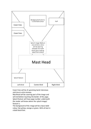
1. Mast Head
Splash image: Medium
shot of Artist. Artist
will be wearing
Checked shirt with
black jeans looking
away from camera
Background of artistis
a solid bold colour
Cover lines
Cover lines
Splash feature
Puff
Left third Centre third Right third
Cover lines will be of upcoming band interviews
and classic artist reviews.
Masthead will be covering part of the image and
will end before touching the border of the page.
Splash feature will have page number underneath
the reader will know where the splash image/
feature is.
The background of the image will be a basic bold
colour like yellow, orange or green. With all text in
a bold black font.
2. Medium close up
shot of artist
Medium close up
shot of artist
Medium close up
shot of artist
Medium close up
of artist
Contents
Splash feature
Cover line
Cover line
Cover line
Next
page info
All four images will be of the same artist but different
shots. With the lines showing a basic structure of what a
magazine cover page would look like. Although the Lines
take up a lot of space, this is needed due to having 114
pages.
Background colour will be a basic white, with basic black
font colour again.
3. Drop cap
Question
Image will be of the
artist at a medium
shot with a solid bold
colour as a
background.
Text boxes will be invisible so only text will be visible.
This lets more of the image be seen.
Black font will be used again with the image being the
background for the text.
Pull Quote