
Recommended
Recommended
More Related Content
Similar to From the case study, Case 1.3, compare and contrast the benefits of .docx
Similar to From the case study, Case 1.3, compare and contrast the benefits of .docx (20)
More from VannaJoy20
More from VannaJoy20 (20)
Recently uploaded
Recently uploaded (20)
From the case study, Case 1.3, compare and contrast the benefits of .docx
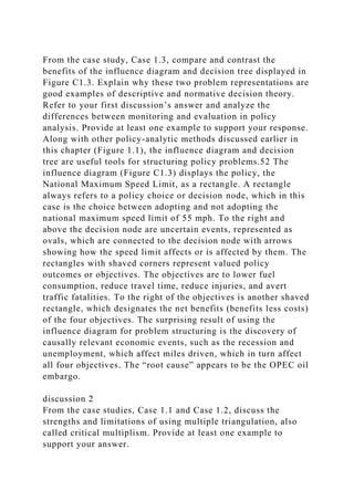
- 1. From the case study, Case 1.3, compare and contrast the benefits of the influence diagram and decision tree displayed in Figure C1.3. Explain why these two problem representations are good examples of descriptive and normative decision theory. Refer to your first discussion’s answer and analyze the differences between monitoring and evaluation in policy analysis. Provide at least one example to support your response. Along with other policy-analytic methods discussed earlier in this chapter (Figure 1.1), the influence diagram and decision tree are useful tools for structuring policy problems.52 The influence diagram (Figure C1.3) displays the policy, the National Maximum Speed Limit, as a rectangle. A rectangle always refers to a policy choice or decision node, which in this case is the choice between adopting and not adopting the national maximum speed limit of 55 mph. To the right and above the decision node are uncertain events, represented as ovals, which are connected to the decision node with arrows showing how the speed limit affects or is affected by them. The rectangles with shaved corners represent valued policy outcomes or objectives. The objectives are to lower fuel consumption, reduce travel time, reduce injuries, and avert traffic fatalities. To the right of the objectives is another shaved rectangle, which designates the net benefits (benefits less costs) of the four objectives. The surprising result of using the influence diagram for problem structuring is the discovery of causally relevant economic events, such as the recession and unemployment, which affect miles driven, which in turn affect all four objectives. The “root cause” appears to be the OPEC oil embargo. discussion 2 From the case studies, Case 1.1 and Case 1.2, discuss the strengths and limitations of using multiple triangulation, also called critical multiplism. Provide at least one example to support your answer.
- 2. Propose two reasons argumentation mapping can help a policy maker become a critical thinker. Provide at least two examples to support your response. When advanced technologies are used to achieve policy goals, sociotechnical systems of considerable complexity is created. Although it is analytically tempting to prepare a comprehensive economic analysis of the costs and benefits of such policies, most practicing analysts do not have the time or the resources to do so. Given the time constraints of policy making, many analyses are completed in a period of several days to a month, and in most cases policy analyses do not involve the collection and analysis of new data. Early on in a project, policy makers and their staffs typically want an overview of the problem situation and the potential impacts of alternative policies. Under these circumstances, the scorecard is appropriate. The Goeller scorecard, named after Bruce Goeller of the RAN D Corporation, is appropriate for this purpose. Table C1.1 shows the impacts of alternative transportation systems. Some of the impacts involve transportation services used by members of the community, whereas others involve impacts on low-income groups. In this case, as Quade observes, the large number of diverse impacts are difficult to value in dollar terms, making a benefit-cost analysis impractical and even impossible.50 Other impacts involve financial and economic questions such as investments, jobs created, sales, and tax revenues. Other impacts are distributional because they involve the differential effects of transportation. ■ TABLE C1.1 Scorecard Social Impacts CTOL VTOL TACV TRANSPORTATION Passengers (million miles) 7 4 9 Per trip time (hours) 2 1.5 2.5 Per trip cost ($) $17 $28 $20 Reduced congestion (%) 0% 5% 10%
- 3. FINANCIAL Investment ($ millions) $150 $200 $200 Annual subsidy ($ millions) 0 0 90 ECONOMIC Added jobs (thousands) 20 25 100 Added sales ($millions) 50 88 500 COMMUNITY Noise (households) 10 1 20 Added air pollution (%) 3% 9% 1% Petroleum savings (%) 0% −20% 30% Displaced households 0 20 500 Taxes lost ($millions) 0 0.2 2 Landmarks destroyed None None Fort X DISTRIBUTIONAL Low-income trips (%) 7% 1% 20% Low-income household Noise annoyance (%) 2% 16% 40% Source: Goeller (1974); Quade, Analysis for Public Decisions (C1.2) In 1972 and 1973, the United States and other petroleum- dependent countries experienced the first of several oil crises precipitated by a dramatic increase in the price of crude oil by the Organization of Petroleum Exporting Countries (OPEC). The response of American and European leaders was to adopt maximum speed limits of 55 mph and 90 kph, respectively. In the United States, the National Maximum Speed Limit (NMSL) was designed to reduce the consumption of gasoline by requiring that all vehicles on interstate highways travel at a maximum of 55 mph, a speed that would maximize fuel efficiency for most vehicles. Soon after the implementation of the 55 mph speed limit, it was discovered that the new policy not only reduced fuel consumption, but apparently caused a dramatic decline in traffic fatalities and injuries as well. Therefore, long after the OPEC
- 4. oil crisis was over, the speed limit was retained, although it was no longer needed to respond to the energy crisis that prompted its passage in 1973. Indeed, the 55 mph speed limit was retained for more than 20 years until it was officially repealed in November 1995.51 Heated debates preceded the repeal. Senator John C. Danforth of Missouri, an influential advocate of the policy, argued that the repeal would save one minute per day per driver but result in an additional 600 to 1,000 deaths. The Washington Post and the New York Times joined the opposition, reporting that, although fatalities would surely rise, the savings in time was trivial. Later, Secretary of Transportation Pena announced that the Clinton administration was firmly opposed to abandoning the speed limit. This was the right moment for an evaluation of the benefits and costs of the N M S L. A spreadsheet is a simple but powerful tool for doing so. The scorecard, as we saw in Case 1.1, is a useful tool for monitoring and forecasting impacts when benefit-cost analysis is not feasible or desirable. On the scorecard, policy alternatives are arrayed in columns along the top of the matrix and policy impacts are listed in each row. Spreadsheets, by contrast, are appropriate and useful for prescribing preferred policies and evaluating their outcomes. Spreadsheets display the benefits and costs of observed or expected policy outcomes, creating information about policy performance as well as preferred policies (see Figure 1.1). Table C1.2 displays a spreadsheet used to evaluate the effects of the 55 mph speed limit at the end of 1974, one year after the policy was implemented. To show the differences between the spreadsheet and the scorecard, Table C1.2 also displays the same information as a scorecard. ■