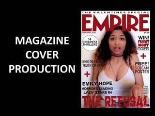
The document summarizes the process of choosing an image and designing the cover for a magazine promoting a horror film. Key details:
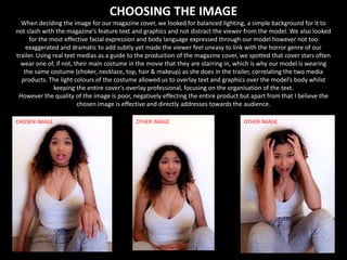
- The chosen image features balanced lighting, a simple background, and subtle facial expression/body language to not distract from text or make viewers uneasy.
- Editing in Photoshop allowed adding text/graphics and altering lighting/color. A glow effect was added to the actress's name to emphasize her significance.
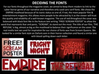
- Sans-serif fonts were used to link to the cyber horror genre. A well-known masthead was selected to attract viewers and signal quality. Font color and sizing balanced attention between masthead and film title.


![[DSC Europe 25] Borko Kozomora - Optimizing business workflows with advances ...](https://cdn.slidesharecdn.com/ss_thumbnails/hbgekyb0txw0xpo4yfml-borko-kozomora-leading-ai-transformation-260122103838-cc29ee38-thumbnail.jpg?width=640&height=640&fit=bounds)


![[DSC Europe 25] Paula Garcia Esteban -Building the Future: The Role of Data S...](https://cdn.slidesharecdn.com/ss_thumbnails/9ld1r1bsqpwve8qfvphy-paula-garcia-esteban-building-the-future-260122103838-4171f5cb-thumbnail.jpg?width=640&height=640&fit=bounds)


