POWER BI - Pie Chart, Doughnut Chart, Treemap, Funnel Chart
•
0 likes•315 views

Visualizations types examples: Pie Chart, Doughnut Chart, Treemap, Funnel Chart

Recommended
More Related Content
What's hot
What's hot (20)
Similar to POWER BI - Pie Chart, Doughnut Chart, Treemap, Funnel Chart
Similar to POWER BI - Pie Chart, Doughnut Chart, Treemap, Funnel Chart (20)
More from Silvia Alongi
More from Silvia Alongi (19)
Recently uploaded
Recently uploaded (20)
POWER BI - Pie Chart, Doughnut Chart, Treemap, Funnel Chart
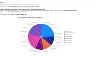
- 1. 11/26/2020 Pie Chart 1/1 Sales Volume by Region Name and Quarter 200K (5.26%) 235K (6.19%) 255K (6.71%) 243K (6.4%) 92K (2.42%) 109K (2.87%) 118K (3.12%) 113K (2.97%) 90K (2.36%) 110K (2.91%) 118K (3.1%) 76K (2%)97K (2.56%) 96K (2.53%) 175K (4.61%) 204K (5.38%) 225K (5.94%) 213K (5.61%) 168K (4.43%) 208K (5.47%) 223K (5.88%) 212K (5.58%) Region Name Greater Manchester Merseyside South Yorkshire Tyne and Wear West Midlands West Yorkshire Pie Chart The purpose of a Pie chart is to illustrate the contribution of different values to a total. For instance, let's show the different Regions and the percentage of the overall Sales. Suppose I wanted to subdivide each particular pie (portion) for each individual Region Name. I want to know what the sales were in Q1, Q2, Q3, Q4 but I want the colours to remain as each individual Region Name. So what I need to do is drag Quarter into Details. We have now each of pie segments divided up into four. Note make sure to put Legend ON: Format + Legend ON
- 2. 11/26/2020 Doughnut Chart 1/1 Sales Volume by Region Name and Quarter 200K (5.26%) 235K (6.19%) 255K (6.71%) 243K (6.4%) (2.42%) (2.87%) (3.12%) 113K (2.97%) 90K (2.36%) 110K (2.91%) 118K (3.1%) 76K (2%)97K (2.56%) 96K (2.53%) 175K (4.61%) 204K (5.38%) (5.94%) (5.61%) (4.43%) 208K (5.47%) 223K (5.88%) 212K (5.58%) 92K 109K 118K 225K 213K 168K Date Region Name Greater Manchester Merseyside South Yorkshire Tyne and Wear West Midlands West Yorkshire Doughnut Chart A doughnut chart is similar to a pie chart in that it shows the relationship of parts to a whole. The only difference is that the center is blank and allows space for a label or icon.
- 3. 11/26/2020 Format and Limit - Pie Chart 1/1 Sales Volume by Region Name and Quarter 5.26% 6.19% 6.71% 6.4% 2.42% 2.87% 3.12% 2.97% 2.36% 2.91% 3.1% 2.99% 2.56%2.7% 2.53% 4.61% 5.38% 5.94% 5.61% 4.43% 5.47% 5.88% 5.58% Region Name Greater Manchester Merseyside South Yorkshire Tyne and Wear West Midlands West Yorkshire Pie Chart - Format How to change the labels styles: Format + Detail Labels ON + Label Style For example, you can see the Category, or data value, or the percentage of the total,or some combination thereof. Pie Chart - Limit For instance, what if you had 20 items? Let's say I have Date - Year into Legend. You see that it gets very crowded very quickly. Now in some of the other programmes, you can say I want the top 10 to be shown separately and everything else to be grouped together. That is not yet possible in Power BI.
- 4. 11/26/2020 Treemap 1/1 Sales Volume by Region Name and Quarter Greater Manchester West Midlands West Yorkshire Merseyside South Yorkshire Tyne and Wear Qtr 1 Qtr 2 Qtr 3 Qtr 4 Qtr 1Qtr 2 Qtr 3 Qtr 4 Qtr 1Qtr 2 Qtr 3 Qtr 4 Qtr 1Qtr 2 Qtr 3 Qtr 4 Qtr 1 Qtr 2 Qtr 3 Qtr 4 Qtr 1 Qtr 2Qtr 3 Qtr 4 Treemaps An alternate way of displaying values which are 100% of a total value is by using the Treemap. Treemaps display hierarchical data as a set of nested rectangles. Each level of the hierarchy is represented by a colored rectangle (branch) containing smaller rectangles (leaves). Power BI bases the size of the space inside each rectangle on the measured value. The rectangles are arranged in size from top left (largest) to bottom right (smallest). Using a treemap, we have the entire visualisation taken up by each of the region names and we can also drill down to show all of the quarters. If we move Date into Details: we will have the four quarters grouped together for each Region. So use Details section when you want to subdivide while still keeping the same colour. What might be very useful is set up drill through. So clicking on any one of the rectangles and getting to a visualisation for that particular area. So for instance, you can drill through to a different page that you have set up.
- 5. 11/26/2020 Funnel Chart 1/1 Sales Volume by Region Name 100% 39.8% Greater Manchester West Midlands West Yorkshire Merseyside South Yorkshire Tyne and Wear 932K 817K 811K 432K 431K 371K Funnel Chart - shows percentages of the total from top to bottom - helps you visualize a linear process that has sequential connected stages - are good if you have got sequential data (So anything which is a linear sequence is a good fit for the funnel charts). Examples: Perhaps you are going through various stages, and you want to see: - how many hours are being spent by labour, - how many hours are being spent by plumbing or by decorating, - how much volume of a project you have got. Formatting - New Section = Conversion Rate Label ON, which shows the percentage difference from the very first item.