SlideShare a Scribd company logo
1 of 10
Download to read offline
11/26/2020 Ribbon Chart
1/1
Sales Volume by Year and Region Name
Year
1995 2000 2005 2010 2015
33K
31K
61K
24K
61K
42K
41K
49K
25K
43K
26K
52K
30K
40K
48K
61K
38K
26K
17K
14K
30K
10K
27K
21K
19K
11K12K
23K
20K
24K
19K
29K
26K
14K 11K
19K
15K 14K
28K
12K
27K
19K
24K
21K 13K18K
25K
13K
27K
27K
15K
19K
16K
17K
13K 11K
25K
10K
25K
16K21K
11K11K
18K17K 21K 24K 24K
12K 10K 13K 16K
30K
27K
51K
22K
51K
37K
38K
24K
42K
39K
50K
24K
49K
43K
27K
35K
35K
24K
30K
26K
55K
21K
35K
44K
52K
42K
37K
52K
37K
42K
52K
22K
28K
26K
34K
47K
Region Name Greater Manchester Merseyside South Yorkshire Tyne and Wear West Midlands West Yorkshire
Ribbon Chart
You can create ribbon charts to visualize data, and quickly discover which data category has the highest rank (largest value). Ribbon charts are effective at showing rank change, with the highest range (value) always displayed on top for each time period.
We can see that we've got West Yorkshire starting off third and then it comes up to second. Then goes down to third again.
Similarly we can see very clearly that South Yorkshire tarts at fifth and then becomes fourth in 2001, before slipping back down.
Ribbon Chart allows us to see the volume with the total. So it's equivalent to the stacked, but it doesn't display them in a fixed order like the stacked charts do.
Instead, it puts at the top the one which is the biggest and at the bottom the one which is the smallest.
Format + Ribbons section or Format + Data Labels
So Ribbons are useful when you want to know the ranking of individual categories, together with their size.
So it serves a different purpose to the line charts and the stacked area charts, but it does make for an interesting topic of conversation.
11/26/2020 Waterfall Chart - Cumulative
1/1
SalesVolume by Year
0.0M
0.5M
1.0M
1.5M
2.0M
2.5M
3.0M
3.5M
Date Year
SalesVolume
1995 1996 1997 1998 1999 2000 2001 2002 2003 2004 2005 2006 2007 2008 2009 2010 2011 2012 2013 2014 2015 2016 Total
Increase Decrease Total
Waterfall Chart: Cumulative
WATERFALL CHARTS:
- show a running total as Power BI adds and subtracts values,
- useful for understanding how an initial value is affected by a series of positive and negative changes,
- are quite useful when you're want to have an allocated cumulative count or if you want to drill down into the significant figures.
For instance, you might be calculating a company's profits and seeing what the most profitable items were and which made the most loss. So you can be auditing the major changes.
Example: How many homes did we sell by the end of 2004?
Using a Waterfall Chart, each year's sales volumes gets added to the previous year. As we can see, 243,065 is the Sales Volume in 2004.
11/26/2020 Waterfall Chart - Breakdown
1/1
SalesVolume by Year and RegionName
0K
50K
100K
150K
200K
Year
SalesVolume
1995
Other
WestMidlands
GreaterManches…
1996
Other
GreaterManches…
WestYorkshire
1997
Merseyside
Other
GreaterManches…
1998
Other
GreaterManches…
WestYorkshire
1999
Other
SouthYorkshire
GreaterManches…
2000
Other
WestYorkshire
GreaterManches…
2001
Other
GreaterManches…
WestYorkshire
2002
Merseyside
Other
WestMidlands
2003
Other
Merseyside
SouthYorkshire
2004
WestYorkshire
GreaterManches…
Other
2005
Other
GreaterManches…
WestYorkshire
2006
Other
WestMidlands
WestYorkshire
2007
WestYorkshire
GreaterManches…
Other
2008
WestMidlands
GreaterManches…
Other
2009
WestMidlands
Other
Increase Decrease Total Other
Waterfall Chart: Breakdown
If we add Region Name into the Breakdown, each of the Regions gets added into all of the years. We can see that when we get to 2004 and 2005, we have got some negative sales volume compared to the previous year. And then 2009
drops off completely.
Format + Sentiment colors:
Increase - Green: means that these are your big advances.
Decrease - Red: means these are your biggest decliners.
To see the most 2 significant (the biggest bottom and the biggest top): Format + Breakdown + 2.
Note: it is showing 3 breakdowns, as the others are going to be wrapped up into Other. Also, as soon as I put in a breakdown, it is not longer cumulative (the end figure is the totality for that year).
For example, we can see that in 2003, Merseyside has got up 2000 units and West Midlands has gone down by 2000 units.
11/26/2020 Line Chart
1/1
Line Chart: Average House Price change
So we can see that we start off at around 4% (1997) go all the way up to +28% (2004), and then all the way down to -9.6 (2009).
Note: Change the aggregation for 12m%change
12m% Change by Year
-10
-5
0
5
10
15
20
25
30
Year
12m%Change
2000 2005 2010 2015
0.0
5.4
28.6
-9.6
3.8
3.0
-3.3
4.7
4.2
3.8
9.6
7.0
0.6
7.3
26.1
8.2
-3.0
-0.6
11/26/2020 Waterfall 2
1/1
Waterfall Chart: Average House Price change
So we can see that:
- between 2001 and 2002: we have the biggest raisers in South Yorkshire and Tyne and Wear
- between 2004 and 2005: we have got huge declines in Tyne and Wear and Merseyside.
So it just allows a different view of your data and see how it's been going over time.
12m% Change by Year and RegionName
-10
0
10
20
30
40
50
60
Year
12m%Change
1996
WestMidlands
GreaterManchester
Other
1997
Other
SouthYorkshire
WestYorkshire
1998
Merseyside
SouthYorkshire
Other
1999
WestMidlands
GreaterManchester
Other
2000
Merseyside
TyneandWear
Other
2001
SouthYorkshire
TyneandWear
Other
2002
SouthYorkshire
TyneandWear
Other
2003
Merseyside
Other
WestMidlands
2004
Other
TyneandWear
Merseyside
2005
Other
WestYorkshire
GreaterManchester
2006
Other
SouthYorkshire
Merseyside
2007
Other
WestYorkshire
GreaterManchester
2008
Other
SouthYorkshire
GreaterManchester
2009
WestMidlands
WestYorkshire
Other
2010
Other
WestYorkshire
WestMidlands
Increase Decrease Total Other
11/26/2020 Scatter Chart
1/1
Scatter Chart: Comparing two different values
How does the Sales volume vary according to Price Inflation?
- If houses are rising quickly, do we have more Sales Volume? So people are trying to buy the houses before the prices get too high.
- If it's going down, do we have a reduction in the Sales Volume?
- Are people frightened and not want to buy?
So let's compare SUM Sales Volume and AVG House Price Inflation, using a Scatter chart.
Note:
- add Date into Details, so we don't have it overall.
- drag Region Name to Legend, so we have each Region in a different colour. So we can now see the difference in sales volume for the various Regions.
Sales Volume and Sum of 12m% Change by Year and RegionName
-200
-100
0
100
200
300
400
500
Sales Volume
Sumof12m%Change
10K 20K 30K 40K 50K 60K
RegionName Greater Manchester Merseyside South Yorkshire Tyne and Wear West Midlands West Yorkshire
11/26/2020 Scatter Chart2
1/1
Scatter Chart: Showing Dates at once
So the question is: So, do we want all of the dates to be shown at once, or do we want it to be shown more as a presentation?
What if I want to concentrate on one year at a time?
- Drag Year down from Details to Play Axis. Clicking on the Play Button, we can see the dots for each year and how they change over time.
- Add Sales Volume to Size: the bigger the Sales Volume, the bigger the Size.
Clicking on the Play Button, we can see that the further right we go, the more the circles get bigger. But as soon as we get to the left-hand side, they start reducing in size.
Sales Volume, Sum of 12m% Change and Sales Volume by RegionName and Year
-200
-100
0
100
200
300
400
500
Sales Volume
Sumof12m%Change
10K 20K 30K 40K 50K 60K
2016
RegionName
1995 1996 1997 1998 1999 2000 2001 2002 2003 2004 2005 2006 2007 2008 2009 2010 2011 2012 2013 2014 2015 2016
Greater Manchester Merseyside South Yorkshire Tyne and Wear West Midlands West Yorkshire
11/26/2020 Bubble Chart
1/1
Bubble Chart: Comparing three different values
So the idea about this is generally to have three independent variables, numeric. So let's have a different, a third value, for the size.
For example, let's add Average Price in the Size. Note: Change the aggregation to Average.
So now, we can see that the cumulative effect of all the house price inflation. But when we get around to 2007, this is when the house prices were at their maximum, and then they slightly declined.
However, they were still fairly big even though there is some negative inflation, and even though sales values are down.
We still have much lower house prices in 1996 compared to the peak of the negative house price inflation around 2009.
SalesVolume, Sum of 12m% change and Average Price by RegionName and Year
-200
-100
0
100
200
300
400
500
SalesVolume
Sumof12m%change
10K 20K 30K 40K 50K 60K
2016
RegionName
1995 1996 1997 1998 1999 2000 2001 2002 2003 2004 2005 2006 2007 2008 2009 2010 2011 2012 2013 2014 2015 2016
Greater Manchester Merseyside South Yorkshire Tyne and Wear West Midlands West Yorkshire
11/26/2020 Dot Plot Chart
1/1
Dot Plot Chart: Adding a categorical field into X-Axis
To create a dot plot chart, replace the numerical X-Axis field with a categorical field (es.Area Code) and remove Date from Play Axis
Sum of 12m% change and Average Price by RegionName and AreaCode
1,520
1,540
1,560
1,580
1,600
1,620
1,640
1,660
1,680
AreaCode
Sumof12m%change
E11000001 E11000002 E11000003 E11000007 E11000005 E11000006
RegionName Greater Manchester Merseyside South Yorkshire Tyne and Wear West Midlands West Yorkshire
11/26/2020 Format - Scatter Chart
1/1
Scatter Chart: Format
- Change the shape for Mangester: Format + Shape + Customise Series ON
- Add Category labels: Format + Category labels ON
- Add Color Borders: Format + Color Borders ON
Note: It is not possible at the moment to change the speed of Play button.
Sales Volume, Sum of 12m% Change and Sales Volume by RegionName and Year
-200
-100
0
100
200
300
400
500
Sales Volume
Sumof12m%Change
10K 20K 30K 40K 50K 60K
2016
Greater Manchester
West Midlands
West YorkshireMerseyside
South Yorkshire
Tyne and Wear
RegionName
1995 1996 1997 1998 1999 2000 2001 2002 2003 2004 2005 2006 2007 2008 2009 2010 2011 2012 2013 2014 2015 2016
Greater Manchester Merseyside South Yorkshire Tyne and Wear West Midlands West Yorkshire

More Related Content

Similar to POWER BI - Ribbon Chart, Waterfall, Scatter Chart, Bubble Chart, Dot Plot Chart

Power BI - Table, Matrix, Bar Charts, Line Chart, Area Chart and Combo Charts
Power BI - Table, Matrix, Bar Charts, Line Chart, Area Chart and Combo ChartsPower BI - Table, Matrix, Bar Charts, Line Chart, Area Chart and Combo Charts
Power BI - Table, Matrix, Bar Charts, Line Chart, Area Chart and Combo ChartsSilvia Alongi
 
SalesyearQ1Q2Q3Q43.569199510004.1521995.25000000000001003.9981995.50.docx
SalesyearQ1Q2Q3Q43.569199510004.1521995.25000000000001003.9981995.50.docxSalesyearQ1Q2Q3Q43.569199510004.1521995.25000000000001003.9981995.50.docx
SalesyearQ1Q2Q3Q43.569199510004.1521995.25000000000001003.9981995.50.docxjeffsrosalyn
 
From Oecd To SNR
From Oecd To SNRFrom Oecd To SNR
From Oecd To SNR30088
 
JFoutch_Graph_Chart_Samples
JFoutch_Graph_Chart_SamplesJFoutch_Graph_Chart_Samples
JFoutch_Graph_Chart_SamplesJulia Foutch
 
November Market Watch 2020
November Market Watch 2020November Market Watch 2020
November Market Watch 2020Michelle Makos
 
December 2017 - A wild ride: Toronto real estate market charts
December 2017 - A wild ride: Toronto real estate market chartsDecember 2017 - A wild ride: Toronto real estate market charts
December 2017 - A wild ride: Toronto real estate market chartsScott Ingram, CPA, CA, MBA
 
December 2011 Market Seminar
December 2011 Market SeminarDecember 2011 Market Seminar
December 2011 Market SeminarWeichert Realtors
 
5. business cycle
5. business cycle5. business cycle
5. business cyclehfonfe
 
July 2016 Home Sales Report
July 2016 Home Sales ReportJuly 2016 Home Sales Report
July 2016 Home Sales ReportPhil Sveum
 
EATTA Shippers Meeting, 25th September 2019
EATTA Shippers Meeting, 25th September 2019EATTA Shippers Meeting, 25th September 2019
EATTA Shippers Meeting, 25th September 2019Timber Trade Federation
 
Presentation to O'Connor and Associates Land Forecast 051414
Presentation to O'Connor and Associates Land Forecast 051414Presentation to O'Connor and Associates Land Forecast 051414
Presentation to O'Connor and Associates Land Forecast 051414Scott Davis
 
Business Model Canvas to Financial Plan
Business Model Canvas to Financial PlanBusiness Model Canvas to Financial Plan
Business Model Canvas to Financial PlanEmad Saif
 
Q4 2012 Columbus Retail Market Trends
Q4 2012 Columbus Retail Market TrendsQ4 2012 Columbus Retail Market Trends
Q4 2012 Columbus Retail Market Trendscolliersohio
 
April 2016 Home Sales in Toronto and GTA
April 2016 Home Sales in Toronto and GTAApril 2016 Home Sales in Toronto and GTA
April 2016 Home Sales in Toronto and GTAMichelle Makos
 
Scania Interim Report January - March 2012
Scania Interim Report January - March 2012Scania Interim Report January - March 2012
Scania Interim Report January - March 2012Scania Group
 

Similar to POWER BI - Ribbon Chart, Waterfall, Scatter Chart, Bubble Chart, Dot Plot Chart (20)

Power BI - Table, Matrix, Bar Charts, Line Chart, Area Chart and Combo Charts
Power BI - Table, Matrix, Bar Charts, Line Chart, Area Chart and Combo ChartsPower BI - Table, Matrix, Bar Charts, Line Chart, Area Chart and Combo Charts
Power BI - Table, Matrix, Bar Charts, Line Chart, Area Chart and Combo Charts
 
SalesyearQ1Q2Q3Q43.569199510004.1521995.25000000000001003.9981995.50.docx
SalesyearQ1Q2Q3Q43.569199510004.1521995.25000000000001003.9981995.50.docxSalesyearQ1Q2Q3Q43.569199510004.1521995.25000000000001003.9981995.50.docx
SalesyearQ1Q2Q3Q43.569199510004.1521995.25000000000001003.9981995.50.docx
 
From Oecd To SNR
From Oecd To SNRFrom Oecd To SNR
From Oecd To SNR
 
JFoutch_Graph_Chart_Samples
JFoutch_Graph_Chart_SamplesJFoutch_Graph_Chart_Samples
JFoutch_Graph_Chart_Samples
 
November Market Watch 2020
November Market Watch 2020November Market Watch 2020
November Market Watch 2020
 
December 2017 - A wild ride: Toronto real estate market charts
December 2017 - A wild ride: Toronto real estate market chartsDecember 2017 - A wild ride: Toronto real estate market charts
December 2017 - A wild ride: Toronto real estate market charts
 
VisualPresentation
VisualPresentationVisualPresentation
VisualPresentation
 
Section 1-6
Section 1-6Section 1-6
Section 1-6
 
December 2011 Market Seminar
December 2011 Market SeminarDecember 2011 Market Seminar
December 2011 Market Seminar
 
Indian Cv Market
Indian Cv MarketIndian Cv Market
Indian Cv Market
 
5. business cycle
5. business cycle5. business cycle
5. business cycle
 
Economic Update with Dr. Lawrende Yun
Economic Update with Dr. Lawrende YunEconomic Update with Dr. Lawrende Yun
Economic Update with Dr. Lawrende Yun
 
July 2016 Home Sales Report
July 2016 Home Sales ReportJuly 2016 Home Sales Report
July 2016 Home Sales Report
 
EATTA Shippers Meeting, 25th September 2019
EATTA Shippers Meeting, 25th September 2019EATTA Shippers Meeting, 25th September 2019
EATTA Shippers Meeting, 25th September 2019
 
Presentation to O'Connor and Associates Land Forecast 051414
Presentation to O'Connor and Associates Land Forecast 051414Presentation to O'Connor and Associates Land Forecast 051414
Presentation to O'Connor and Associates Land Forecast 051414
 
Timeseries forecasting
Timeseries forecastingTimeseries forecasting
Timeseries forecasting
 
Business Model Canvas to Financial Plan
Business Model Canvas to Financial PlanBusiness Model Canvas to Financial Plan
Business Model Canvas to Financial Plan
 
Q4 2012 Columbus Retail Market Trends
Q4 2012 Columbus Retail Market TrendsQ4 2012 Columbus Retail Market Trends
Q4 2012 Columbus Retail Market Trends
 
April 2016 Home Sales in Toronto and GTA
April 2016 Home Sales in Toronto and GTAApril 2016 Home Sales in Toronto and GTA
April 2016 Home Sales in Toronto and GTA
 
Scania Interim Report January - March 2012
Scania Interim Report January - March 2012Scania Interim Report January - March 2012
Scania Interim Report January - March 2012
 

More from Silvia Alongi

Digital Marketing Performance Report_Google Data Studio
Digital Marketing Performance Report_Google Data StudioDigital Marketing Performance Report_Google Data Studio
Digital Marketing Performance Report_Google Data StudioSilvia Alongi
 
User Behaviour Report - Google Data Studio
User Behaviour Report - Google Data StudioUser Behaviour Report - Google Data Studio
User Behaviour Report - Google Data StudioSilvia Alongi
 
Power BI - Measure performance (Gauges, Cards, KPIs)
Power BI - Measure performance (Gauges, Cards, KPIs)Power BI - Measure performance (Gauges, Cards, KPIs)
Power BI - Measure performance (Gauges, Cards, KPIs)Silvia Alongi
 
Affiliate Marketing_Sales Deck
Affiliate Marketing_Sales DeckAffiliate Marketing_Sales Deck
Affiliate Marketing_Sales DeckSilvia Alongi
 
Search Landscape Analysis (Competitor Analysis)
Search Landscape Analysis (Competitor Analysis)Search Landscape Analysis (Competitor Analysis)
Search Landscape Analysis (Competitor Analysis)Silvia Alongi
 
SERP Layout on Desktop Search_Training Deck
SERP Layout on Desktop Search_Training DeckSERP Layout on Desktop Search_Training Deck
SERP Layout on Desktop Search_Training DeckSilvia Alongi
 
Keyword Research Process_Training Deck
Keyword Research Process_Training DeckKeyword Research Process_Training Deck
Keyword Research Process_Training DeckSilvia Alongi
 
Keyword Ranking Report
Keyword Ranking ReportKeyword Ranking Report
Keyword Ranking ReportSilvia Alongi
 
Google Data Studio_Calculated Fields and Custom Dimensions
Google Data Studio_Calculated Fields and Custom DimensionsGoogle Data Studio_Calculated Fields and Custom Dimensions
Google Data Studio_Calculated Fields and Custom DimensionsSilvia Alongi
 
Google Data Sudio_Dynamic Tables,Filters and Aggregation
Google Data Sudio_Dynamic Tables,Filters and AggregationGoogle Data Sudio_Dynamic Tables,Filters and Aggregation
Google Data Sudio_Dynamic Tables,Filters and AggregationSilvia Alongi
 
Google Data Studio_Building a User Journey Funnel with Google Analytics
Google Data Studio_Building a User Journey Funnel with Google AnalyticsGoogle Data Studio_Building a User Journey Funnel with Google Analytics
Google Data Studio_Building a User Journey Funnel with Google AnalyticsSilvia Alongi
 
Google Data Studio_Digital Performance Overview_Template
Google Data Studio_Digital Performance Overview_TemplateGoogle Data Studio_Digital Performance Overview_Template
Google Data Studio_Digital Performance Overview_TemplateSilvia Alongi
 
SEM Exam - 50 Questions with answers
SEM Exam - 50 Questions with answersSEM Exam - 50 Questions with answers
SEM Exam - 50 Questions with answersSilvia Alongi
 
SEO exam - 50 Questions with answers
SEO exam - 50 Questions with answersSEO exam - 50 Questions with answers
SEO exam - 50 Questions with answersSilvia Alongi
 
Report. Affiliate marketing. Plan of attack for generating new affiliate busi...
Report. Affiliate marketing. Plan of attack for generating new affiliate busi...Report. Affiliate marketing. Plan of attack for generating new affiliate busi...
Report. Affiliate marketing. Plan of attack for generating new affiliate busi...Silvia Alongi
 
Programmatic Revolution_Report_Silvia Alongi
Programmatic Revolution_Report_Silvia AlongiProgrammatic Revolution_Report_Silvia Alongi
Programmatic Revolution_Report_Silvia AlongiSilvia Alongi
 
The Programmatic Revolution_Presentation_Silvia Alongi
The Programmatic Revolution_Presentation_Silvia AlongiThe Programmatic Revolution_Presentation_Silvia Alongi
The Programmatic Revolution_Presentation_Silvia AlongiSilvia Alongi
 
VIVA SRL - Marketing Plan
VIVA SRL - Marketing PlanVIVA SRL - Marketing Plan
VIVA SRL - Marketing PlanSilvia Alongi
 

More from Silvia Alongi (19)

Digital Marketing Performance Report_Google Data Studio
Digital Marketing Performance Report_Google Data StudioDigital Marketing Performance Report_Google Data Studio
Digital Marketing Performance Report_Google Data Studio
 
User Behaviour Report - Google Data Studio
User Behaviour Report - Google Data StudioUser Behaviour Report - Google Data Studio
User Behaviour Report - Google Data Studio
 
Power BI - Mapping
Power BI - MappingPower BI - Mapping
Power BI - Mapping
 
Power BI - Measure performance (Gauges, Cards, KPIs)
Power BI - Measure performance (Gauges, Cards, KPIs)Power BI - Measure performance (Gauges, Cards, KPIs)
Power BI - Measure performance (Gauges, Cards, KPIs)
 
Affiliate Marketing_Sales Deck
Affiliate Marketing_Sales DeckAffiliate Marketing_Sales Deck
Affiliate Marketing_Sales Deck
 
Search Landscape Analysis (Competitor Analysis)
Search Landscape Analysis (Competitor Analysis)Search Landscape Analysis (Competitor Analysis)
Search Landscape Analysis (Competitor Analysis)
 
SERP Layout on Desktop Search_Training Deck
SERP Layout on Desktop Search_Training DeckSERP Layout on Desktop Search_Training Deck
SERP Layout on Desktop Search_Training Deck
 
Keyword Research Process_Training Deck
Keyword Research Process_Training DeckKeyword Research Process_Training Deck
Keyword Research Process_Training Deck
 
Keyword Ranking Report
Keyword Ranking ReportKeyword Ranking Report
Keyword Ranking Report
 
Google Data Studio_Calculated Fields and Custom Dimensions
Google Data Studio_Calculated Fields and Custom DimensionsGoogle Data Studio_Calculated Fields and Custom Dimensions
Google Data Studio_Calculated Fields and Custom Dimensions
 
Google Data Sudio_Dynamic Tables,Filters and Aggregation
Google Data Sudio_Dynamic Tables,Filters and AggregationGoogle Data Sudio_Dynamic Tables,Filters and Aggregation
Google Data Sudio_Dynamic Tables,Filters and Aggregation
 
Google Data Studio_Building a User Journey Funnel with Google Analytics
Google Data Studio_Building a User Journey Funnel with Google AnalyticsGoogle Data Studio_Building a User Journey Funnel with Google Analytics
Google Data Studio_Building a User Journey Funnel with Google Analytics
 
Google Data Studio_Digital Performance Overview_Template
Google Data Studio_Digital Performance Overview_TemplateGoogle Data Studio_Digital Performance Overview_Template
Google Data Studio_Digital Performance Overview_Template
 
SEM Exam - 50 Questions with answers
SEM Exam - 50 Questions with answersSEM Exam - 50 Questions with answers
SEM Exam - 50 Questions with answers
 
SEO exam - 50 Questions with answers
SEO exam - 50 Questions with answersSEO exam - 50 Questions with answers
SEO exam - 50 Questions with answers
 
Report. Affiliate marketing. Plan of attack for generating new affiliate busi...
Report. Affiliate marketing. Plan of attack for generating new affiliate busi...Report. Affiliate marketing. Plan of attack for generating new affiliate busi...
Report. Affiliate marketing. Plan of attack for generating new affiliate busi...
 
Programmatic Revolution_Report_Silvia Alongi
Programmatic Revolution_Report_Silvia AlongiProgrammatic Revolution_Report_Silvia Alongi
Programmatic Revolution_Report_Silvia Alongi
 
The Programmatic Revolution_Presentation_Silvia Alongi
The Programmatic Revolution_Presentation_Silvia AlongiThe Programmatic Revolution_Presentation_Silvia Alongi
The Programmatic Revolution_Presentation_Silvia Alongi
 
VIVA SRL - Marketing Plan
VIVA SRL - Marketing PlanVIVA SRL - Marketing Plan
VIVA SRL - Marketing Plan
 

Recently uploaded

Predictive Analysis - Using Insight-informed Data to Determine Factors Drivin...
Predictive Analysis - Using Insight-informed Data to Determine Factors Drivin...Predictive Analysis - Using Insight-informed Data to Determine Factors Drivin...
Predictive Analysis - Using Insight-informed Data to Determine Factors Drivin...ThinkInnovation
 
Building on a FAIRly Strong Foundation to Connect Academic Research to Transl...
Building on a FAIRly Strong Foundation to Connect Academic Research to Transl...Building on a FAIRly Strong Foundation to Connect Academic Research to Transl...
Building on a FAIRly Strong Foundation to Connect Academic Research to Transl...Jack DiGiovanna
 
办理学位证纽约大学毕业证(NYU毕业证书)原版一比一
办理学位证纽约大学毕业证(NYU毕业证书)原版一比一办理学位证纽约大学毕业证(NYU毕业证书)原版一比一
办理学位证纽约大学毕业证(NYU毕业证书)原版一比一fhwihughh
 
PKS-TGC-1084-630 - Stage 1 Proposal.pptx
PKS-TGC-1084-630 - Stage 1 Proposal.pptxPKS-TGC-1084-630 - Stage 1 Proposal.pptx
PKS-TGC-1084-630 - Stage 1 Proposal.pptxPramod Kumar Srivastava
 
From idea to production in a day – Leveraging Azure ML and Streamlit to build...
From idea to production in a day – Leveraging Azure ML and Streamlit to build...From idea to production in a day – Leveraging Azure ML and Streamlit to build...
From idea to production in a day – Leveraging Azure ML and Streamlit to build...Florian Roscheck
 
VIP High Class Call Girls Jamshedpur Anushka 8250192130 Independent Escort Se...
VIP High Class Call Girls Jamshedpur Anushka 8250192130 Independent Escort Se...VIP High Class Call Girls Jamshedpur Anushka 8250192130 Independent Escort Se...
VIP High Class Call Girls Jamshedpur Anushka 8250192130 Independent Escort Se...Suhani Kapoor
 
Kantar AI Summit- Under Embargo till Wednesday, 24th April 2024, 4 PM, IST.pdf
Kantar AI Summit- Under Embargo till Wednesday, 24th April 2024, 4 PM, IST.pdfKantar AI Summit- Under Embargo till Wednesday, 24th April 2024, 4 PM, IST.pdf
Kantar AI Summit- Under Embargo till Wednesday, 24th April 2024, 4 PM, IST.pdfSocial Samosa
 
꧁❤ Greater Noida Call Girls Delhi ❤꧂ 9711199171 ☎️ Hard And Sexy Vip Call
꧁❤ Greater Noida Call Girls Delhi ❤꧂ 9711199171 ☎️ Hard And Sexy Vip Call꧁❤ Greater Noida Call Girls Delhi ❤꧂ 9711199171 ☎️ Hard And Sexy Vip Call
꧁❤ Greater Noida Call Girls Delhi ❤꧂ 9711199171 ☎️ Hard And Sexy Vip Callshivangimorya083
 
High Class Call Girls Noida Sector 39 Aarushi 🔝8264348440🔝 Independent Escort...
High Class Call Girls Noida Sector 39 Aarushi 🔝8264348440🔝 Independent Escort...High Class Call Girls Noida Sector 39 Aarushi 🔝8264348440🔝 Independent Escort...
High Class Call Girls Noida Sector 39 Aarushi 🔝8264348440🔝 Independent Escort...soniya singh
 
20240419 - Measurecamp Amsterdam - SAM.pdf
20240419 - Measurecamp Amsterdam - SAM.pdf20240419 - Measurecamp Amsterdam - SAM.pdf
20240419 - Measurecamp Amsterdam - SAM.pdfHuman37
 
GA4 Without Cookies [Measure Camp AMS]
GA4 Without Cookies [Measure Camp AMS]GA4 Without Cookies [Measure Camp AMS]
GA4 Without Cookies [Measure Camp AMS]📊 Markus Baersch
 
DBA Basics: Getting Started with Performance Tuning.pdf
DBA Basics: Getting Started with Performance Tuning.pdfDBA Basics: Getting Started with Performance Tuning.pdf
DBA Basics: Getting Started with Performance Tuning.pdfJohn Sterrett
 
Consent & Privacy Signals on Google *Pixels* - MeasureCamp Amsterdam 2024
Consent & Privacy Signals on Google *Pixels* - MeasureCamp Amsterdam 2024Consent & Privacy Signals on Google *Pixels* - MeasureCamp Amsterdam 2024
Consent & Privacy Signals on Google *Pixels* - MeasureCamp Amsterdam 2024thyngster
 
1:1定制(UQ毕业证)昆士兰大学毕业证成绩单修改留信学历认证原版一模一样
1:1定制(UQ毕业证)昆士兰大学毕业证成绩单修改留信学历认证原版一模一样1:1定制(UQ毕业证)昆士兰大学毕业证成绩单修改留信学历认证原版一模一样
1:1定制(UQ毕业证)昆士兰大学毕业证成绩单修改留信学历认证原版一模一样vhwb25kk
 
Industrialised data - the key to AI success.pdf
Industrialised data - the key to AI success.pdfIndustrialised data - the key to AI success.pdf
Industrialised data - the key to AI success.pdfLars Albertsson
 
vip Sarai Rohilla Call Girls 9999965857 Call or WhatsApp Now Book
vip Sarai Rohilla Call Girls 9999965857 Call or WhatsApp Now Bookvip Sarai Rohilla Call Girls 9999965857 Call or WhatsApp Now Book
vip Sarai Rohilla Call Girls 9999965857 Call or WhatsApp Now Bookmanojkuma9823
 
INTERNSHIP ON PURBASHA COMPOSITE TEX LTD
INTERNSHIP ON PURBASHA COMPOSITE TEX LTDINTERNSHIP ON PURBASHA COMPOSITE TEX LTD
INTERNSHIP ON PURBASHA COMPOSITE TEX LTDRafezzaman
 
毕业文凭制作#回国入职#diploma#degree澳洲中央昆士兰大学毕业证成绩单pdf电子版制作修改#毕业文凭制作#回国入职#diploma#degree
毕业文凭制作#回国入职#diploma#degree澳洲中央昆士兰大学毕业证成绩单pdf电子版制作修改#毕业文凭制作#回国入职#diploma#degree毕业文凭制作#回国入职#diploma#degree澳洲中央昆士兰大学毕业证成绩单pdf电子版制作修改#毕业文凭制作#回国入职#diploma#degree
毕业文凭制作#回国入职#diploma#degree澳洲中央昆士兰大学毕业证成绩单pdf电子版制作修改#毕业文凭制作#回国入职#diploma#degreeyuu sss
 
Effects of Smartphone Addiction on the Academic Performances of Grades 9 to 1...
Effects of Smartphone Addiction on the Academic Performances of Grades 9 to 1...Effects of Smartphone Addiction on the Academic Performances of Grades 9 to 1...
Effects of Smartphone Addiction on the Academic Performances of Grades 9 to 1...limedy534
 

Recently uploaded (20)

Predictive Analysis - Using Insight-informed Data to Determine Factors Drivin...
Predictive Analysis - Using Insight-informed Data to Determine Factors Drivin...Predictive Analysis - Using Insight-informed Data to Determine Factors Drivin...
Predictive Analysis - Using Insight-informed Data to Determine Factors Drivin...
 
Call Girls in Saket 99530🔝 56974 Escort Service
Call Girls in Saket 99530🔝 56974 Escort ServiceCall Girls in Saket 99530🔝 56974 Escort Service
Call Girls in Saket 99530🔝 56974 Escort Service
 
Building on a FAIRly Strong Foundation to Connect Academic Research to Transl...
Building on a FAIRly Strong Foundation to Connect Academic Research to Transl...Building on a FAIRly Strong Foundation to Connect Academic Research to Transl...
Building on a FAIRly Strong Foundation to Connect Academic Research to Transl...
 
办理学位证纽约大学毕业证(NYU毕业证书)原版一比一
办理学位证纽约大学毕业证(NYU毕业证书)原版一比一办理学位证纽约大学毕业证(NYU毕业证书)原版一比一
办理学位证纽约大学毕业证(NYU毕业证书)原版一比一
 
PKS-TGC-1084-630 - Stage 1 Proposal.pptx
PKS-TGC-1084-630 - Stage 1 Proposal.pptxPKS-TGC-1084-630 - Stage 1 Proposal.pptx
PKS-TGC-1084-630 - Stage 1 Proposal.pptx
 
From idea to production in a day – Leveraging Azure ML and Streamlit to build...
From idea to production in a day – Leveraging Azure ML and Streamlit to build...From idea to production in a day – Leveraging Azure ML and Streamlit to build...
From idea to production in a day – Leveraging Azure ML and Streamlit to build...
 
VIP High Class Call Girls Jamshedpur Anushka 8250192130 Independent Escort Se...
VIP High Class Call Girls Jamshedpur Anushka 8250192130 Independent Escort Se...VIP High Class Call Girls Jamshedpur Anushka 8250192130 Independent Escort Se...
VIP High Class Call Girls Jamshedpur Anushka 8250192130 Independent Escort Se...
 
Kantar AI Summit- Under Embargo till Wednesday, 24th April 2024, 4 PM, IST.pdf
Kantar AI Summit- Under Embargo till Wednesday, 24th April 2024, 4 PM, IST.pdfKantar AI Summit- Under Embargo till Wednesday, 24th April 2024, 4 PM, IST.pdf
Kantar AI Summit- Under Embargo till Wednesday, 24th April 2024, 4 PM, IST.pdf
 
꧁❤ Greater Noida Call Girls Delhi ❤꧂ 9711199171 ☎️ Hard And Sexy Vip Call
꧁❤ Greater Noida Call Girls Delhi ❤꧂ 9711199171 ☎️ Hard And Sexy Vip Call꧁❤ Greater Noida Call Girls Delhi ❤꧂ 9711199171 ☎️ Hard And Sexy Vip Call
꧁❤ Greater Noida Call Girls Delhi ❤꧂ 9711199171 ☎️ Hard And Sexy Vip Call
 
High Class Call Girls Noida Sector 39 Aarushi 🔝8264348440🔝 Independent Escort...
High Class Call Girls Noida Sector 39 Aarushi 🔝8264348440🔝 Independent Escort...High Class Call Girls Noida Sector 39 Aarushi 🔝8264348440🔝 Independent Escort...
High Class Call Girls Noida Sector 39 Aarushi 🔝8264348440🔝 Independent Escort...
 
20240419 - Measurecamp Amsterdam - SAM.pdf
20240419 - Measurecamp Amsterdam - SAM.pdf20240419 - Measurecamp Amsterdam - SAM.pdf
20240419 - Measurecamp Amsterdam - SAM.pdf
 
GA4 Without Cookies [Measure Camp AMS]
GA4 Without Cookies [Measure Camp AMS]GA4 Without Cookies [Measure Camp AMS]
GA4 Without Cookies [Measure Camp AMS]
 
DBA Basics: Getting Started with Performance Tuning.pdf
DBA Basics: Getting Started with Performance Tuning.pdfDBA Basics: Getting Started with Performance Tuning.pdf
DBA Basics: Getting Started with Performance Tuning.pdf
 
Consent & Privacy Signals on Google *Pixels* - MeasureCamp Amsterdam 2024
Consent & Privacy Signals on Google *Pixels* - MeasureCamp Amsterdam 2024Consent & Privacy Signals on Google *Pixels* - MeasureCamp Amsterdam 2024
Consent & Privacy Signals on Google *Pixels* - MeasureCamp Amsterdam 2024
 
1:1定制(UQ毕业证)昆士兰大学毕业证成绩单修改留信学历认证原版一模一样
1:1定制(UQ毕业证)昆士兰大学毕业证成绩单修改留信学历认证原版一模一样1:1定制(UQ毕业证)昆士兰大学毕业证成绩单修改留信学历认证原版一模一样
1:1定制(UQ毕业证)昆士兰大学毕业证成绩单修改留信学历认证原版一模一样
 
Industrialised data - the key to AI success.pdf
Industrialised data - the key to AI success.pdfIndustrialised data - the key to AI success.pdf
Industrialised data - the key to AI success.pdf
 
vip Sarai Rohilla Call Girls 9999965857 Call or WhatsApp Now Book
vip Sarai Rohilla Call Girls 9999965857 Call or WhatsApp Now Bookvip Sarai Rohilla Call Girls 9999965857 Call or WhatsApp Now Book
vip Sarai Rohilla Call Girls 9999965857 Call or WhatsApp Now Book
 
INTERNSHIP ON PURBASHA COMPOSITE TEX LTD
INTERNSHIP ON PURBASHA COMPOSITE TEX LTDINTERNSHIP ON PURBASHA COMPOSITE TEX LTD
INTERNSHIP ON PURBASHA COMPOSITE TEX LTD
 
毕业文凭制作#回国入职#diploma#degree澳洲中央昆士兰大学毕业证成绩单pdf电子版制作修改#毕业文凭制作#回国入职#diploma#degree
毕业文凭制作#回国入职#diploma#degree澳洲中央昆士兰大学毕业证成绩单pdf电子版制作修改#毕业文凭制作#回国入职#diploma#degree毕业文凭制作#回国入职#diploma#degree澳洲中央昆士兰大学毕业证成绩单pdf电子版制作修改#毕业文凭制作#回国入职#diploma#degree
毕业文凭制作#回国入职#diploma#degree澳洲中央昆士兰大学毕业证成绩单pdf电子版制作修改#毕业文凭制作#回国入职#diploma#degree
 
Effects of Smartphone Addiction on the Academic Performances of Grades 9 to 1...
Effects of Smartphone Addiction on the Academic Performances of Grades 9 to 1...Effects of Smartphone Addiction on the Academic Performances of Grades 9 to 1...
Effects of Smartphone Addiction on the Academic Performances of Grades 9 to 1...
 

POWER BI - Ribbon Chart, Waterfall, Scatter Chart, Bubble Chart, Dot Plot Chart

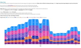
  • 1. 11/26/2020 Ribbon Chart 1/1 Sales Volume by Year and Region Name Year 1995 2000 2005 2010 2015 33K 31K 61K 24K 61K 42K 41K 49K 25K 43K 26K 52K 30K 40K 48K 61K 38K 26K 17K 14K 30K 10K 27K 21K 19K 11K12K 23K 20K 24K 19K 29K 26K 14K 11K 19K 15K 14K 28K 12K 27K 19K 24K 21K 13K18K 25K 13K 27K 27K 15K 19K 16K 17K 13K 11K 25K 10K 25K 16K21K 11K11K 18K17K 21K 24K 24K 12K 10K 13K 16K 30K 27K 51K 22K 51K 37K 38K 24K 42K 39K 50K 24K 49K 43K 27K 35K 35K 24K 30K 26K 55K 21K 35K 44K 52K 42K 37K 52K 37K 42K 52K 22K 28K 26K 34K 47K Region Name Greater Manchester Merseyside South Yorkshire Tyne and Wear West Midlands West Yorkshire Ribbon Chart You can create ribbon charts to visualize data, and quickly discover which data category has the highest rank (largest value). Ribbon charts are effective at showing rank change, with the highest range (value) always displayed on top for each time period. We can see that we've got West Yorkshire starting off third and then it comes up to second. Then goes down to third again. Similarly we can see very clearly that South Yorkshire tarts at fifth and then becomes fourth in 2001, before slipping back down. Ribbon Chart allows us to see the volume with the total. So it's equivalent to the stacked, but it doesn't display them in a fixed order like the stacked charts do. Instead, it puts at the top the one which is the biggest and at the bottom the one which is the smallest. Format + Ribbons section or Format + Data Labels So Ribbons are useful when you want to know the ranking of individual categories, together with their size. So it serves a different purpose to the line charts and the stacked area charts, but it does make for an interesting topic of conversation.
  • 2. 11/26/2020 Waterfall Chart - Cumulative 1/1 SalesVolume by Year 0.0M 0.5M 1.0M 1.5M 2.0M 2.5M 3.0M 3.5M Date Year SalesVolume 1995 1996 1997 1998 1999 2000 2001 2002 2003 2004 2005 2006 2007 2008 2009 2010 2011 2012 2013 2014 2015 2016 Total Increase Decrease Total Waterfall Chart: Cumulative WATERFALL CHARTS: - show a running total as Power BI adds and subtracts values, - useful for understanding how an initial value is affected by a series of positive and negative changes, - are quite useful when you're want to have an allocated cumulative count or if you want to drill down into the significant figures. For instance, you might be calculating a company's profits and seeing what the most profitable items were and which made the most loss. So you can be auditing the major changes. Example: How many homes did we sell by the end of 2004? Using a Waterfall Chart, each year's sales volumes gets added to the previous year. As we can see, 243,065 is the Sales Volume in 2004.
  • 3. 11/26/2020 Waterfall Chart - Breakdown 1/1 SalesVolume by Year and RegionName 0K 50K 100K 150K 200K Year SalesVolume 1995 Other WestMidlands GreaterManches… 1996 Other GreaterManches… WestYorkshire 1997 Merseyside Other GreaterManches… 1998 Other GreaterManches… WestYorkshire 1999 Other SouthYorkshire GreaterManches… 2000 Other WestYorkshire GreaterManches… 2001 Other GreaterManches… WestYorkshire 2002 Merseyside Other WestMidlands 2003 Other Merseyside SouthYorkshire 2004 WestYorkshire GreaterManches… Other 2005 Other GreaterManches… WestYorkshire 2006 Other WestMidlands WestYorkshire 2007 WestYorkshire GreaterManches… Other 2008 WestMidlands GreaterManches… Other 2009 WestMidlands Other Increase Decrease Total Other Waterfall Chart: Breakdown If we add Region Name into the Breakdown, each of the Regions gets added into all of the years. We can see that when we get to 2004 and 2005, we have got some negative sales volume compared to the previous year. And then 2009 drops off completely. Format + Sentiment colors: Increase - Green: means that these are your big advances. Decrease - Red: means these are your biggest decliners. To see the most 2 significant (the biggest bottom and the biggest top): Format + Breakdown + 2. Note: it is showing 3 breakdowns, as the others are going to be wrapped up into Other. Also, as soon as I put in a breakdown, it is not longer cumulative (the end figure is the totality for that year). For example, we can see that in 2003, Merseyside has got up 2000 units and West Midlands has gone down by 2000 units.
  • 4. 11/26/2020 Line Chart 1/1 Line Chart: Average House Price change So we can see that we start off at around 4% (1997) go all the way up to +28% (2004), and then all the way down to -9.6 (2009). Note: Change the aggregation for 12m%change 12m% Change by Year -10 -5 0 5 10 15 20 25 30 Year 12m%Change 2000 2005 2010 2015 0.0 5.4 28.6 -9.6 3.8 3.0 -3.3 4.7 4.2 3.8 9.6 7.0 0.6 7.3 26.1 8.2 -3.0 -0.6
  • 5. 11/26/2020 Waterfall 2 1/1 Waterfall Chart: Average House Price change So we can see that: - between 2001 and 2002: we have the biggest raisers in South Yorkshire and Tyne and Wear - between 2004 and 2005: we have got huge declines in Tyne and Wear and Merseyside. So it just allows a different view of your data and see how it's been going over time. 12m% Change by Year and RegionName -10 0 10 20 30 40 50 60 Year 12m%Change 1996 WestMidlands GreaterManchester Other 1997 Other SouthYorkshire WestYorkshire 1998 Merseyside SouthYorkshire Other 1999 WestMidlands GreaterManchester Other 2000 Merseyside TyneandWear Other 2001 SouthYorkshire TyneandWear Other 2002 SouthYorkshire TyneandWear Other 2003 Merseyside Other WestMidlands 2004 Other TyneandWear Merseyside 2005 Other WestYorkshire GreaterManchester 2006 Other SouthYorkshire Merseyside 2007 Other WestYorkshire GreaterManchester 2008 Other SouthYorkshire GreaterManchester 2009 WestMidlands WestYorkshire Other 2010 Other WestYorkshire WestMidlands Increase Decrease Total Other
  • 6. 11/26/2020 Scatter Chart 1/1 Scatter Chart: Comparing two different values How does the Sales volume vary according to Price Inflation? - If houses are rising quickly, do we have more Sales Volume? So people are trying to buy the houses before the prices get too high. - If it's going down, do we have a reduction in the Sales Volume? - Are people frightened and not want to buy? So let's compare SUM Sales Volume and AVG House Price Inflation, using a Scatter chart. Note: - add Date into Details, so we don't have it overall. - drag Region Name to Legend, so we have each Region in a different colour. So we can now see the difference in sales volume for the various Regions. Sales Volume and Sum of 12m% Change by Year and RegionName -200 -100 0 100 200 300 400 500 Sales Volume Sumof12m%Change 10K 20K 30K 40K 50K 60K RegionName Greater Manchester Merseyside South Yorkshire Tyne and Wear West Midlands West Yorkshire
  • 7. 11/26/2020 Scatter Chart2 1/1 Scatter Chart: Showing Dates at once So the question is: So, do we want all of the dates to be shown at once, or do we want it to be shown more as a presentation? What if I want to concentrate on one year at a time? - Drag Year down from Details to Play Axis. Clicking on the Play Button, we can see the dots for each year and how they change over time. - Add Sales Volume to Size: the bigger the Sales Volume, the bigger the Size. Clicking on the Play Button, we can see that the further right we go, the more the circles get bigger. But as soon as we get to the left-hand side, they start reducing in size. Sales Volume, Sum of 12m% Change and Sales Volume by RegionName and Year -200 -100 0 100 200 300 400 500 Sales Volume Sumof12m%Change 10K 20K 30K 40K 50K 60K 2016 RegionName 1995 1996 1997 1998 1999 2000 2001 2002 2003 2004 2005 2006 2007 2008 2009 2010 2011 2012 2013 2014 2015 2016 Greater Manchester Merseyside South Yorkshire Tyne and Wear West Midlands West Yorkshire
  • 8. 11/26/2020 Bubble Chart 1/1 Bubble Chart: Comparing three different values So the idea about this is generally to have three independent variables, numeric. So let's have a different, a third value, for the size. For example, let's add Average Price in the Size. Note: Change the aggregation to Average. So now, we can see that the cumulative effect of all the house price inflation. But when we get around to 2007, this is when the house prices were at their maximum, and then they slightly declined. However, they were still fairly big even though there is some negative inflation, and even though sales values are down. We still have much lower house prices in 1996 compared to the peak of the negative house price inflation around 2009. SalesVolume, Sum of 12m% change and Average Price by RegionName and Year -200 -100 0 100 200 300 400 500 SalesVolume Sumof12m%change 10K 20K 30K 40K 50K 60K 2016 RegionName 1995 1996 1997 1998 1999 2000 2001 2002 2003 2004 2005 2006 2007 2008 2009 2010 2011 2012 2013 2014 2015 2016 Greater Manchester Merseyside South Yorkshire Tyne and Wear West Midlands West Yorkshire
  • 9. 11/26/2020 Dot Plot Chart 1/1 Dot Plot Chart: Adding a categorical field into X-Axis To create a dot plot chart, replace the numerical X-Axis field with a categorical field (es.Area Code) and remove Date from Play Axis Sum of 12m% change and Average Price by RegionName and AreaCode 1,520 1,540 1,560 1,580 1,600 1,620 1,640 1,660 1,680 AreaCode Sumof12m%change E11000001 E11000002 E11000003 E11000007 E11000005 E11000006 RegionName Greater Manchester Merseyside South Yorkshire Tyne and Wear West Midlands West Yorkshire
  • 10. 11/26/2020 Format - Scatter Chart 1/1 Scatter Chart: Format - Change the shape for Mangester: Format + Shape + Customise Series ON - Add Category labels: Format + Category labels ON - Add Color Borders: Format + Color Borders ON Note: It is not possible at the moment to change the speed of Play button. Sales Volume, Sum of 12m% Change and Sales Volume by RegionName and Year -200 -100 0 100 200 300 400 500 Sales Volume Sumof12m%Change 10K 20K 30K 40K 50K 60K 2016 Greater Manchester West Midlands West YorkshireMerseyside South Yorkshire Tyne and Wear RegionName 1995 1996 1997 1998 1999 2000 2001 2002 2003 2004 2005 2006 2007 2008 2009 2010 2011 2012 2013 2014 2015 2016 Greater Manchester Merseyside South Yorkshire Tyne and Wear West Midlands West Yorkshire