1. Shahnaaz Begum Media
Evaluation
My masthead ‘manors 6th
form’ is something short and catchy so that it
catches the attention on my target audience. I have made it the colour red
because red is the main colour of Plumstead Manor both secondary school
and 6th
form, also following the colours
of the school uniform. When I have
made my final product of the magazine
cover I will add a better masthead, including the logo of Plumstead Manor,
this will then add colour to my magazine cover and allow me to use a wider
range of colours.
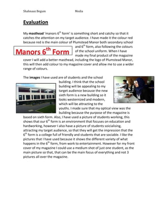
The images I have used are of students and the school
building. I think that the school
building will be appealing to my
target audience because the new
sixth form is a new building so it
looks westernized and modern,
which will be attracting to the
youths. I made sure that my optical view was the
building because the purpose of the magazine is
based on sixth form. Also, I have used a picture of students working, this
shows that our 6th
form is an environment that focuses on education and
hardworking, however I also have a picture of students soicialising,
attracting my target audience, so that they will get the impression that the
6th
form is a college full of friendly and students that are sociable. I like the
pictures that I have used because it shows the different variety of what
happens in the 6th
form, from work to entertainment. However for my front
cover of my magazine I could use a medium shot of just one student, as the
main picture so that, that can be the main focus of everything and not 3
pictures all over the magazine.