

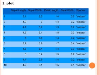
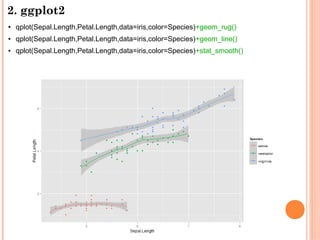
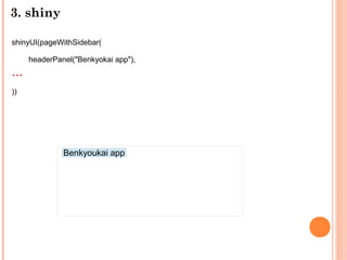
![1. plot
plot(x,y, ...)
> plot(iris[,"Sepal.Length"],iris[,"Petal.Length"])](https://image.slidesharecdn.com/random-130616201542-phpapp02/85/3-R-3-320.jpg)
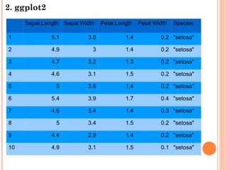
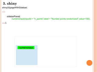
![1. plot
plot(iris[,"Sepal.Length"],iris[,"Petal.Length"],
xlab = "Sepal Length", ylab = "Petal Length",
main = "Iris data: Sepal vs. Petal Length")](https://image.slidesharecdn.com/random-130616201542-phpapp02/85/3-R-4-320.jpg)
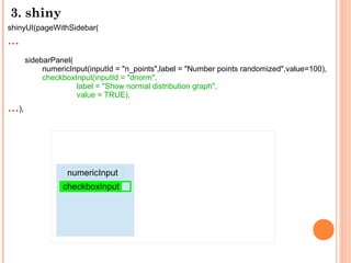
![1. plot
plot(iris[,"Sepal.Length"],iris[,"Petal.Length"],
xlab = "Sepal Length", ylab = "Petal Length",
main = "Iris data: Sepal vs. Petal Length",
col=c("orange3","seagreen4"))](https://image.slidesharecdn.com/random-130616201542-phpapp02/85/3-R-5-320.jpg)
![1. plot
plot(iris[,"Sepal.Length"],iris[,"Petal.Length"],
xlab = "Sepal Length", ylab = "Petal Length",
main = "Iris data: Sepal vs. Petal Length",
col=c("orange3","seagreen4"))
par(bty="l",las=1,bg="antiquewhite1")](https://image.slidesharecdn.com/random-130616201542-phpapp02/85/3-R-6-320.jpg)
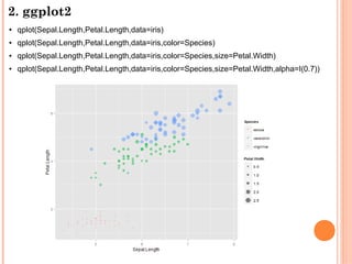
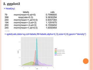
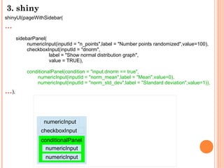
![1. plot
plot(iris[,"Sepal.Length"],iris[,"Petal.Length"],
xlab = "Sepal Length", ylab = "Petal Length",
main = "Iris data: Sepal vs. Petal Length",
col=c("orange3","seagreen4"))
legend("bottomright",legend=c("Sepal Length","Petal Length"),
fill=c("orange3","seagreen4"),ncol=1,title="Iris data legend")](https://image.slidesharecdn.com/random-130616201542-phpapp02/85/3-R-7-320.jpg)
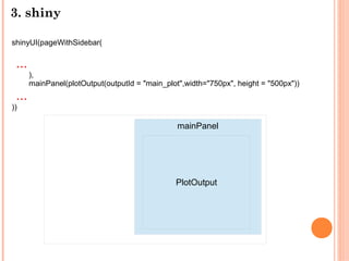
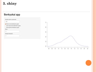
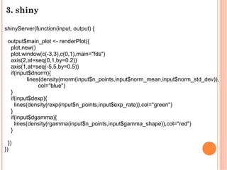
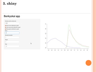
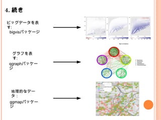
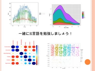

The document summarizes an R study meeting. It introduces plotting in base R and ggplot2, including examples using the iris dataset. It then discusses shiny for building interactive web apps in R. Examples show building user interfaces and servers, and rendering plots based on user input. The meeting aims to continue studying R through discussing big data visualization, graph visualization, and geographic data visualization using specific R packages.


![[Yang, Downey and Boyd-Graber 2015] Efficient Methods for Incorporating Knowl...](https://cdn.slidesharecdn.com/ss_thumbnails/sparse-constrained-lda-151024072334-lva1-app6891-thumbnail.jpg?width=640&height=640&fit=bounds)

![A Neural Attention Model for Sentence Summarization [Rush+2015]](https://cdn.slidesharecdn.com/ss_thumbnails/emnlp2015yomi-151024073845-lva1-app6892-thumbnail.jpg?width=640&height=640&fit=bounds)


