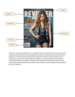
1. Masthead
Cover story
Side story
Barcode
Skyline
Main image
‘Revolver’ is an already existing metal music magazine. My cover page would be somehow similar to this
one because the masthead of my cover page would be similarly in a large, clear and unique font with a
skyline on it. The cover story title would also be in large font to make sure that the reader’s eye can
easily catch it. I will also be using a barcode on my magazine. A very important similarity will be the
female model. Metal music magazines mostly use male models but I challenged that convention and
used a female model instead. I will be using more side story titles on my cover page and will also add the
price of the magazine.
2. Header
Images
Articles
Editor’s info
This is the content page of an already existing metal music magazine ‘Hammer.’ The titles of the articles
are in bold and clear font and there is some introductory information given about the article underneath
its title so that the reader is aware of what he is going to read. The images connote that it is a metal
magazine. In the right bottom, some Editor’s info is given-I am going to use thiss convention in my
magazine too. The Cover story’s title is not really prominent and the reader will not get to know about
the cover story because all the article titles are written in the same font and size.
3. This is the double fold spread of a metal music magazine. The Title is written in a very large font and in a
separate box which makes it very eye catching- I am going to use this idea too. Other than that, the
images are very attractive and connote the genre of the magazine very clearly. On the right side, a quote
is written in a large font. I am also going to use this idea in my double fold spread.
Over all, I find this double fold spread very attractive.
Title
Cover story
Images