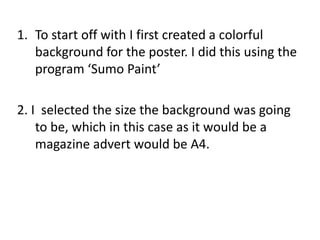
1. To start off with I first created a colorful background for the poster. I did this using the program ‘Sumo Paint’ 2. I selected the size the background was going to be, which in this case as it would be a magazine advert would be A4.
2. I then selected the gradient of colourswhich I chose various shades of pastel like purples and blues as I thought this would be visually striking but still allow the images on the poster to stand out:
3. I then selected the spiral effect and pulled the spiral out so that it would swirl the distance of the page:
5. I now needed the lettering and images for the poster, the next step was importing all the photos & screenshots we had taken from filming into power point. These images were all our original photo’s and screenshots from our media product:
6. I then selected the images and applied the effect ‘Bevel Perspective Left, White’ to give the photo’s a frame and make them three dimensional to stand out against the spiral background.
7. I now needed a font for the heading and phrases on the poster, I chose to use ‘Alba Super’ as I felt this had similar aesthetics to various 80’s album covers and looks slightly like grafitti lettering. Alba Super
8. I made the letting white and added an orange glow so that it would stand out against the pastel colours of the posters background:
9. All that was left now was to add some star’s and quotes from journalists:
10. After this I just arranged all the fonts and pictures on the poster on Photoshop to look neat and professional and the poster was complete: