Grateful 7 speech thanking everyone that has helped.pdf
Analysed child hope website
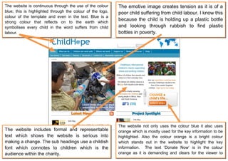
1. The website is continuous through the use of the colour The emotive image creates tension as it is of a
blue; this is highlighted through the colour of the logo, poor child suffering from child labour. I know this
colour of the template and even in the text. Blue is a
because the child is holding up a plastic bottle
strong colour that reflects on to the earth which
symbolises every child in the word suffers from child and looking through rubbish to find plastic
labour. bottles in poverty.
The website not only uses the colour blue it also uses
The website includes formal and representable orange which is mostly used for the key information to be
text which shows the website is serious into highlighted. Also the colour orange is a bright colour
making a change. The sub headings use a childish which stands out in the website to highlight the key
font which connotes to children which is the information. The text ‘Donate Now’ is in the colour
audience within the charity. orange as it is demanding and clears for the viewer to
read.