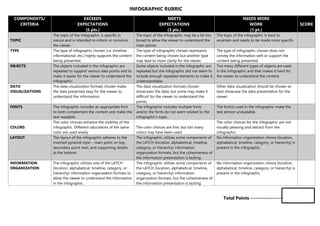
1. INFOGRAPHIC RUBRIC
COMPONENTS/
CRITERIA
EXCEEDS
EXPECTATIONS
(5 pts.)
MEETS
EXPECTATIONS
(3 pts.)
NEEDS MORE
WORK
(1 pt.)
SCORE
TOPIC
The topic of the infographic is specific in
nature and is intended to inform or convince
the viewer.
The topic of the infographic may be a bit too
broad to allow the viewer to understand the
main points.
The topic of the infographic is hard to
ascertain and needs to be made more specific.
TYPE The type of infographic chosen (i.e. timeline,
informational, etc.) highly supports the content
being presented.
The type of infographic chosen represents
the content being chosen but another type
may lead to more clarity for the viewer.
The type of infographic chosen does not
convey the information well or support the
content being presented.
OBJECTS The objects included in the infographic are
repeated to support various data points and to
make it easier for the viewer to understand the
infographic.
Some objects included in the infographic are
repeated but the infographic did not seem to
include enough repeated elements to make it
understandable.
Too many different types of objects are used
in the infographic and that makes it hard for
the viewer to understand the content.
DATA
VISUALIZATIONS
The data visualization formats chosen make
the data presented easy for the viewer to
understand the information.
The data visualization formats chosen
showcases the data, but some may make it
difficult for the viewer to understand the
points.
Other data visualization should be chosen to
best showcase the data presentation for the
viewer.
FONTS The infographic includes an appropriate font
to both complement the content and make the
text readable.
The infographic includes multiple fonts
and/or the fonts do not seem related to the
infographic’s topic.
The font(s) used in the infographic make the
text almost unreadable.
COLORS
The color choices enhance the visibility of the
infographic. Different saturations of the same
color are used wisely.
The color choices are fine, but too many
colors may have been used.
The color choices for the infographic are not
visually pleasing and detract from the
infographic.
LAYOUT The layout of the infographic adheres to the
inverted pyramid style – main point on top,
secondary point next, and supporting details
at the bottom.
The infographic utilizes some components of
the LATCH (location, alphabetical, timeline,
category, or hierarchy) information
organization formats, but the cohesiveness of
the information presentation is lacking.
No information organization choice (location,
alphabetical, timeline, category, or hierarchy) is
present in the infographic.
INFORMATION
ORGANIZATION
The infographic utilizes one of the LATCH
(location, alphabetical, timeline, category, or
hierarchy) information organization formats to
allow the viewer to understand the information
in the infographic.
The infographic utilizes some components of
the LATCH (location, alphabetical, timeline,
category, or hierarchy) information
organization formats, but the cohesiveness of
the information presentation is lacking.
No information organization choice (location,
alphabetical, timeline, category, or hierarchy) is
present in the infographic.
Total Points ---------------------