Bridge Fight Board by Daniel Johnson dtjohnsonart.com
Production process of print advert
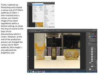
1. Firstly, I opened up
Photoshop and created
a canvas size of 27.94cm
width by 21.59cm. I
then inserted onto a
canvas, our chosen
image of ice cream
ingredients within a
kitchen setting, to relate
the mise en scene to the
topic of our
documentary which is
cream. However, at the
end of the production
process we changed the
canvas size to 30cm
width by 19cm height. I
also adjusted the
brightness and
2. Here I inserted text using
the text tool and chose
white for the font colour.
I also used the shape tool
to make a red box in the
background which we
found was a popular
colour when conducting
our audience research.
Also, we chose this
colour as red connotes
danger and the topics
discussed in our
documentary represent
ice cream as being
symbolised as dangerous.
3. I then included a ‘+’ and ‘=‘ sign on our image using the text tool and choosing red as the
font colour to again connote danger and relate the image to our title that is ‘The Delicious
Truth’ as the ingredients shown suggest it is unhealthy.
4. I then created a Channel 4 logo by imitation, using the shape tool to create the outline. I then
used the paint bucket tool to fill in the logo with the colour white as this follows codes and
conventions of a professional Channel 4 print advert.
5. Any changes we thought we
needed to make before
finalising our product were
conducted at the end. We
felt that the font should be
changed to Trebuchet MS
instead of Myriad Pro as this
looked more similar to
Channel 4’s regular font. I
also changed the colour of
the ‘+’ and ‘=‘ sign to white
and filling the outside with
red by going to layer style
and then selecting the
‘stroke’ option as we felt
this stood out more and
gave it a more professional
and fresher look. I also
altered the size of the logo
as we felt ours was originally
very large in comparison to
professional Channel 4 print
adverts. Finally, I changed
the canvas size as
mentioned beforehand.