Final reflection, week 7
•
1 like•110 views

Reflection on how to do a magazine and banner ad in Adobe Illustrator and Photoshop. Feel free to use it as a guide.

Recommended
More Related Content
What's hot
What's hot (19)
Similar to Final reflection, week 7
Similar to Final reflection, week 7 (20)
Recently uploaded
Recently uploaded (20)
Final reflection, week 7
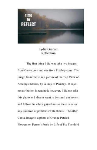
- 1. Lydia Graham Reflection The first thing I did was take two images from Canva.com and one from Pixabay.com. The image from Canva is a picture of the Top View of Amethyst Stones, by G lady of Pixabay. It says no attribution is required; however, I did not take this photo and always want to be sure I am honest and follow the ethics guidelines so there is never any question or problems with clients. The other Canva image is a photo of Orange Petaled Flowers on Person’s back by Life of Pix The third
- 2. image is a glass plate holding crystals and a candle holder from Pixabay. It was a photo by Mareefe s. says no attribution necessary. I needed to set up magazine ad in Adobe Illustrator (open new file, 8.5 by 11), and made sure ppi is 300 and set up bleed as 0.125 on all sides. This is generally the standard bleed, but may change according to client need, always be sure to check if there is one and if so, what the number should be. If none is given or unknown, use the 0.125. Then open document. Once opened, the red outline indicates the bleed area. Anything we extend needs to go beyond that red line to be sure it gets trimmed properly. Use the PDF with the client info/pallet/typography etc. Open so we can access those elements. Copy and paste logo onto the magazine ad. When you do
- 3. this the colors for the logo are automatically added to the swatches. This happens for any item copied and pasted FYI. Then we need to Place the image that we prepared last week where we layered the two images from Canva. The image should be over the bleed by less than an inch and lessen the opacity to 65%. Lessening the opacity helps the other images show up better when we bring it into the file. Leave room at the top for the heading/title. Then we bring in the carved out the background and place on top. Week 4 For week four we had to create the text for the banner ad for the magazine cover. There were helpful tutorials, however I used a YouTube video that I found called How to Create Fancy 3D Text in
- 4. Photoshop! Easy. I did not follow all the instructions simply because I wanted my banner ad to be clean and simple and some of the instructions called for something that would not fit my focus for the ad. I created a custom banner with the background and text, no additional layers aside from the color options. I used the 1280 by 300 for the pixel size and 150 DPI. Once in the design I chose Arial Bold for the text and rasterized the layer for the text. I then did the following: • Edit/Transform/Warp/Flag (I liked this design a lot) • I then changed the color of the text by right clicking on the layer and choosing blending options. Once there I clicked on the plus tab next to where it says color overlay and changed the CMYK for the text to the gray that is on the style guide. I
- 5. then changed the background layer to a very soft gold to match the golden colors in my magazine draft. I think this is a great option and will blend nicely. • I wanted to do the 3D but honestly had a hard time and figured I have four weeks until the project needs to be completed so I will practice as that makes perfect. • For now, I am happy with my design. I have saved as a photoshop image, and PDF and will submit in a zip folder. This is a more secure way to submit my drafts for an assignment and for a potential client. Week 5
- 6. For week five we had to create the draft of the banner ad and include some animation using the layered images and logo from the included documentation for the class. We had to follow these steps: Instructions Prepare one banner ad rough by modifying the digital materials used in the magazine ad and optimizing the imagery files into both a layered Photoshop .psd file and a .gif of the animated banner ad design. Your banner should be 1280 pixels by 300 pixels at 150 dpi. • Adapt the banner ad from the magazine ad to capture the tone and style of the design while enhancing the call to action by using some basic Photoshop animation techniques.
- 7. • When adapting the ad, consider what makes an on-screen, interactive ad different than a printed magazine ad and which tools in Photoshop and Illustrator you will need to use effectively to accomplish your goals. • Focus on best use of color, typography, imagery, and all the elements and principles of design to draw the viewer's attention. • When adapting the ad, consider what parts of the magazine ad design are no longer needed when placed on screen or which new elements might need to be introduced to create a successful layout and structure. The .gif should be optimized for on-screen viewing, and as you did for Milestone One, take
- 8. screenshots of the tools that you used to modify/adapt the magazine ad to become a Web banner. I optimized by using the timeline window. I clicked on the down arrow and chose create frame animation. Then I clicked on the button and it pulled up the frames that had the eye on it (prior to this I hid the ones I wanted to animate which were the title and the layer photo). Now I choose the duplicated thumbnails and choose the layers I want animated by choosing them. I then click play, adjust the timing and looping, optimize (by clicking on the lines at the right corner of the box and choosing Optimize Animation and click ok. Now we want to save as a GIF, click on file/export and then save for web/keep default settings/save. To see the GIF, go to the image in desktop, right click
- 9. and open with Internet Explorer. I added the text, resized, and did all the above steps, it came out great! The feedback from the instructor has been all positive. Each assignment and discussion grade has been a consistent A which leads me to believe I am absorbing the material with Adobe Illustrator and photoshop. The discussion threads have been positive with my peers giving me guidance and support with how to line things up and/or make the color pop on the banner ad and the magazine ad. Copyright laws protect the rights of the author, artist, or other originators of creative work to control when and how they work can be copied and disseminated, and it prevents others from appropriating the work without permission. By
- 10. simply giving the true artist credit, your image and reputation remain intact and you avoid legal issues/being sued (Sarokin, D., 2019). The four factors judges consider for fair use law are: • the purpose and character of your use. • the nature of the copyrighted work. • the amount and substantiality of the portion taken, and. • the effect of the use upon the potential market (Stanford University, N.D.). This week was the final submission of the banner ad and magazine ad. I simply finished cleaning up the images. For the banner ad, I changed the background color from white to light
- 11. purple to compliment the design. I also changed the text to wave, so it stands out more. I had to play around with each layer, added the phone number and just took my time adjusting the colors by clicking on the background layer, edit, fill/and then changing the color it was easy. I also changed the background/bottom layer of the magazine ad. I did a blue/white tinted color and added the lettering and moved the images around – it looks great! The following pages are the screenshots of my images that I used. Again, the images were used and downloaded from Canva and Pixabay. See the attribution at the top of the page.
- 12. Banner ad rough draft Image of lady’s back and amethyst rock from Canva
- 13. Amethyst Rock from Canva via Lady G, no attribution needed
- 14. Dish with blue amethysts from Pixabay, no attribution needed Image of glass bowl with amethysts and jar Image of layering for amethyst rock and lady with flowers on her back for magazine ad
- 15. Draft of magazine ad Blank template for magazine ad in Adobe Illustrator
- 16. The company sample page for their logos and color chart to be used for project company logo
- 17. Banner ad rough
- 18. Image from Canva of bowl with amethyst rocks, jar Banner ad rough draft
- 19. Images of amethyst rocks and lady with flowers on her back from Canva Final banner ad submission
- 20. Final Magazine ad submission
- 21. References Sarokin, D. (2019). Why Are Copyright Laws Important? smallbusiness.cron.com. Retrie ved from https://smallbusiness.chron.com/copy right-laws-important-52601.html. Stanford (N.D.). Measuring Fair Use: The Four Factors. fairuse.standford.edu. Retrieved from https://fairuse.stanford.edu/overview/ fair-use/four-factors/.