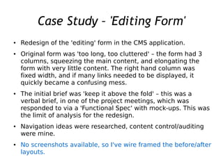
1. Case Study – 'Editing Form'
● Redesign of the 'editing' form in the CMS application.
● Original form was 'too long, too cluttered' – the form had 3
columns, squeezing the main content, and elongating the
form with very little content. The right hand column was
fixed width, and if many links needed to be displayed, it
quickly became a confusing mess.
● The initial brief was 'keep it above the fold' – this was a
verbal brief, in one of the project meetings, which was
responded to via a 'Functional Spec' with mock-ups. This was
the limit of analysis for the redesign.
● Navigation ideas were researched, content control/auditing
were mine.
● No screenshots available, so I've wire framed the before/after
layouts.
3. Edit
-Read
Major changes to
UX
2 columns
Left hand menu
'accordian'
Tabs to other
areas of the form
#1 goal was to
keep everything
“above the fold”
4. Edit
-Edit
Edit Tab
Document linking has an
added level, but new
business rules determine
linking allowed
New CKEditor panel
modified icons to suit
business users
Image widget included for
better rich text support
Reduction in duplicated
content via image gallery
6. Edit
-History
The history is
actually saved to
another database.
The quickest way to
display this data
was by inserting an
iFrame
History document links
displayed in an iFrame
7. Things that needed doing...
The database was 'mainly' cross browser compatible, but not responsive. It was
designed to be used on a 1280px desktop, and some elements were hard coded to
1024px widths.
Elements of the design worked fine on the iPad, but no time was spent in specific
support of tablet devices, even though they formed 4+% of traffic to the website,
from 0% only 6 months earlier.
The iFrame solution needed to be re-coded into something a lot more forward
thinking – probably I'd have gone for a JSON lookup.