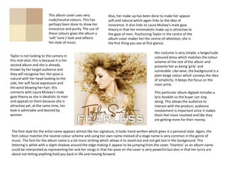
1. This album cover uses very Also, her make up has been done to make her appear
nude/neutral colours. This has soft and natural which again links to the idea of
perhaps been done to show her innocence. It also links to Laura Mulvey’s male gaze
innocence and purity. The use of theory in that her minimalistic make-up is attractive to
these colours gives the album a the gaze of men. Positioning Taylor in the centre of the
‘soft’ tone / look and reflects album cover makes her the centre-of-attention; she is
her style of music. the first thing you see at first glance.
Her costume is very simple; a beige/nude
Taylor is not looking to the camera in coloured dress which matches the colour
this mid-shot; this is because it is her scheme of the rest of the album and
second album and she is already presents her as being ‘girly’ and
known by her target audience and vulnerable. Like-wise, the background is a
they will recognise her. Her pose is plain beige colour which conveys the idea
natural with her head looking to the of simplicity; It keeps the focus on the
side, her soft facial expression and main artist.
the wind blowing her hair; this
connects with Laura Mulvey’s male This particular album digipak includes a
gaze theory as she is idealistic to men lyric booklet so the buyer can sing
and appeals to them because she is along. This allows the audience to
attractive yet, at the same time, her interact with the product; audience
look is admirable and desired by involvement is important since it makes
women. them feel more involved and like they
are getting more for their money.
The font style for the artist name appears almost like her signature, it looks hand-written which gives it a personal style. Again, the
font colour matches the neutral colour scheme and using her own name instead of a stage name is very common in the genre of
music. The font for the album name is a lot more striking which allows it to stand out and not get lost in the background. The
lettering is white with a slight shadow around the edge making it appear to be jumping from the cover. ‘Fearless’ as an album name
could be interpreted as representing her and her songs in that her pose on the cover is very powerful but also in that her lyrics are
about not letting anything hold you back in life and moving forward.
2. The colour scheme for this album cover is very A low camera angle is used to look up slightly at
different to her previous albums. This one still uses Taylor. This gives her a sense of superiority and
the neutral / nude colours nut has also used black enforces the idea that she has become a role
and a striking pink / red which is challenging her model to a lot of teenage girls as they find her
genre. The use of these colours suggests that she lyrics about relationships and break-ups relatable
is aiming to create an edginess that will make this and comforting if they are going through
album stand out from the rest. something similar.
Taylor’s red parted lips fit with The background is out of focus,
the ideas with Laura Mulvey’s there is a hint of a location or
male gaze theory. Her image somewhere that isn’t a plain studio
attracts the gaze of males as room however its blurred out. This
well as females as her image is puts all the attention onto Taylor
appealing and attractive to men because there is nothing else for
and admiral by women. The your eye to get distracted by.
focus of the cover is very much
on her lips because they are in
colour. The fact that her face is
in the shade, we are given the A close-up shot is being used
impression that she is ‘hiding in however her costume is just about
the shadows’ and still has the visible. She appears to be wearing a
vulnerable side to her that she white blouse which gives her a
presents herself to have in her classy look, this contrasts to her
previous albums. other album covers where to wears
dresses and looks more ‘girly’. Her
hair also has a classy-look in the
The album name is ‘Red’ and has been written in a bold red font that stands out from the way it has been style, her look as a
washed-out coloured background. Taylor called her album this because of the crazy, whole is very well-presented;
intense, semi-toxic relationships she has been involved in and wanted to express her perhaps to appeal to older teenage
feelings and emotions; the word ‘red’ has connotations of love and passion but also of girls as well as young.
anger and frustration. On the contrary, the artist name is written slightly smaller and in
white. White could represent the innocence she portrays in her other albums and
contrasts dramatically against the striking shade of red above it.
3. The colours used make the album cover look vintage The location that has been used as the
and worn down; I think the colours work well back-drop for this album cover appears
together and compliment each other. The use of the very worn down and continues the
red and green makes the cover stand out more than if vintage theme. The walls are old and
a neutral colour palette had been used. In general, stained and the room seems to be
these are ‘warm’ colours and give the impression that empty, thereby giving the impression
the artist is very down-to-Earth and grounded. that she is in a desolate building.
A long shot displays the costume of
Having a longshot for the cover the artist. Birdy’s outfit is very
image means that her face cannot quirky and unique and allows her to
really be seen too well however it is stand out as a young female solo
clear that her make-up is minimalistic artist. The red woollen jumper
as it isn’t visible and you can see that contrasts well with the green wall
she holds eye contact with the behind her and makes her relatable
camera which draws in the buyer and as she is wearing fashions that are
could even be said to follow Laura current. Her skirt presents her as
Mulvey’s male gaze theory where she ‘girly’ and makes her appear more
attracts the attention of the gaze of classy. Using a long shot is
males as well as females. Birdy’s hair unconventional of this genre as
hasn’t been styled to stand out, it is generally album covers use close-
natural and looks effortless. ups therefore Birdy is challenging
conventions to make her cover
stand out from others.
The artist name is written in a relatively small font in the top left hand corner; maybe because this is her first album and not many
people know who she is yet. The font used is quite quirky which could represent her music style and gives her album personality
whereas a standard font would have come across as plain. It could be written in white to represent her innocence. ‘Birdy’ as an artist
name could represent the idea of birds and having freedom; her music style is very different to others in this genre and doesn’t seem
to follow the rules giving her freedom to experiment with the songs. Her album does not have a name, this could be because she
wants to show simplicity and the idea that pictures speak louder than words.