4. 3 Kerwin Pillay 2015
Graphic Design
G
raphic Design is a subject that I always
wanted to study & learn more about. For
some reason it has always intrigued me.
This has been a very enjoyable year designing
and creating new things every week.
On the left is my book fair poster. The whole
poster had to be created entirely out of cut out
paper. For my design, I made the whole poster
appear as a book shelf with four books in each
shelf to make up the space needed to put each
letter to form the words; “CAPE TOWN BOOK
FAIR.” I also used my Quill & Ink logo on the
next page to form the letter ‘O’ in the word
‘BOOK.’ The most difficult part in creating this
poster was trying to cut out each shape as
neatly as possible. Especially the website at the
bottom.
O
n the right is my Kirstenbosch poster. It is
a very simple and unique design.
I used a full page image of flowers because
Kirstenbosch is known for it’s flowers and
beauty. I wanted an image that was bright
enough and also one that captured the viewers
attention.
KerwinPillay_FinalMagazine.indd 4 2015-11-25 19:08:00
5. 4Kerwin Pillay 2015
Q
uill & Ink was our re-branding assignment. We were given the name of the company, but
weren’t allowed to use the quill or feather in our designs as they were already used in the
original logo design. For my re-branding, I decided to use a perfect splatter of black ink and
have the words ‘Quill & Ink’ in the centre. I also edited it in a way that the ampersand forms the tail
of the ‘Q’ which made it look better. Apart from that, we also had to design a business card and
letterhead for our logo’s.
In term 1 we had to design our own typeface. My typeface was of Greek origin. Each letter was made
within an equilateral triangle. I named it ‘Thrice’ because of the way i designed it; in a triangle which
has three equal sides. We then had to illustrate the typeface in our own way. I drew mine onto a
trident because it was inspired by the Greek mythology God, Perseus. I wanted to make it look like it
was engraved into the trident with the cracks.
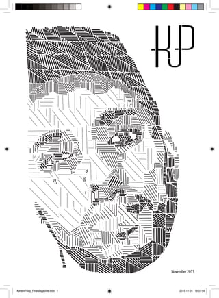
Our first magazine cover design had to include the portrait we did in illustration consisting of
different forms of lines that showed the shadows and highlights. For my portrait I used Emilia Clark,
an actress from the famous series Game Of Thrones.
KerwinPillay_FinalMagazine.indd 5 2015-11-25 19:08:03
6. 5 Kerwin Pillay 2015
Massimo Vignelli
“If you can design one thing, you
can design everything.You can
design everything.”
M
assimo Vignelli (January 10, 1931 – May
27, 2014) was an Italian designer who
worked in a number of areas ranging
from package design through houseware
design and furniture design to public signage
and showroom design. He was the co-founder
of Vignelli Associates, with his wife, Lella. His
ethos was, “If you can design one thing, you
can design everything,” and this was reflected
in the broad range of his work. Vignelli worked
firmly within the Modernist tradition, and
focused on simplicity through the use of basic
geometric forms in all his work. Vignelli studied
architecture at the Politecnico di Milano and
later at the Università di Architettura, Venice.
From 1957 to 1960, he visited America on a
fellowship, and returned to New York in 1966 to
start the New York branch of a new company,
Unimark International, which quickly became,
in scope and personnel, one of the largest
design firms in the world. The firm went on to
design many of the world’s most recognizable
corporate identities, including that of American
Airlines. Vignelli designed the iconic signage for
the New York City Subway system during this
period, and the 1970s–80s map of the system.
Contrary to news reports, Vignelli did not design
the Washington Metro Map, which was designed
by Lance Wyman and Bill Cannan.
KerwinPillay_FinalMagazine.indd 6 2015-11-25 19:08:03
7. Kerwin Pillay 2015 6
Ji Lee
J
i Lee was born in Korea, raised in Brazil,
and lives and works in New York. He
believes ideas are nothing, doing is
everything. Ji Lee is a Communication Designer
at Facebook, and former designer and creative
director at the Google Creative Lab, who
is known for his illustrations and public-art
projects. He also teaches at the School of Visual
Arts. Among the works of public art he is known
for is the Bubble Project: Mr. Lee printed 50,000
stickers that look like speech bubbles used in
comic strips. He then posted these blank speech
bubbles on top of advertisements throughout
New York City allowing anyone who sees them
to write in their comments and thoughts. In
2006, Mr. Lee wrote a book about the project
called Talk Back: The Bubble Project which talks
about the blank bubbles which transformed
the corporate monologue into a true public
dialogue. Lee was also one of the founders of
the project Mysterabbit, where a small white
coloured rabbit was placed anonymously in
over 19 different countries around the world.
KerwinPillay_FinalMagazine.indd 7 2015-11-25 19:08:04
8. 7 Kerwin Pillay 2015
Illustration
I
llustration is the subject that brings out the creative side of you. It’s filled
with fun assignments. Drake has always been my favourite music artist.
I think it’s because I can relate to him so much, whether it is through his
personal life or through his lyrics. This Drake Pop Art poster was done in
Photoshop & posterized into 4 tones.
Above is my abstract
wine label interpretation
of the wine range
‘Galaxy.’
Below is my stylized
playing card in the
‘sugarskull’ style.
KerwinPillay_FinalMagazine.indd 8 2015-11-25 19:08:07
9. 8Kerwin Pillay 2015
M
y spirit animal is something I enjoyed doing. We had to illustrate &
stylize our drawing & it had to include the spirit animal. I chose the
snake. I drew it wrapped around her neck & coming through her
eye. The orange is to show the snake scales, which indicates that she’s
turning into a snake. The background is purple ink which give the effect
of poison or snake venom.
Above is my literal wine
label interpretation of the
wine range ‘Galaxy.’
Below is the first of three
abstract illustration series.
KerwinPillay_FinalMagazine.indd 9 2015-11-25 19:08:10
10. 9 Kerwin Pillay 2015
Digital Design
D
igital Design is always fun, depending
on whether you know your way around
Photoshop, Illustrator and InDesign.
Luckily for me, it is not much of a problem.
Below is my ‘City In A Cup.’ I decided to use
the city Dubai because it is well known and is a
very modern city. I included as many elements
of Dubai as possible such as famous buildings
and landmarks. For the background I used
the Arabian dessert along with a few national
animals from the country.
A
bove is my dust cover. I created a
cyborg/woman in Photoshop. This took
a lot of time because of the amount
of fine editing that had to be done to get this
completed image above. I decided to call her
‘Cyberdoll.’
On the right, are my wine bottles with the wine
labels I did in Illustration. These are the two
abstract designs. It is placed in a starry galaxy
background with an actual image of two stars
colliding. It gives the impression that the taste
of this wine is out of this world.
KerwinPillay_FinalMagazine.indd 10 2015-11-25 19:08:13
12. 11 Kerwin Pillay 2015
Drawing
A
lthough drawing was part of illustration, all drawings were done on Fridays.
Above is my ‘Visit South Africa’ postercard. It consists of real images with cut outs
from the map of South Africa. I used colour brush pens to bring out the colour in the
proteas, flowers and for the bird. It took quite a long time to cut out each shape that take up a
specific space.
KerwinPillay_FinalMagazine.indd 12 2015-11-25 19:08:15
13. 12Kerwin Pillay 2015
T
he four pencil drawings above were done
by just looking at the objects and drawing
them freehand. We had to draw four
objects, showing the shadows of the dark areas
and highlights of the light areas of
the objects. This had to be drawn
in 3D. For my drawings, I used an
apple, a mug, a paint holder and
a pencil. We also had to add the
shadow of the objects which shows
the direction of the light source.
T
hese three pencil drawings
were done in three stages.
Stage one was done to show the
shape of the face.
Stage two shows the shadows
and highlights in areas of the
face.
Stage three are the final images.
These drawings were also done to help us with
the alignment of the eyes, ears, nose and mouth
when drawing portraits.
M
y whale illustration on the
left is just a printed black
and white image. We had to
incorporate a concept which had
to link to the whale. I used white bubbles to show
what it’s like to breath underwater. I also did this
wavy pattern to show the flow of the ocean.
KerwinPillay_FinalMagazine.indd 13 2015-11-25 19:08:17