Russian Call Girls in Goa Samaira 7001305949 Independent Escort Service Goa
Front Cover Development
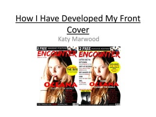
1. How I Have Developed My Front
Cover
Katy Marwood
2. Mock-Up One
I made this first mock up for a visualization of how my
front cover would look with the image I wanted and
the masthead with the font. Obviously a lot of editing
and adjusting still had to be done. Like, adding
features, barcode, price, etc.
3. Mock-Up Two
This was the second mock up that I published on my
blog. The reason why the jump from mock up 1 to
mock up 2 is so large is because I posted a
development process on my blog showing how I
added features and what effects I have used. Here,
you can see that I have added a puff advertising a
giveaway, free posters and my main feature alongside
some more features.
4. Mock-Up Three
This is the third mock up I published on my blog.
Here, you can see that I have changed the font of my
main feature. The reason I did this was because I was
using the same font as my masthead (Edo SZ) and it’s
a very unusual thing for magazine front covers to
have the same font as the masthead.
I also added a list of bands on a “+plus” feature which
I took inspiration from NME magazine. Also, I
removed “the biggest bands of 2014” feature as I
didn’t like the aesthetic it gave my magazine as I
thought it looked too similar to NME’s new layout.
5. Mock-Up Four
This is the fourth mock up of Encounter magazine. I
made a few noticeable changes in this version of my
magazine.
I added the issue number and the price as this is
obviously a vital feature of any magazine and must be
shown in some form so that the audience can see the
price information. The price/issue number can be
located onto the barcode but I think it’s easier to see
under the masthead. I also added a barcode on the
other side of the magazine.
6. Mock-Up Five
The fifth mock up of my magazine I created. The
difference between this cover and the fourth mock up
is that I used the new photos I had taken as my
previous photos weren’t very suitable as the models
weren’t looking at the camera making it seem
intimidating for the audience.
7. Mock-Up Six
This is the sixth mock up of my magazine. The only
thing that changed in this mock up was that I moved
the barcode to the right corner as it previously looked
out of place.
8. Final Cover
This is my final magazine front cover and there is a
very noticeable difference between this cover and my
last mock up (mock up six)
I wasn’t very happy with my previous mock up as
there was a lot of noticeable white space on the
cover. I overcome this problem by adding some more
features onto the left side of the page where the
most white space was shown.
I also re-edited the image in photoshop and altered
the background.
I also added a photo that I had taken at the left
corner of my cover that reads ‘’Reader Reviews The
1975’’. The 1975 are a band from the indie rock genre
with a large audience/fanbase so that would generate
a lot of interest into my magazine.
I changed some of the graphological elements of my
magazine, like the masthead. I played around with
some of the effects in photoshop and made the text
more bolder which in my opinion makes the
magazine stand out and look just that little bit more
professional.