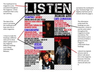
1. The masthead of my magazine is very consistent throughout the magazine. I chose a bold font that is very eye catching. Just below the masthead it Says “Contents Page” in a Slightly small font just to Indicate what this page is. The date of the issue is just below the masthead and I have seen this in other magazines. The information underneath the headings are very important, I chose to use the same colors throughout the magazine to show consistency. The information is just a summary of what is going on in the magazine underneath those headings. I chose to make the headings a different color just to show what is going to be in the magazine. Different headings such a News, Interview, New Releases. I placed my originals pictures next to where I talk about him in the magazine. Exclusive interview with A.B, you can clearly tell who A.B is.