Strategy + Design:
A case study that highlights a brand revamp solution.
-
Victory Creations was facing challenges on brand recognition, lack of visual uniformity across and handling multiple operational entities without a consistent tone of voice.
It found it's solution in a monolithic brand architecture that is in line with the changing global design and marketing trends.
Result: New global partnerships, new queries on website & increase in brand awareness.
Credits:
Agency: Boch & Fernsh
Creative Direction: Chirag Shah & Jimmy Crasto
Strategy: Chirag Shah & Jimmy Crasto
Designers: Jimmy Crasto & Vishnu Haridas
Copy writing: Jimmy Crasto
3D Visualisation: Nidhin & Ajay Vishwakarma
Stall Design: Ajay Vishwakarma
Brand Film: Navin Singh
Case Study: Jimmy Crasto
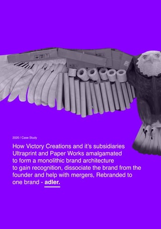
1. How Victory Creations and it’s subsidiaries
Ultraprint and Paper Works amalgamated
to form a monolithic brand architecture
to gain recognition, dissociate the brand from the
founder and help with mergers, Rebranded to
one brand - adler.
2020 / Case Study
2. TRADING LLP
Introduction
Victory Creations are traders and suppliers of wastepaper and stocklots.
For 3 decades, their business focus has been diverse. With the help
of UltraPrint and Paper Works, their subsidiaries in the waste paper
business, Victory has evolved to meeting global demands of paper mills &
convertors by giving them a constant supply. They are reputed for
bridging cultures, demand & supply, currencies and distances.
Challenges:
Devang Vora, the founder of Victory Creations and
one of the pioneers in waste paper trade, since the
last 35 years, has expanded to a global reach,
operating under multiple entities.
With it’s recent global partnerships, Victory faced
the problem of zero brand recall and the difficulty of
adapting to changing market trends due to lack of a
monolithic brand architecture and a
uniform visual theme.
Existing Identity & Message
We at Victory Creations are not just
about paper from all over the world .
We're also about recycling our Earth's
resources and conserving nature.We
strongly believe in the words of the
forefathers : ' BE THE CHANGE YOU
WANT TO SEE '
We, at Paperworks, believe that Paper
is not to be wasted. It is to be recycled
and reused to make paper again. We
reperesent the re-use and recycling of
waste paper, and its systematic
distribution to paper mills. REUSE.
REDUCE. RECYCLE.
One stop shop for all grades of
waste-paper and stocklots. Buyers of
palletised paper board. Buyers and
Suppliers of Wastepaper and
Cardboard. We believe in providing
all grades of stocklots, resulting in
reduction of waste paper.
3. Customer:
Victory Creations and it’s subsidiaries Ultraprint &
Paper Works believes in building business-to-
business partnerships.
It’s primary customer base boasts of global
traders, suppliers and distributors of waste paper.
Victory’s partnerships also extend to recycling units
and large scale print shops.
Why will someone partner with Victory?
- A brand that evokes global dominance.
- Adapts to changing market trends.
- Expert market leaders.
- Believes in a circular economy.
- Agile and Focused.
Traders Suppliers
One brand to establish market
dominance and form global
partnerships.
Paper Mills
Recycling
Unit
Print Shops
Distributors
03
4. 04
Solution:
A monolithic brand architecture that evokes:
• Focus
• Agility
• Knowledge
• Vision
• Dominance
Identifying an entity as a brand is an extensive
process. It requires identifying what keywords
multiple stakeholders in the company associate
the brand with.
This is a collaborative effort between the stake-
holders and the brand gurus.
We covered the brand on different verticals and
identified relevant attributes under. It was a deep
dive into the culture of the brand, What feeling
one gets when they engage with the brand, the
impact the brand leaves on a customer and the
brand’s x-factor that allows the brand to gain a
winning edge in the market.
Culture Feeling Impact X Factor
Mission Driven
Innovative
Credible
Focused
Loyalty
Assurance
Credibiity
Progressive
Simplistic
Timely Delivery
Security
Informed
Saved Time
Confident
Simple
Hardworking
Passionate
Capable
Dominant
Victory Creations as a Brand:
5. We identified that since Victory was a pioneer and the biggest market
player in wastepaper trade.
We learnt that it’s communication bench marking had to be done with -
global logistic solution providers & traders.
Competition:
A deep dive into studying the competitors was
needed and that’s what we did.
• Maersk • Evergreen line • Hapag-Lloyd • PIL • Hyundai Merchant • China Cosco
6. Communication Strategy:
- Logo
- Stationery
- Website
Phase 1: Brand Revamp - Internal - 2months
Objective: To inherit brand relaunch values and incorporate values of adler among
internal stakeholders. To educate & maintain change of tone of voice and
identity.
ATL
- Magazine Ads
- Standees
- Brochure
- Brand Film
BTL
- Exhibition booth - for paperX
- Billboard
Phase 2: Brand Revamp - External - 3 months
Objective: To educate new brand to customers through ATL & BTL activities.
Phase 3: Brand Revamp - External - 6 months - Suggested but not approved
Objective: To take the brand adler digital and start it’s marketing activities
on LinkedIn and Facebook.
To also create an intuitive app for the suppliers to place
orders and track delivery.
06
7. 06
Position Statement / Brand Story:
Insights:
Victory Creations are early market adopters,
establishing global dominance in wastepaper trade.
They provide logistical trade solutions to businesses
in a warm, professional and friendly enviornment
while helping them feel secure and giving them
peace of mind.
• Recycling Units
• Paper Mills
• Other Distributors
• Large Print Shops
• Other Sustainable Brands working with
waste paper packaging
Actions:
• Fast Delivery
• Solving Logistic Barriers
• Simple/Intuitive
• Make it easy
• Simple design - for local supplier orders
9. 08
Naming:
Few of the selected names
adler in german means ‘eagle’.
An extensive naming study led us to believe that
a global name was the need of the hour.
With strong roots in germany, Victory concluded
‘adler’ - a common german name,
was the way to go.
adler associates itself to an eagle.
With it’s razor sharp vision and a global mighty
range, it evokes leadership and demands
respect.
adler means eagle in german. Values of
focus, leadership, vision & agility
vupa V+U+P+A - Amalgamation of Victory, Ultraprint
& Paperworks
Viktor Finds roots in it’s original name Victory.
Victor means winner
Omesa means progress, liberation & creation
GreenPa Invented name combining green w paper.
Papierworks Papier means ‘ Paper ’ . Name suggested
for a 360 solution on wastepaper.
Repap values of Recycle, Reduce & Reuse of wastepaper.
‘ Pap ’ for paper.
Kai Paper was invented by Cai Lun.
Victory is the pioneer of waste paper trade in India.
Dehri an indianised name. Amalgamation of Devang Vora
and Hrishikesh Vora, the founders.
11. Icon Etymology:
Our idea was to create a wordmark, part of
which can be broken down and used as a
stand-alone mark.
The eagle was used because of it’s values that
are well engrained within the brand adler.
The icon is an interesting depiction of the brand
services.
The ‘ e ’ is a symbolic depiction of the pile of
stocklot.
The icon shows an eagle lifting a pile of stocklot
which signifies global delivery.
10
The story behind the icon,
12. The adler eagle.
The story of the
adler eagle
adler associates itself to an eagle.
With it’s razor sharp vision and a global mighty
range, it evokes leadership and demands
respect.
13. Customer:
Since the eagle was an essential part of the
brand story, we went ahead to create an eagle
made out of wastepaper.
This was done in 3D.
It was an ideal visual route to take forward on
all ATL communication.
19. 17
Thought behind the website:
The website in this case was most important
because Victory’s old website communication was
confusing and cluttered with information.
It was essential in this case that the design be
simple and intuitive for global traders, distributors
& suppliers to come park their queries and learn
about adler.
Our Objective for the website:
• To inform
• Simple & Intuitive design
• Free Flowing
• Engrain ‘ adler ’ as a go-to brand for expert
waste paper trade solutions.
Link to website: www.adlerpaper.com
21. New website Design: For Distributors & Suppliers.
Link to website: www.adlerpaper.com
22. 20
Thought behind the magazine:
For the magazine we wanted to break away from
our master theme of the trade eagle, and create a
supportive theme that highlights waste paper trade.
For this, we created a dominant set of 3D
visual ads that positioned adler as a pioneer
and expert in waste paper trade.
Link to website: www.adlerpaper.com
26. 26
PaperX Exhibition:
The end goal for adler was to gain new eye balls
at the biggest paper expo called Paperx.
We helped them achieve this goal by building a unique exhibition
booth for them to increase brand awareness and gain traction,
ending up with new partnerships.
27. Result:
- Brand Recognition among old suppliers as adler
& not Victory.
- 15,000 queries through magazine ads and
website.
- 25 new global partnerships at PaperX.
- Brand Coverage in - Recycling Today
- Established market dominance among internal
& external stakeholders and percieved as
brand of high global standards.
27
28. Thank You.
Credits:
Agency: Boch & Fernsh
Creative Direction: Chirag Shah & Jimmy Crasto
Strategy: Chirag Shah & Jimmy Crasto
Designers: Jimmy Crasto & Vishnu Haridas
Copy writing: Jimmy Crasto
3D Visualisation: Nidhin & Ajay Vishwakarma
Stall Design: Ajay Vishwakarma
Brand Film: Navin Singh
Case Study: Jimmy Crasto