(KRITIKA) Balaji Nagar Call Girls Just Call 7001035870 [ Cash on Delivery ] P...
Analysis of colour palettes
1. Analysis of colour paletes
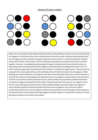
Above are some possible colourpalletcombinationsthatIcouldpossiblyuse whenitcomesroundtomaking
my magazine.Ihave chosenthese colourcombinationsinthe aimtocreate a colourful yetprofessional look
for mymagazine sothat it attracts the target marketand intereststhem.InmypreliminaryworkIusedthe
colourpalletof black,redand white.Ifelthislookedparticulargoodinthe waythe three colourscombine
together.However,Iamedgingtowardskeepingthe magazine usingthe basicblackandwhite coloursas
theybothgo witheverythingandmake the magazine lookprofessional,butaddingathirdcolourintoit so
that itmakesthe page brightand attractive forthe readerso itmatchesmy target market. That my resultme
ingoingfor the colourpalate of blue,white andblackasthiswill addthisdimensiontomymagazine.When
decidingonmycolourshame for mymagazine I will take intoconsiderationof the colourscheme theoriesso
that that the coloursmix well togetherandmake elementsof mymagazine standoutwhere Iwantthemtoo.
I feel the colourpalletsof white,blackandred,blue,white andblack,blue andwhite andblackandyellow
will make mymagazine lookvibrantforthe readerif Idecide togo downthat route for my magazine.Also,I
feel the colourpalletsgrey,blackandwhite,white andblackandgreyand blackwill give mymagazine a
sense of professionalismif Idecide togodownthat theme formymagazine.ButI will have totake in
considerationthatthe theme of mymagazine isElectronicDance Music,where the targetmarketisbetween
16 yearsto 30 years sofor people of thisage categoryto buythe magazine itneedstobe exciting.Thiscould
persuade me togo for the vibrantcolourpallets.