
Recommended
More Related Content
Similar to Digipak analysis saturdays
Similar to Digipak analysis saturdays (20)
Recently uploaded
Recently uploaded (20)
Digipak analysis saturdays
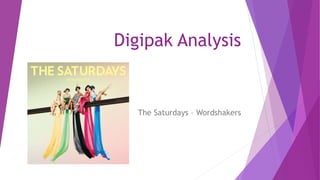
- 1. Digipak Analysis The Saturdays – Wordshakers
- 2. Front Cover • The Front cover is somewhat simple and minimalistic only featuring the artists : Molly, Uma, Rochelle, Vanessa and Frankie. • This therefore allows the artists to be emphasised this also conveys as they are all wearing bright colours which makes them stand out from the rather plain grey background.
- 3. Front cover continued … Furthermore the clothes that they are wearing shows off the sex appeal of the women as they are all showing off their legs and posing seductively. The simple writing I also like as it doesn’t make the front cover look ‘cheesy’ or overcrowded. However the light yellow colour is somewhat difficult to see and may not draw audiences in very well.
- 4. Back Cover • The back cover like the front cover is also simplistic and I think effective in catching someone’s attention. • This image has been taken from the front cover image and shows the bottom parts of the groups flowing dresses. I like the colours however I think that it doesn’t convey the group themselves and their image as artists. • However I do like the positioning of the text at the bottom of the layout as it flows with the image rather than clashing with it.