1. Self-assessment of Contents Page
Does this look like a professional contents page?
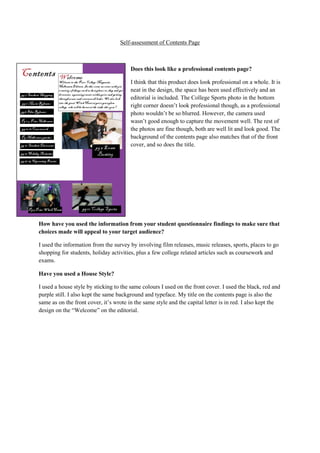
I think that this product does look professional on a whole. It is
neat in the design, the space has been used effectively and an
editorial is included. The College Sports photo in the bottom
right corner doesn’t look professional though, as a professional
photo wouldn’t be so blurred. However, the camera used
wasn’t good enough to capture the movement well. The rest of
the photos are fine though, both are well lit and look good. The
background of the contents page also matches that of the front
cover, and so does the title.
How have you used the information from your student questionnaire findings to make sure that
choices made will appeal to your target audience?
I used the information from the survey by involving film releases, music releases, sports, places to go
shopping for students, holiday activities, plus a few college related articles such as coursework and
exams.
Have you used a House Style?
I used a house style by sticking to the same colours I used on the front cover. I used the black, red and
purple still. I also kept the same background and typeface. My title on the contents page is also the
same as on the front cover, it’s wrote in the same style and the capital letter is in red. I also kept the
design on the “Welcome” on the editorial.