
Recommended
More Related Content
What's hot
What's hot (15)
Similar to Futuristic dance artist's album cover design emphasizing power and individuality
Similar to Futuristic dance artist's album cover design emphasizing power and individuality (20)
More from George_Mugglestone
More from George_Mugglestone (20)
Recently uploaded
Recently uploaded (20)
Futuristic dance artist's album cover design emphasizing power and individuality
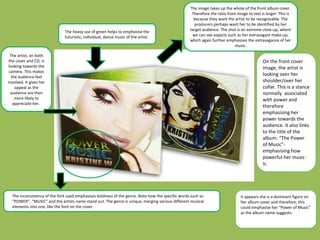
- 1. The heavy use of green helps to emphasise the futuristic, individual, dance music of the artist. The inconsistency of the font used emphasises boldness of the genre. Note how the specific words such as “POWER”, “MUSIC” and the artists name stand out. The genre is unique, merging various different musical elements into one, like the font on the cover. The image takes up the whole of the front album cover. Therefore the ratio from image to text is larger. This is because they want the artist to be recognisable. The producers perhaps want her to be identified by her target audience. The shot is an extreme close-up, where we can see aspects such as her extravagant make-up; which again further emphasises the extravagance of her music. The artist, on both the cover and CD, is looking towards the camera. This makes the audience feel involved. It gives her appeal as the audience are then more likely to appreciate her. On the front cover image, the artist is looking over her shoulder/over her collar. This is a stance normally associated with power and therefore emphasising her power towards the audience. It also links to the title of the album: “The Power of Music”- emphasising how powerful her music is. It appears she is a dominant figure on her album cover and therefore, this could emphasise her “Power of Music” as the album name suggests.