

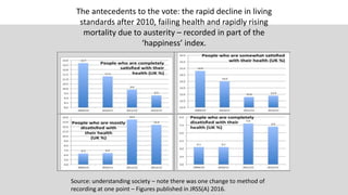


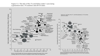
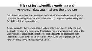
![What happens if we update the inequality
data from 2010 to 2015?
Country by 2015
(real 90:10 ratio)
Income
Inequality
United States 20.3
Singapore 18.5
Israel 17.4
United Kingdom 17.4
Canada 14.5
Spain 13.6
Greece 12.7
Italy 11.3
Ireland 11.1
Germany 10.4
Portugal 10.1
South Korea 10.1
Finland 9.2
Australia 8.8
Netherlands 8.6
New Zealand 8.2
France 7.4
Japan 7.3
Austria 7.0
Switzerland 6.7
Sweden 6.3
Norway 6.2
Belgium 5.9
Slovenia 5.5
Denmark 5.2
The small print
The richest 25 countries in the world in 2009
with populations over 1 million. According to
the IMF's World Economic Outlook Database,
April 2015, this category would now include
Kuwait, UAE, Hong Kong and Qatar in place of
Slovenia, Greece, Portugal and Spain.
Luxembourg, Iceland and San Marino are not
included given populations below 1 million.
Income is now disposable household income:
income from wages, self-employment and
capital, plus social transfers, minus direct taxes
paid. Household income is adjusted
(‘equivalised’) to take account of the amount of
scale economies that different sizes of
households can achieve. [In chart one it is more
crude].
Both the New York Times Income Distribution
Database and OECD Income Database divide all
income components by the square root of the
number of household members.](https://image.slidesharecdn.com/dannytalking15thnovember-171226163542/85/Social-Inequalities-19-320.jpg)

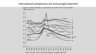
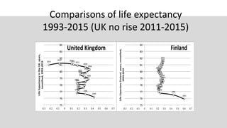
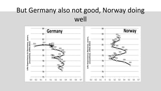
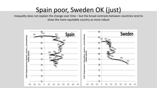
The document discusses social inequalities in the UK, emphasizing how economic factors and policies have led to a decline in living standards, particularly after austerity measures following 2010. It highlights the correlation between income inequality, health outcomes, and populist voting patterns, showcasing life expectancy trends and international comparisons. Additionally, it points out that rising inequality affects societal trust and understanding, ultimately impacting educational and economic outcomes.


