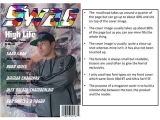
1. • The masthead takes up around a quarter of
the page but can go up to about 40% and sits
on top of the cover image.
• The cover image usually takes up about 80%
of the page but as you can see mine fills the
whole thing.
• The cover image is usually quite a close-up
shot whereas mine isn’t, it has also not been
touched up.
• The barcode is always small but readable,
teasers are used often to give the feel of
exclusivity.
• I only used two font types on my front cover
which were Sonic XBd BT and Ultra Serif SF.
• The purpose of a magazine cover is to build a
relationship between the text, the product
and the reader.
2. • I followed conventions by columning my
text on the DPS.
• I used one background image with two
main focuses and another image that
linked in the text.
• Three different font types were used
which were Incised901 Bd BT, Sonic XBd
BT, Ultra Serif SF.
• My heading and sub-heading stand first,
the images and font used go together to
suggest genre and character.
• My QA format enables readers to get to
know the artist and more get to grips
with the magazine itself.
• My magazine name is on each page to
keep promoting it.
• A teaser has been added and the writing
suggests that the reader is finding out
things that only the artist's inner circle
would know.
3. • The combination of regular items and
features meets audience expectations.
• I have a range of medium shots and long
shots.
• Folios on images so that most popular
artists are easy.
• Shows the amount of pages which
according to audience research is
expected of a weekly music magazine.
• Contents page includes name of
magazine quite big at the top.
• Contents page follows codes and
conventions as it’s just one page.
• The range of artists used enables readers
to familiarise themselves with more
artists associated with the magazine and
that genre.
• The contents page shows that the
magazine has music reviews, gig
guides, exclusive interviews, new acts
and opinions on musical taste.