1. Oliver Jeffers this a picture from the
book how to catch a star
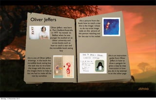
this is the image i chose
Oliver Jeffers was born to do my artist image
in Port Hedland Australia style on this picture of
in 1977 he moved to the person reaching out
Belfast when he was for the star in his rocket
younger he studied art at
Ulster university and
wrote books such as
how to catch a star and
the incredible book eating
boy
this is an instruction
this is one of Oliver Jeffers guide from Oliver
drawings in the book the Jeffers in how to
incredible book eating boy draw a penguin he
the task was to re-create gives a step by step
the image with the some instruction in how
the images there to help us you do it my attempt
but we had to make all the is on the other page
rest by ourselves
Monday, 12 November 2012
2. this is my drawing of the how to
Oliver Jeffers work catch a star book i created my artist
image sketch i got the original
this is a picture of the image and placed it on photoshop so
boy i had to colour in i could use the eye dropper tool to
on photoshop i had to copy the image colour and use in
multiply the layers to my image the process was quite hard
get colour in the image trying to get where the colour meet
and then trying to each other and trying to blend the
match the colours that image the rocket was quite straight
are shown in the book forward to make i gridded both of
zooming into the image the images so i could get the rocket
to get a fine line i the right place the image is still
colouring of the image incomplete
i like how i got the
colours and not this the final project i did for the Oliver
overlapping any of the Jeffers portfolio we had to create a page
background form his book the incredible book
eating boy this is the final project
together the task was to create the
this is an image i had to draw of Oliver image on blog website with some the
Jeffers penguin i had to draw from the images there for us or we had to
guide he gives in the guardian following complete the rest of the image and then
the step by step guide i created the place the image on the final photoshop
penguin following this the image is a bit master the image required a lot of tools
jagged but i am quite pleased with the such as the eyedropper tool paint
outcome i had to change the opacity to bucket zooming in images creating new
get different colours to fit with the layers and renaming them getting the
image such as the shadow and the image in the right place the best one
orange bit on his chest layer is the boy eating the book it came
out perfectly
Monday, 12 November 2012
3. Eric Carle this a book i also enjoyed
when i was younger and it
was Brown, Brown bear,
Born in Syracuse, New York, in 1929, Eric
Carle moved with his parents to Germany what do you see i had a go
when he was six years old; he was and drawing the front
educated there, and graduated from the cover a s my artist image
prestigious art school, the Akademie der sketch
bildenden Künste, in Stuttgart. But his
dream was always to return to America,
the land of his happiest childhood
memories. So, in 1952, with a fine
portfolio in hand and forty dollars in his
pocket, he arrived in New York. Soon he
found a job as a graphic designer in the
promotion department of The New York
Times. this is my image of a Hungry Caterpillar by Eric Carle the task was to
make my own by first creating round circles and just getting the shape of
this is no doubtfully Eric the caterpillar we then added some different colours as it like in the
Carle most famous piece of image after that i added the head again making a circle with the shape
tool after that i then added some detail to the image making the ears
work the Hungry purple and then adding the feet the yellow outline was made quick
Caterpillar that always well selecting the image and then just highlighting the outside line i got then
known to children and extend the line a bit and clour in only the area that was selected i then
added the eyes and mouth ti am most pleased with the feet because i
most adults well be very really looked closely at them and then copied the colour patern
familiar to this book and i
had a go and re-creating the
image on photoshop
Monday, 12 November 2012
4. this is my name in my own font the idea of once the letter is on the grid the layer had to be
this writing task was to make are font on multiplied so that it doesn’t overlap the grid lines
paper so we could create are own name and makes it easier to line up the text to fit in
in a style we would like we first had to the box provided i had to do this for all the text
make the guide lines with two lines at the but after it was done i had a full alphabet in place
top and two at the bottom at the same with 0 to 9 in place the grid is complete as you
distance apart with that we use the guides can see below.
to where we want the letter to go and this is my alphabet text again but this time i had to spell Media
also show where they will end at so if the National with the letters on a blank piece of paper on photoshop it
letter starts at the top it would finish at required the same task as the alphabet grid by copying the text from
the third line and if started at the second the scanned image of my text and then placing the letters in the
it would go to the bottom or if the letter middle for the first time i had to use more the same letters twice but
was an a or e in lower case then it fit in it doesn’t make a lot of difference as you still keep the letters from
the middle of the page as it does not have the other page i put all the letters in middle with National starting
a tip that goes over or under the line. closer to the edge and nearer the edge to make it look better and
with my alphabet and number text done and now not start at the same place with National going near the edge. there
uploaded to my computer i can now place the text was some letters overlapping the other text so i had to multiply all
into a new file by copying all the text and numbers the layers so they don’t overlap
into a grid with the original text on them. i had to
the next task was to get the text and then put it on a sketchpad i first had to find an image online of a
get the grid from the posterous website but i
blank sketchpad and i found the perfect one it had a pencil in the corner but it makes it look like that the
couldn’t download the link straight from it so i had
text has just been put on so it makes it a great effect. instead of copying and pasting from the scanned
to copy the image and then open the image in
image i kept the previous work which was the Media National work i merged all the layers together so
Photoshop once that was done i could then open
that it became just one layer and then i could just drag layer and then place the layer into the sketch pad
my text that i acquired from Nick and now i placed
at first the text was huge and overlapped the sketchbook so i had command t and make the text smaller
in photoshop from there using the text box i could
and then had to make the sketchpad on top of the text and then multiply the layer and then place the text
using command c copy the image and then clicking
which i put it and the top and then placed at the side to make the image look like it had been written by
on the grid using command v i could copy the
pencil with the pencil at the side looking like it had just been used.
image
Monday, 12 November 2012
5. had to start doodling on photoshop just to make a
background image pattern and then crop a bit of the image that i
liked and then start to colour the image only using
4 colours i used green, yellow,red and purple
leaving the spiral white after colouring the images i
added a stain glass effect that added red lines and i
made the colours from the middle lighter almost
turning white to the colours from the edge normal
with some colours overlapping each other in the
picture after we done that we then had to copy
the image and then flip the image to match the
otherside and keep doing this until the image size
is 2000x2000
i am very pleased with my image and makes look
very tripy and cool and best i feel was that the
corner of all 4 make a star which really works well
across the image and i really like that the image with
the stain glass effect i added after colouring the
image overall i am pleased with this picture and is
now the background n the desktop
Monday, 12 November 2012
6. Rosie Ball study
Rosie Ball is an ex long road student who went
as the picture shows Rosie makes the scene out of cardboard show
she can see the image from different angles and start the
storyboarding as well the images will show what the person can see
to the University of Norwich college of arts to and how she will want to design the game level with this in mind she
talk about her recently nominated for a bafta for can get the idea of how it will work in the Ipad for the gamer to see
her game tick tock toys which won the 2011 the cardboard does go into great detail as she says on her video that
dare to be digital competition. she studied games it really helps me to develop where i want my detailed images and to
art and design BA hons of where she extended see the image from multiple angles in the shot for the ipad or ipod
her knowledge of the gaming industry in her the picture above shows her shop for the game sweet land that she
winning game tick tock toys her role was to be made for her project in university and you can start to see that the
the 2D artist and the lead UI which meant she game doesn’t use a lot colour and it’s going to be a dark game and
was doing all the designing and drawing of the focuses on the main area of the game for the gamer to see when they
game are playing
once the design is done she then moves into the layout of the game onto
the ipad she has to make sure the image she is working with fits into the
screen and whats it to be in the right area for the gamer to see and
make sure that the game is easy for the gamer to understand and to
understand the rules and controls of the game and not getting confused
to make her game Rosie has to first sketch out the idea of her game
by how the game works it must be clear to her and to the player as well
and to get the detail of what she is going to make and how the game is
as her.
going to work she needs to design her characters how the scenes are
do work outside of school as this help will increase your confidence and
going to look like and then show how the game play is going to work
skill for future work
and how the player is going to understand this as well once she has
it’s good to be ambitious it might help with thinking of new ideas to work with
completed this stage she then can start going into detail of the game.
Don’t lose track of what you want to learn in your final year as
the game she made in university she had to make a flow chart so she
there are a lot of
can keep track of where she is and how the game process will work for
her to make the game successful
Monday, 12 November 2012
7. Tony Blair Portrait after making the face which i was very disappointed about i
this is a portrait of Tony Blair wanted to try again but this time just to focus on the face of Tony
my task was to make to copy of Blair firs t of all i gridded the original picture and put on the
this image but only cropping an rulers and the same on the new image so i could see where the
area of the image i liked the face starts and finish and the same for when it came to drawing
image because he just uses the the eyes, ears, mouth and nose this made the process so much
a blue colour for the whole easier to draw the picture above is the final result and i am very
image apart form the face but happy with this picture this really is the best piece i have done on
he makes the image around Tony photoshop the image i feel really looks like the real image and is so
blair stand out to get the main much better than the first image i draw for the whole image in
focus on him and really captures future i will work with grids as this made it so much easier to draw
the expression on his face and and see where the image lines up against the original image
the rose on his suit is drawn in
great detail on the design of the
rose
this is my first attempt at the
image at first i had a go at
drawing the whole picture i felt
that i got the body correct but
the problem was his face it
really didn’t go as i wanted it to
do so i felt that i could could do
the face again but just cropping
the face .
Monday, 12 November 2012
8. Comic strip
this is the second strip of the comics we made and we uploaded the
scaned image to photoshop and from there we strated to make the
image look more cleaner and much more presentable using
photoshop we could zoom in to the picture and from there we
this is the first piece of my comic strip that i made using a collage of could see where the image looks untidy due to the photocopier not
images from google but we had to use images that were allowed to be picking it up. when we zoomed we could see the black ink with lots
modified so we had to go to google images advanced search and then of grains so we needed to get rid of the the grains first of all though
and click on only images labeled for reuse only and we could search to we had to get rid of the grey outline of the black ink so clicking on
see what i could use for my comic there would be a few images that are the image at the top and then clicking on gradient we could move
relevant to use all the others are not even close to what you type in the the white colours to make the black ink stand out more and get a
search engine. the first piece i started with was the wall to get the clearer image of what was needed to be done. once we had that
background. the second step i took was to add the wooden floor so i done we could start to make the image look more better frst we
could get the balance between the floor and the wall after these were tried using the mouseboard and then went on to use the tablets
done i could go into detail of the room starting with the bed i took the which made it so much more easier to use for me and we
image and then using the quick selection tool starting from the inside i could draw a stright line just using one hand instead trying to control
could get the outline of the bed and delete the background and then the brush with two hands and keeping a steady balance. once we
place the bed in the comic strip making sure that the layer was on top gone over the detail parts that needed updating after that. i made the
of the floor and wall so it would not disappear into the background. i layer to go to multiply and then locked the layer and created a new
added the chest of draws in this was an easier picture to get out as it layer which i could use to colour in the image and ake it more like a
had no detail in the background so it was simple cut out into the comic comic strip i then started to colour in the whole image and now
strip. After that i added the alarm clock i couldn’t find the image i makes the image look so much more better and easier to look at for
wanted so had to get a picture of a slightly blurred image and had to cut the reader. i can also created shadows of some of the objects by
out the blurry parts of the image. once i had all the parts into the comic using darker colours it can stand out more the project is complete
i had to place the images into the right place and making sure that the and ready to be put in with the others for the comic strip for the
layers dont overlap each over and fit into the right places whole project
Monday, 12 November 2012
9. white lies
drawing of a little
The Hobbit this is my first
over I used was fr
om the
front cover the c front cover
Little White Lies Cover Darjeling li mited I chose the
tched the film befo
re but also I
because I wa face as
ings in Owen Wilsons
really like the shad also makes
it makes it look more creative and
ht that
rougher to highlig
his face look more strator
be en in a fight. the illu
the character has any other
is Paul Willoug hby he has done m
does other
little white lies covers but he also
s that he
nd other magazine
work for himself a oes film
has done as well he normally d
based on
magazines and often his work are
for this project I had to create a Little White Lies cover
for the film The Hobbit. to do this I first had a go at actors.
drawing on Photoshop the cover for the
Darjeeling Limited film of Owen Wilson the Cover was
created by the illustrator Paul
Willoughby. the picture on other page is my unfinished
app tempt of the cover
Monday, 12 November 2012
10. be
he band ages would
Little White Lies Cover continue where th e start of t bandages t
hat are
so I knew other
to create the picture I got the image and then create nes t o show the e the depth of the
I add the la first lot to creat d the
a new A4 sheet and then lined the two up together
on top of the drawn I then adde
and then put the grid on the images so I knew where image. with th e bandages e the mouth is on
nd wer lines to
I needed to draw I first used a thin brush on a setting hair that comes arou orward hand drawn
tf etail
of 6 I then started to get the shape of his head first I well straigh he has with all the d
picture as ir that picture
stopped at the point of were the bandages are show t he curly ha d the colour to the
ad ool to
because I wanted to add them later as they were the done I c ould then used th e palette t g all
br ush tool I r the p icture addin
more detailed part of the drawing. I went to draw using paint I wanted fo ead.
olours
the mouth and the eyes which were no real s elect the c d the dot on his h
s an
problems but the hardest part was drawing the nose the colour that
I have never really been that good at drawing noses it age the only things o be
took many attempts to get the shape right. looking e mo st of the im neck which needs t
I have don lete are th
e
wider and
the
back at now this is something I really need to work comp k more
need to be th e head loo ad. this
on in the future of this project as it will really affect
in more as it makes t goes around his he
ge tha tes to
the drawing.
top o f the banda er than twenty minu
no long
with the nose finally done I then started to add the s hould take
bandages and the scuffs on the face it started to create complete
more detail on the picture the black marks i used a very
thin brush to create the scuffs and the bandages i also
made light black lines on the plaster to show where the
middle was. the next part was making the bandages
around the head earlier I had stopped the head around
half way.
Monday, 12 November 2012
11. The Hobbit Themes
With the first app tempt of a little white lies cover
done I could now look at the Hobbit trailer to
understand what the themes of the film need to be like
for the cover for this I took screen grabs from the
trailer and then explain about the themes in the film
that the viewer needs to know and how i can use this
for my project The second image shows a very dark cave the only
source of light is coming from Gandalf’s orb on the
end of his mast the setting is very narrow with a
small path way being the only visible object that you
can see the theme of the image is more dark and
suspense the audience know that the character is
walking into the unknown and the theme of the
the image shows a rural peaceful setting the mood of
image is to shows with the very narrow and barely
the image is very relaxed the characters show to be in
visible image. the mood of the image is very tense as
engaging mood talking to each other as family you can
we can not see what is in front of Gandalf and the
see the setting is very rural and has a lot of wildlife
audience would start to expect something is going to
built up around such as the tress and the over grown
happen. it sets the mood well for the film. the shot is
shrubs that have grown over the homes of the hobbits
from above so it like someone is watching him.
in the background see a blue sky and glorious green
hills in the background to show the audience a very
relaxed setting. the bright colours show the audience
that it is a very relaxed setting.
Monday, 12 November 2012
12. create a
n e I then went on to
with the themes do tanding
e ho bbit to get a unders
mood board for th gain some ideas of
what
also the
of the themes and eds to be
and know what ne
I am going to draw represent
je ct the bottom half
included for the pro the top
the ir background and
the characters and ay and the
half show the dangers that are in w
evil
characters that are
the final image we can see again is in the cave but the
exit of the cave we the character standing at the exit
and the other characters sitting around the camp fire.
the dark setting makes it again very tense for the
audience to watch but the difference is it looks like we
are seeing the characters from someone else’s
perspective to get the audience to know that
someone is watching them and this keeps the viewer
engaged to know who is the person or thing that is
watching it creates a very tense atmosphere the
visibility is hard to see but the main people who we
are meant to be focusing on are clearly the characters
for the audience to be looking at.
Monday, 12 November 2012
13. Hobbit Drawin
gs Thorin
With the Mood board done I could then move
onto ideas for the final cover. I did this by creating
the rough idea’s on paper using the style of Paul
willoughby I tried to create a drawing of Thorin by
creating multiple rough sketches of the figure of
him holding his bow and arrow to the middle of
the frame which I was going to make the main
focus point of the image as well as his face as it
rawn of
brings something different to view at and also it pts I h ad quickly d
creates a more interesting picture to view the first app tem k like the final product
these were them loo head
Thorin Fa ce none of get the s hape of the
as trying to ings
sIw will see w ith the draw
but that wa ight as you detailed
and the h air look r ey are much more
lfi nal image th
of the actua
Monday, 12 November 2012
14. More Hobbit Drawings
these are some more drawings of Thorin that have
done to help to get the final image perfectly these are
very basic drawings but these are the start to help
me create the final piece. the point of drawing these
quick drawings was to get the basic outline done for
the project later on
these are some of the earlier work I did of
other characters I thought of doing Before
deciding on drawing Thorin very basic drawing
very quick and rough with no detail at all these
were just the basic images that were done
within 2 minutes for each drawing of the
characters
Monday, 12 November 2012
15. Detailed images
look
ted to t he class to
image th at I presen as you can
see the
this was th
e image. he is
This picture is a more detailed im feedb ack on the st image and ore
age of Thorin but
it still wasn’t the final drawing I wa at then give w is lower than the la have added m
ro I
s going to make bow and ar t like a pose in a way ns on
of him you can see much like the
final version the righ oat an d the patte add
positioning of him is the same and standing up ith his fur c hing that I didn’t
image w
the bow and de tail to the is arrow th
e only t on the
arrow all so included in the image
the face was still d on h te d to focus
not up to the standard that I want the bow an round because I wan ground wh
en I
g back
ed for the final was a back I would focus on the
image at r on
im age itself th me to that stage late
ca
Monday, 12 November 2012
16. Feedback for pictures
e these
re partic ularly effectiv
for the A spects that a id Well positioned, Nice
after completing my Little white lies front cover draft t are sa otion,
are t he things tha brows p ortraying em
the class went around writing down their thoughts on of detail, Eye to the
inking , lots detail, t he attention
the piece paper that was next to them the area's that , attention to ive, I like the shading on
the question answered were is the cover suitable for The posture e effect
patterns make it mor
a Real little white lies cover, Aspects that you think arms.
are particularly effective in the cover and Aspects that the bow and
could be Developed or improved. these are the
responses for my front cover that I drew. that
tention t o the detail
se respons es are pay at e feel that th
e picture
the makes m portray
I hav e put into a er that is to
have r a cov
for the first heading the responses were Good body
is much mo re effective fo pleased about and the
am very best of
shot and the the dress and patterns relate to the
th e ho bbit which I ring out the
at will b
hobbit well the responses gives me a good feeling that I
detail is something th e right notes
for a
ve hit th
have targeted the Hobbit theme these were the main
this work so I ha
ver.
theme for that response
succe ssful front co
Monday, 12 November 2012
17. Feedback Continued
l project
for the final aspects that could be developed or ot me think ing for the fina
th e notes have g r a project if I
need to
improved the things that were said are More detail good fo
which is always age more
in the face, the fingers don't look realistic and some ing to make the im
change someth comments hav
e also
background detail this comment was most common reader the e which
effective to the about the imag
od things
I will add a background for the project because in
hig hlighted the go be used for the
final
is going to
the earlier sketches I did do trees in the
is something that
background which makes the image look more shop
work on photo
intense.
the detail in the face is something I will look into if i
used colour it will be very different and their I can
add detail to the face afterwards. the last one was
the fingers don't look realistic which is something
of a weak point of my drawing much like noses it
will be something I will have to practice to make
the image look more realistic
Monday, 12 November 2012
18. Paul Willougbh hite L ies cover t
hat he’s
y
e
the two Little W es are almost the sam
looking at pictur
Little white lie an see the the face of
done you c hat the main focus is s like in the
the
s cove rs in the way
t
ter but we
don’t see the
eye
ed by the
hat and
charac e cover ne
ere the eyes ar he same in the first o
lawless w ay as t the
at is the w t they keep e it
the text th yes bu
er up the e w to the audienc
cov
the classes to sho ut the
emes of a cover ing to do b
main th hing that I
was go o make
was so met d an ba ckground t
wou ld be to ad re authentic
difference ok mo
t he image lo
before I started to draw the final product on Photoshop
I wanted to draw the character in the style of Paul
Willougbhy because he mainly focuses on the face of
the character and it being the main theme of the work
which was something I wanted to do for this project so
I had a look at his work and also looking back at the
work of Owen willson that I had done it something that
I was keen on doing for the project so I had a little look
into his work to see what ideas I could take from him
Monday, 12 November 2012
19. Draft Photosh
op piece
Paul Willoughb
y
Before drawing the final image on Photos
hop in
the style of Paul Willoughby before I sta
rted my
final project. I drew a dragon from a image
I found
from Google and then decided to to cre
ate to
give myself an Idea of what I was going
to do to
create the final image . this is the image
that I
drew on photoshop
hotoshop
e dragon t hat I drew on P
the image of th nfidence
T his is ing at it ga ve me great co
’s unfin ished but look also to high qu
ality
it bstract and
t o crea te something a r in this projec
t the
aiming fo
level of dra wing which I am t position and
the picture
in the righ out the
facial features are all t I like most ab
ragon. wha akes the
looks like an actual d und the eye m
detail aro
age is t hat the eye the the image a mo
re of
im hich gives
ima ge sta nd out more w to have for the
final
at I want
an edge this is something th
project.
Monday, 12 November 2012
20. logo work
With all the rough idea’s
final drawings finished an
already having a go at dr d
awing a image on photo
I now could start my littl shop
e white lies cover of Tho
do to this I needed to ha rin
ve the little white lies lo
on the magazine so gett go
ing the logo I then placed
to were it should be. the it
first thing that I started
was the Hobbit text beca on
use I had an idea of usin
the actual Hobbit Desig g
n I created this by draw
and then adding at the bo ing it
ttom Issue I felt it kept to
the The Hobbit theme fo
r the cover that I was
designing
got
d for the final piece I
is the text that I create ecause I felt
it would
This al film B mething
age fr om the actu would be so
the im cause it keeps
ll on the image be image and it
work we hten up a ve
ry dark
ell on the
that would brig which w orks very w
to the H obbit theme
final piece
Monday, 12 November 2012
21. Process of making etail done I could then st
art to get
the w ith the all the d
detail on the b
ody to ex act specificatio
ns that I
to the colourin
g in of
image the
want ed them to be
moving on
k time but then I could se
e if I
the d etail which too es on the body
or any of
any chang
to start creating th
e image I first put n eeded to make at he uses in th
e picture.
th
know where I can the guides on to the equipment
line up my image fo h the
drawing with that
done I then starte
r to start
take a whil e to do but wit
head which was th d on drawing the The colours would that I needed s
omething
e centre point of th at I knew em real
the little white lies e project with hair and fur co oat and hair se
logo already in Pla e the fur c pacity
would overlap the ce i knew that it t hat would mak lines with the o
head so I had to m int white
head was still even ake sure the doin g this I added fa ter colour so it
made
so I made the Log ate a ligh
o transparent to down so it would cre ctive
see where the hea
d joined up. the im age more distin
with the head don
e I moved onto th
body. with the outl e outline of the
ine done I could th
the basic outlines en start getting
of the shields and
the outline of the the fur coat and
bow and arrow
Monday, 12 November 2012
22. what
r feedback lesson to show
Process continued I th en had anothe
ed changing an
d the poin ts of what was
good
ot a good
need
stay. over all the images g
and needed to ound as
nly problem was the backgr
view and the o rity for
with the colours and the main body complete I then re
e detail th is was the prio
moved onto the background what I wanted was it needed to mor rted to add tre
es in the
I sta
the final image t colour which
made the
trees in the background and a light colour to fill in a very fain
background in t more.
the rest of the background I start by filling in the image stand ou
trees and then decided to show where the light is
coming from some of the trees would be a different tail to
colour to the rest. n moved o n to adding de
with that done I the ic box design b
ut it was
very bas and arrow
the bow I did a ery basic bow
when I did this it was a great idea it made the picture it made a v look at
re ally effect and re creative to
stand out even more which was something I was at was mo
int o something th t the audience
would
looking for in the picture that was needed to make ething tha
and also it was som in selling point
on a little
the image stand out. I filled the background in a very is the ma re done I
look at which e touch ups we
yellow colour to complete the image this was the once thes I create
w hite lies cover. go from which
first draft completed e Hobbit lo
the n added the Th e and the final
image was
ictur
earlier to the p
complete
Monday, 12 November 2012
23. draft picture
This is not the finished version of th
e image but this
is what I came up with before I did
some minor
tweaks to this version as you can se
e the image I
have created is fantastic and could no
t be more
pleased with this as it got everything
that I wanted
from this the image shows the charac
ters detail to
from the facial features that capture
the anger you
can see on his face. to the detail that
on the bow
with the dark green patterns that go
across the bow
which I feel give the character much
more detail to
the image because the image looks
very basic with no
detail on the character and this bring
s out something
that is very noticeable I also created
some detail on
the armour as well to give out for th
e audience to
notice and study with great detail . als
o the detail on
the fingers look very impressive as th
is was a
problem that I struggled with at the
beginning the
image looks like Thorin and all the de
tail is perfect it’s
exactly how I wanted it especially th
e background as
it makes the cover look more darker
and more
daunting to look at
Monday, 12 November 2012
24. Final Cover
this is the final version of my Li
ttle White Lies cover
the difference between the first
and last is that the
their is the trees that are distin
ctly in the
background to stop making the
image look flat I
also changed the colours of the
trees in the
background to make them look
more brighter than
the first image to create a very
luminous
background for example the su
n lighting the trees
to highlight Thorin the main char
acter of the cover. I
also changed the colour of his fac
e as well to see a
little bit more brighter on appe
arance, the eyes have
also been added with a white to
uch to show where
he is looking the lines on the tr
ees have been toned
down because the white lines w
here to light so they
needed the opacity changing to
make it look more
realistic the final image which I
am so proud of
because it’s a project which I fe
lt was something
that I could create that would lo
ok like the
character that would be the mos
t authentic image
but also stick to the guidelines
of a Little White Lies
cover which was the most impo
rtant aim for this
project which I have complete us
ing the tools
provided
Monday, 12 November 2012
25. Meeting the requirements an u
of the fi lm and the m
nderstanding tart to draw out ideas fo
oods
r
with ld now s
of the brief that it shows I cou
proje ct but to sta
rt of jus t quickly ske
rawing on Th
tching
orin
the final ing on d
the task at hand was to create a illustrated piece for
characters before decid gh Little Wh
ite Lies
out w a rou in
the Hobbit for a Little White Lies cover to do this I
the task was now dra er to show what the ma
had to go through the task before hand so I could app- f A3 pap the class as
they
cover on a sheet o rward to
tempt to create a final piece. the first task was to look
idea that I a m putting fo re great and
what can
spects a tanding
at other Little White Lies covers by other illustrators. I
m ark an d say what a clear unders
ill give a
looked at Paul Willoughby as the artist that I looked
be imp roved this w r the final pr
oject.
to do fo
and in particular his drawing of Owen Wilson after what I need
the
looking at his picture I went on to have a go at
itical for me to design
drawing the picture myself to give an idea at what I
t he peer fe edback is cr earch into a
ny Little
any res k would
was going to draw for the final project.
fi nal piece if I didn’t hand the tas
k before wrong
Whit e Lie s cover wor rk would be
t the wo gain a
been complete bu sk I need to
have to the ta
e rese arch is vital hite Lies Co
vers
with the first drawing done the next task was to look at becaus Little W
t anding of the portrait the characters
the Hobbit trailer to gain an understanding of the film clear unders Film so I can e mast
and also understand the mood the film shows to do this and The Hobbit task inc orporates th
in th e righ t manor. the ed to the lev
el of
I took screenshots of the film and then describe the en follow
themes and mood of the screen shot and give a brief head the task have be ate the final
piece.
d to cre
paragraph wh ich is require
Monday, 12 November 2012