
Recommended
More Related Content
What's hot
What's hot (17)
Viewers also liked
Viewers also liked (13)
Similar to Contents Analysis
Similar to Contents Analysis (20)
Recently uploaded
Recently uploaded (20)
Contents Analysis
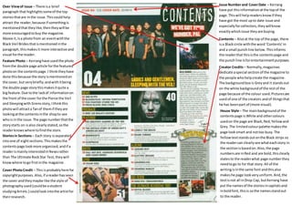
- 1. Over View of issue – There is a brief paragraph that highlights some of the top stories that are in the issue. This could help attract the reader, because if something is mentioned that they like, then they will be more encouraged to buy the magazine. Above it, is a photo from an event with the Black Veil Brides that is mentioned in the paragraph, this makes it more interactive and visual for the reader. Feature Photo – Kerrang have used the photo from the double page article for the featured photo on the contents page. I think they have done this because the story is mentioned on the cover, but very briefly; and with it being the double page story this makes it quite a big feature. Due to the lack of information on the front of the cover for the Pierce the Veil and Sleeping with Sirens story, I think this photo will attract a fan of them if they are looking at the contents in the shop to see who is in the issue. The page number that the story starts on is also clearly stated, so the reader knows where to find the story. Issue Number and Cover Date – Kerrang have put this information at the top of the page. This will help readers know if they have got the most up to date issue and especially for collectors, they will know exactly which issue they are buying. Stories in Sections – Each story is separated into one of eight sections. This makes the contents page look more organized, and if a reader is mainly interested in News rather than The Ultimate Rock Star Test, they will know where to go first in the magazine. Contents – Also at the top of the page, there is a Black circle with the word ‘Contents’ in and a small punch line below. This informs the reader that this is the contents page and the punch line is for entertainment purposes. Cover Photo Credit – This is probably here for copyright purposes. Also, if a reader has seen the cover and they maybe like the style of photography used (could be a student studying Art etc.) could look into the artist for their research. Creator Credits – Normally, magazines dedicate a special section of the magazine to the people who help create the magazine. The background box is Grey and it stands out on the white background of the rest of the page because of the colour used. Pictures are used of one of the creators and of things that he has been part of (more visual). House Style – The main background of the contents page is White and other colours used on the page are Black, Red, Yellow and Grey. The limited colour palette makes the page look smart and not too busy. The Yellow text stands out on the Black strips so the reader can clearly see what each story in the section is based on. Also, the page numbers are in Red and are bold, this clearly states to the reader what page number they need to go to for that story. All of the writing is in the same font and this also makes he page look very uniform. And, the text is not all in Drop Cap, but Kerrang have put the names of the stories in capitals and in bold font, this is so the names stand out to the reader.