Unlock the power of Instagram with SocioCosmos. Start your journey towards so...
Cover Analysis
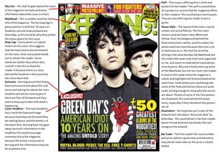
1. Sky Line – the skyline goes above the name
of the magazine normally and extra
information about the issue is in here.
Masthead – This is another word for the
title of the magazine. The Kerrang logo is
green and ties in with the ’10 years on’
headline, also the featured band are
Greenday, so this could be why they picked
the colour green for this issue.
Puff – This issue is offering free t-shirts and
posters for the reader. The puff is a promotion
of a product or service that the magazine offers
to their readers. This could attract more buyers.
They are also offering one reader to win a
guitar.
Drop Cap – Every word is in capital
letters on this cover, this suggests
that the main stories are mentioned
on the cover. And, every word stands
out to attract the reader. Some
words are bolder than others also,
‘untold’ is like this to draw the
reader in because there is a story
behind the headline in the issue that
has never been told.
Exclusive – Kerrang assure that they
have exclusive stories about the rock
scene and stating this above the main
headline will attract more buyers if
there are fans of the band and they
want to keep up to date with what is
happening.
Cover Headline – The main headline
ties in with the featured image
because Greenday are the band they
are talking about, and the photo is of
the band. Also, Kerrang have not gave
away too much information in the
headline, this could encourage
someone to buy the magazine,
because the article is exclusive to
Kerrang and the information may not
be anywhere else.
House Style – The layout of the cover is quite
simple, but very effective. The four main
colours used are Green, Red, White and
Yellow. And, the background behind the
featured picture is white, and this makes the
photo stand out more because there are a lot
of dark tones to it. The font for all of the
writing is the same besides the Masthead and
this makes the cover look smart and organised
to me, and easier to read (which could attract
more buyers). Billy Joe’s head covers up some
of the Masthead, but not too much, this makes
it clear to the reader what the magazine is
called, and highlights the featured band at the
same time. Small photos are used along side
some of the featured stories, these are quite
small, but big enough to show who the stories
are about. Photos of some of the free posters
are displayed, this could attract the buyer
more, especially if they like whom the posters
are of.
Illustration – Kerrang have put in part of the
artwork from the album ‘American Idiot’ by
Greenday. This could attract a fan that maybe
doesn’t know what the band looks like, but
recognize the artwork.
Bar Code – Tells the reader the issue number
and price, which is quite clear and therefore,
may attract more sales as the price is clearly
stated.