Human Factors of XR: Using Human Factors to Design XR Systems
Band feature spreads design
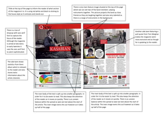
1. There is one main feature image situated at the top of the page
Tittle at the top of the page to inform the reader of what section
where we can see two of the band members playing
of the magazine it is. It is using red white and black to sticking to
instruments together. This picture projects the band as close
the house style as it contrasts and stands out.
c friends as they are laughing together and also very talented as
there is a range of instruments in the background.
There is a Use of
Another side bare featuring a
dropcap with sans serif
pull quote from Tom Meighan
font to capture the
makes the magazine seem
focus of the reader.
more exclusive and as though
Although the magazine
he is speaking to the reader.
Is aimed at late teens
to early twenties it
uses the sans serif font
to seem sophisticated.
The side bare shows
statistics from there
album which is relevant
to the reader and also
shares extra
information about the
artists interests.
The main body of the text is split up into smaller paragraphs in The main body of the text is split up into smaller paragraphs in
order for it to be easier to read. This also keeps the attention order for it to be easier to read. This also keeps the attention
of the reader as it moves on quickly. There is an uneven of the reader as it moves on quickly. There is an uneven
balance within the spread as wee see text above the start of balance within the spread as wee see text above the start of
the article. The main image evens this out however as it takes the article. The main image evens this out however as it takes
up half of the page. up half of the page.