1. More than just a lable: Wine growing, Making, Testing, Drinking, Pairing …
Example: Rooster Hill Vineyard
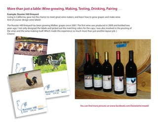
Living in California, gave me the chance to meet great wine makers, and learn how to grow grapes and make wine.
And of course: design wine labels!
The Rooster Hill Vineyard has been growing Malbec grapes since 2007. The first wine was produced in 2009 and bottled two
years ago. I not only designed the labels and picked out the matching colors for the caps, I was also involved in the pruning of
the vines and the wine-making itself. Which made this experience so much more than just another layout job :)
Cheers!
2009
750 ml 13 % alc
Rooster Hill
Malbec
2010
750 ml 13 % alc Rooster Hill
Malbec
2011
750 ml 13 % alc Rooster Hill
Malbec
You can find more pictures on www.facebook.com/DanielaVormwald
2. Logos and business-equipment: See it, feel it
Example: Medical Masages: Pavlin
I developed the complete corporate design
for the massage practice:
from the business card to the design of the
waiting room. I drew the woman with chalk on
canvas for the waiting room. The drawing is
repeated on all of the commercial documents
and was vectorized for the car and show window.
I made the gift vouchers, look and feel very valuable
by personalizing them. The customer can chose
between various papers, ribbons and
colored envelopes.
This idea for the gift vouchers
increased turnover by 20 %.
Massagepraxis Pavlin
At the beginning of my career, I worked a lot in the field of corporate design and logo development –
a time of excessive creativity and very little sleep
RED BEAR CABINS
3. Direct Mailings: Face the client
Example: grocery chain tegut
To improve customer loyalty and improve sales of
house brand products, the grocery chain estab-
lished a customer card.
Cardholders receive direct mailings containing
attractive coupons and seasonal recipes. These
recipes along with all of the important ingredients
are found at the point of sale.
Nicely arranged, with a sign pointing out the deal
for the customer card holders. Of course, an appli-
cation form is found nearby.
The designing of catalogues, brochures and flyers has been a part of my life for over 15 years now - and it’s still exciting!
During my internship at “cre art“
I was part of the team which cooked and photographed
these recipes. I guess that´s when my enthusiasm for
cooking started :)
4. Book Covers: You can count on me
Example: Das Mathematikbuch
The target group are highly intelligent teachers who
associate the word“mathematics”with strong and
bright colors!
So I picked 5 bright and friendly
colors which were good to combine.
I chose photographic motives with mathematical con-
tent and to which the students can relate.
With a thin white line I drew the mathematical topic on
the front.
Students open the book enthusiastically, because it
doensn´t look like normal“boring”mathematics!
It is a pleasure to get the feed-back:
“… my students can´t wait to open their new “Mathematikbuch …”
The book series “Das Mathematikbuch” for the classes 5 to 9.
5. Packaging & displays: Enchanting toy-worlds
Example: BABY born® miniworld
“Design an advent calender for tiny dolls.” …was the briefing I got
during my recruitment test at the advertising agency da kapo.
After years of playing with Barbie dolls and building their
doll houses out of old cardboards, it was natural for me
todesign a packaging which is“playable”.
So I started crafting …
And after a few hours, the idea for the BABY born®
miniworld packaging was born – and I was hired.
The doll packagings can be combined to one
big doll house.
The first advent calender sold out within a few
days and the calenders still are a sales hit, which
I am very proud of.
At the advertising agency „da kapo“ I became a pro on packaging, POP items, catalogs and graphic displays.