1. Review of Website
How well the product meets my original intentions:
Before starting the project I was keen to make my website look a specific way, I wanted it to be
unique and different from other websites. I wanted it to be easy to browse, nice to look at and
unique. Firstly I made each of the pages (apart from the ones which needed scrolling) single frame,
almost like a slideshow. I thought this would provide the user with an easier and more pleasant visit
to the website. Personally I really like the way this feature turned out and it meant I could put small
bite sized pieces of information onto the website as opposed to lots of irrelevant information that is
just filling up space. I was also going for a minimalist and clean look which I feel I accomplished very
well. In particular I really like the way the logo I made blends into the top bar, which then ends
before the other side of the page. As shown below:
I think this looks very nice and is something I am happy with.
Whenever I look at websites I find ones that use a theme throughout look much better as opposed
to ones that feel disjointed and mismatched. When I started out creating my website I wanted to
make sure each page matched each of the other – both in terms of font and design. This is
something that I feel I did quite well as it all feels minimalist and easy on the eyes with a similar
colour scheme throughout giving it a feel of simplicity and ease of use.
An overview of the production process:
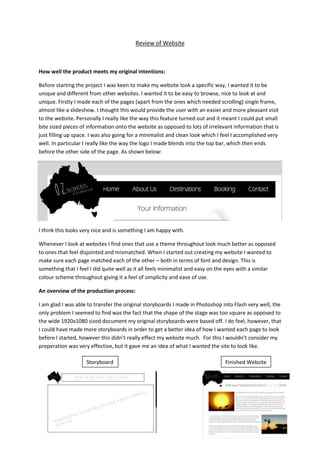
I am glad I was able to transfer the original storyboards I made in Photoshop into Flash very well, the
only problem I seemed to find was the fact that the shape of the stage was too square as opposed to
the wide 1920x1080 sized document my original storyboards were based off. I do feel, however, that
I could have made more storyboards in order to get a better idea of how I wanted each page to look
before I started, however this didn’t really effect my website much. For this I wouldn’t consider my
preperation was very effective, but it gave me an idea of what I wanted the site to look like.
Storyboard Finished Website
2. When creating the website I wanted a specific font (as seen in the storyboard) called Brain Flower. I
felt it matched the Australian theme very well and would’ve looked perfect on my website.
However, the college computers do not allow for custom fonts to be added as they require
administrator privilages in order to add them. There was only one computer in the college where I
was able to put fonts into Windows and have them succesfully remember and use them, however it
wasn’t possible to only use this computer every lesson so I had to go for another font.
The font I wanted: The font I used:
INFORMATION ABOUT
ABOUT AUSTRALIA
How well I managed time:
Luckily I took quite quickly to Flash as I had used it before which meant I could complete tasks
quickly and efficiently and meant I completed my website with lots of time to spare. I do not have
much to comment on this part of production because I think I worked fast and efficiently and was
able to get help when I found problems in Flash. So for this part I think my time management,
monitoring, work flow and meeting deadlines were good.
An evaluation of my finished product:
I think my product was very good, I am very happy with it. I feel the only way in which I would really
like to improve the product would be the use of my custom font which I was unable to add to the
finished product. If I was able to add this font throughout the website I think it would improve the
whole website. I think the only thing I need to add to the website would be the “travel tips” that
were mentioned in the brief, but this would be an easy fix and would not take long.
If I was to do another website, or start this again knowing what I know now I would definitely make
sure I did more planning beforehand in order to get a clear and consise idea of what I wanted to do
at each point in the production of the website. After doing this I think it would be easier to create
my website.