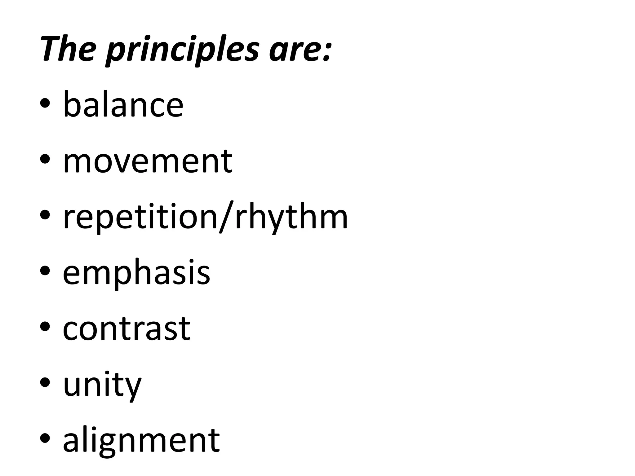
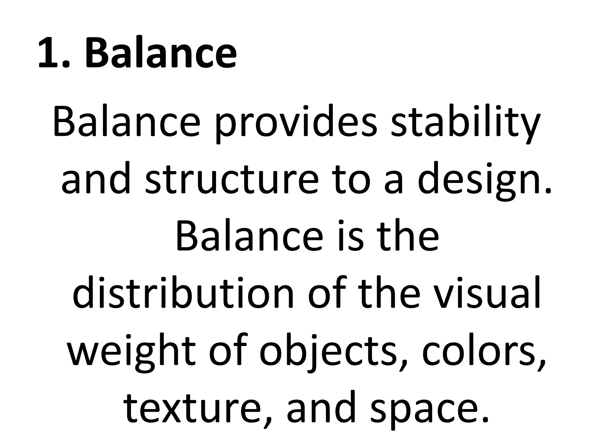
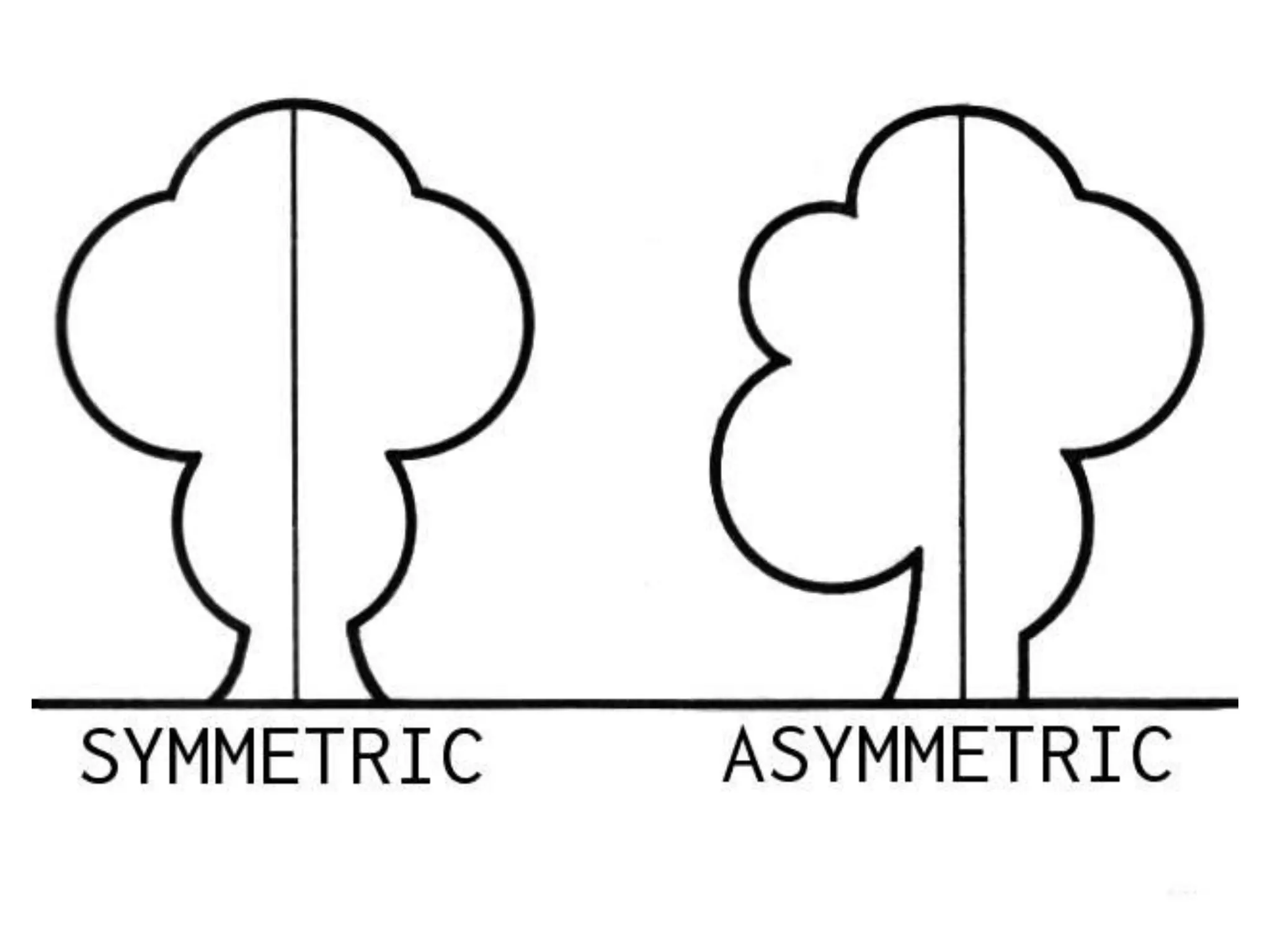
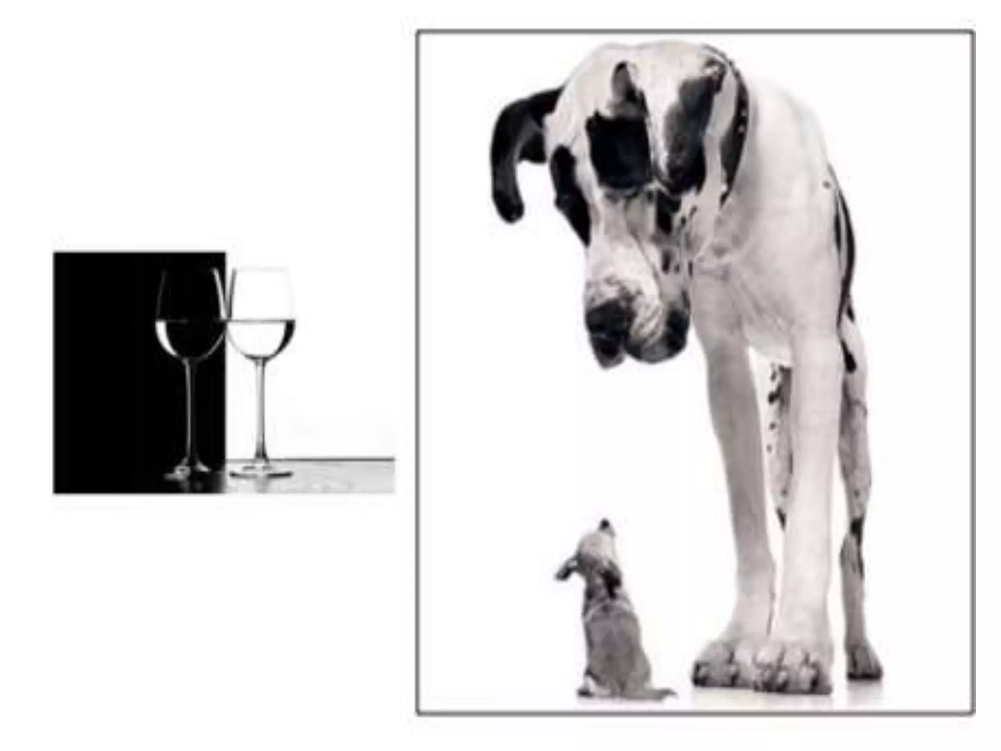
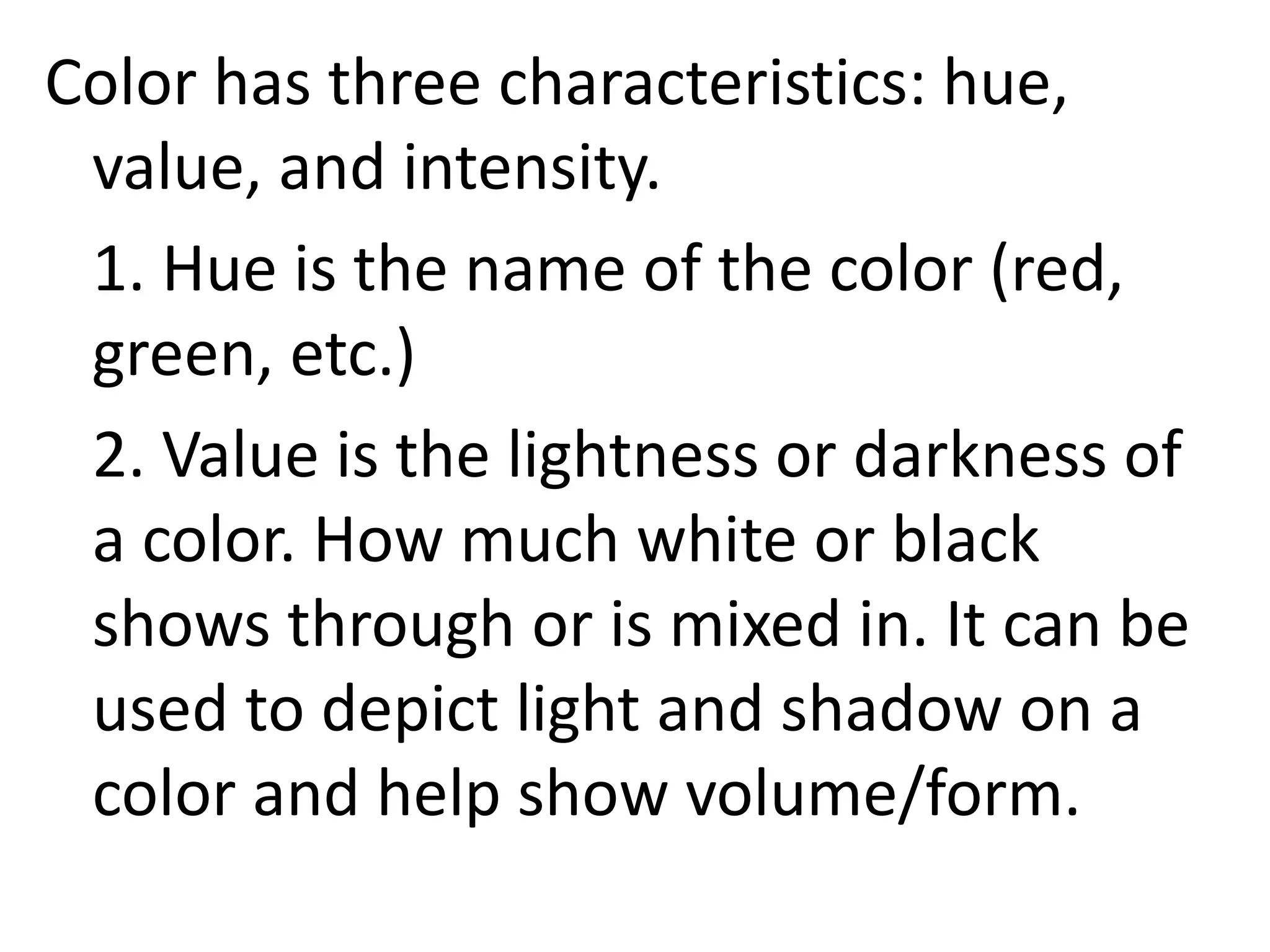
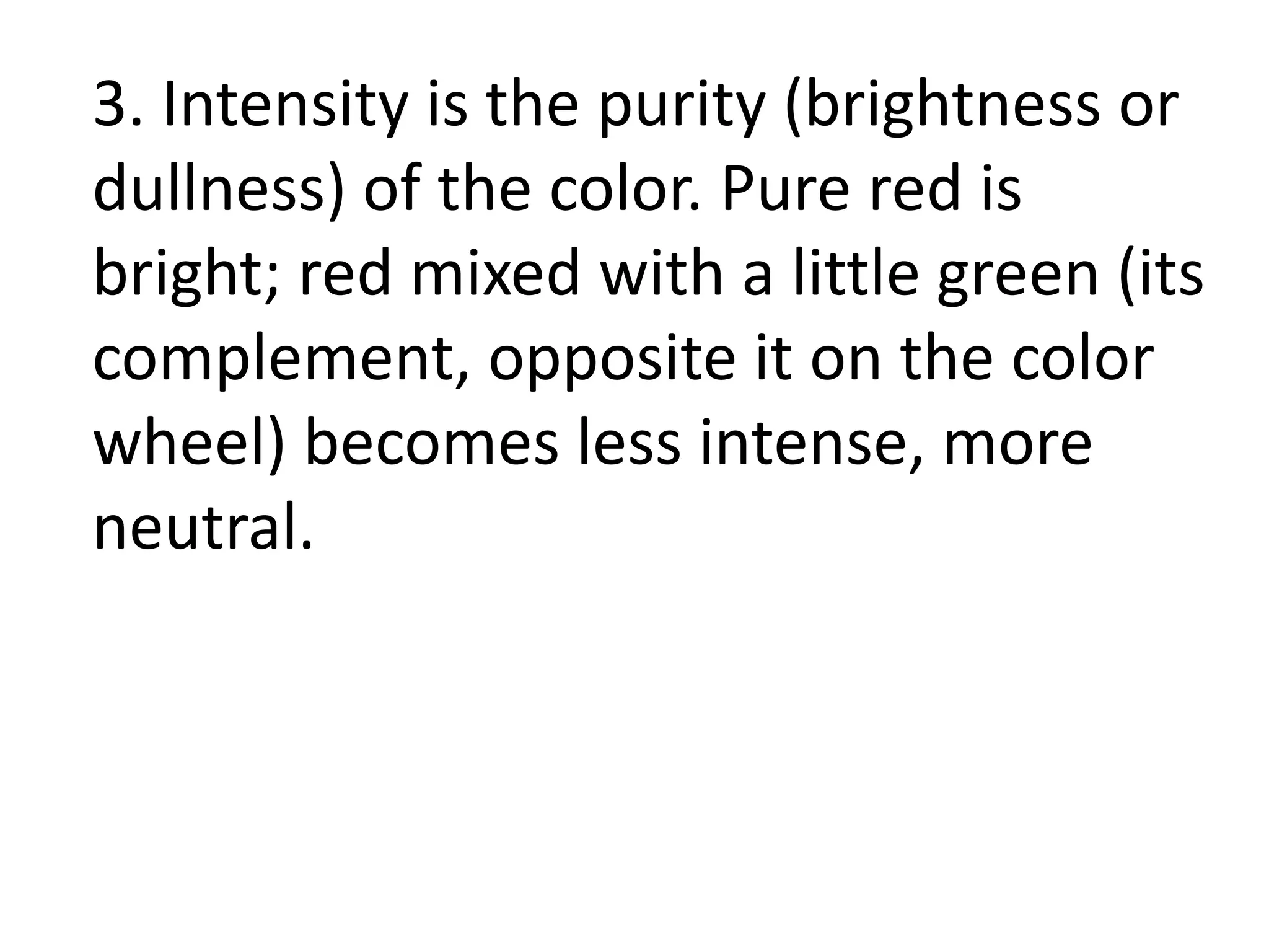
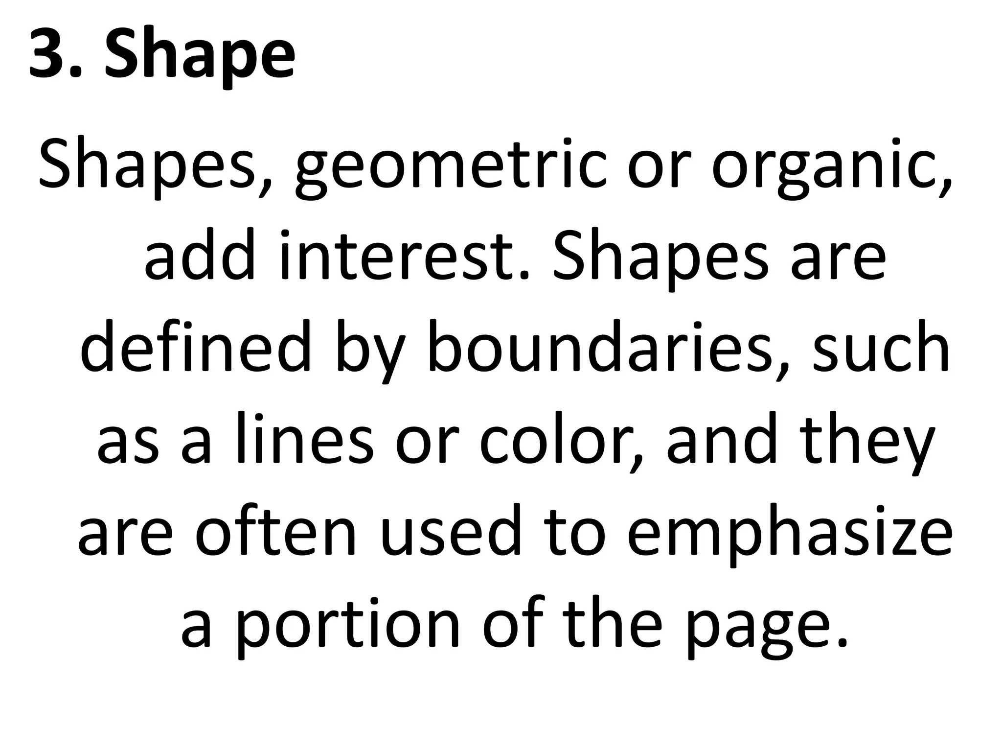
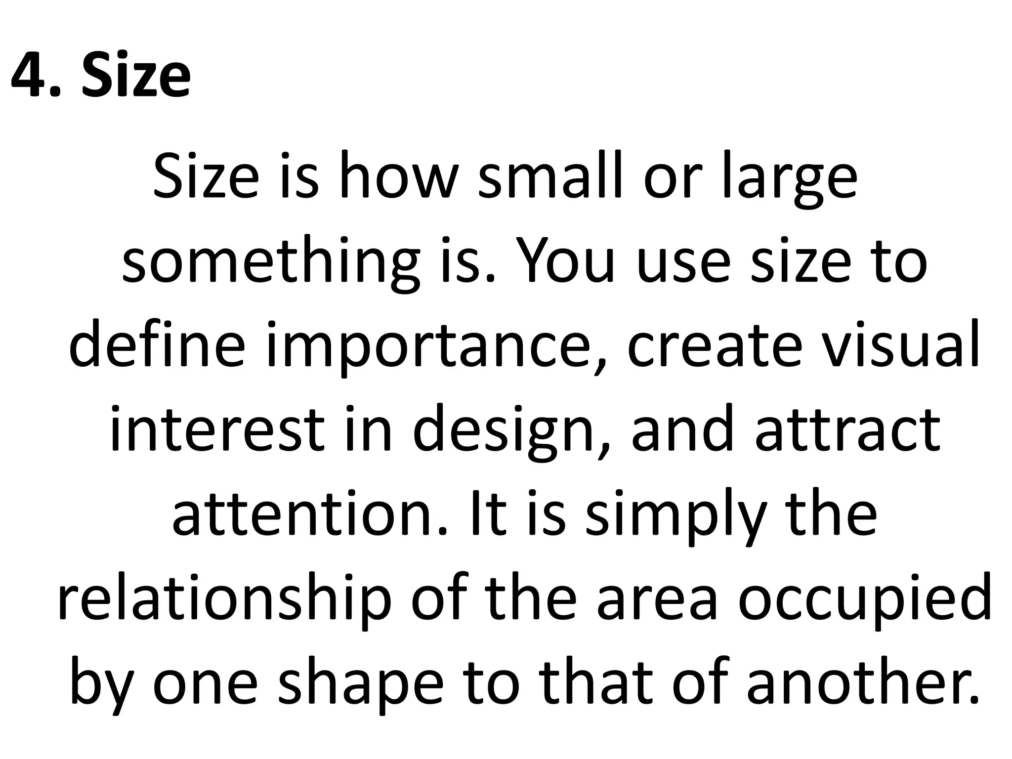
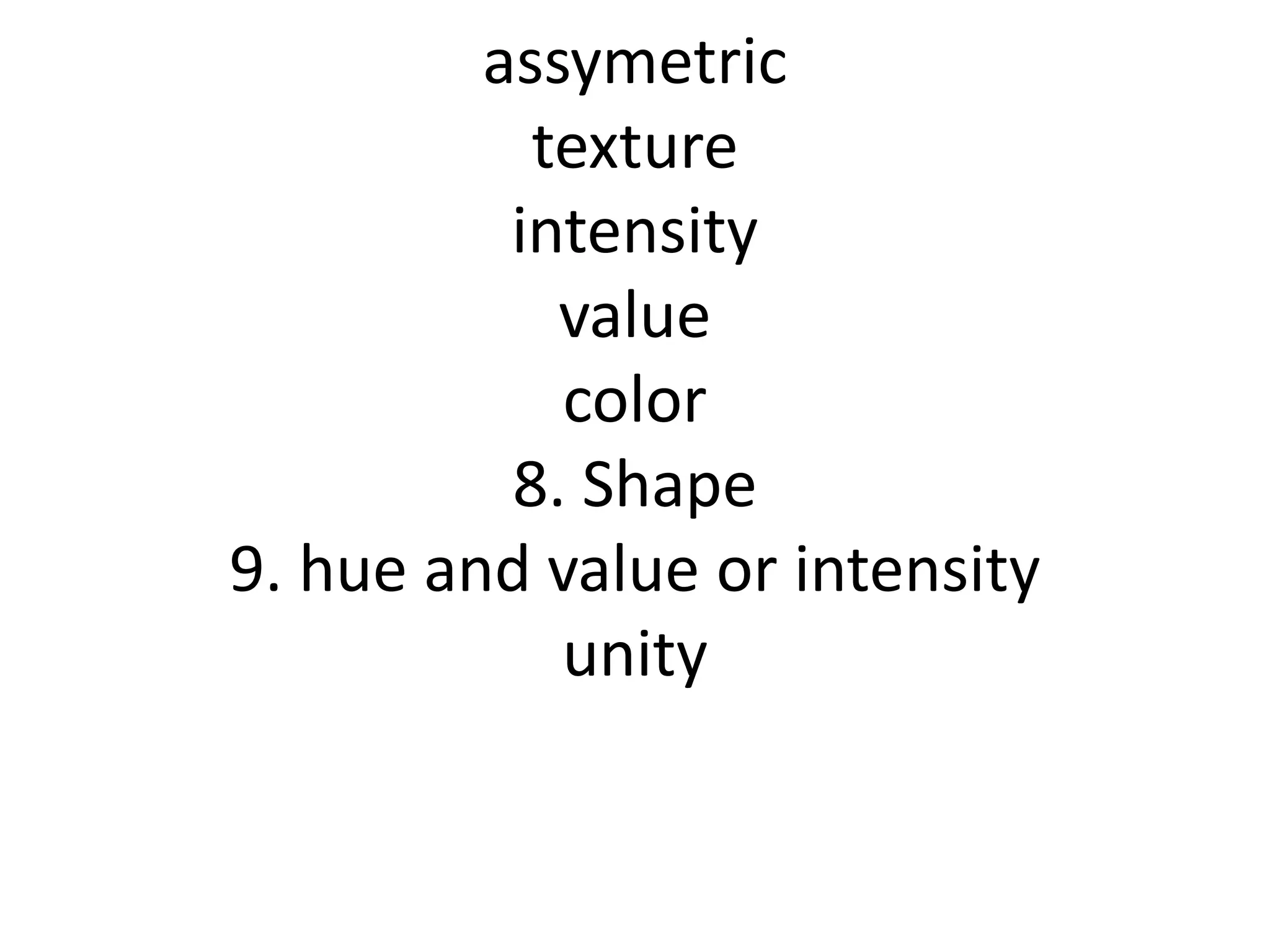
Basic Web design
principles and
elements
The principles are:
• balance
• movement
• repetition/rhythm
• emphasis
• contrast
• unity
• alignment
1. Balance
Balance provides stability
and structure to a design.
Balance is the
distribution of the visual
weight of objects, colors,
texture, and space.
Balance can be
achieved in three
ways: Symmetrical,
Asymmetrical, and
Radial.
2. Movement
Movement is the path our
eyes follow when we look
at a work of art. Its
purpose is to create unity
in the artwork with eye
travel.
3.Repetition/Rhythm
Rhythm is the repetition of visual
movement – colors, shapes or
lines. Variety is essential to keep
rhythms exciting and active, and to
avoid monotony. Repetition,
movement, and rhythm work
together to create the visual
equivalent of a musical beat.
4. Emphasis
It is the part of the design that
catches the viewer’s attention.
Emphasis is used by artists to
create dominance and focus in
their work. Traditionally emphasis
was the central part of the design,
from which all other parts
radiated.
5. Contrast
Contrast refers to differences in
values, colors, textures, shapes,
and other elements. It creates
visual excitement, and add
interest to the work. This occurs
when two parts of a design or
page layout are different.
6. Unity
Unity is the feeling of harmony
between all parts of the work of
art, which creates a sense of
completeness. It provides the
cohesive quality that makes an
artwork feel complete and
finished.
7. Alignment
Alignment is the principle of design
governing how text and graphics line up
with each other. One of the principles of
design, alignment refers to lining up the
top, bottom, sides, or middle of text or
graphic elements on a page. The use of
grids and guides can aid in placement
and alignment of both text and graphics.
The elements are:
• Line
• Color
• Shape
• Size
• Value
• Texture
• Space
1. Line
It is a continuous mark made on a surface
by a moving point; it may be flat (pencil
line) or three-dimensional (a rod, groove,
ridge, etc.) Line can also be created when
two shapes/textures meet. Types of line
can include actual, implied, vertical,
horizontal, diagonal and contour lines.
Lines are useful for dividing space and
drawing the eye to a specific location.
2. Color
Color creates a mood within the
piece and tells a story about the
brand. Every color says
something different, and
combinations can alter that
impression further. Color is the
part of light that is reflected by
the object we see.
Color has three characteristics: hue,
value, and intensity.
1. Hue is the name of the color (red,
green, etc.)
2. Value is the lightness or darkness of
a color. How much white or black
shows through or is mixed in. It can be
used to depict light and shadow on a
color and help show volume/form.
3. Intensity is the purity (brightness or
dullness) of the color. Pure red is
bright; red mixed with a little green (its
complement, opposite it on the color
wheel) becomes less intense, more
neutral.
3. Shape
Shapes, geometric or organic,
add interest. Shapes are
defined by boundaries, such
as a lines or color, and they
are often used to emphasize
a portion of the page.
4. Size
Size is how small or large
something is. You use size to
define importance, create visual
interest in design, and attract
attention. It is simply the
relationship of the area occupied
by one shape to that of another.
5. Value
Value refers to dark and light.
Value contrasts help us to see
and understand a two-
dimensional work of art. Use
value to create depth and light,
create a pattern, lead the eye, or
to emphasize.
6. Texture
Texture refers to the surface quality, both
simulated and actual, of artwork.
Textures can create a more three-
dimensional appearance on this two-
dimensional surface.
It can be real or implied by different uses
of media. It is also the degree of
roughness or smoothness in objects.
7. Space
One of the elements of design, white
space is the absence of text and
graphics. White space provides visual
breathing room for the eye. it’s also the
overall airiness or density of the page
including space between lines of type
(leading), text offset around graphics,
size of margins, and heaviness or
lightness of the fonts.
assymetric
texture
intensity
value
color
8. Shape
9. hue and value or intensity
unity

Basic Web design principles and elements.pptx

  • 1.
  • 2.
    The principles are: •balance • movement • repetition/rhythm • emphasis • contrast • unity • alignment
  • 3.
    1. Balance Balance providesstability and structure to a design. Balance is the distribution of the visual weight of objects, colors, texture, and space.
  • 4.
    Balance can be achievedin three ways: Symmetrical, Asymmetrical, and Radial.
  • 7.
    2. Movement Movement isthe path our eyes follow when we look at a work of art. Its purpose is to create unity in the artwork with eye travel.
  • 9.
    3.Repetition/Rhythm Rhythm is therepetition of visual movement – colors, shapes or lines. Variety is essential to keep rhythms exciting and active, and to avoid monotony. Repetition, movement, and rhythm work together to create the visual equivalent of a musical beat.
  • 11.
    4. Emphasis It isthe part of the design that catches the viewer’s attention. Emphasis is used by artists to create dominance and focus in their work. Traditionally emphasis was the central part of the design, from which all other parts radiated.
  • 13.
    5. Contrast Contrast refersto differences in values, colors, textures, shapes, and other elements. It creates visual excitement, and add interest to the work. This occurs when two parts of a design or page layout are different.
  • 15.
    6. Unity Unity isthe feeling of harmony between all parts of the work of art, which creates a sense of completeness. It provides the cohesive quality that makes an artwork feel complete and finished.
  • 17.
    7. Alignment Alignment isthe principle of design governing how text and graphics line up with each other. One of the principles of design, alignment refers to lining up the top, bottom, sides, or middle of text or graphic elements on a page. The use of grids and guides can aid in placement and alignment of both text and graphics.
  • 19.
    The elements are: •Line • Color • Shape • Size • Value • Texture • Space
  • 20.
    1. Line It isa continuous mark made on a surface by a moving point; it may be flat (pencil line) or three-dimensional (a rod, groove, ridge, etc.) Line can also be created when two shapes/textures meet. Types of line can include actual, implied, vertical, horizontal, diagonal and contour lines. Lines are useful for dividing space and drawing the eye to a specific location.
  • 22.
    2. Color Color createsa mood within the piece and tells a story about the brand. Every color says something different, and combinations can alter that impression further. Color is the part of light that is reflected by the object we see.
  • 23.
    Color has threecharacteristics: hue, value, and intensity. 1. Hue is the name of the color (red, green, etc.) 2. Value is the lightness or darkness of a color. How much white or black shows through or is mixed in. It can be used to depict light and shadow on a color and help show volume/form.
  • 24.
    3. Intensity isthe purity (brightness or dullness) of the color. Pure red is bright; red mixed with a little green (its complement, opposite it on the color wheel) becomes less intense, more neutral.
  • 25.
    3. Shape Shapes, geometricor organic, add interest. Shapes are defined by boundaries, such as a lines or color, and they are often used to emphasize a portion of the page.
  • 26.
    4. Size Size ishow small or large something is. You use size to define importance, create visual interest in design, and attract attention. It is simply the relationship of the area occupied by one shape to that of another.
  • 27.
    5. Value Value refersto dark and light. Value contrasts help us to see and understand a two- dimensional work of art. Use value to create depth and light, create a pattern, lead the eye, or to emphasize.
  • 28.
    6. Texture Texture refersto the surface quality, both simulated and actual, of artwork. Textures can create a more three- dimensional appearance on this two- dimensional surface. It can be real or implied by different uses of media. It is also the degree of roughness or smoothness in objects.
  • 29.
    7. Space One ofthe elements of design, white space is the absence of text and graphics. White space provides visual breathing room for the eye. it’s also the overall airiness or density of the page including space between lines of type (leading), text offset around graphics, size of margins, and heaviness or lightness of the fonts.
  • 30.