
Recommended
More Related Content
What's hot
What's hot (19)
Similar to Typography teaching presentation
Similar to Typography teaching presentation (20)
Recently uploaded
Recently uploaded (20)
Typography teaching presentation
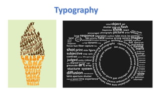
- 2. • The arrangement, style, and/or appearance of text. While making sure it’s legible, readable, and appealing when displayed • It creates a greater meaning by font, size, color, layout, etc. It is all around us!
- 3. This is a great example of typography. They used great text that catches the person’s attention right away. This is on the home page and would be a great idea for anyone’s home page. It makes the viewer want to look at more of the website. Their text fit the theme of their website very well.
- 4. There are TWO major classifications of fonts to choose from: Serif fonts have serifs at the end of strokes. Sans serif fonts don’t have any serifs or extra details on the letters Make sure to not choose fonts that are too similar. Serif fonts work well for headings while sans serif works well for body text.
- 5. Things to think about when choosing text for your website: contrast, readability, and size. It can be straining on the eyes to read something with poor contrast. Black text on a white background is the easiest to read. Sans serif fonts are easier to read when in the body text because serifs make it harder for the eyes to follow. Serif fonts work great for headings. Text that is too small is hard to read. Text that is too large takes up too much space. So, find a size that works well with your design and is easy to read.
- 6. These fonts are available on most computers so that everyone can see your text. Choosing from the web safe fonts will ensure that you are in control of what your text looks like. Here are some examples of web safe fonts: Arial Times New Roman Verdana Georgia Courier Impact