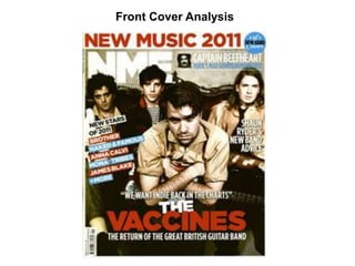
2. - Sticks to red, white and blue colour
theme which ties into the ‘great British
guitar band’ being the colours of the
Union Jack
- The masthead (magazine’s ‘logo’) fades
in with the background quite a lot which
brings everything else into the
foreground as the focus
- Justin Young is right in the middle of the
shot making him the main focus and
showing his leadership within the band
- Compositionally the shot fits with the ‘rule
of thirds’ with the bands heads on the top
horizontal line, and the lead singer in the
middle vertical section and the other
band members either side
- The strapline heading ‘new music 2011’
and the word ‘vaccines’ are both in red
which links them together showing that
the band will be big/successful in that
year
- The text at the side (coverlines) inform
the reader of what else is inside as well
as the main story. This makes it appeal to
a wider audience as some readers may
not like the Vaccines but be interested in
one of the bands listed
Front cover
Analysis
3. Double Page Spread Analysis
They used a large
photograph of the band
taking up roughly two
thirds of the two pages as
the main point of the
article is that they want to
make it big in 2011 and
the picture and the scale
of it signifies that.
The photo used has a very old and vintage
style to it with the faded effect used, while
still sticking to the house colours of red,
blue and white with the white clothes and
guitar and the red guitar tied in with the
blue lines over both pages. The front page
quotes “we want indie back in the charts”
and the old style of this shot could show
that they want to bring an old style back.
Large heading that stands out
to clearly inform the reader of
what the main feature of the
article is.