1. Analyzing Gene Expression Data from Two Corn Strains
In this example, we analyzed a gene expression dataset (GSE16567) of two corn (Zea mays) strains, the
drought tolerant line Han 21 and the drought sensitive Ye 478. In the study, each strain was subjected
to four watering regimes: moderate drought, severe drought, re-watering, and control. Transcriptome
expression for each treatment was measured using an Affymetrix Maize Genome Array, providing
intensity scores that are proxies for measuring gene-expression. Below, we demonstrate how we can
use Iris to explore patterns of expression across treatment groups.
Data structure: GSE16567, 24 samples (drought treatment groups) and 17,621 gene features (Affymetrix
intensity values in RMA format).
Exploring drought treatment groups in Sample Space networks.
In our first exploration of the data, we structured the data with the samples as rows and genes as
columns, in Iris terminology this is the sample space format. In the resulting network, each node is a
collection of samples that are similar in their gene expression.
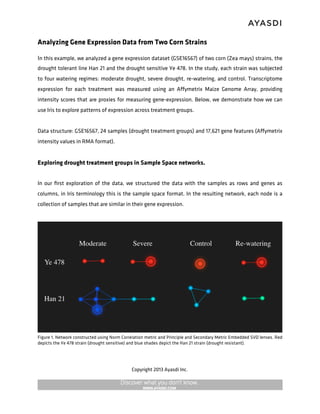
Figure 1. Network constructed using Norm Correlation metric and Principle and Secondary Metric Embedded SVD lenses. Red
depicts the Ye 478 strain (drought sensitive) and blue shades depict the Han 21 strain (drought resistant).
Copyright 2013 Ayasdi Inc.
2. Using the Quick Analysis feature to generate the network above, we see that Iris quickly segregates
the Han 21 strain from the Ye 478 strain in an entirely unsupervised manner. Additionally, notice how
Iris readily distinguishes drought treatments within each strain.
Another view of the data is provided by changing one of the lenses used in network construction. This
new network now resembles a butterfly, but the insight provided is still the same — a clear distinction
between the four watering regimens and the two strains. Changing the mathematical lens provides a
different view of the same data and provides more details. If we use the Find feature to search for
samples from each treatment group, each lobe of the butterfly’s wings is predominantly data points
corresponding to treatment types.
Figure 2. Network constructed using Norm Correlation metric, L-infinity Centrality and Principle Metric Embedded SVD as
lenses. Each image of the network is colored by the Find function, identifying nodes populated by samples corresponding to a
specific treatment. Red nodes represent those which are the most enriched with probe sets for each treatment of interest.
Copyright 2013 Ayasdi Inc.
3. The different treatments form distinct parts of the network; we can use the Explain feature to identify
the genes that determine those groups. Theexplain function uses the two-sample Kolmogorov-Smirnov
test to identify the gene features (columns) that most distinguish each treatment group. In the table
below, we list a subset of the most distinguishing genes for each treatment.
Exploring differential gene expression in Gene Space networks
Copyright 2013 Ayasdi Inc.
4. We can also look at how Iris builds networks in feature space. In our feature space, rows represent
different genes, and columns represent different treatment groups. Each node in this network is a
collection of genes, the expression of which is similar across treatment types.
Figure 3. This is an example of a gene space network constructed using correlation as a metric and L-infinity centrality and
Gaussian density as our lenses. It is colored by L-infinity centrality, which measures how central a row is in relation to the rest
of the data set. Here, blue colors are more central and red colors are less.
Pathway Analysis
Iris’s pathway analysis allows you to use public and user-provided annotation for genes, or probe IDs,
that explain interesting shapes, or regions of our Iris network.
Using the “severe drought” region of our sample space network (Figure 2.), we found the probes in
the gene feature space network that most distinguished the severe drought group. The picture below
demonstrates where those probes exist in our gene space.
Copyright 2013 Ayasdi Inc.
5. Figure 4. Genes previously identified in sample space now represented in gene space. Red nodes are the most enriched with
probe sets we previously identified in sample space.
We conduct Pathway analysis by selecting the the most enriched nodes (pure red) for the severe
drought probe IDs in our gene space network. To select the most enriched nodes, we use the
histogram feature, highlighting the upper end of the distribution.
Iris’s pathway feature returns annotation from Gene Ontology (GO) pathways, NCI cancer pathways,
Entrez Gene pathways, and many others. Iris also provides the corresponding probe IDs and a link to
the database that describes each pathway. For our analysis, we chose the GO Process pathway, but
there are also other GO annotations available, which are not shown here — such as GO process and GO
component.
The table below is an example of the output from our pathways analysis. These pathways are
mapped from Zea mays to Arabidopsis. From our selection of nodes from the severe drought
treatment, we have identified pathways that are most highly represented in our selection. Notice
that the severe drought group corresponds closely with several pathways that involved in
osmoregulation.
Copyright 2013 Ayasdi Inc.
6. Meaningful color using the contrast wand
Exploring the structure of this network identifies regions of genes with similar expression. Using the
contrast wand feature allows us to examine relative gene expression, between groups, as colors
Copyright 2013 Ayasdi Inc.
7. within our network. Contrast wand is an extremely useful tool that allows researchers to identify
probes that show considerable changes in expression between treatment groups.
The figure below uses the contrast wand to depict changes in expression between corn strains, under
different drought conditions, relative to their experimental controls. Notice that there is a more
extreme change in color intensity of the drought sensitive strain (Ye 478) than the drought resistant
strain (Han 21).
Figure 5. In this data set, probe intensities are log2-normalized. We fixed the range of our color scheme to values between -1
and 1, highlighting expression that has changed at least two-fold. Solid red nodes represent genes that show at least a two
fold increase in expression, and solid blue nodes represent genes that show at least a two-fold decrease in expression.
Copyright 2013 Ayasdi Inc.