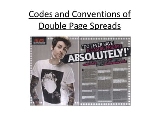
2. •The magazine uses the
same unique font for their
masthead to re-enforce the
brand
Masthead
3. Main Image
• There is usually one main image of the double page spread.
Direct address is used to engage the reader and the mise-en-
scene represents who is in the photograph
4. Headline
• The headline is across the
top of the page(s) and are
normally only a few words
long. It is used to draw the
audience in and uses a
stylised font.
5. Drop Quotes
• Drop quote are
sometimes found on
the image, in the
article or as the
headline.
6. Stand first
• The stand first introduces
the article and is positioned
under the headline but
above the article. I features
the band/artist name (in
different colours) and
sometimes the name of the
journalist
7. Drop Cap
• The drop cap is
stylised (font, colour,
size) and can be up to
10 lines deep
8. By-line
• The by-line tells
the reader who
wrote the article
and who took the
photographs
9. Strap line
• The strap line
depends on the
article for example
in this article, the
strap line is ‘News’
10. Colour Scheme
• The colour scheme is simple
and represent the
band/feature e.g. Rock artist
has a grey background with
black blocks of colour
11. Typography
• The typography used is small
(11 pt) with a simple font.
The first line could be
capitalised or in bold.
Questions are in a different
colour or in bold.
12. Page Number
• Page number is size
11pt and is found
at the in the
bottom corner of
the page(s)