
Recommended
More Related Content
What's hot
What's hot (20)
Similar to ANCILLARY TEXTS: MAGAZINE ADVERT/DIGIPAK
Similar to ANCILLARY TEXTS: MAGAZINE ADVERT/DIGIPAK (20)
Recently uploaded
Recently uploaded (20)
ANCILLARY TEXTS: MAGAZINE ADVERT/DIGIPAK
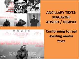
- 1. ANCILLARY TEXTS: MAGAZINE ADVERT / DIGIPAK Conforming to real existing media texts
- 2. Digipaks I have found from research
- 3. Digipak #1 • One of the main conventions of a digipak which I found from research and analysis was that the main focus is on the artist. This is therefore why there is 5 images of Tawanda (supposedly the artist of the track ‘Dear Lana’… ‘Kaner Flex’. This is very common in rap artists digipaks as they are the unique selling point of the digipak. They are the reason that it will attract to an audience and earn them an income from it. They are drawn in by the images even before they have the chance to decide whether the track inside is any good. This highlights Goodwin's theory as it is called ‘Voyeurism.
- 4. Digipak #2 The front cover mainly focuses on the artist and it is vital to use for marketing of the digipak, Therefore it is essential to have the artist name clearly seen The font colour of our font is red. This colour can relate to anger. This is because the message our artist 'Kaner Flex' is trying get across relating to racism, the education system and social justice system is a huge dividing issue in the world we live in today. Kaner has a opinion which he wants to get across. We therefore thought the colour of red can highlight this. Also the colour of red represents love and lust which represents the love he has for his music and the love of the person he is writing this album too. We therefore think red can incorporate the two contrasting emotions he is trying to convey in the album. For instance in the Eminem and Tinchy Strider digipak red is quiet a bold colour.
- 5. Magazine Adverts I have found from research
- 6. Magazine Advert #1 • DESIGN • I decided to create my magazine advert landscape, this is a more unique style and doesn’t usually conform to all magazine adverts especially in my genre. It includes the same conventions of a typical magazine advert (bold fonts, artists names, release dates, etc ) • However here are some example of artists such as rappers like Drake, Skepta and singers like Beyonce.
- 7. Magazine Advert #2 Album name- clear and precise, central so audience read it first. Artist name – Also very clear with the artist behind, even if didn’t know who the artist was the connection can be made. Red, white, black, red colour designed maintained throughout magazine advert, digipak and music video Social network connection/synergistic link Reviews showing, pre release ratings are successful, more likely for audiences to buy if a trusted source recommends. Common within the Rap/hip hop genre. From research a lot have the ‘parental advisory’ label