Automated Project Office Dashboard Screenshots
•Download as PPT, PDF•
3 likes•729 views

These screenshots show how APO offers high levels of visibility and control across all business and IT projects.

Recommended
Recommended
More Related Content
More from Computer Aid, Inc
More from Computer Aid, Inc (20)
Recently uploaded
Recently uploaded (20)
Automated Project Office Dashboard Screenshots
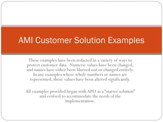
- 1. AMI Customer Solution Examples These examples have been redacted in a variety of ways to protect customer data. Numeric values have been changed, and names have either been blurred out or changed entirely. In any examples where whole numbers or names are represented, those values have been altered significantly. All examples provided began with APO as a “starter solution” and evolved to accommodate the needs of the implementation.
- 2. Overview
- 7. Planning
- 13. Utilization
- 23. SLAs
- 27. Other
Editor's Notes
- DISCLAIMER: These examples have been redacted in a variety of ways to protect customer data. Numeric values have been changed, and names have either been blurred out or changed entirely. In any examples where whole numbers or names are represented, those values have been altered significantly.
- This tab represents current performance of 6 selected “key” KPIs, as well as average performance over time for the past 3 months. This is a division-level look at data from many projects, and can be drilled into by levels of the organization. Results are a combination of operational data from external systems and risk associated with contextual data from surveys.
- This scorecard represents a portfolio view of several projects, with focus on several selected KPIs. The portfolio can be reorganized to sort by risk associated with any of the available KPIs. This solution is delivered at a 100-150 person IT shop with a nearly even split between on-shore and off-shore resources.
- This screen represents a slightly more detailed view of project performance, including performance trends over time by reporting period (in this case, the customer assesses teams twice a month).
- This tab represents results of a large (several thousand) satisfaction survey with helpdesk support across the organization. Data is sorted by department and physical geography, and results are anonymous. This solution is deployed at a large organization managing IT projects staffed by 400-500 individuals (per project). They are distributed across the continental US.
- This implementation collects resource utilization data from several time/effort tracking systems and consolidates results, making the data reportable by project, role, or individual (both current utilization, and totals over time). This customer is a state government agency with an IT staff over 500.
- This engagement represents planned vs. actual hours at a high level, along with status against milestones (all data in this example is derived from survey results)
- In a different view of utilization, this instance represents forthcoming demand based on planned activities. Status (and delays) of current activities, coupled with forthcoming projects, presents total capacity and demand, filterable by date (results are combination of survey responses for current project status, along with imported data for time-on-task and pipeline). In this example, results are limited to 3 months in the future, but that is an artificial limit posed by the user.
- At a more detailed level, staff count “swells” are shown over time to identify changes in projects with high resource consumption. Specific “key” metrics are also teased out as significant criteria to watch over time – any downward trending results in warnings.
- Satisfaction is reported as a purely survey-based representation of data. Summary results of satisfaction on 6 criteria are reported, with the ability to drill down by role, portfolio, organization, or project. Results are reported over time as well as current status.
- This implementation uses project plan data to plot degree of project completion over time, then also trends actuals as reported by the team via surveys to represent likelihood of completing on time. When the probable completion date extends beyond the planned date, the message text turns red and projects a new delivery date. Adjusting the date then turns the warning off. This deployment covers a large engagement managing many vendors for a single project – all constituents are rolled together to represent one overall picture of project status.
- This screen represents relatively straightforward EVA data, in this example fed by an external financials spreadsheet. Data could come into the system via surveys or a direct feed as well.
- This implementation is tracking ticket closure by month – reporting on overall resolution rates, and total open/closed within the month. In this example, the customer wants to show projects in the list even if they do not have any tickets to report for the month (normal behavior would be to show only the projects with tickets in the latest month displays). Totals are then rolled up to report over time, showing incidents by project, as well as overall for the entire organization. In this example, data is completely fed by an external system.
- This example is a representation of external data evaluated against expectation guidelines and showing overall performance over the life of a project.
- This is another representation of SLA-based data over time, broken out as a percentage. This particular customer wanted a decimal-based representation in order to align with other status reports already in place.
- This tab allows a user to evaluate total participation in qualitative data collection, which can be represented by role, assessment, respondent, organization, or project. At a glance, a user can evaluate their overall confidence in data being reported back to them.
- This screen represents a report-style summary of responses to assessments, broken out by phase.
- The “standard” question response tab allows a user to consume distribution statistics for each question, and drill down by response, respondent, role, project, organization, or date. It also represents distribution of responses over time.
- An alternative interpretation of the question response tab for a customer who wanted to be able to put specific emphasis on variation in response distribution from one week to the next.