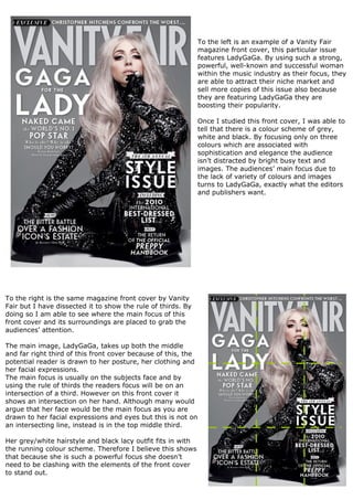
1. To the left is an example of a Vanity Fair
magazine front cover, this particular issue
features LadyGaGa. By using such a strong,
powerful, well-known and successful woman
within the music industry as their focus, they
are able to attract their niche market and
sell more copies of this issue also because
they are featuring LadyGaGa they are
boosting their popularity.
Once I studied this front cover, I was able to
tell that there is a colour scheme of grey,
white and black. By focusing only on three
colours which are associated with
sophistication and elegance the audience
isn’t distracted by bright busy text and
images. The audiences’ main focus due to
the lack of variety of colours and images
turns to LadyGaGa, exactly what the editors
and publishers want.
To the right is the same magazine front cover by Vanity
Fair but I have dissected it to show the rule of thirds. By
doing so I am able to see where the main focus of this
front cover and its surroundings are placed to grab the
audiences’ attention.
The main image, LadyGaGa, takes up both the middle
and far right third of this front cover because of this, the
potential reader is drawn to her posture, her clothing and
her facial expressions.
The main focus is usually on the subjects face and by
using the rule of thirds the readers focus will be on an
intersection of a third. However on this front cover it
shows an intersection on her hand. Although many would
argue that her face would be the main focus as you are
drawn to her facial expressions and eyes but this is not on
an intersecting line, instead is in the top middle third.
Her grey/white hairstyle and black lacy outfit fits in with
the running colour scheme. Therefore I believe this shows
that because she is such a powerful focus she doesn’t
need to be clashing with the elements of the front cover
to stand out.