
Recommended
More Related Content
What's hot
What's hot (19)
Viewers also liked
Viewers also liked (10)
Similar to How Interest Rate Changes Impact Asset Returns
Similar to How Interest Rate Changes Impact Asset Returns (20)
More from 123jumpad
More from 123jumpad (10)
Recently uploaded
Recently uploaded (20)
How Interest Rate Changes Impact Asset Returns
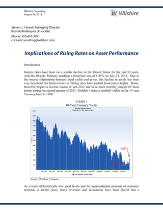
- 1. Introduction Interest rates have been on a secular decline in the United States for the last 30 years, with the 10-year Treasury reaching a historical low of 1.43% on July 25, 2012. Due to the inverse relationship between bond yields and prices, the decline in yields has been very beneficial for bond owners as falling rates have pushed bond prices higher. Rates, however, began to reverse course in late-2012 and have more recently jumped 65 basis points during the second quarter of 2013. Exhibit 1 depicts monthly yields on the 10-year Treasury back to 1990. Exhibit 1 10-Year Treasury Yields Source: Wilshire Compass As a result of historically low yield levels and the unprecedented amounts of monetary stimulus in recent years, many investors and economists have been fearful that a 1.43% 2.52%
- 2. significant increase in nominal rates is inevitable. The recent jump in rates has stoked those concerns, causing some to believe that the secular trend in rates has now reversed. If true, a shift in interest rate regimes could have significant implications for investment portfolios and, while not all asset classes have as direct a relationship to nominal rate changes as do high quality bonds, the general rate environment can be an important driver of portfolio returns. Since all investments are a transfer of cash today for an uncertain series of future cash flows, interest rates play an important role in determining the present value of those expected cash flows, upon which a required risk premium can be applied. As such, all investments have some sensitivity to rate changes through this discounting process. The higher the interest rate (i.e. discount rate) the smaller the present value of future cash flows. This relationship is true for any investment, although, it is more pronounced and direct for fixed income securities. Of course there are other important factors which drive asset valuations; including changes in expectations regarding the size and certainty of future cash flows, which vary in their respective contributions to different investment types. In light of heightened concerns over the potential for rising rates, this note by Wilshire Consulting analyzes historical yield changes and presents the impact of those changes on the returns of various asset classes. While our focus is on nominal yields, the nature of a nominal rate change to its embedded drivers (i.e. changes in inflation and/or growth expectations) can play an important role in defining the prevailing environment; we’ll return to this point later. Our review includes seven asset classes and one diversified portfolio. The asset classes, their representative indexes and their allocations within the diversified portfolio are: U.S. Stocks (Wilshire 5000 Index) 20% Non-U.S. Stocks (MSCI ACWI Ex-U.S. Index) 20% U.S. Core Bonds (Barclays Aggregate Index) 25% TIPS1 (Barclays TIPS Index) 10% REITs (Wilshire REIT Index) 5% High Yield (Bank of America Merrill Lynch High Yield Master II Index) 10% Commodities (UBS Commodity Index) 10% Yield Change Segmentation Our analysis begins with a segmentation of changes in the 10-year treasury yield into six groups; three each for rising and falling rates. As can be seen on the leftmost side of Exhibit 2, which focuses on U.S. Core Bonds, the first row includes yield changes of more than 50 basis points (bps), the second row contains yield changes between 25 and 50 bps and the third row contains periods when yields changed less than 25 bps per quarter. Moving to the right, we list the number of quarters within the last twenty years when rates have risen or fallen by the specified magnitude. For example, the number 16 1 TIPS returns prior to Sep. 1997 were simulated using synthetic excess returns from Bridgewater Associates plus a risk free rate (91-day T-Bill).
- 3. in the second column indicates that there were sixteen distinct quarters when rates had decreased by more than 50 bps during the last twenty years (i.e. 80 quarters). The next section (columns three and four) displays the average quarterly asset class returns that correspond to the given change in yields. For example, the -1.0% return in column 3 indicates that during the twelve quarters when rates rose by more than 50 bps the index (Barclays Aggregate in this particular case) realized an average quarterly decline of -1.0%. Moving to the right on the chart, the last section depicts the highest and lowest quarterly returns the index has realized within these various environments of interest rate changes. For example, the return of 2.2% in the last column suggests that during the twelve distinct quarters when interest rates fell by 25-50 bps per quarter the lowest return the index recorded was 2.2%. We produced similar output for all seven asset classes and the diversified portfolio, which can be found in Appendix A, but for the sake of brevity, present only the U.S. Core Bond and U.S. Stock results below. Exhibit 2 Effects of Yield Changes on Barclays U.S. Aggregate Index (20 years through June ‘13) Source: Wilshire Compass Exhibit 2 shows the strong relationship between changes in interest rates and bond returns mentioned earlier, as the realized bond returns move in a linear fashion from an average gain of 3.9% in quarters with rates falling 50 bps or more to a -1.0% average loss during those quarters with a rate increase of 50 bps or more. When segmenting the results between all rising rate versus all falling rate periods, one can quickly quantify the performance edge of bonds in a falling rate environment: up an average of 3.0% in these 40 quarters against a -0.1% average return in 40 periods where rates rose. While one hardly needs this sort of validation of the strength of the relationship for bonds, it is helpful in setting the context for examining other asset classes across this interest rate segmentation. As can be seen in Exhibit 3 below, the only segment within this 20-year historical review where equities had a negative average return was during periods when rates were down by more than 50 bps. To the extent that this historical period can serve as a guide, the average returns to equities have held up well during periods of rising nominal rates; with the average return up 4.5% in the 40 periods with rates rising versus a 2.5% average return across all 80 quarters. It is also worth noting the large difference between the lowest returns for equities across rate change segments, with the largest sell-offs occurring in the three segments defined by falling rates. In recognition of the relatively abbreviated nature of the 20-year look back, we also analyzed the data back to 1940 and Up Down Up Down Magnitude of Rate Changes Highest Lowest Highest Lowest More than 0.50% 12 16 -1.0% 3.9% 1.8% -2.9% 6.1% 2.1% Between 0.50% and 0.25% 16 12 0.0% 2.8% 0.6% -0.7% 3.7% 2.2% Less than 0.25% 12 12 0.8% 1.9% 1.7% -0.1% 3.7% -0.5% 40 40 -0.1% 3.0% 1.8% -2.9% 6.1% -0.5% # of Quarters Avg Qtr Return Quarterly Return Extremes Up Down Totals 80 1.5%
- 4. note that average quarterly returns for U.S. equities (as measured by the S&P 500) were the same 3.0% in rising and falling rate periods, suggesting a rather weak relationship between rate changes and equity performance. Exhibit 3 Effects of Yield Changes on Wilshire 5000 Index (20 years through June ‘13) Source: Wilshire Compass Exhibit 4 below, which summarizes the results of the above analysis across all seven asset classes and the diversified portfolio, helps to visually illustrate the relationship, or lack thereof, between interest rate changes and the returns of various asset classes. Exhibit 4 Effects of Yield Changes on Asset Class Returns (20 Years through June ’13) Source: Wilshire Compass, Bridgewater Associates Starting from the right hand side of Exhibit 4, we can see that when interest rates were down by more than 50 bps only two asset classes (Barclays Aggregate and Barclays TIPS) had positive results. Similarly, when rates were up by more than 50 bps, the same two fixed income indexes were the only asset classes to experience negative average returns (leftmost bars). Commodities, represented by the light blue bars, show strong average performance in quarters with rising rates; most notably in those quarters with Up Down Up Down Magnitude of Rate Changes Highest Lowest Highest Lowest More than 0.50% 12 16 5.6% -6.4% 18.3% -3.7% 9.3% -22.9% Between 0.50% and 0.25% 16 12 3.9% 6.1% 12.8% -10.6% 16.9% -1.8% Less than 0.25% 12 12 4.3% 4.0% 21.5% -6.6% 16.1% -12.3% 40 40 4.5% 0.5% 21.5% -10.6% 16.9% -22.9% Totals 80 2.5% # of Quarters Avg Qtr Return Quarterly Return Extremes Up Down -7.5% -5.5% -3.5% -1.5% 0.5% 2.5% 4.5% 6.5% 8.5% +0.5 or more +0.25 to +0.5 0 to +0.25 0 to -0.25 -0.25 to -0.5 -0.5 or more AverageQuarterlyReturns Wil 5000 ACWI Ex-US Wil REIT Barc Agg Barc TIPS ML HY Mstr II UBS Comm Diversified
- 5. significant rate increases. As can be seen, the return patterns for most asset classes are quite erratic with respect to their relationship to rate changes. As such, with the exception of high quality bonds, even investors with a strong view on the direction of future interest rates (i.e. who believe “they’re sure to go up”) would have a difficult time converting those views into pinpoint projections of asset class behavior. As with most investment pursuits, the dispersion in results further supports the benefits of taking a diversified approach to portfolio construction; even for those investors with an opinion on rates. Notice the more uniform performance of the diversified portfolio (the light pink bars) across rate-change segments. Regression Analysis Since one or two extreme outcomes can have a significant impact on the average returns for a small sample of observations, the returns presented above can provide a misleading interpretation of the underlying relationship between rate changes and asset returns; potentially masking some relationships, while indicating a potential linkage in other cases that are merely coincidental or weak relationships. In order to glean a more detailed understanding of the various asset class sensitivities to rate changes, we ran scatter plots of returns for each of the seven asset classes and the diversified portfolio versus the quarterly rate changes; each chart includes a “best fit” regression line and a model R-squared (R2 ). The R2 statistic indicates how well the data points fit the regression line or, in our case, how well changes in interest rates explain corresponding asset class returns. The higher the R2 , the better is the fit. As was done earlier, we begin with bonds and limit the exhibits in the main body of the note to just stocks and bonds, but include exhibits for all seven asset classes and the diversified portfolio in Appendix B. As can be seen in Exhibit 5, the R2 for bond returns is ~81%, which is, unsurprisingly, the highest among all seven asset classes analyzed. For comparative purposes, the second highest R2 is exhibited by TIPS at ~34% (another fixed income asset class). The significant negative slope of the best-fit line provides further evidence of the strong inverse relationship between bond yields and prices.
- 6. Exhibit 5 Scatter Plot of Barclays U.S. Aggregate Index (20 years through June ’13) Source: Wilshire Compass Exhibit 5 does not have too many significant outliers2 and data points seem to follow the regression line by a relatively narrow range; the same cannot be said about equities, as can be seen in Exhibit 6. U.S. stocks had an R2 of ~21%, indicating limited direct sensitivity to rate changes. This is the fourth highest R2 among the seven asset classes, trailing Core Bonds (~81%), TIPS (~34%) and ACWI Ex-U.S. (~25%). As can be seen, equity returns are scattered, for lack of a better word, all over the chart, with little discernible relationship to changes in nominal rates. The chart does reveal that the worst quarterly stock returns are clustered in the southwest quadrant of the scatter plot associated with periods of falling nominal rates. These observations coincide with the global financial crisis (when rates and returns on risky-assets fell precipitously), which, if removed from the dataset, would lead to an even lower R2 and flatter best-fit line. 2 The one notable outlier in Exhibit 5 (in the upper right quadrant) represents the second quarter of 2009. Though Treasury rates rose during that period, bond investors with credit exposure benefited from a dramatic narrowing of credit spreads. R² = 0.8106 -4.0 -2.0 0.0 2.0 4.0 6.0 8.0 -2.0 -1.5 -1.0 -0.5 0.0 0.5 1.0 1.5 QuarterlyReturns Quarterly Change in Yields Barclays U.S. Aggregate Linear (Barclays U.S. Aggregate)
- 7. Exhibit 6 Scatter Plot of Wilshire 5000 Index (20 years through June ’13) Source: Wilshire Compass Conclusion In this brief research note we attempted to shed some light on the historical behavior of various asset classes to short-term changes in interest rates. The data are not presented to suggest that future relationships will exactly mimic this historical period, but rather to provide some level of understanding of the general sensitivities of these assets to rate changes. As we referenced earlier, it is also important to note that our analysis above focused solely on changes to nominal interest rates and, therefore, made no attempt to describe the major embedded drivers of these nominal rate changes; namely, changes in inflation expectations and real rates (a proxy for growth expectations). Asset classes react to nominal rate changes differently, based on whether the change was driven by a move in real rates, inflation expectations or some combination of the two. For example, if nominal rates rise because growth expectations have pushed real rates higher, the effect on equities is likely to be positive, while an increase in nominal rates from higher inflation expectations could have a negative short-term impact on stock returns. High quality fixed income securities, on the other hand, will have a more predictable and uniform response to nominal rate changes, no matter the underlying driver (real rates or inflation expectations). We did perform regression analysis of the asset classes and diversified portfolio returns against changes to the underlying components of nominal interest rates and, for interested readers, summarize those results in Appendix C. The asset classes that realized the largest increases in R2 (i.e. where the look through to the underlying drivers of nominal rate changes had the largest boost in explanatory power versus the single factor model) R² = 0.2087 -30.0 -25.0 -20.0 -15.0 -10.0 -5.0 0.0 5.0 10.0 15.0 20.0 25.0 -2.0 -1.5 -1.0 -0.5 0.0 0.5 1.0 1.5 QuarterlyReturns Quarterly Change in Yields Wilshire - 5000 Linear (Wilshire - 5000)
- 8. were TIPS (up from 34% to 73%) and commodities (up from 10% to 28%). As measured by the slopes of the regression factors, TIPS intuitively revealed a much stronger negative relationship (-6.7) to changes in real yields than to changes in inflation expectations (-0.4). In the case of commodities, their relationship to changes in real yields was negative (-3.8), while their sensitivity to changes in inflation expectations was strongly positive (10.2). When considering the potential impact of future yield changes on asset returns, these results clearly demonstrate the importance of what underlying factors drive nominal yield changes. Although the statistics reviewed within this report do not lead us to any hard recommendations, as they cover only a relatively short period of time, we view the presented results as further evidence to support the value of diversification in the investment decision making process. Wilshire has always been a strong proponent of this concept. The behavior of the diversified portfolio, which can be seen in the Appendices that reveal relatively low R2 s (14% and 20% for the one and two factor regressions, respectively), demonstrates that premise, as its balance across various economic risk factors dampens the portfolio’s sensitivity to any one factor, such as those driving interest rate changes.
- 9. Appendix A Effects of Yield Changes on Wilshire 5000 Index (20 years ending in June ‘13) Source: Wilshire Compass Effects of Yield Changes on MSCI ACWI Ex-U.S. Index (20 years ending in June ‘13) Source: Wilshire Compass Effects of Yield Changes on Wilshire REIT Index (20 years ending in June ‘13) Source: Wilshire Compass Effects of Yield Changes on Barclays U.S. Aggregate Index (20 years ending in June ‘13) Source: Wilshire Compass Up Down Up Down Magnitude of Rate Changes Highest Lowest Highest Lowest More than 0.50% 12 16 5.6% -6.4% 18.3% -3.7% 9.3% -22.9% Between 0.50% and 0.25% 16 12 3.9% 6.1% 12.8% -10.6% 16.9% -1.8% Less than 0.25% 12 12 4.3% 4.0% 21.5% -6.6% 16.1% -12.3% 40 40 4.5% 0.5% 21.5% -10.6% 16.9% -22.9% Totals 80 2.5% # of Quarters Avg Qtr Return Quarterly Return Extremes Up Down Up Down Up Down Magnitude of Rate Changes Highest Lowest Highest Lowest More than 0.50% 12 16 5.8% -7.4% 27.9% -2.9% 4.0% -22.3% Between 0.50% and 0.25% 16 12 4.7% 5.0% 17.1% -10.6% 19.9% -8.6% Less than 0.25% 12 12 5.0% 0.7% 20.4% -7.3% 19.8% -21.8% 40 40 5.1% -1.2% 27.9% -10.6% 19.9% -22.3% # of Quarters Avg Qtr Return Quarterly Return Extremes Up Down Totals 80 2.0% Up Down Up Down Magnitude of Rate Changes Highest Lowest Highest Lowest More than 0.50% 12 16 4.2% -3.0% 31.7% -5.4% 15.2% -40.0% Between 0.50% and 0.25% 16 12 1.1% 8.3% 15.8% -33.9% 20.1% 1.1% Less than 0.25% 12 12 3.9% 6.9% 16.0% -8.3% 35.4% -4.2% 40 40 2.9% 3.4% 31.7% -33.9% 35.4% -40.0% # of Quarters Avg Qtr Return Quarterly Return Extremes Up Down Totals 80 3.1% Up Down Up Down Magnitude of Rate Changes Highest Lowest Highest Lowest More than 0.50% 12 16 -1.0% 3.9% 1.8% -2.9% 6.1% 2.1% Between 0.50% and 0.25% 16 12 0.0% 2.8% 0.6% -0.7% 3.7% 2.2% Less than 0.25% 12 12 0.8% 1.9% 1.7% -0.1% 3.7% -0.5% 40 40 -0.1% 3.0% 1.8% -2.9% 6.1% -0.5% # of Quarters Avg Qtr Return Quarterly Return Extremes Up Down Totals 80 1.5%
- 10. Effects of Yield Changes on Barclays U.S. TIPS Index (20 years ending in June ‘13) Source: Wilshire Compass, Bridgewater Associates Effects of Yield Changes on BofA ML HY Master II Index (20 years ending in June ‘13) Source: Wilshire Compass Effects of Yield Changes on UBS Commodity Index (20 years ending in June ‘13) Source: Wilshire Compass Effects of Yield Changes on Diversified Portfolio (20 years ending in June ‘13) Source: Wilshire Compass Up Down Up Down Magnitude of Rate Changes Highest Lowest Highest Lowest More than 0.50% 12 16 -1.1% 3.8% 1.8% -7.1% 7.9% -3.5% Between 0.50% and 0.25% 16 12 0.7% 2.9% 5.5% -2.3% 5.1% 0.8% Less than 0.25% 12 12 0.8% 1.5% 2.8% -1.3% 4.8% -3.5% 40 40 0.2% 2.9% 5.5% -7.1% 7.9% -3.5% # of Quarters Avg Qtr Return Quarterly Return Extremes Up Down Totals 80 1.5% Up Down Up Down Magnitude of Rate Changes Highest Lowest Highest Lowest More than 0.50% 12 16 2.9% -1.7% 23.2% -1.8% 6.5% -17.6% Between 0.50% and 0.25% 16 12 2.1% 3.4% 6.1% -2.3% 10.0% -1.6% Less than 0.25% 12 12 2.8% 3.5% 7.1% -1.3% 14.8% -9.5% 40 40 2.6% 1.4% 23.2% -2.3% 14.8% -17.6% # of Quarters Avg Qtr Return Quarterly Return Extremes Up Down Totals 80 2.0% Up Down Up Down Magnitude of Rate Changes Highest Lowest Highest Lowest More than 0.50% 12 16 5.8% -2.0% 16.1% -9.4% 9.6% -30.0% Between 0.50% and 0.25% 16 12 3.4% 3.1% 17.6% -6.3% 11.8% -7.4% Less than 0.25% 12 12 1.1% -1.7% 13.3% -13.0% 9.7% -27.7% 40 40 3.4% -0.4% 17.6% -13.0% 11.8% -30.0% # of Quarters Avg Qtr Return Quarterly Return Extremes Up Down Totals 80 1.5% Up Down Up Down Magnitude of Rate Changes Highest Lowest Highest Lowest More than 0.50% 12 16 3.0% -1.9% 14.5% -2.5% 5.4% -15.0% Between 0.50% and 0.25% 16 12 2.4% 4.3% 8.4% -5.5% 10.1% -1.0% Less than 0.25% 12 12 2.7% 2.1% 7.3% -0.4% 12.1% -10.1% 40 40 2.7% 1.2% 14.5% -5.5% 12.1% -15.0% Totals 80 1.9% # of Quarters Avg Qtr Return Quarterly Return Extremes Up Down
- 11. Appendix B Scatter Plot of Wilshire 5000 Index (20 years ending in June ’13) Source: Wilshire Compass Scatter Plot of MSCI ACWI Ex-U.S. Index (20 years ending in June ’13) Source: Wilshire Compass R² = 0.2087 -30.0 -25.0 -20.0 -15.0 -10.0 -5.0 0.0 5.0 10.0 15.0 20.0 25.0 -2.0 -1.5 -1.0 -0.5 0.0 0.5 1.0 1.5 QuarterlyReturns Quarterly Change in Yields Wilshire - 5000 Linear (Wilshire - 5000) R² = 0.2451 -30.0 -20.0 -10.0 0.0 10.0 20.0 30.0 40.0 -2.0 -1.5 -1.0 -0.5 0.0 0.5 1.0 1.5 QuarterlyReturns Quarterly Change in Yields MSCI ACWI EX-U.S. Linear (MSCI ACWI EX-U.S.)
- 12. Scatter Plot of Wilshire REIT Index (20 years ending in June ’13) Source: Wilshire Compass Scatter Plot of Barclays U.S. Aggregate Index (20 years ending in June ’13) Source: Wilshire Compass R² = 0.0491 -50.0 -40.0 -30.0 -20.0 -10.0 0.0 10.0 20.0 30.0 40.0 -2.0 -1.5 -1.0 -0.5 0.0 0.5 1.0 1.5 QuarterlyReturns Quarterly Change in Yields Wilshire REIT Linear (Wilshire REIT) R² = 0.8106 -4.0 -2.0 0.0 2.0 4.0 6.0 8.0 -2.0 -1.5 -1.0 -0.5 0.0 0.5 1.0 1.5 QuarterlyReturns Quarterly Change in Yields Barclays U.S. Aggregate Linear (Barclays U.S. Aggregate)
- 13. Scatter Plot of Barclays U.S. TIPS Index (20 years ending in June ’13) Source: Wilshire Compass, Bridgewater Associates Scatter Plot of BofA ML HY Master II Index (20 years ending in June ’13) Source: Wilshire Compass R² = 0.3402 -8.0 -6.0 -4.0 -2.0 0.0 2.0 4.0 6.0 8.0 10.0 -2.0 -1.5 -1.0 -0.5 0.0 0.5 1.0 1.5 QuarterlyReturns Quarterly Change in Yields Barclays U.S. TIPS Linear (Barclays U.S. TIPS) R² = 0.1128 -20.0 -15.0 -10.0 -5.0 0.0 5.0 10.0 15.0 20.0 25.0 30.0 -2.0 -1.5 -1.0 -0.5 0.0 0.5 1.0 1.5 QuarterlyReturns Quarterly Change in Yields BofA ML HY Master II Linear (BofA ML HY Master II)
- 14. Scatter Plot of UBS Commodity Index (20 years ending in June ’13) Source: Wilshire Compass Scatter Plot of Diversified Portfolio (20 years ending in June ’13) Source: Wilshire Compass R² = 0.1003 -40.0 -30.0 -20.0 -10.0 0.0 10.0 20.0 -2.0 -1.5 -1.0 -0.5 0.0 0.5 1.0 1.5 QuarterlyReturns Quarterly Change in Yields UBS Commodity Linear (UBS Commodity) R² = 0.1433 -20.0 -15.0 -10.0 -5.0 0.0 5.0 10.0 15.0 20.0 -2.0 -1.5 -1.0 -0.5 0.0 0.5 1.0 1.5 QuarterlyReturns Quarterly Change in Yields Diversified Linear (Diversified)
- 15. Appendix C Regression Statistics (20 years ending in June ’13) Source: Wilshire Compass Slope R2 R2 Slope (∆RY) Slope (∆IE) Wil 5000 7.6 21% 21% 6.8 8.0 ACWI Ex-U.S. 9.0 25% 26% 5.7 11.0 Wil REIT 4.4 5% 5% 3.1 5.3 Barc Agg -3.2 81% 83% -3.9 -2.9 Barc TIPS -2.8 34% 73% -6.7 -0.4 ML HY Mstr II 3.1 11% 20% -0.5 5.3 UBS Comm 4.9 10% 28% -3.8 10.2 Diversified 3.3 14% 20% 0.6 4.9 Nominal Yield Changes Real Yield and Inflation Expectation Changes
- 16. Important Information This material contains confidential and proprietary information of Wilshire Consulting, and is intended for the exclusive use of the person to whom it is provided. It may not be modified, sold or otherwise provided, in whole or in part, to any other person or entity without prior written permission from Wilshire Consulting. This material is intended for informational purposes only and should not be construed as legal, accounting, tax, investment, or other professional advice. Past performance does not guarantee future returns. This material may include estimates, projections and other "forward-looking statements." Due to numerous factors, actual events may differ substantially from those presented. Information contained herein that has been obtained from third party sources is believed to be reliable. Wilshire Consulting gives no representations or warranties as to the accuracy of such information, and accepts no responsibility or liability (including for indirect, consequential or incidental damages) for any error, omission or inaccuracy in such information and for results obtained from its use. Information and opinions are as of the date indicated, and are subject to change without notice. Wilshire® is a registered service mark of Wilshire Associates Incorporated, Santa Monica, California. All other trade names, trademarks, and/or service marks are the property of their respective holders. Copyright © 2013 Wilshire Associates Incorporated. All rights reserved. Information in this document is subject to change without notice. www.wilshire.com