
Recommended
More Related Content
What's hot
What's hot (20)
Viewers also liked
Similar to Font and colour research
Similar to Font and colour research (20)
Recently uploaded
Recently uploaded (20)
Font and colour research
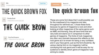
- 1. These are some font ideas that I could possibly use for the masthead of my magazine and also throughout for sell lines ect. I chose these fonts because my genre of magazine is rock and when looking at other magazines of the same genre such as NME and Kerrang, they all have fonts that are very bold and stand out in comparison to other genres of magazine. The fonts of rock magazines are often very dramatic because this reflects on the rock genre as it is known for being a very confident and in your face genre, just as the font should be. By using a daring font on my magazine I will be conveying the rock genre and it will be easy for my audience to identify which genre of magazine I was aiming to create.
- 2. The colour palette I have decided to sue for my magazine is black, red and white. These are colours often associated with the rock genre because they are dark and grungy, common connotations of the lifestyle of rock itself. Red can convey danger and also stands out against the muted black/white shades so it will stand out to my readers. These colours have also been used on other similar style magazines which tells me that they are noticeable to readers and are connected with the genre. It is important that I use complimentary colours as they will be sued throughout my magazine to create a house style and I want the colours to make reading easy and enjoyable. If I used bright colours such as orange and yellow, it is likely that the genre of my magazine would not be easily noticed and it would also make the pages overpowering and something that people wouldn't have an interest in reading.