Download as PDF, PPTX
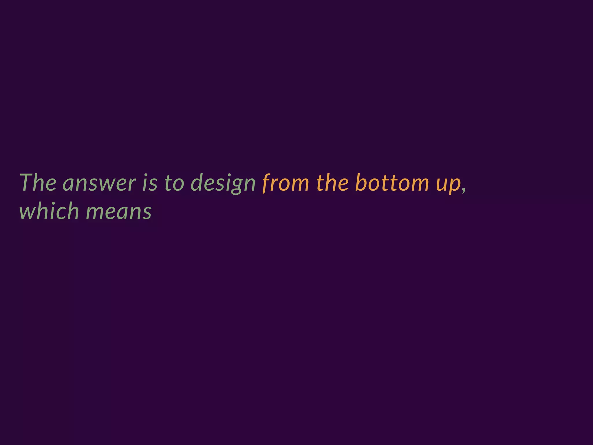
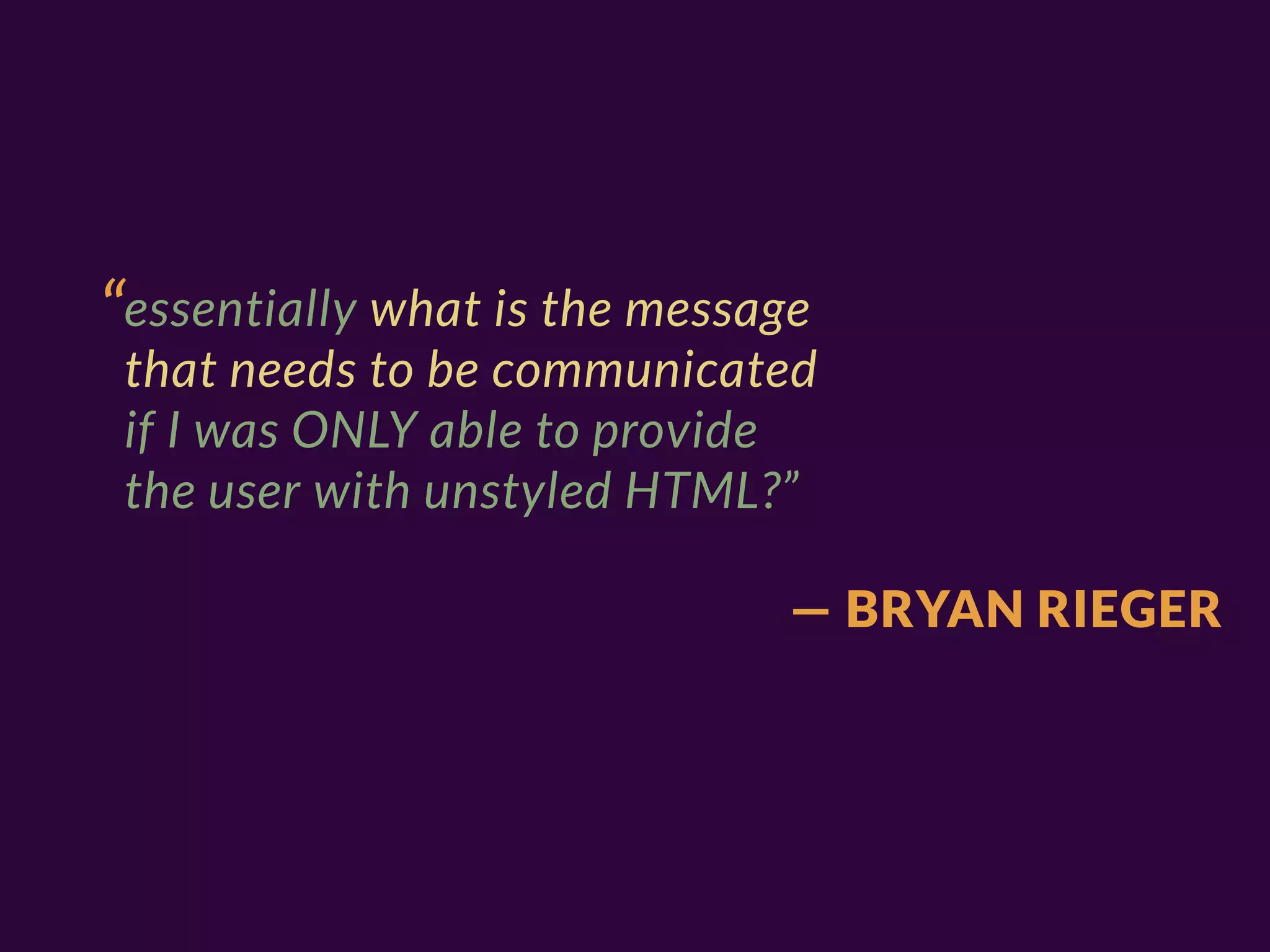
![“One technique I've used for
years is to 'design in text'… not
necessarily describing
everything in textual form[…]”
— BRYAN RIEGER](https://image.slidesharecdn.com/mobilism2012-120511102642-phpapp02/75/Responsive-Design-Workflow-Mobilism-2012-16-2048.jpg)
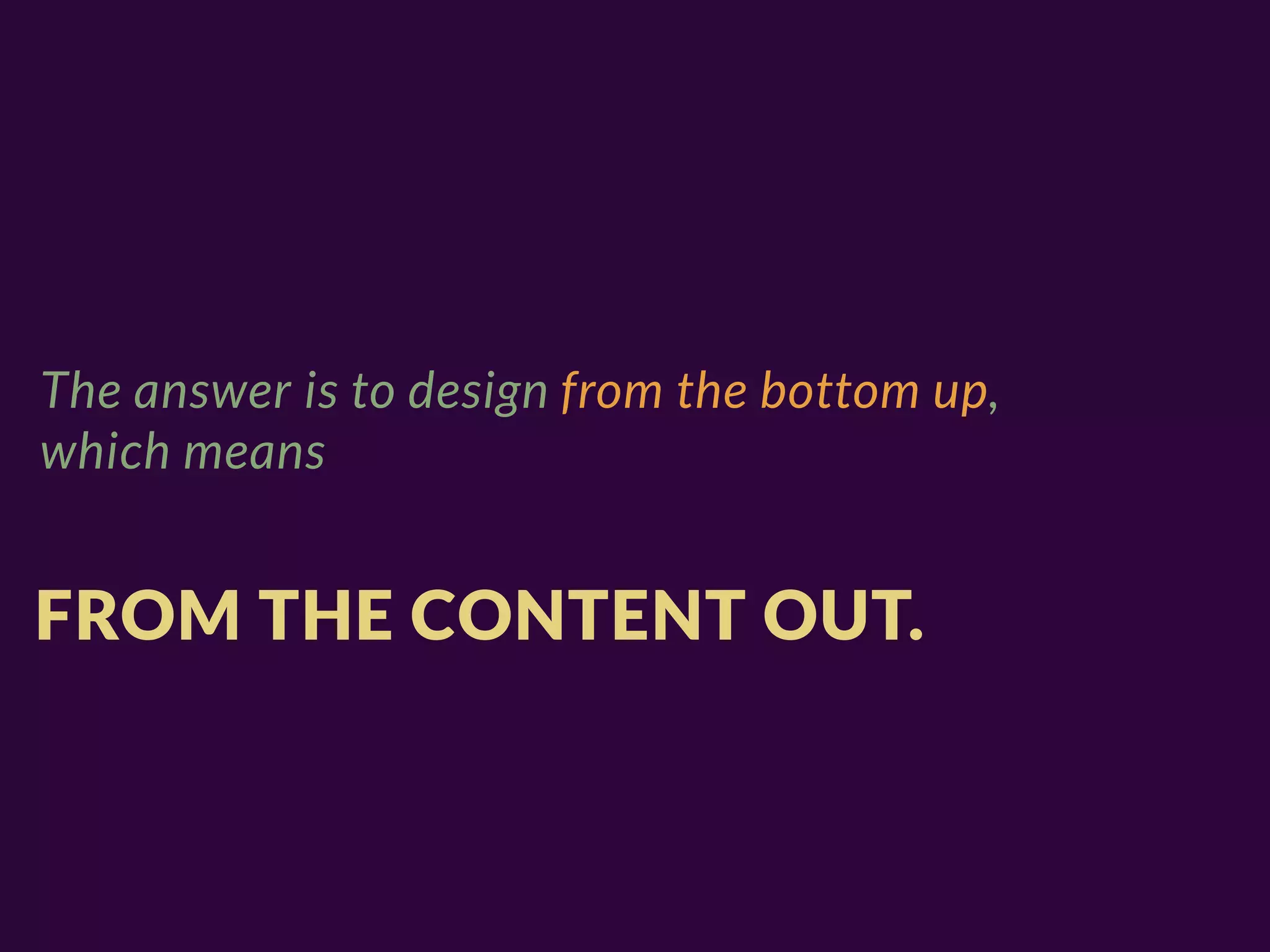
![“(which usually results in docs
sounding oddly creepy, '–it puts
the lotion on it's skin!')[…]”
— BRYAN RIEGER](https://image.slidesharecdn.com/mobilism2012-120511102642-phpapp02/75/Responsive-Design-Workflow-Mobilism-2012-17-2048.jpg)


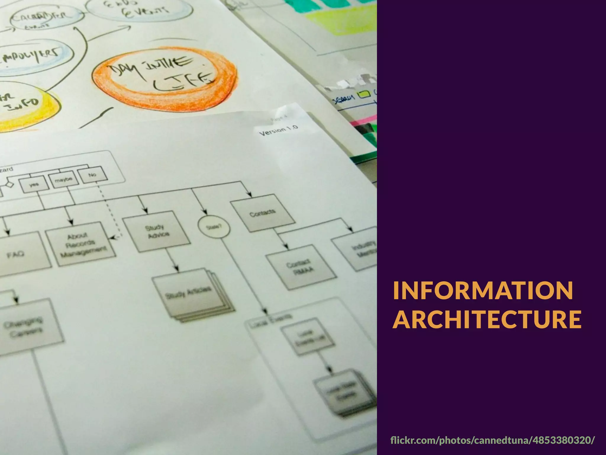
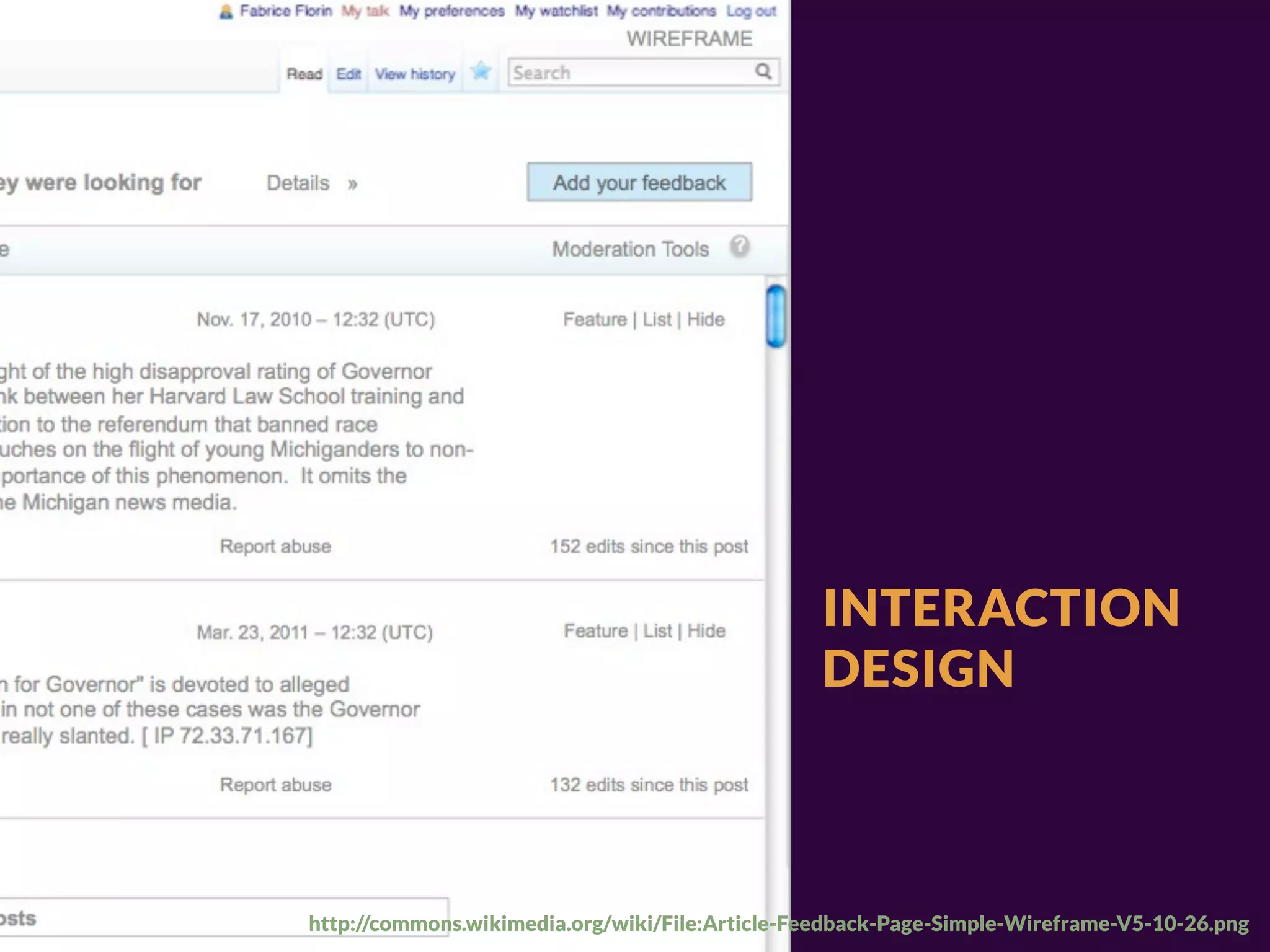
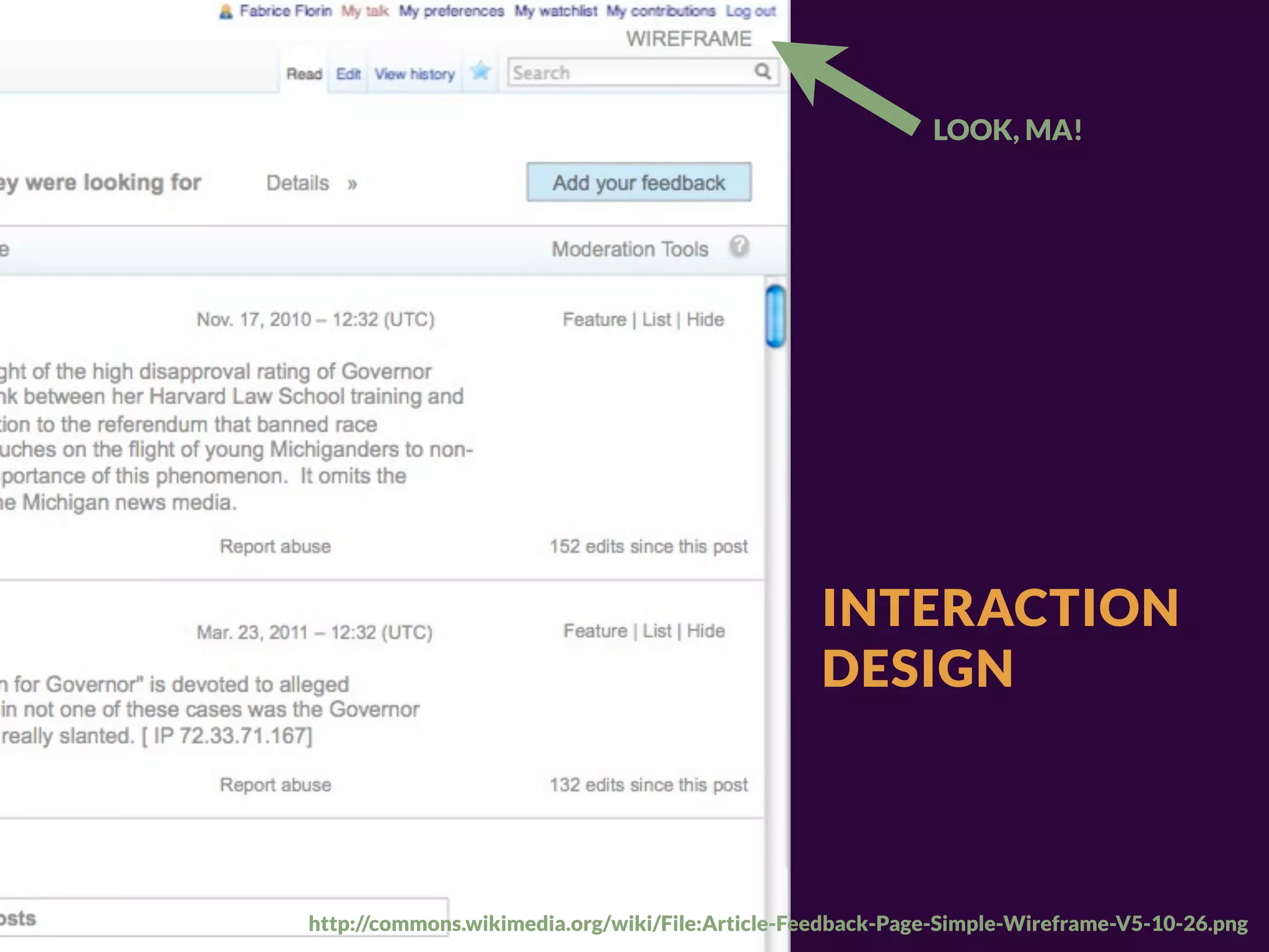


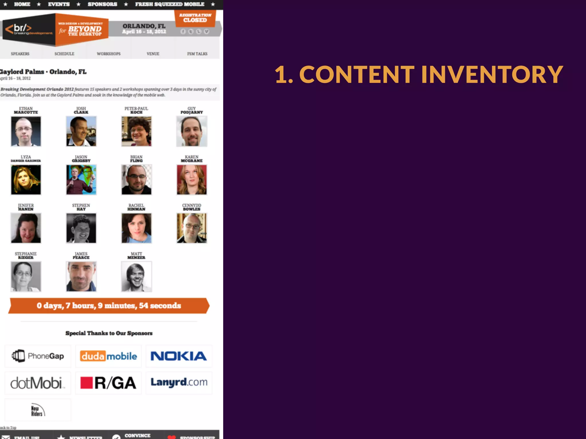
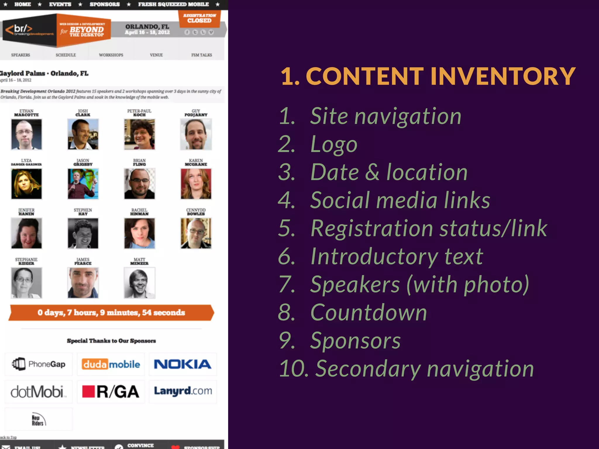
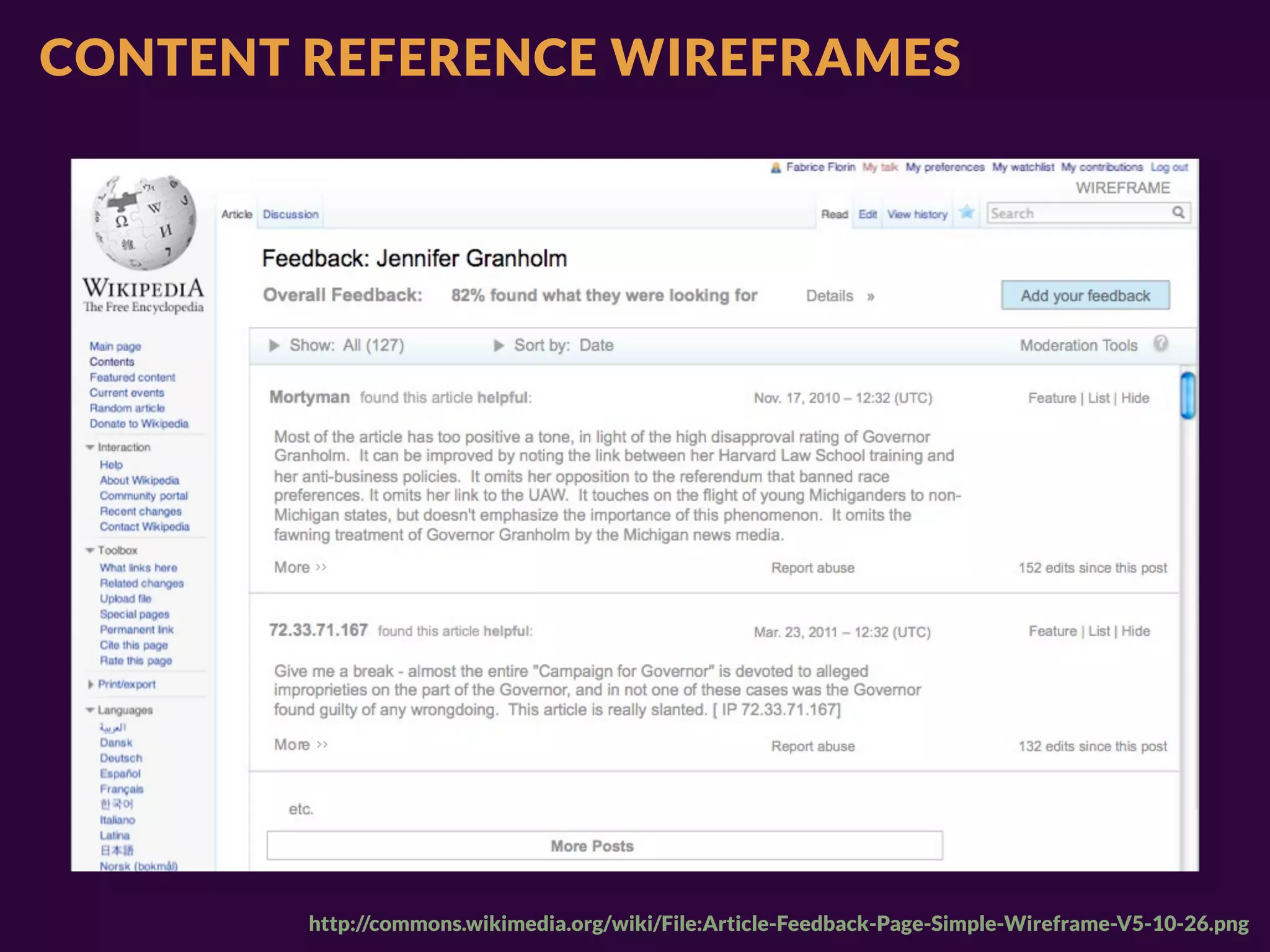
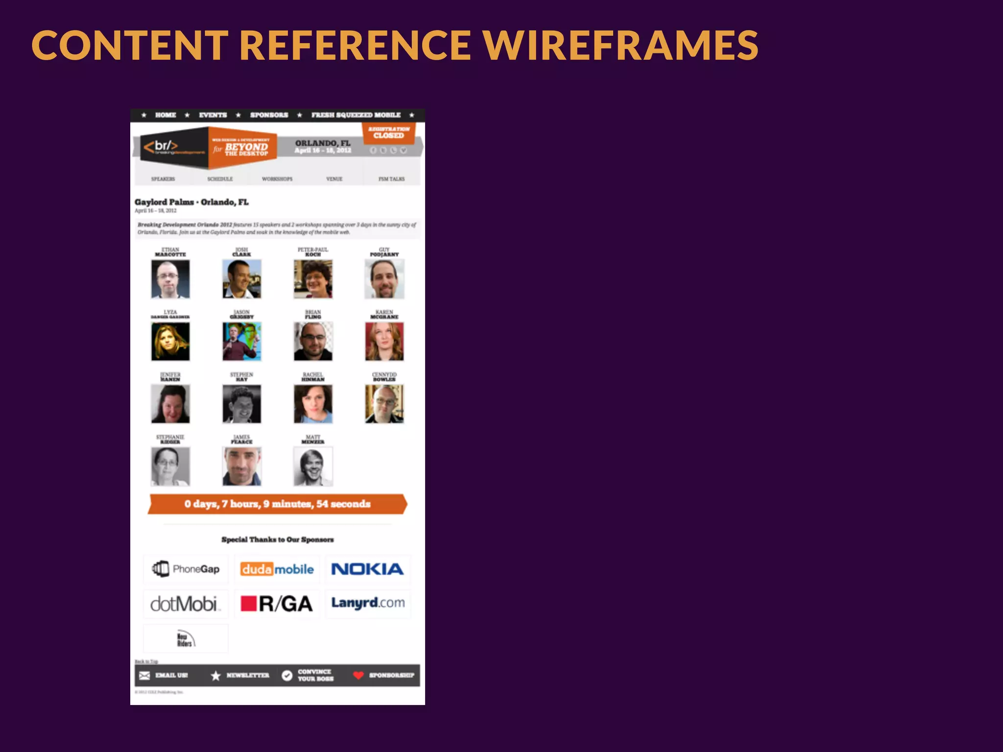
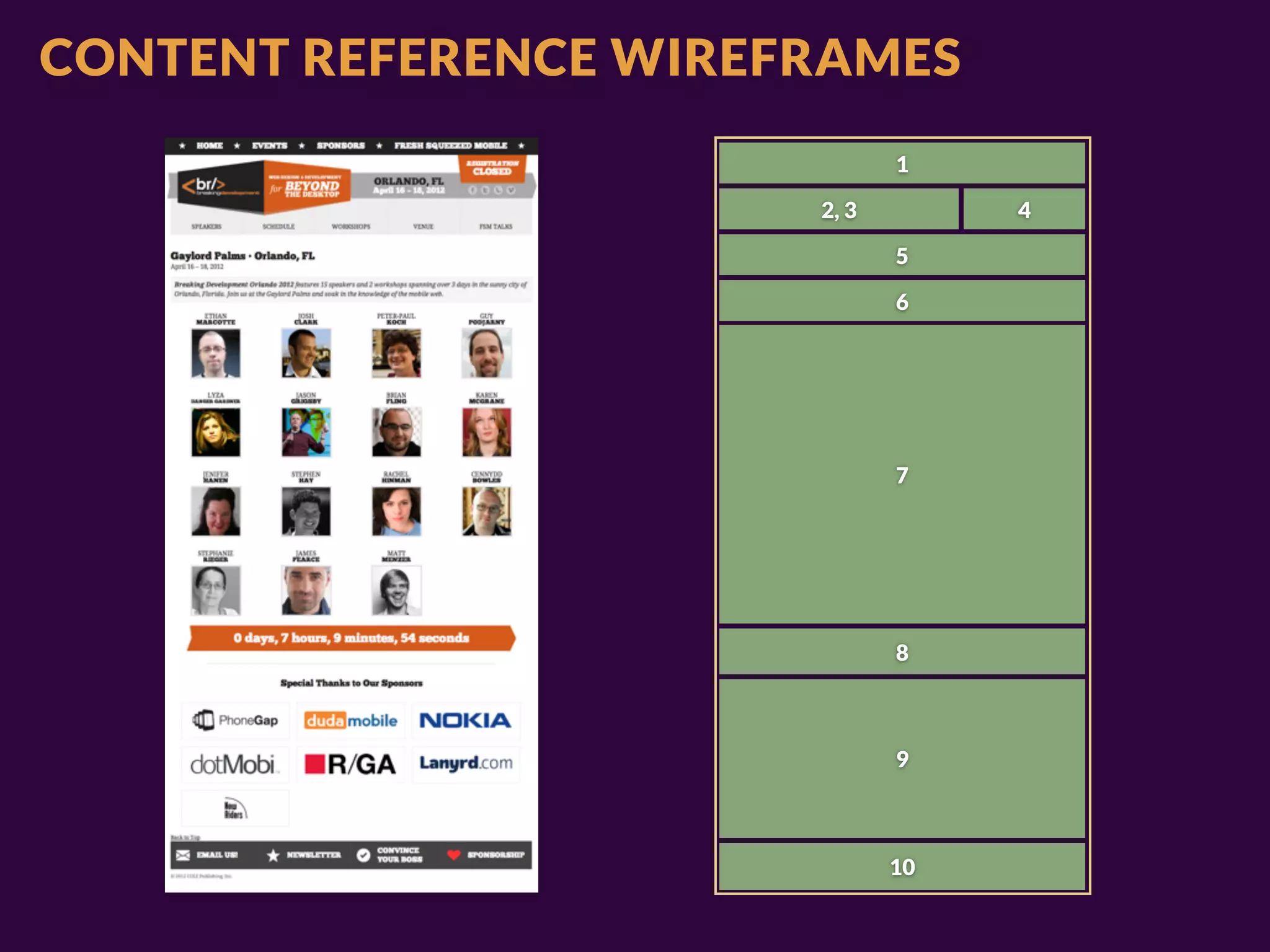
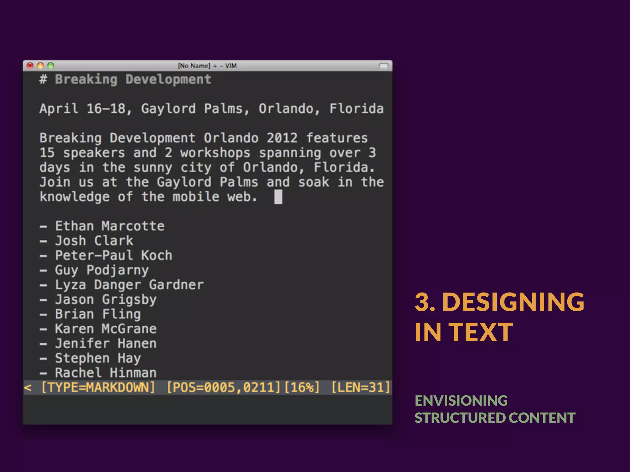
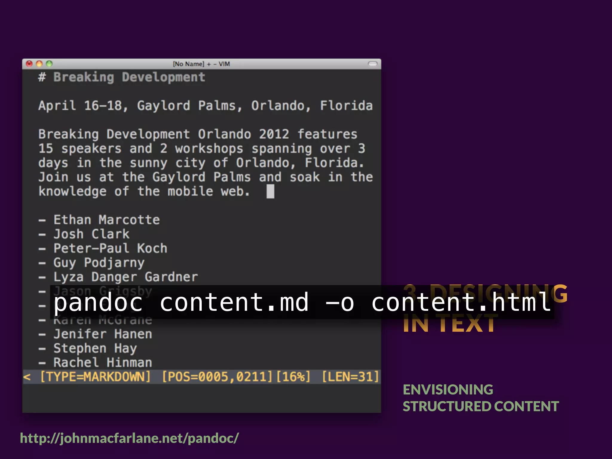
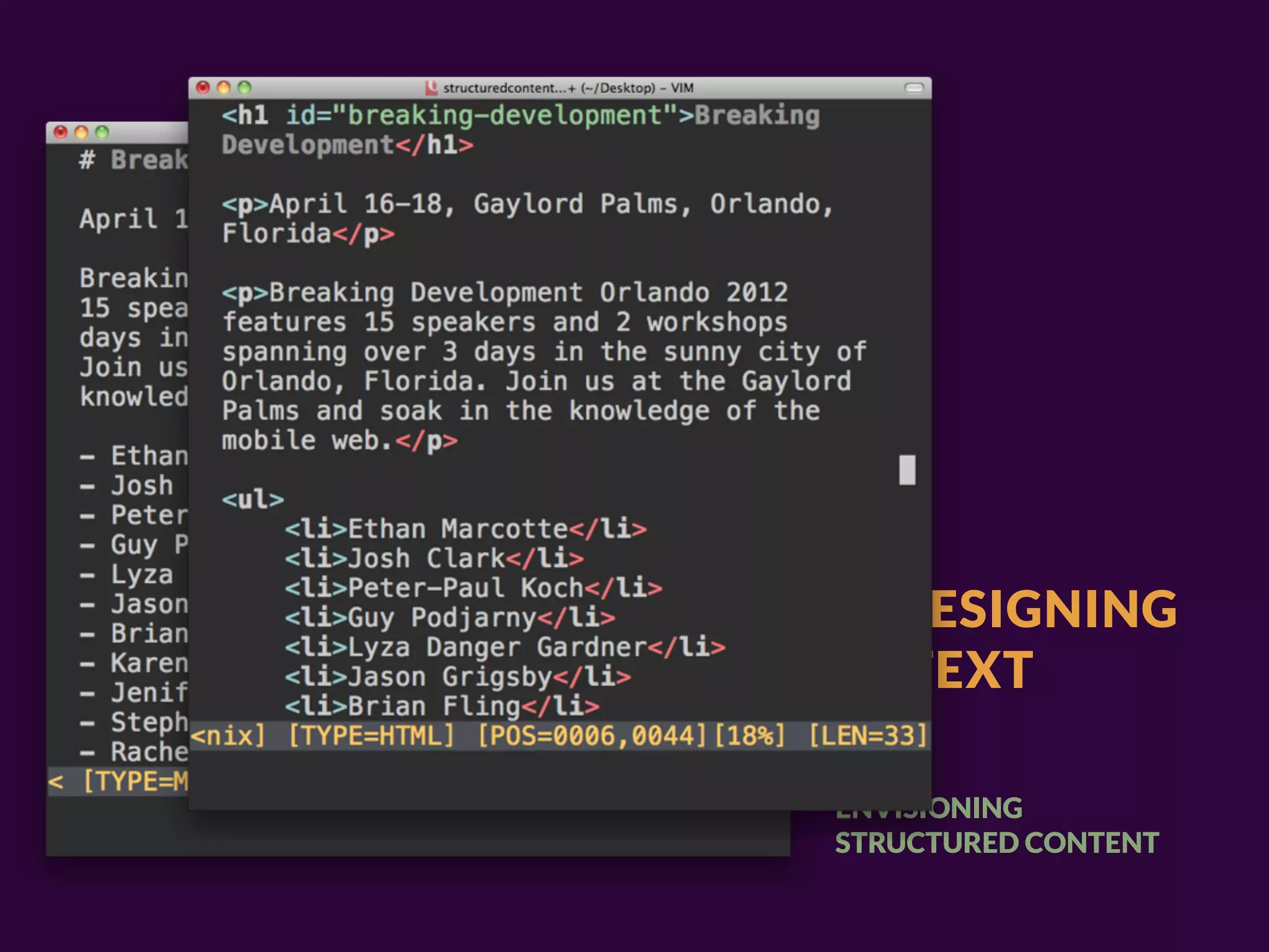
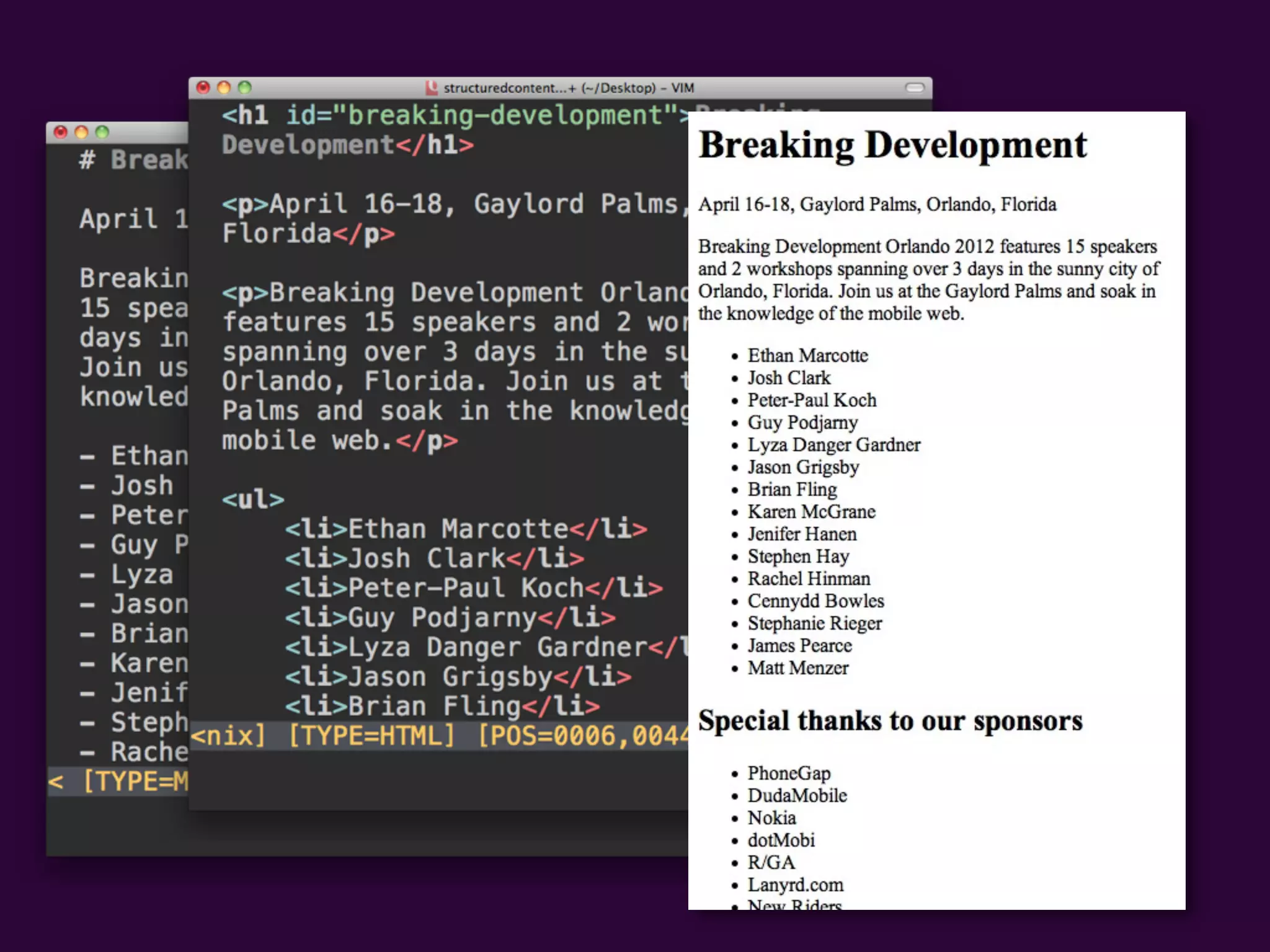

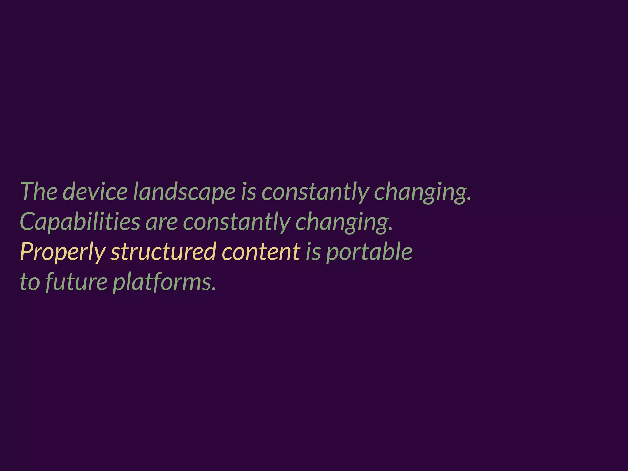
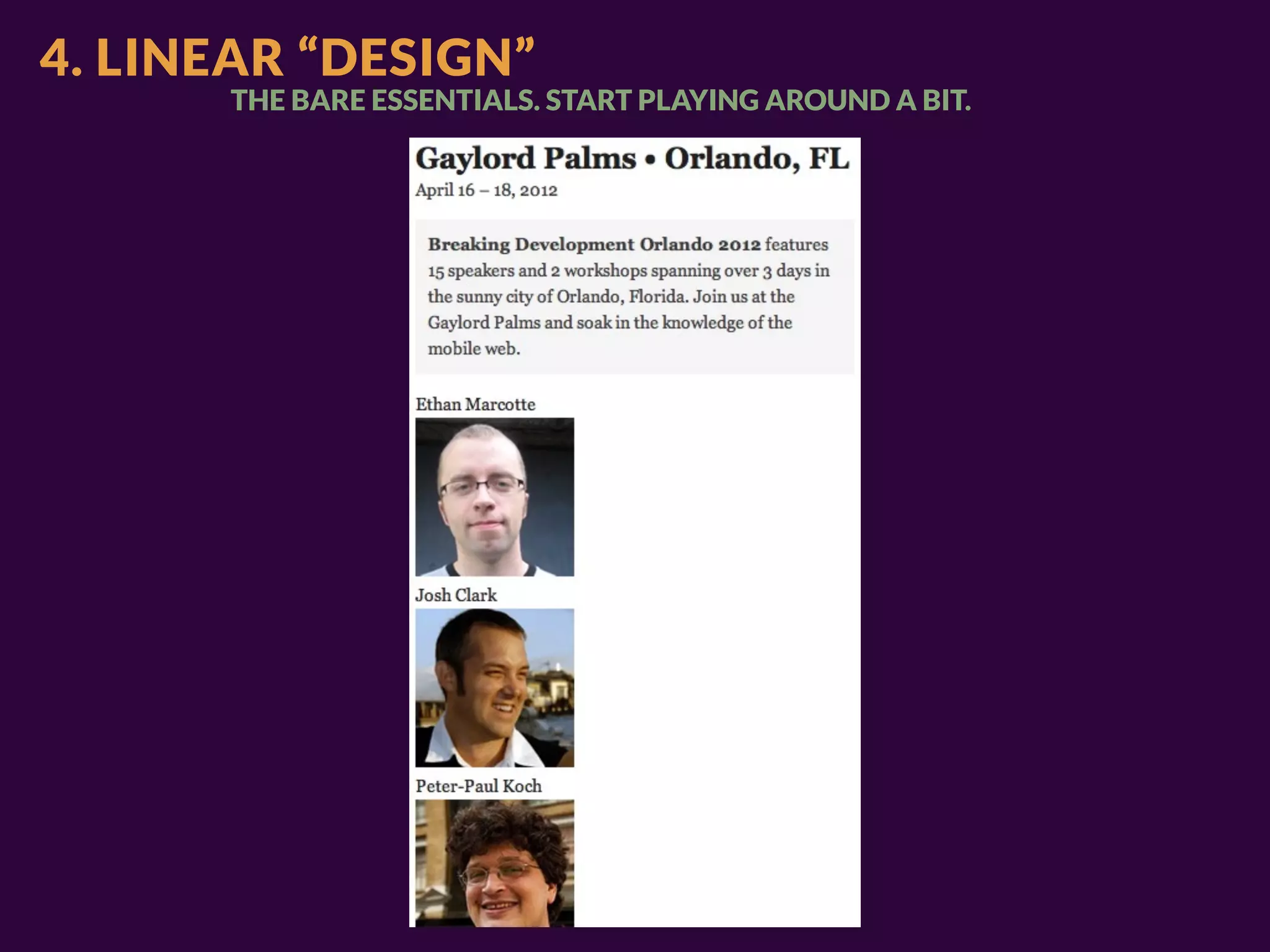
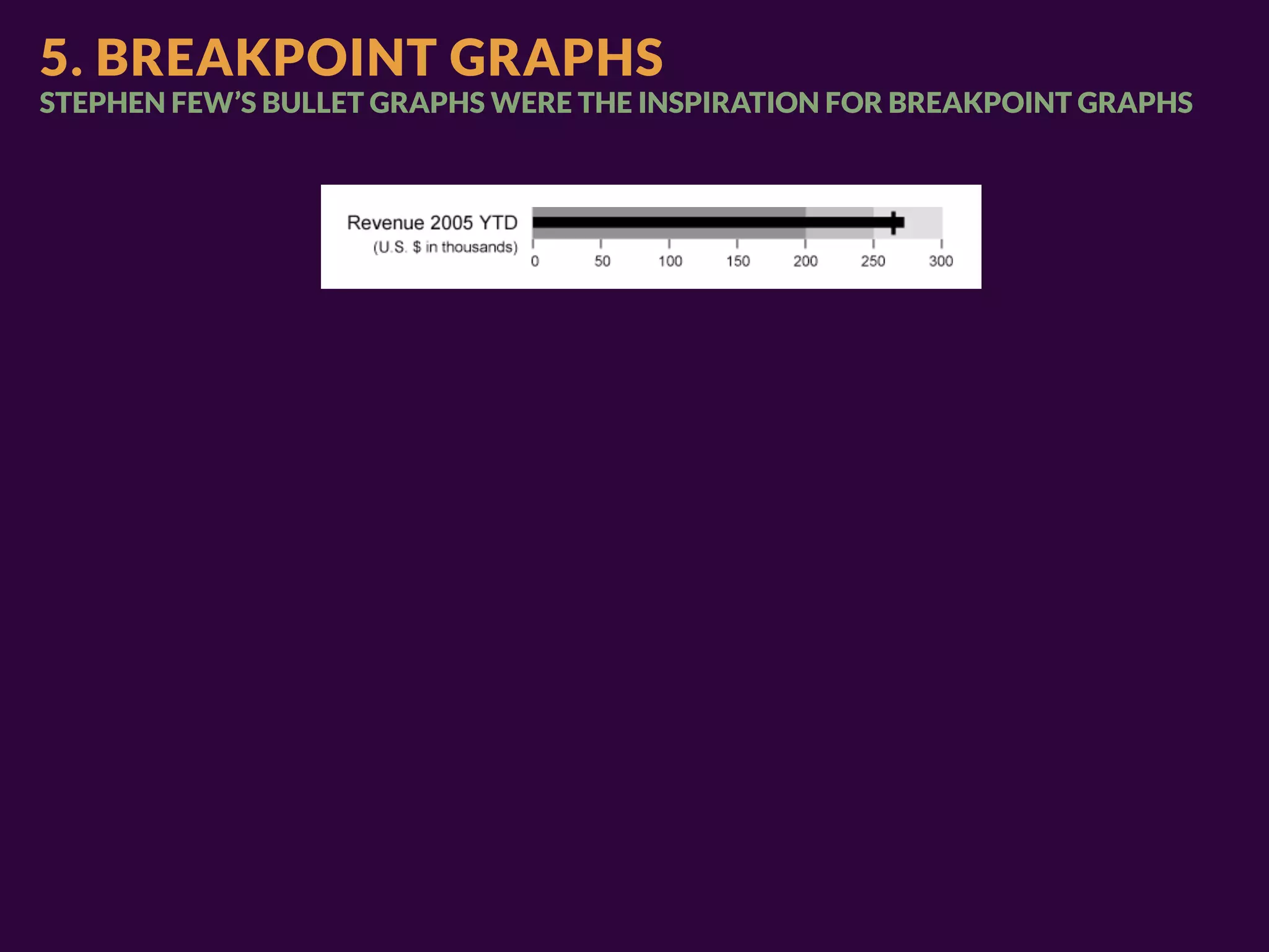
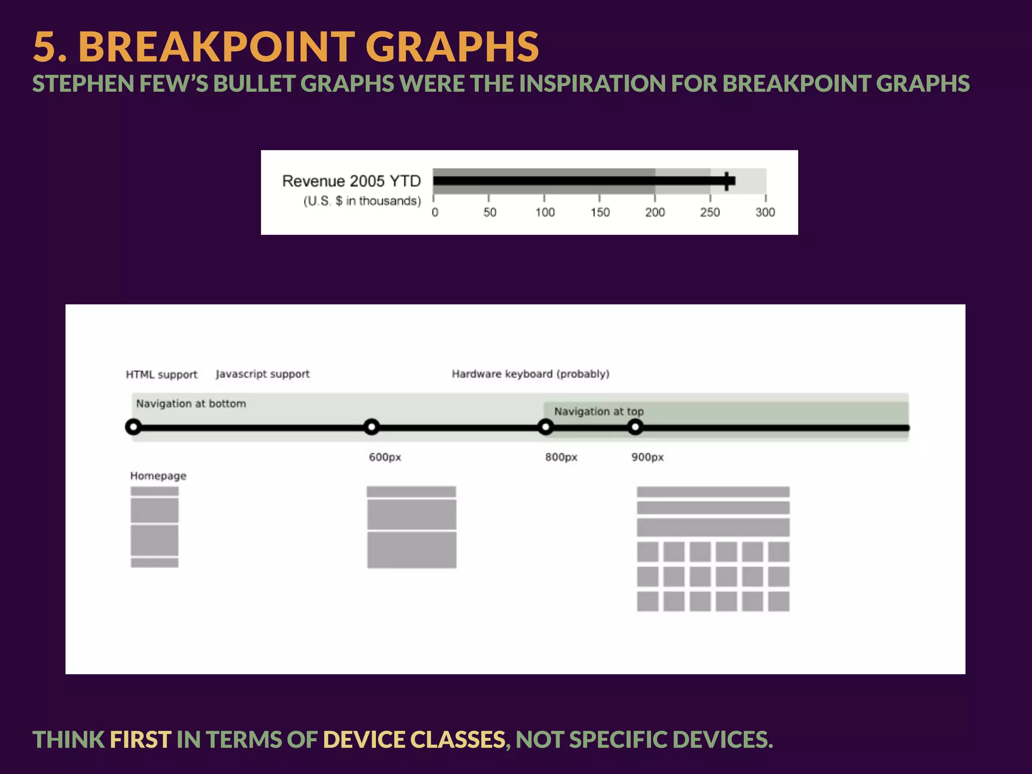
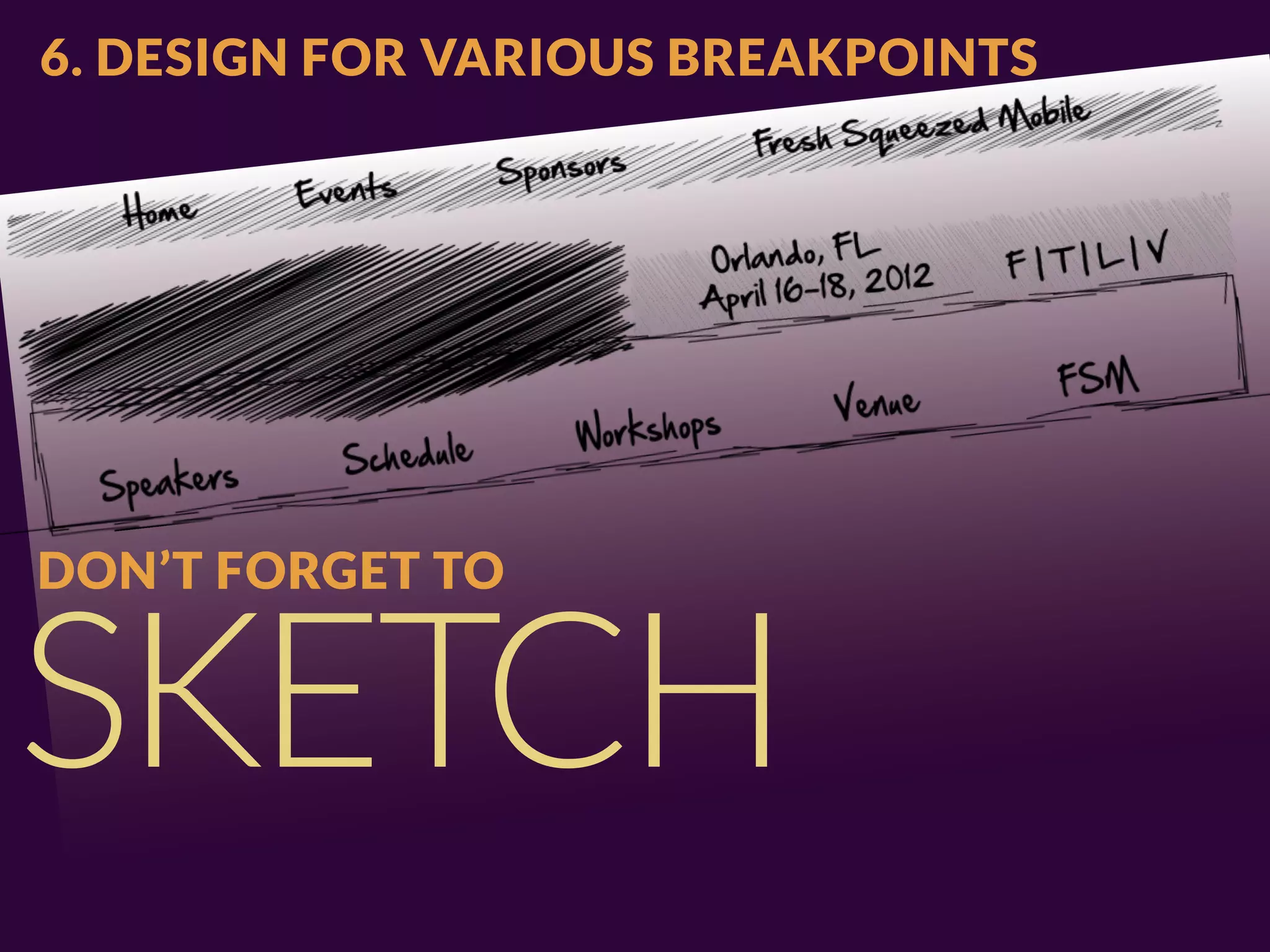
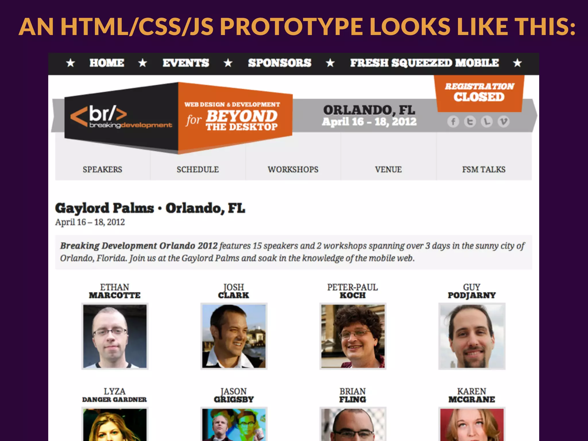
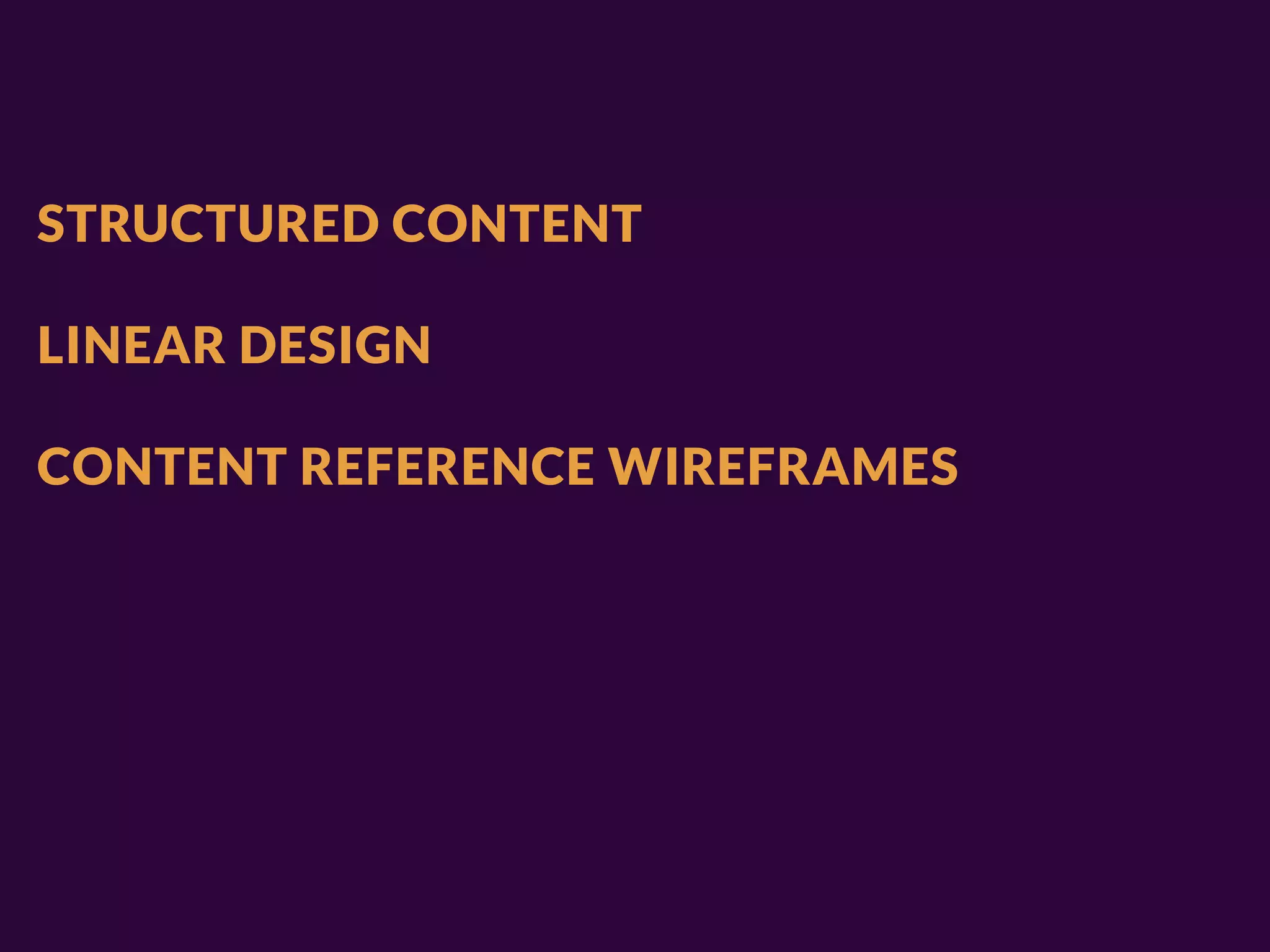
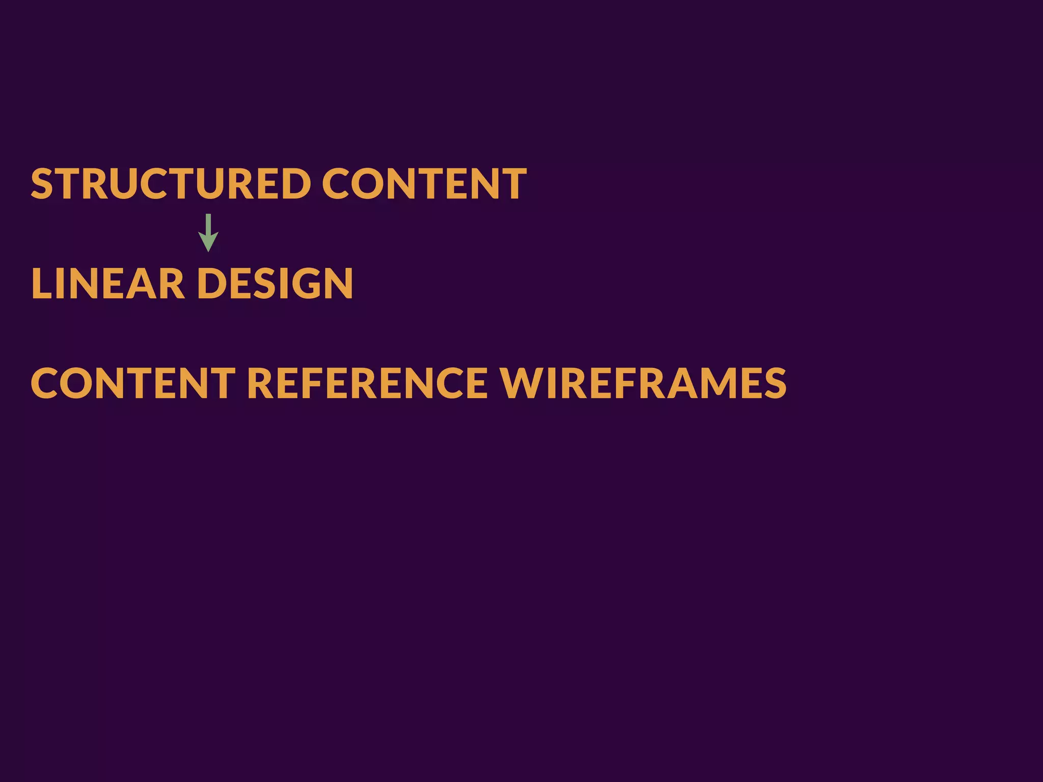

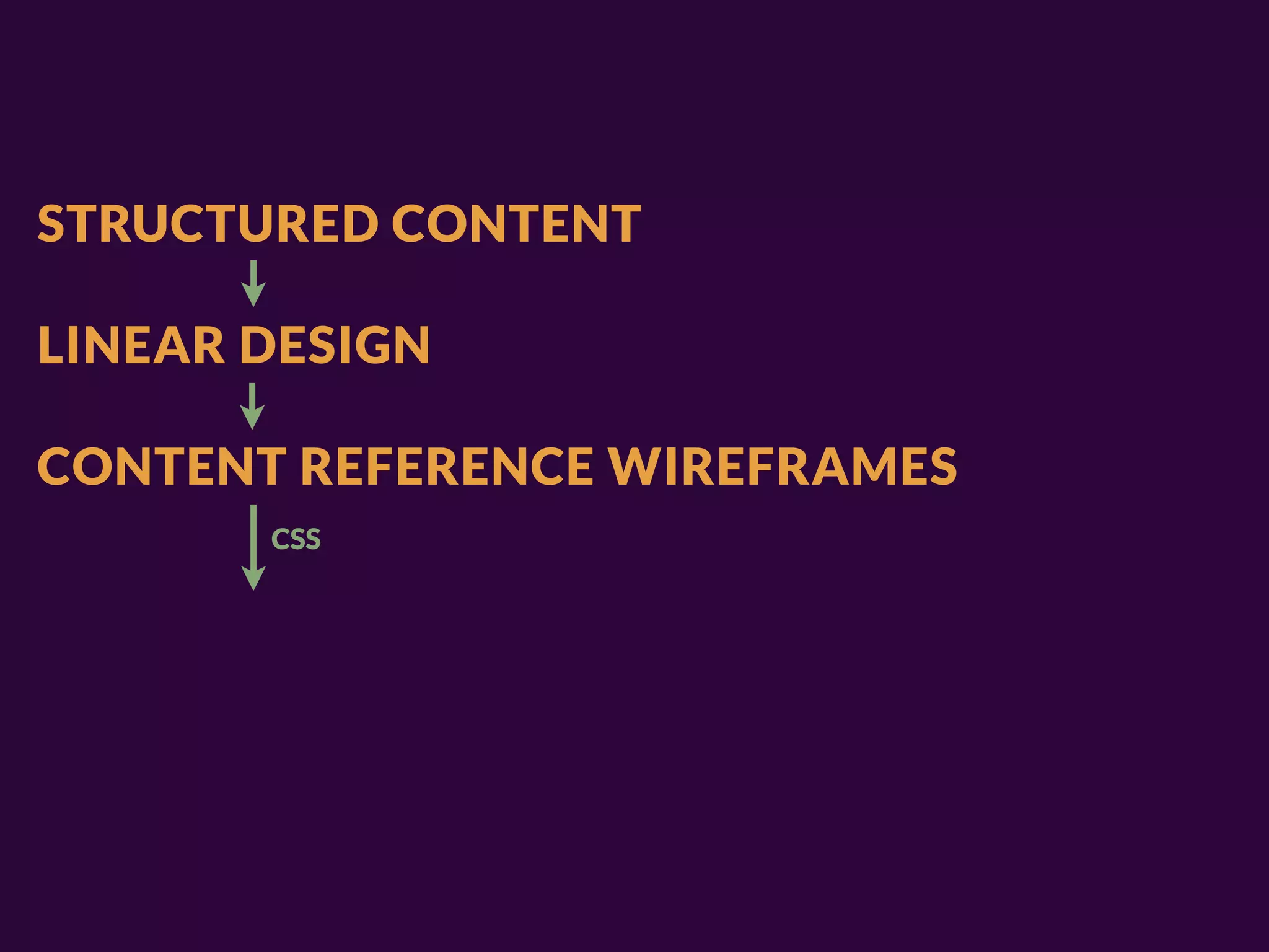
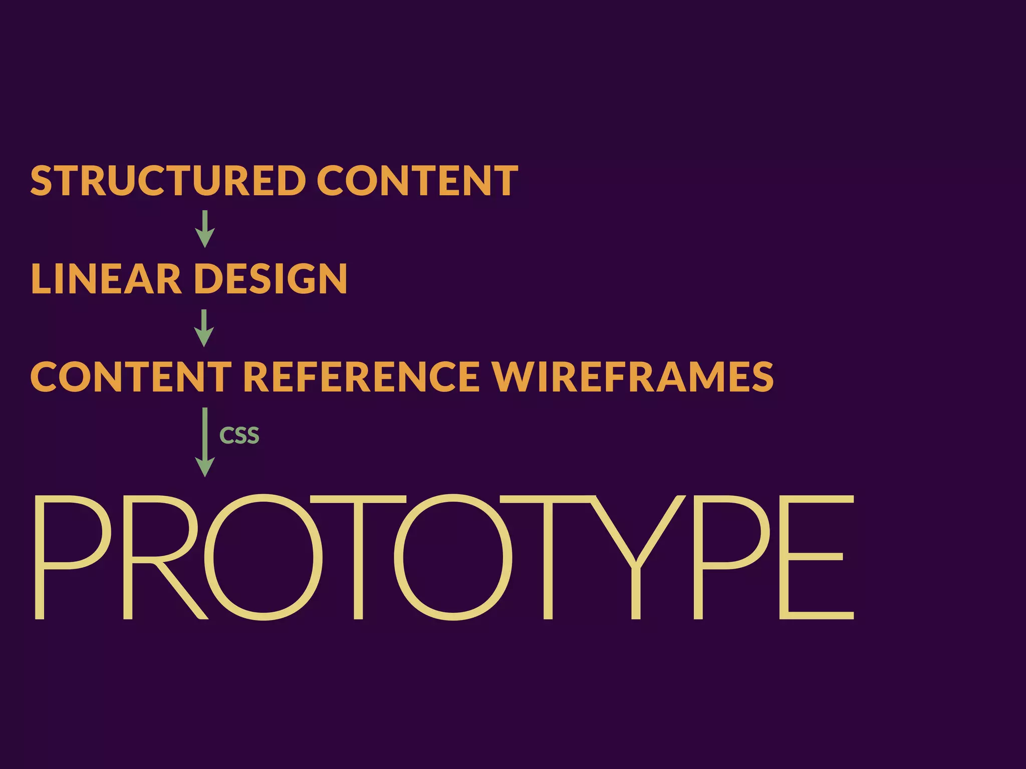

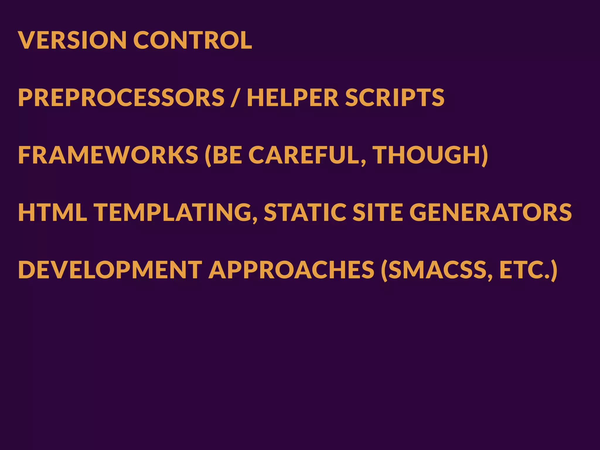


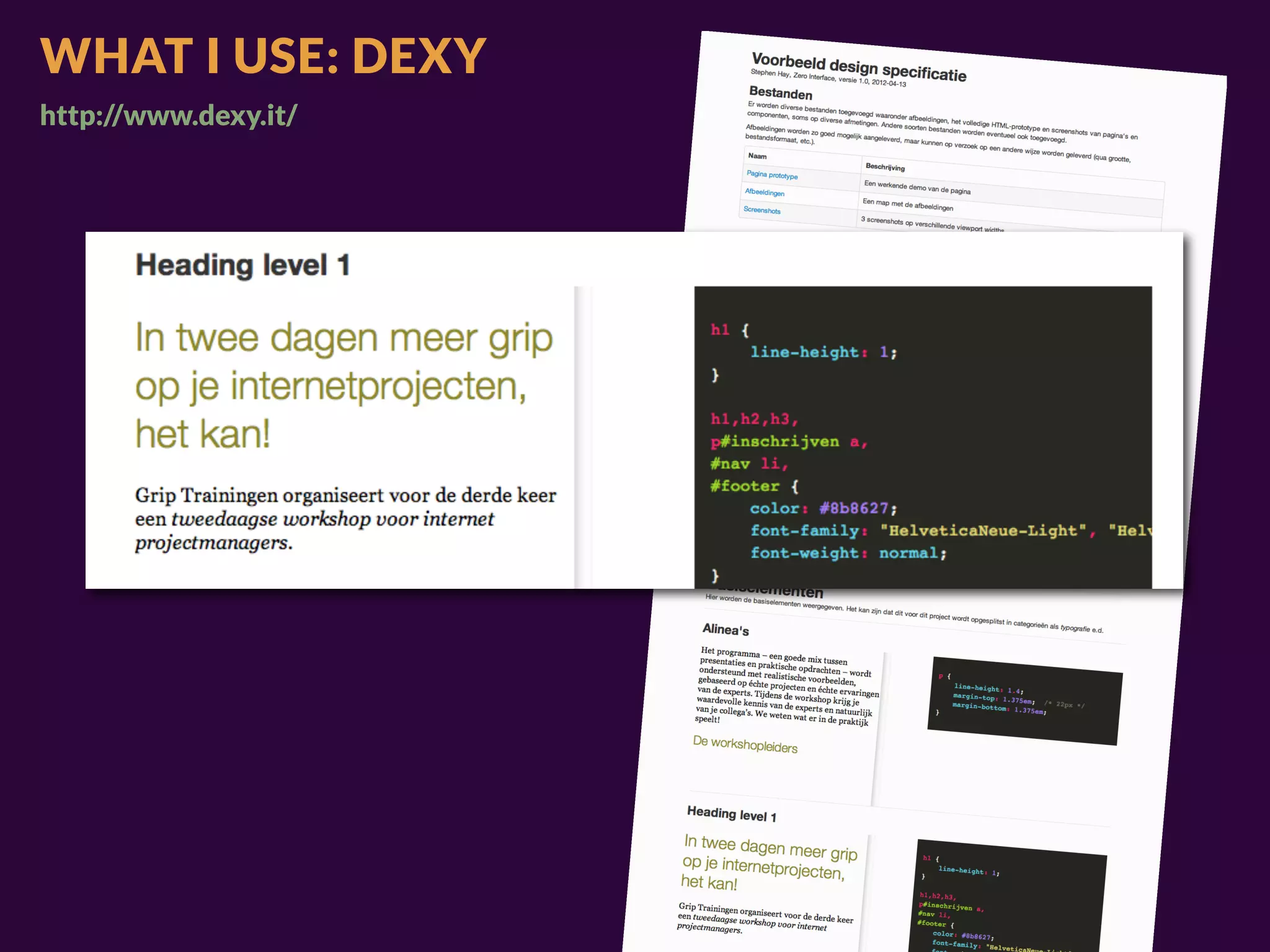
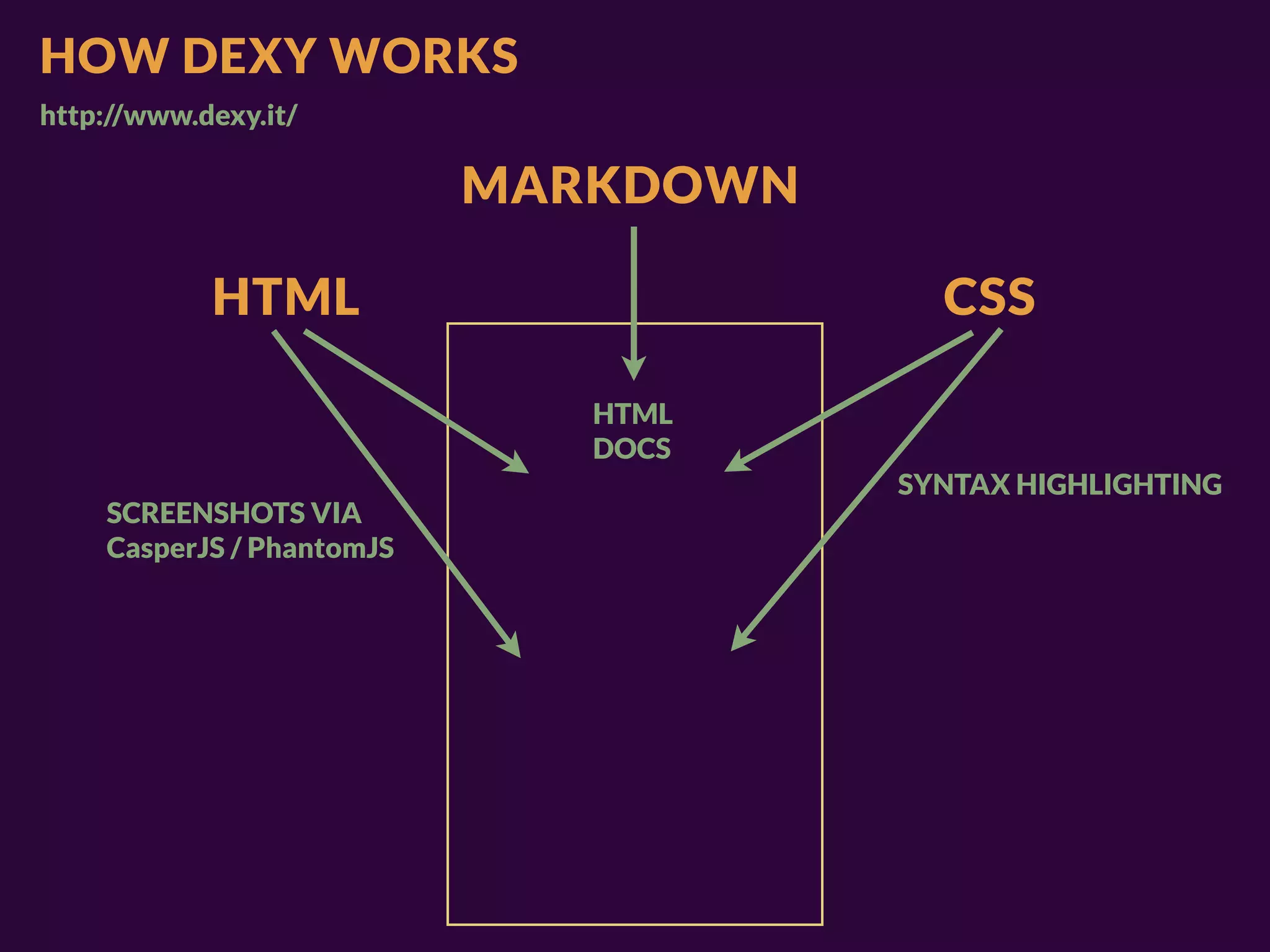

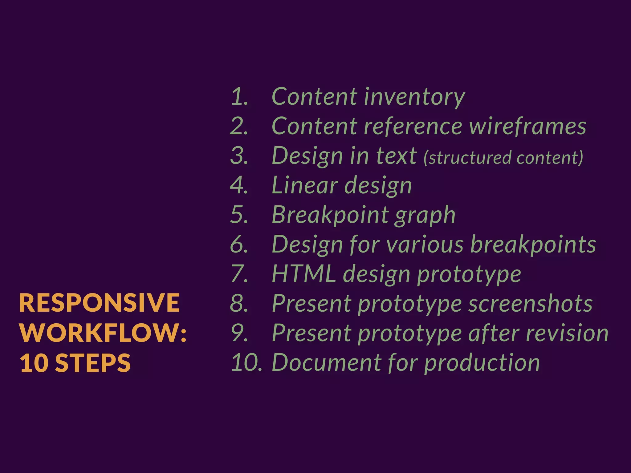


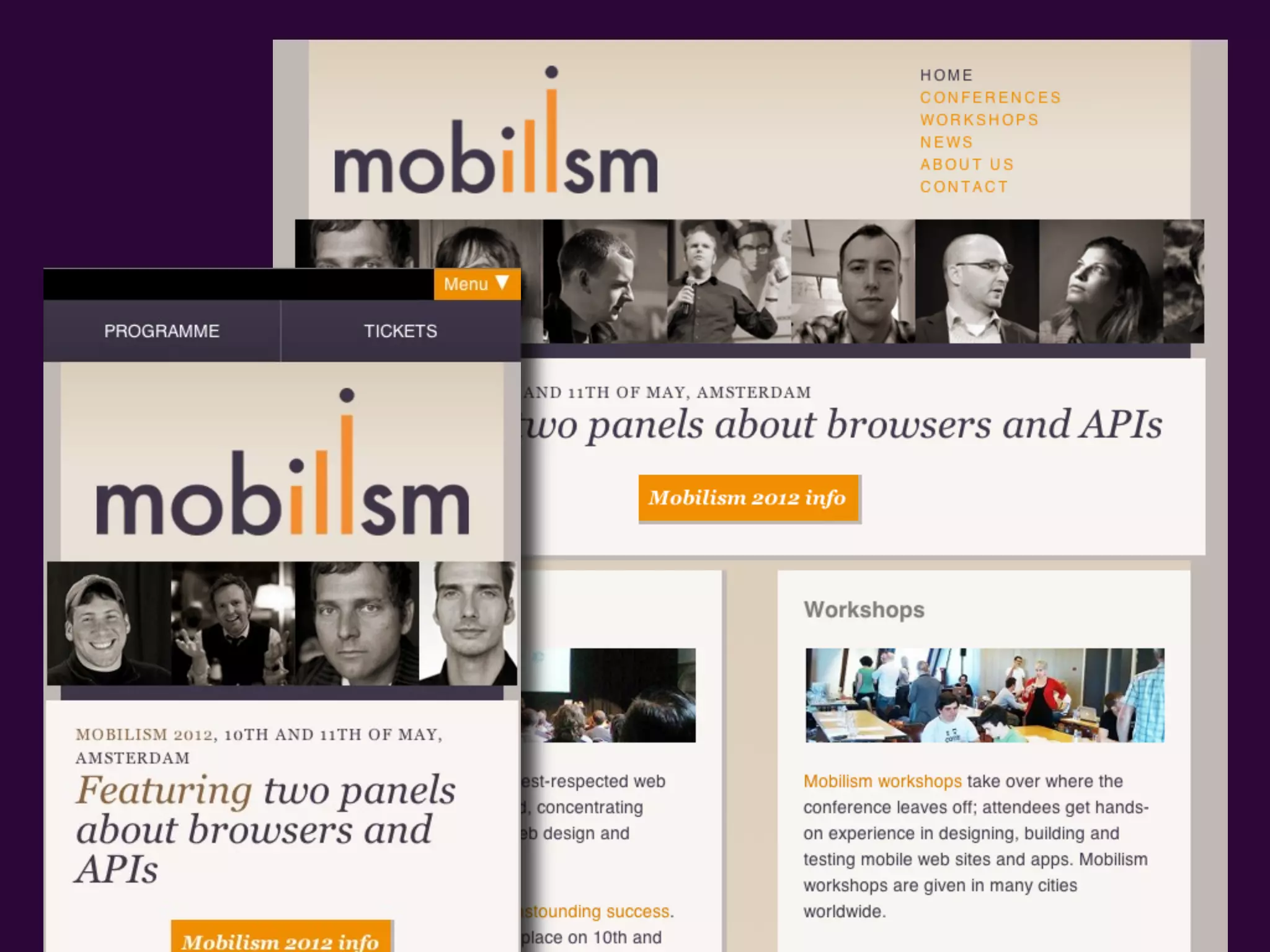
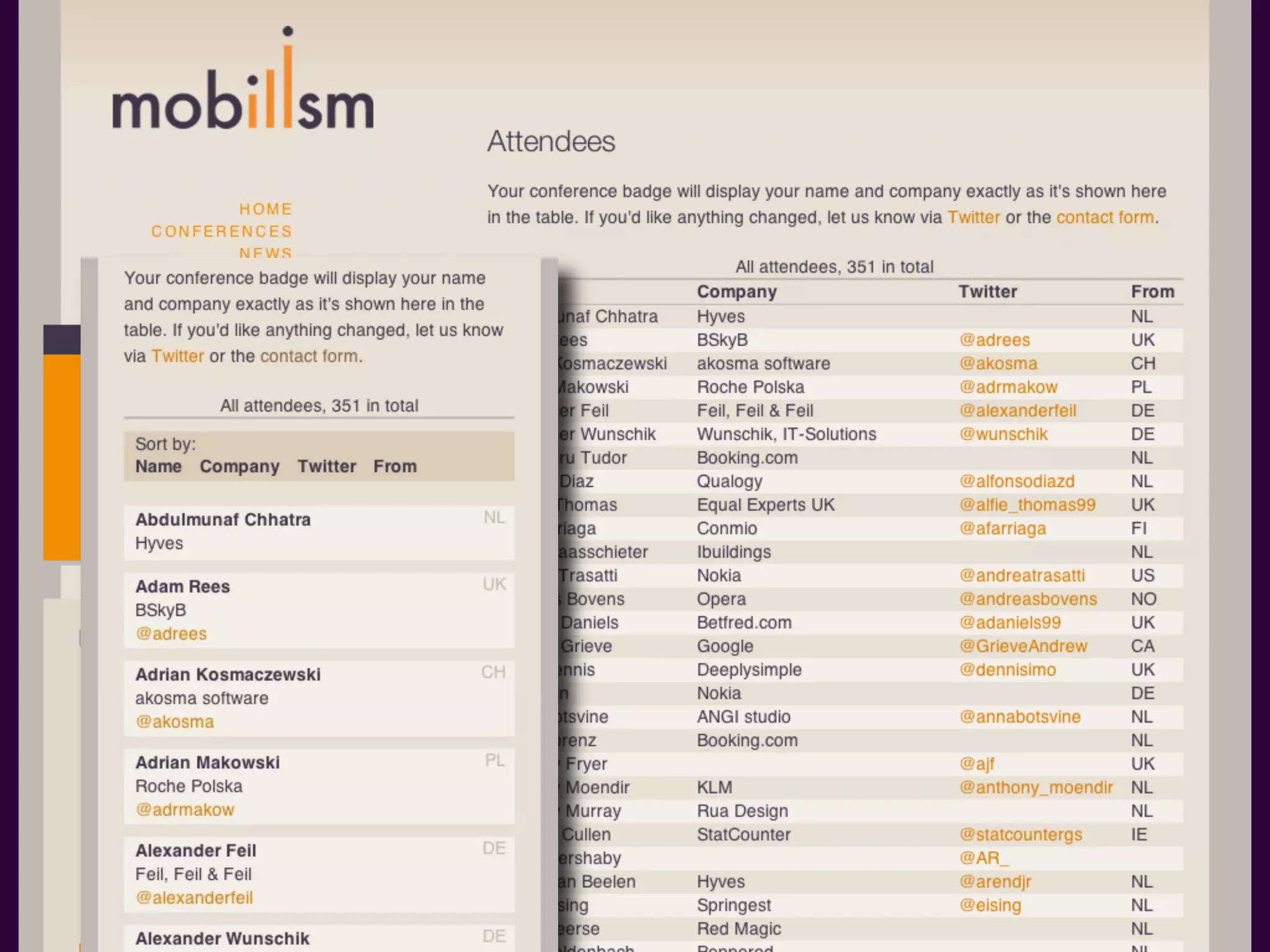
The document outlines a responsive design workflow, emphasizing the importance of content-first design and structured content. It details a 10-step process that includes creating content inventories, wireframes, and prototypes for various devices. The author advocates for an adaptive approach to design amidst rapidly changing technology, encouraging designers to consider device classes and deliver prototypes rather than traditional design assets.


![[演講簡報] Mopcon - 巧用 UI & UX 工具,提升設計溝通品質(彭其捷)](https://cdn.slidesharecdn.com/ss_thumbnails/1-221113073411-a9d4d733-thumbnail.jpg?width=640&height=640&fit=bounds)


![Vibe Coding vs. Spec-Driven Development [Free Meetup]](https://cdn.slidesharecdn.com/ss_thumbnails/vibecodingvsspecdrivendevelopment-251209105622-43f455e7-thumbnail.jpg?width=640&height=640&fit=bounds)


