1. USE
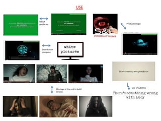
MPAA
certificate Productionlogo
Distribution
company
Use of subtitles
Montage at the end to build
tension.
2. DEVELOP
Orphan has a very long
introduction whereas I've
tried to get straight to the
point so the audience are
hooked in quicker.
In the Orphan the scenes that take
place in daylight have no effect on
them. In my trailer, decided to put
a dark tinge around it so its looks a
bit more dark and creepy.
In the Orphan trailer there is no
specific date as to when the film will
be released, I copied this however
didn’t put in the website, production
and distribution logos.
Most of my scenes take place
at my house whereas in
Orphan the scenes take pace
in various locations.
3. CHALLENGE
In my trailer there are only three
characters – the mum, dad and the devil
child. In the Orphan there are two The beginning of my trailer is
younger siblings. I have not included completely different to the Orphan. I
younger siblings because I wanted to wanted the audience to be unaware
focus on the devil child terrorizing the of where the devil child came from so
mum and dad. began with a strange knock on the
door and a baby on the doorstep. This
keeps the audience guessing.
4. USE
Masthead is red and bold grabbing the audience’s
attention. Masthead fills up whole width of page.
Picture is the
main focus taking
up nearly all of
the cover.
Title of film at the
bottom half of the
page.
I have included typical codes and
Same layout of the extra conventions of a magazine cover for
stories (at the side). example, barcode, price, tagline,
issue date etc.
5. DEVELOP
The slug line on my magazine is situated at the top of the
masthead whereas on Empire its at the bottom of the
masthead.
As the genre of my
trailer is horror, I
have edited the
picture of the devil
child by making
the pupil’s red.
The barcode is positioned
differently at the bottom right.
6. I have used two images in my
CHALLENGE magazine cover. A picture of the
woods which I edited and a picture of
Mahima (devil child).
My colour
scheme is very
different but
this is down to
the difference
in genres. My
colour scheme
is quite dark
which reflects
the horror
genre clearly.
I added a few extra stories.
7. USE
Both of the posters include
a tagline.
I used the same font
used for The Ring for
Devil’s Spawn.
I used a black tinge around the main
image
8. DEVELOP I wanted to emulate the main
image of the girl however in
my poster the devil child is
looking at the audience
directly.
The colour scheme for The Ring
is white and black but I decided I
did want to add red because it
has connotations of blood and
danger.
9. CHALLENGE I did include cast names in my
poster.
I used steeltongs in my
poster.
I’ve added an image of trees in the
background. I edited it and put in
a blue tinge.
The Ring poster has a release
date, I put “coming soon”
The poster I’ve created is instead.
landscape.