More than Just Lines on a Map: Best Practices for U.S Bike Routes
Magaine Analysis
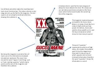
1. A medium shot is used for the main image as it
allows for more detail in the shot. This means we
can see tattoos and chains included on the front
cover which further accentuates the overall rap
feel of the magazine.
Use of black and white makes the masthead and
main cover line stand out. The colour scheme is very
edgy and sets up the feel for the magazine. The red
aspects are very bright and attract attention,
drawing the audience in.
The word “superstar”
represents the artist as of high
status, this makes the audience
want to buy the magazine as
they want to stay on top of
what's popular and not read
irrelevant information therefore
the word “superstar” shows the
information is current
We know the magazine is aimed at fans of
rap music as the information and people
included are rap based. The cover lines
include the word “rappers” and things such
as “rap’s next big superstar” which clearly
points out the aim of the magazine and
therefore the audience.
The magazine represents power
and wealth, the stance Gucci
Mane is in makes it look like he is
ready to fight which portrays
power. His tattoos, chains and
watches show wealth as it is over
the top and excessive which
shows he has money to spend.
2. The use of white and pale colours
gives the magazine a classy feel
which contrasts the style of music
that is grime. This reflects the artist
it a professional light which a lot of
people wouldn’t associate with
Skepta but gives fans a sense of
pride that would attract them to
the magazine.
His stance is as if he’s looking to
the audience which makes it feel
quite personal. This would
attract the audience as it makes
you feel engaged and
associated with the magazine.
His name is in a central position giving it a sense of
importance. Along with his overall stance, Skepta is
given a sense of power which would makes people look
up to him and therefore buy the magazine.
The masthead is bold and
professional again reflecting the
feel of the magazine. The ‘F’ is
contrasted to make it stand out
which could again signify a sense
of importance. The masthead
include the word ‘Fade’ which
links in with how the colours
blend together.
The colours are very heavenly
portraying Skepta as some kind
of angel or ‘Gods gift’.
3. His stance shows off his chains
representing wealth. He has his
hands in his pockets which
gives a relaxed effortless feel.
The word “king” portrays Jay Z in a regal manor
making him of very high status and gives us the
image that he is the best in the business.
The cover uses mainly secondary
colours, the white signifies purity and
black, elegance. This gives the
magazine a professional feel and the
yellow stands out attracting attention
and making the cover more fun.
Artificial lighting is used in the photo
which reflects off his face and arms,
this attracts attention to the main
features of his face and shows strength
in his arms which is what Jay Z is
wanting to show.
His white top blends in with the
background, white is a very
heavenly colour so by him wearing
it presents him in an angel like way.