
Recommended
More Related Content
Recently uploaded
Recently uploaded (20)
Featured
Featured (20)
Magazine Cover Analysis
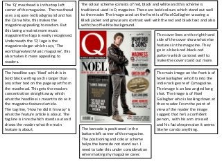
- 1. The ‘Q’ masthead is in the top left The colour scheme consists of red, black and white and this scheme is corner of the magazine. The masthead traditional used in Q magazine. These are bold colours which stand out well uses a square red background and has to the reader. The image used on the front is of Noel Gallagher wearing a the Q in white, this makes the Black jacket and grey jeans contrast well with the red and black text and also magazine appealing to readers. But with the off-white background. this being a mainstream music magazine the logo is easily recognised. The cover lines on the right hand Underneath the ‘Q’ logo is the side of the cover show what else magazine slogan which says, ‘The features in the magazine. They worlds greatest Music magazine’, this go in a black-red-black-red also makes it more appealing to pattern which contrast well to readers. make the cover stand out more. The headline says ‘Noel’ which is in The main image on the front is of bold black writing and is larger than Noel Gallagher who fits into the any other text on the page apart from indie rock genre of Q magazine. the masthead. This gets the readers The image is an low angled long concentration straight away which shot. The image is of Noel what the headline is meant to do as it Gallagher who is looking down at the magazine featured article. then reader. From the point of The tag line, ‘How he did it his way’ is view of the reader the image what the feature article is about. The suggest that he’s a confident tag line is in red which stands out and person, with his arm crossed shows the reader what the main and his facial expression it seems feature is about. The barcode is positioned in the like he can do anything. bottom left corner of the magazine. The positioning and colour scheme helps the barcode not stand out. I need to take this under consideration when making my magazine cover.
- 2. The masthead is displaying the The colour scheme consist of red, white and black. This is a quite simple magazine name, ‘NME’. As NME is a colour scheme. The text varies between red and white, the red attracts the well established magazine the image readers to the magazine. ‘Damon’ and ‘Gorillaz’ are apart of the main cover on the front can slightly covers the line are both In red bold text, this is because the readers can recognise the masthead this is because it’s an names. easily recognizable magazine. The masthead is in the conventional The main cover line is about the top half of the magazine, in the top Gorillaz and Damon Albarn who left hand corner, similar to ‘Q’ created Gorillaz. The main cover magazine. Underneath the line attracts the readers instantly as masthead is the full name of the is the largest text on the cover. magazine, ‘New Musical Express’, The fist line, ‘Reality Blurs!’ is a play and next to that is the price of the on words as Damon Albarn is also magazine. the lead singer of the band Blur. The other cover lines are at the top, The main image is a mid shot of above the masthead and at the Damon Albarn who created Gorillaz, bottom. There are also three other with the two of the four fictional cover lines that border around the band members of Gorillaz, Murdoc main image. The cover lines are all Niccals(left) and Noodle(right). The about bands and artist with the facial expression of Damon Albarn exception of one. They are all similar looks as if he’s tired/annoyed with in size and some are slightly larger to with the two. This could be that The barcode is positioned in the emphasis their importance. Noodle (left) is grabbing his lips. The bottom left corner of the magazine. facial expressions of the two The positioning and colour scheme fictional characters reflect their helps the barcode not stand out. I character personalities created by need to take this under consideration Albarn. when making my magazine cover.
- 3. The is the cover of Clash magazine. This The main cover line, ‘reunion’ is in it’s own font which makes its stand out has a very simple layout with not a lot and attracts the reader to the magazine as it’s a different font to any other of text, but the use of the colours and text on the cover . The lines underneath this read, ‘the XX on love, loyalty the simple layout makes it I think very and understanding’, this gives the reader an insight what the article on The effective. XX is about. The plain white bold masthead The main image is a mid shot of contrast well with the black the member of ‘The XX’. They all background. The masthead is in the look serious and this reflects what conventional place with it spreading the article on them could be across the the top of the magazine. about. The 3 band members are all wearing black clothing which matches the black background and The cover lines are underneath the has a good effect on the cover. masthead is smaller text and again Their faces have been tinted blue the white text go well with the black and this contrast well with the background to make the text stand black and white color scheme. The out. positioning of the three is very interesting as it makes none of them stand out. Typically when a The colour scheme consist of black, band is on a front of a magazine white and blue. The main colours are the readers can clearly see who black (background) and white (text), the front man because they are in the blue gives the cover a really nice the middle and are in front of the contrast and makes it appealing to rest, but in this it seems as if they the readers of the magazine they all are important as each The barcode is position in the bottom other. This again probably relates right hand side of the magazine and has to the the cover line, ‘the XX on the price above it love, loyalty and understanding’.