The document evaluates how effective the combination of the main product (music video) and ancillary texts (digipak and advert) are. It finds that they are generally effective due to consistent brand identity, themes, and genre conventions across the tasks. Specifically, the music video, digipak, and advert all use similar fonts, colors, images, and locations to represent the alternative rock genre. However, the document notes that including images of the band in the digipak and advert could help further promote the artist.
"Mastering the Digital Landscape: Navigating the World of Digital Marketing"
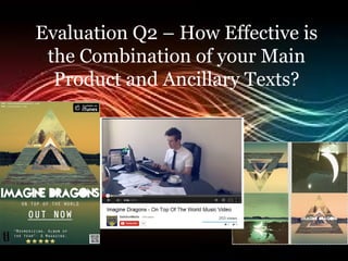
Evaluation Q2 - How effective is the combination...
1. Evaluation Q2 – How Effective is
the Combination of your Main
Product and Ancillary Texts?
2. • In our main product and ancillary tasks the main aim
was not only to create a realistic representative piece
of work for our main task but to also use the ancillary
tasks to try and resemble real media products as well
as to create a professional looking music video, advert
and digipak. To gain this we needed to resemble
media products that are worthy of being seen on music
channels, digipaks in music stores and adverts in the
eye of the general public such as on billboards etc.
3. • Our music video out most was the difficult
part of our tasks to make sure it looked
professional enough. This is because it
had to be filmed over a period of time,
not only that we had to filter it, edit it,
and create a storyline which would look
and come across as a real media product.
For our digipak and advert we needed to
use photoshop but that was the most
editing we had to do.
6. • The brand identity in our tasks was extremely important
in showing how effective our music video, digipak and
advert are as a combination. The main part of brand
identity appears in our digipak and advert, with the
use of the triangle symbol to represent the album and
the artist/band. Also the use of illusional pictures on
both the digipak and the advert is part of brand
identity, this is useful for promoting the band, for
their illusional ideas of song and music video well as
pictures.
7. • We used the same fonts for the digipak and
advert, this is also part of brand identity. This
is useful for people to recognise this font, they
will associate it initially with this band, the
same goes for the pictures and the triangle
symbol. Our music video doesn’t include any
brand identity because we have not included
the characters from the video in our digipak or
advert. This lessens our promotion for our
music video in some sense, for example,
audiences seeing the advert before the music
video, they may see the characters on the
advert and feel intrigued to watch the video
after seeing that etc.
8. • The connotations of representing our
genre were an added importance to how
effective our combination of tasks was.
Across all three tasks there was a specific
theme and set of generic conventions
that needed to be added, these were
essential to the alternative rock genre
and our artist/band.
9. • Colours:
Music Video – the colours we’re very bright, happy, warm,
cheerful etc. This is to coincide with the feel of the song,
this theme was there to match the theme of the song,
similarly to what Imagine Dragons do with their other
music videos.
Digipak – The colours are quite dull, they are not very
bright, this is again a theme for Imagine Dragons, this is
also a generic theme for the alternative rock genre. Most
alternative rock albums do not use bright colours they are
quite dull and simplistic.
Advert – Similarly to the digipak theme, the colours are
quite simplistic to match the brand identity of the digipak,
also so that these are representative to the genre, audiences
will recognise the colour scheme and associate it with this.
genre.
10. • Images:
Music Video – Illusional images are included in the video,
such as the river reflection scene, the window shine scene
etc.
Digipak – this also includes illusional images, the moon
picture, the triangle with several pictures within it etc.
Advert – The reflective tree and lake image in the
background is again very illusional especially with the
filtered colour.
This illusional theme is a common convention not only for
this band but for Imagine Dragons as a band as well.
11. • Text:
Music Video – this includes no text.
Digipak – the font used for this again falls into
brand identity as the font matches the advert
text/font as well, this is the used font for Imagine
Dragon, as well as this, alternative rock artists
commonly use funky, different fonts to stand out
from other genres.
Advert – as above ^^
12. • Locations:
Music Video – Lot of different locations, these are all happy
warm places to coincide with the jobs each character has as
well as fitting in with the theme of the song, summery,
uplifting and warm.
Digipak – locations used in this, again, there are lots of
different locations used, the front cover especially combines
with the music video as it is a warm feature location.
Advert – similarly to the digipak, this uses a warm location
to combine with the digipak and the music video –
differently this uses just one location.
13. • As a combination of the three products, music
video, digipak and advert they are effective
because of the use of brand identity and the
similar themes that they include, such as the
use of fonts, images and locations. They do
not attract attention in the aspect of colours
as it is not a bright theme, especially in the
advert and digipak. I do like the themes which
are included in the three tasks, it matches the
genre. It does promote the artist in terms of
the brand identity in the symbol, however,
there is no images used including the band so
this aspect does not promote the artist.
14. • As a combination, I think they do promote
the band well, this genre has
conventions which I think we have met,
especially with the use of brand identity,
the colour scheme, the costume, the
characters and the images. If I was to
improve either of the three tasks I would
maybe involve an image of the artist to
help increase the promotion of the band.