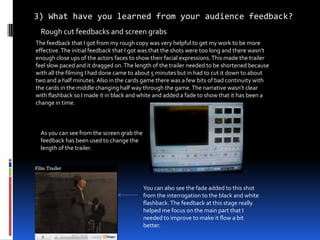
1. 3) What have you learned from your audience feedback? Rough cut feedbacks and screen grabs The feedback that I got from my rough copy was very helpful to get my work to be more effective. The initial feedback that I got was that the shots were too long and there wasn’t enough close ups of the actors faces to show their facial expressions. This made the trailer feel slow paced and it dragged on. The length of the trailer needed to be shortened because with all the filming I had done came to about 5 minutes but in had to cut it down to about two and a half minutes. Also in the cards game there was a few bits of bad continuity with the cards in the middle changing half way through the game. The narrative wasn’t clear with flashback so I made it in black and white and added a fade to show that it has been a change in time. As you can see from the screen grab the feedback has been used to change the length of the trailer. You can also see the fade added to this shot from the interrogation to the black and white flashback. The feedback at this stage really helped me focus on the main part that I needed to improve to make it flow a bit better.
2. Second draft feedbacks and screen grabs The next stage after the rough cut feedback was the second draft feedback. In this stage I added the music to the trailer. The feedback about the music I added was it fitted well with the gangster genre but they weren’t sure if I should only have one song going the whole way through. I found another good track that I though went well with the gangster genre and I added that in when ‘Carl’ says ‘all in’ in the card game. The feedback I got from using the music then was really good because it highlights the importance of the card game and what is at stake. The feedback was that the trailer had good pace so it was interesting but it was too confusing to know what the storyline actually was. In this stage I also added text in the trailer to make it more like a trailer and to explain the plot better because it was to confusing from the feedback. I made the writing be at a pace which you could read but it was a bit faster than a comfortable pace to read so it would keep the audience focused. I think the feedback really helped in this stage as well because I could now make the trailer more entertaining with the different music and people could now follow the plot. The music also really helps the action build tension due to the way it is fast paced it fits with the action going on in the trailer.
3. final draft feedbacks and screen grabs For my final draft feedback I got feedback that the trailer seemed a lot like a film opening and it needs to be more like a trailer. I rearranged the order of the title and then add parts like the two institutions and the release date at the end. This made more like a film trailer because film trailers will show their institutions who made it, the producer and the release date. I also decided to add character introductions like the ones off the snatch trailer. This is where the camera will pause on a character and then cut them out of the shot and put them in a different coloured background with their name on it. When I showed people this in the trailer the immediately said it looked like the way they would do it on snatch. The feedback I got from this section really helped because it has changed my trailer from a film opening to a film trailer. These are the two institutions that I had for my film trailer. While these are being shown I decided to add another music track to show that when the music changes that is the start of the trailer. This is an example of the way I have introduced Harry. I have added effects to all the people I have introduced because I think it just looks slightly better and the feedback I got from my teacher agreed that it looked better.
4. Poster and magazine front cover My poster had some feedback on the way I should design it because I was having a bit of trouble deciding whether to keep all the characters in colour or only have the main characters in colour and the rest in black and white. I changed the way that the magazine front cover has been laid out because it has now got all the most important people at the front and the less important people at the back to show the hierarchy. I took my teachers advise to model the magazine front cover on the empire magazine front cover I have used the feedback that I have got to make the characters be in black and white. After making the characters in black and white I thought it looked a lot better because it makes the main characters stand out more and the other characters seem more scare and rough like gangsters are portrayed I have used the red, white and black colour scheme and I have used the way the have got their other main stories in the boxes to the right