
Recommended
More Related Content
What's hot
What's hot (15)
Similar to Magazine Cover Design Elements
Similar to Magazine Cover Design Elements (20)
Recently uploaded
Recently uploaded (20)
Magazine Cover Design Elements
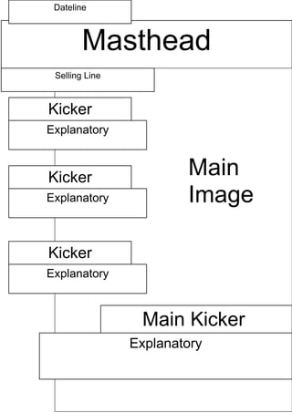
- 1. Dateline Masthead Selling Line Kicker Explanatory Kicker Main Explanatory Image Kicker Explanatory Main Kicker Explanatory
- 2. The selling line, located is directly under the masthead. This should be short and snappy as well as informed on what this magazine's point is. The font will be Times New Roman as it is easier to read. The dateline would be kept at the top left corner so it will be the first text the reader would see. The font will also be Times New Roman. The Masthead would have the biggest font size from the rest as well as a different text colour to make it stand out. The font will be either Arial or Ravie to add emphasis. These will be the coverlines, located at the left hand side of the magazine. They cover other news which is included in the magazine but are not as important as the main headline. The font will be Times New Roman. This is where the main image will be placed. The image chosen is a photo of a girl turning to the camera, smiling while holding a folder and carrying her bag, entering the school. This is the main kicker/coverline which will be linked to the main image featured. This section would have a bigger font size from the other coverlines, but is smaller than the masthead. The font would be Arial as this is easier to read.